


Brian in Boston
-
Posts
8,476 -
Joined
-
Last visited
-
Days Won
3
Posts posted by Brian in Boston
-
-
Biloxi, Mississippi's new minor league baseball team (the relocating Huntsville Stars of the Double A Southern League) has announced the finalists in its Name-The-Team contest:
Biloxi Beacon - A symbol of resilience, the “Biloxi Beacon” honors the Biloxi beach lighthouse, which has weathered nature’s mightiest storms since 1848. Beacon embodies Biloxi's can-do attitude, shared by Coastians throughout the region.Biloxi Black Jacks - Combining the fun of Minor League Baseball with casino & seafood industries, the “Biloxi Black Jacks” pays homage to the “rare” black-colored gulf coast Jack fish.
Biloxi Mullets - A tribute to Biloxi bacon and the popular Biloxi fish, the “Biloxi Mullets” falls in line with the Lugnuts, Biscuits and other wacky names Minor League Baseball is known for.
Biloxi Schooners - The “Biloxi Schooners” celebrates the legendary Biloxi-built boats known for their speed and windward ability. This workhorse became a way of life for fishermen along the Mississippi Coast.
Biloxi Shrimpers - The Gulf Coast shrimp gave birth to Biloxi’s famous seafood industry in the 1920s and 1930s. The name “Biloxi Shrimpers” embodies Biloxi's reputation as the hub of the Gulf’s shrimping industry.
Biloxi Shuckers - The “Biloxi Shuckers” celebrates Biloxi’s legacy as the original “Seafood Capital of the World.” Raw, fried, steamed, or broiled -- shucking oysters has been synonymous with Biloxi for generations.
-
The Norwich, CT-based Connecticut Tigers - Class A New York-Penn League affiliate of the Detroit Tigers - have unveiled a pair of new alternate marks.
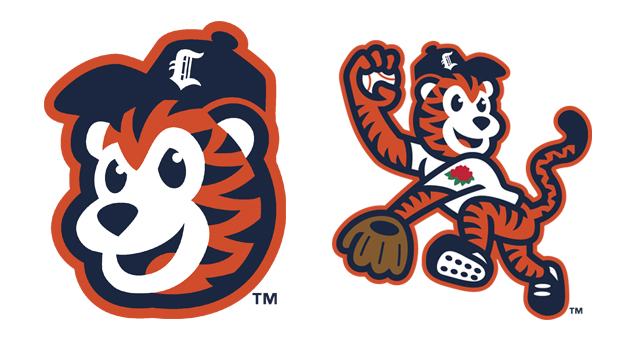
Both logos depict team mascot C.T. the Tiger. Amongst the symbolic touches gracing the second mark: a rose-shaped patch on the jersey sleeve which pays homage to the City of Norwich being known as the "Rose City", four stripes on C.T.'s left arm signifying the Detroit Tigers' four World Series titles, and eight spikes on the mascot's left cleat representing the eight counties within the State of Connecticut.
The marks were designed by Brandiose.
-
The Sioux Falls Canaries of the independent American Association have unveiled a pair of new alternate logos.


-
Joplin, Missouri's entry in the American Association has a name and logo...
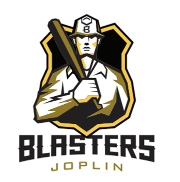
The franchise - which relocated from El Paso, Texas - takes the field in 2015.
-
Don Garber pulled no punches while addressing the 2014 IMG World Congress of Sports on Wednesday.
MLS Commissioner Don Garber yesterday said the decision to award Qatar the '22 FIFA World Cup and the potential that the event may have to move from summer to winter because of weather was a "monumental disaster" for soccer worldwide. He added that he hopes the event is moved. "We certainly would be happy to host it here and have a lot of big stadiums that could turn it around and host on very short notice," said Garber, who spoke on the opening panel of the '14 IMG World Congress of Sports. "But we're going to be on the sidelines on this and hope that FIFA can resolve this in a way that is good for the sport."
http://www.sportsbusinessdaily.com/Daily/Issues/2014/03/20/Events-and-Attractions/World-Cup.aspx
-
With regard to the recent deletions in this thread...
I can't speak for any other members of the Moderating Team, but amongst the top complaints I find filling my PM inbox on a regular basis from the CSSLC membership in general are those focused on the subject of threads being dragged off-topic. It is easily a "Top 3" beef amongst those members of this community who have turned to me when voicing their discontent. So, that being said, one of the moderating tasks that I try to undertake whenever possible is to keep threads focused on the subject at hand.In a best-case scenario, I'll not only delete posts that have absolutely nothing to do with a thread's stated topic, I'll also post a brief reminder of what said thread's topic is and request that CCSLC members make every effort to stay focused on that topic. That said, there are days - many of them, in fact - when I find my career pursuits draw me away from regular visits to the CCSLC via my desktop or laptop computers. At such times, I'll engage with the CCSLC via my smartphone, which - mea culpa - isn't necessarily the latest and greatest generation of said devices.I bring this up because when a need to engage in CCSLC housekeeping catches my eye at such times, I'll sometimes engage in a "quick-and-dirty" clean-up (sorry about the oxymoron). Whether because my time or the efficiency of my smart-phone is limited, I'll be forced to cut some corners.In the case of the recent deletion of comments regarding The Admiral's absence that had appeared this thread, had I been on my home computer with more time available to me, I'd have elected to split said comments off into their own new thread with a post explaining why I'd done so. Unfortunately, I was in between business-related appointments, interfacing with this site via a tiny screen on my painfully-dated smartphone, and - in the moment - I elected to engage in a "quick-and-dirty" edit of said thread's content.I can assure you that there was no motive for my actions beyond simple CCSLC housekeeping. My sincerest apologies for leaving the reasoning behind my thread-edit unexplained.
Please, feel free to carry on with the task of analyzing L'affaire de Coyotes de Phoenix ridicule.Brian -
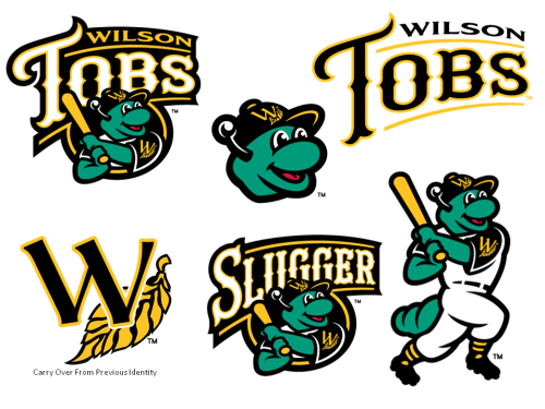
The Wilson Tobs of the summer-collegiate Coastal Plain League have unveiled a new logo package. The marks were designed by Skye Dillon - aka, the CCSLC's cward - of Skye Design Studios.
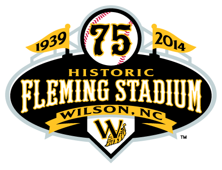
Additionally, Skye designed a logo to commemorate the 75th anniversary of the Tobs' home ballpark, Fleming Stadium.
Skye Design Studios is no stranger to creating brand identity packages for summer-collegiate baseball teams, having previously designed logos for the Edenton Steamers (Coastal Plain League), Holyoke Blue Sox (New England Collegiate League), Springfield Sliders (Prospect League), and Wisconsin Woodchucks (Northwoods League).
-
The Akron Rubber Ducks have unveiled their uniforms.
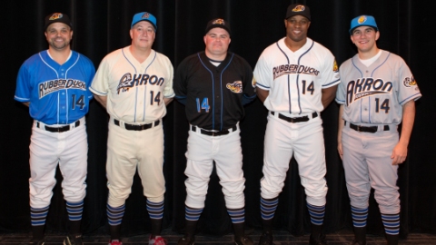
http://www.milb.com/news/article.jsp?ymd=20140209&content_id=67593812&vkey=pr_t402&fext=.jsp&sid=t402 -
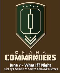
The Omaha Storm Chasers have announced that June 7, 2014 will be "What If? Night" at Werner Park. The team will take the field sporting specialty jerseys of the Omaha Commanders, one of the finalist identities that lost out to Storm Chasers when the franchise rebranded from the Royals moniker.
-
-
The Scranton/Wilkes-Barre RailRiders have announced that August 8, 2014 will be "What If? Night" at PNC Field. The team will take the field sporting the uniforms of the Scranton/Wilkes-Barre Trolley Frogs, one of the finalist identities that lost out to RailRiders when the franchise rebranded from the Red Barons moniker.


-
While not minor-league, the Wilmington Sharks of the summer-collegiate Coastal Plain League have unveiled new logos and uniforms. The new brand identity was designed by Dan Simon and the team at Studio Simon.
PRIMARY MARK

SECONDARY MARK

WORDMARK

UNIFORMS

-
Ballpark Business is reporting that the Nogales Desert Ghosts of the all-but-defunct independent American West Baseball League have apparently been resurrected as the Yuma Desert Ghosts of the proposed indy Western Association of Professional Baseball. Flynnagain Productions is responsible for designing the team's new logo package.
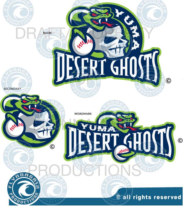
http://ballparkbiz.wordpress.com/2013/12/31/nogales-desert-ghosts-and-new-league-take-on-yuma/
-
Because the "rock" in "Rock Cats" presumably means stone, so in other words, "mountain lion," more or less. The "rock" in "rock and roll" is a separate word meaning "to sway," so going in both directions at once destroys whatever precious little semiotic integrity "Rock Cats" could possibly have. But that's kind of Brandiose's schtick, to have one degree of separation too many between the name of the team and the iconography. It would be like if they made the Charlotte Knights' logo a moon wearing sunglasses like the old McDonald's logo, because it's night (Knight) time.
The "rock" in Rock Cats has never referred to stone, nor has the team's mascot ever been meant to be a mountain lion.
When cartoonist Gil Gilchrist helped the New Britain Red Sox rebrand in 1994, he chose the name Rock Cats as a tip-of-the-hat to rock 'n' roll music. When he learned that the team's owner - Joe Buzas - had purchased his first minor-league team in the 1950s, Gilchrist hit upon the idea of paying homage to the decade that birthed the term "rock 'n' roll" by creating a guitar-strumming, sunglass-wearing, pompadour-sporting feline mascot - "Rocky". Gilchrist combined the logo with the Rock Cats moniker and the place-name Hardware City, long a nickname for New Britain.

Because few people outside of Connecticut knew that Hardware City referred to New Britain, the place-name was eventually changed and a new logo, incorporating stylized "NB" initials, was unveiled to go with it.
 - A cat wearing sunglasses in front of a N and B together in red")
The Rock Cats' current primary mark...
 - A cat wearing a baseball cap sneering behind a glove on top of New Britain in white and Rock Cats in red over a tail")
... was designed by Dan Simon and introduced in 2007.
So, by portraying the Rock Cats' mascot as a singer in an Elvis-inspired jumpsuit, Brandiose actually brought the team's identity back to its original inspiration.
Incidentally, Gilchrist designed the logos for the Portland Sea Dogs, Norwich Navigators, and Binghamton Mets, as well as the mascot for Shimizu S-Pulse of soccer's J-League.
-

According to team owner John W.S. Creedon, Jr., the team name has two significant components.
The word “Brave” recognizes Worcester’s brave men and women in uniform, those serving both locally and abroad. In particular, the word serves as a tribute to Worcester’s fallen firefighters, such as the six heroes (Paul Brotherton, Timothy Jackson, Jeremiah Lucey, Jay Lyons, Joseph McGuirk, and Thomas Spencer) who perished in the December 1999 Worcester Cold Storage Warehouse fire, as well as Jon Davies who gave his life in December of 2011. Today marks the fourteenth anniversary of the Cold Storage Warehouse firefighters’ bravery, and this coming Sunday marks the second anniversary of Jon Davies’ bravery.The word “Hearts” is a reference to Worcester’s nickname as the “Heart of the Commonwealth.”
Team General Manager Dave Peterson described the logo design as being, "heavily inspired by the colors and symbols of the Worcester flag, including the red heart and green laurels on a white seal against a green field." Peterson added that the top of the shield featured in the logo was meant to represent, "Worcester's proud blue collar heritage and economy driven by the remarkable work ethic of the city's citizens."
-
The New Britain Rock Cats (Double-A Eastern League) have unveiled a new alternate logo. The mark, which will be featured on the Rock Cats' caps several times next season, depicts team mascot Rocky wearing a Metallic Red, Elvis-inspired jumpsuit. The Rock Cats - and/or design partner Brandiose - have stated that the team is the first professional sports franchise to use Metallic Red in their team identity.
-
While not minor-league, the new Kenosha, Wisconsin-based franchise in the summer-collegiate Northwoods League has unveiled its name and logo.

Kingfish General Manager Jake McGhee said that the name was chosen in the wake of community members and focus groups telling the team that the "image of Kenosha was Lake Michigan". This being the case, McGhee went on to say, "We wanted a name that would connect with the lake, but also... ties in with both royal and nautical themes".
The team's colors have been designated Lake Michigan Blue, Vintage Cream, King's Gold, and Cardinals Red.
The logo was designed by Madison, Wisconsin-based Shine United. The firm was responsible for creating the logo of the Northwoods League's Madison Mallards franchise, which is owned and operated by the same group that controls the Kingfish, the Wisconsin Rapids Rafters, and the Green bay Bullfrogs.
-
Top Left: Primary Logo
Top Right: Amusements Logo
Bottom Left and Center: Alternate LogosBottom Right: Batting Practice Cap Logo
-
Why couldn't Inland Empire update the highway shield for a secondary logo?
Here's what those involved in the rebranding process had to say:
"There is some confusion/trademarking issues with the Route 66 sign, so the challenge was: How do you tell the story of cars on the most famous highway, without going near the sign. Muscle cars became a huge inspiration, hence the classic Blue & Orange Unical 76 color scheme." - Jason Klein, Brandiose“The idea is to make it (Inland Empire 66ers identity) come alive with the character. We were looking for something that had action to it. It was hard to take the Route 66 shield and apply any action to it.” - Donna Tuttle, Inland Empire 66ers co-owner
“Although our old logo has served a great purpose for our office and organization, we did not feel it supported the enthusiasm and creativity that our organization is known for." - Joe Hudson, Inland Empire 66ers General Manager
-
While not minor-league, the new Worcester-based franchise in the Futures Collegiate Baseball League has announced the five finalists in its "Name The Team" contest. According to the team website, they are:
- Worcester Bravehearts - an homage to Worcester's brave men and women in uniform serving locally and abroad as well as a reference to "the Heart of the Commonwealth"
- Worcester Canal Diggers - a reference to Worcester's industrial history where scores of Irish immigrants dug the Blackstone canal through the region
- Worcester Freight Trains - a reference to Worcester's proud past and present operation of locomotives
- Worcester Mighty Caseys - a nod to the "Casey at the Bat: A Ballad of the Republic Sung in the Year 1888" poem written by Ernest Thayer on Chatham Street in Worcester
- Worcester True Blues - meaning "unwaveringly or staunchly loyal, especially to a person, a cause, etc.; the real deal" and a reference to Worcester's pride and blue collar heritage
Frankly, I can't say that any of them strike me as being particularly good. My gut tells me that they're going to go with Worcester Bravehearts. Of those five, I'd go with Canal Diggers. That said, my real preference would be to pay homage to Ernest Thayer's "Casey at the Bat" by naming the team the Worcester Nine. Barring that, I'd opt for the Worcester Blast in honor of the role the city has played in the fields of rocketry and space exploration (birthplace of rocketry pioneer Robert Goddard... home to David Clark Company, which has designed, developed, and manufactured air/space crew protective and communication equipment for the Mercury, Gemini, Apollo, and Space Shuttle programs... original home to Wyman-Gordon Company, one of the global leaders in forging aerospace parts... the first rocket propelled by liquid fuel launched in nearby Auburn, MA).
-
Typically outstanding work from Dan Simon and the team at Studio Simon. This is a logo package comprised of clean and iconic elements, without so much as a superfluous stroke or inconsistent line-weight to be found. Rather than selling a client on a complete abandonment of their previous identity, or a makeover so all-encompassing that little beyond the old name still exists once the dust settles, Studio Simon elected to simply refresh elements from the client's branding history - both existing marks and those from the team's storied past. This is the type of quality work that results from a designer and his team possessing the experience, talent, and self-confidence necessary to recognize that tasteful restraint can be as valuable a tool in the branding professional's arsenal as envelope-pushing excess.
-
 1
1
-
-
In my opinion, the Charlotte Knights logo package is, unfortunately, another in the line of "misses" that Brandiose has turned out over the past two years.
The wordmark is solid, if imperfect. I particularly like the fact that its font pays homage to the similarly-styled lettering that graced minor-league Charlotte Hornets jerseys circa 1950. That said, within the "KNIGHtS" wordmark, I think that the presence of the "Queen Charlotte's Crown" on the "H" and the "t" being rendered as a cross take away from the mark. They clutter what could be a simple, clean, classily-rendered wordmark."
The primary/home cap logo is, again, solid, if imperfect. I love the Knight's helmet topped with a crown. What I'm not crazy about is the particular style of the stylized "C" surrounding the helmet. I'm not seeing a C "in the form of a horse's tail", as Brandiose and the Charlotte Knights claim. I'm seeing a letter "C" rendered in a font that seems not particularly well-designed and clashes with the wordmark font.
The road cap logo is a complete miss in my book. Look, I'm open to modern, stylized logos. I can be a fan of pared-down simplicity. Lord knows that after excoriating Brandiose over the "everything-PLUS-the-kitchen-sink" and "more-is-less" design ethos that I thought plagued the company's work on behalf of the Lexington Legends, Scranton/Wilkes-Barre RailRiders, and Stockton Ports, that I should welcome a stylized and simple logo in the Knights' identity package. That said, this logo isn't it. This looks like nothing so much as a crude sketch of a brainstormed idea dashed-off early in the design process. It looks unfinished. Gothamite and sc49erfan15 raise pertinent questions: Is the knight riding a jet ski or a giant, frog-like creature? Either one would be apropos, given that the knight is clearly trying to make his way through... a flowing river? And if the knight is, in fact, making his way through water, where might I have seen a similarly-stylized depiction of water? Oh, that's right... in the logo adorning the road cap that Brandiose designed for the West Michigan Whitecaps. Wow, a logo that's rudimentary AND derivative.
The alternate cap logo - featuring a stylized "K" comprised of a sword plunging through the chest of a winged dragon - is decent. That said, I find something awkwardly disturbing about the fact that a minor-pro franchise which features a dragon - Homer - as its beloved, kid-friendly mascot, will also sport a logo showing a dragon being skewered by a sword.
The batting practice cap logo would likely be my favorite part of the new Charlotte Knights identity package... if the point of the sword that forms the upper-right stroke in the stylized "K" were allowed to peek out from behind the letter's stem.
Is this logo package an upgrade over what the Charlotte Knights had? Sure. Then again, given what the Knights had been sporting up this point, that's not exactly saying much.
I don't want to come across as hyper-critical, or be accused of kicking folks while they're down, but I'm getting a "spread-too-thin" vibe out of Brandiose over the past couple of years. I take no pleasure in saying so, as Jason and Casey not only strike me as great guys, but they're also the talent behind some of what I consider to be the finest identity packages out there (Clearwater Threshers... Lakeland Flying Tigers... Myrtle Beach Pelicans... Asheville Tourists). It just seems to me that a lot of their latest work isn't up to the quality of earlier efforts. I wonder whether the fact that they've become so popular amongst potential clients means that they're being asked to do too much? If you look at the sheer number of sports projects that they seem to be working on, factor in their work with other clients/partners like Hat Club and Mishka, then add their side-projects like the Clink Room to the mix, you have to wonder whether they can give any single project the amount of attention that they used to early in their career?-
1
-
-

The sleeve emblem logo is outstanding. It's easily the best aspect of the entire identity package... and by a large margin. The Texas League All-Star Game logo is quite nice. The alternative logo is solid.
Beyond that, I can't say that this identity system does much for me. In the primary cap logo, the interplay of the horse's head, the letter A, and what are meant to be the horse's mane and - I presume - the reins of the horse's bridle make for a visually convoluted mark. The road cap logo is serviceable. The custom font script is, "Meh", at best. The fashion cap logo is brutal. -
For what it's worth, the Miami Herald is reporting that Vinnie Viola is purchasing Sunrise Sports & Entertainment in its entirety, including both the Florida Panthers and the management rights to the BB&T Center. The latter portion of the SS&E portfolio is what generates the considerable revenue that offsets the Panthers losses.
http://www.miamiherald.com/2013/09/19/3634940/new-york-businessman-leading-group.html"Sunrise Sports & Entertainment, which operates the arena, is the profitable arm of the Florida Panthers family of companies and is said to be part of the transaction."


Minor/Independent/Collegiate League Baseball Logo/Uniform Changes
in Sports Logo News
Posted
Well, this has cropped-up on the Virginia Beach Neptunes' website...
There are days when, as a branding enthusiast, my soul dies a little bit.