


FiddySicks
-
Posts
25,330 -
Joined
-
Last visited
-
Days Won
63
Posts posted by FiddySicks
-
-
1 hour ago, tBBP said:
@FiddySicks, I had to look up what Black Diamonds even meant in that context, because I had no clue, even after reading your post. (Full disclosure: I ain't never skiied in my life.) Apparently it's a ski run. So would I then be to guess that the nickname would be the name of the actual slope itself?? (Unless they try to double- or even triple-entendre it incorporating the actual signage, the pike itself, and the gemstones.
 )
)
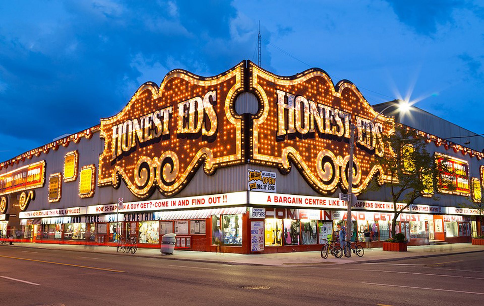
Anyway, I also found this image:

From that I pull black, sky blue, snow white, and [pick some shade of] brown. While not all that distinctive a la a Kraken or VGK, it would be the first time a/ a major pro sports team has paired, as a primary colorway, a/ black with light blue, b/ brown with light blue, c/ black with brown, and d/ all four of those colors together (setting aside the Memphis Grizzlies' 2023 City Edition stuff).
That could be an interesting colorway for either Yeti(s) or Black Diamonds...
(Also, what would be the chances of/reception to that second one being shortened to just "Diamonds"?)
This is all correct. Basically, Black diamond level ski runs are the highest (non back country, but I wont even get into that part of it other than to say the picture you posted is backcountry skiing) recognized runs in the sport. You also have to remember that I grew up in and am back living in an Olympic level ski resort town, so that kind of aesthetic is in my blood. My dad worked for years at the local resort, and I ran a ski/board shop my first three years back up here. I’m a complete and total sucker for any of that kind of branding. And some of it is really really good. I absolutely think it could translate over to a hockey team in a sophisticated, but still very bright and fun identity (that also avoids stepping on the Avalanche too too much). There’s also a pretty smooth way you could link all of that with the Utah Olympics in 2002, which I’m sure a big chunk of hockey fans my age in Utah got their love from (which is actually what happened to me, even though I’m not in Salt Lake).
It would be such a breath of fresh air to get something like that rather than just another brand catering to the lowest common denominator. Yeti(s) is a great name for a soccer team for five year olds, but it REALLY misses the mark for a team in the sport’s highest league. I also can’t imagine just how hard they would get cracked on if they just continue to be a dysfunctional extension of the Coyotes (which was a name that was a LOT more sophisticated than Yeti, and it STILL got cracked on hard because they sucked).
-
 1
1
-
 1
1
-
-
10 hours ago, spartacat_12 said:
I feel like the Jays want something that any Canadian would want to buy, so I'd be surprised if they reference something too specific about the city. It could be cool to base the design off something like the old Honest Ed's signage, but I doubt that would resonate with people in New Brunswick or Saskatchewan.
Which seems weird to me becauseA.) It goes against the idea of a CITYConnect
B.) Unless they ditched the red Canada Day unis, they already have that.
It’s probably gonna be red and black and say NORTH on it.
-
There’s nothing even close to being as good as Black Diamonds. Not everyone’s cup of tea, but perfect for a team in the mountains that doesn’t want to ape too much of the Avs identity. In fact, some of the best skiiers/snowboarders in the world basically specialize in outrunning huge avalanches they’ve triggered. It would sort of be a perfect one-up to them on top of being a really solid brand choice.
But this league is a circus, so of course it’s gonna be Yeti.
-
 7
7
-
2
-
-
Alright tight. Let’s see if this kid can put out this dumpster fire. At least Silicon Valley is warm. And even on a rookie deal, I think he might still be able to afford a modest little condo with a disconnected parking spot. That’s a come up in the Bay Area. Win win, really.
-
3 hours ago, Echo said:
Do you have that 7000 printed on your helmet bumper or are we just supposed to take your word for it?
Our little height slogan/marker for the town/lake is “6225” (I live above town), and I absolutely would not be shocked if the high school football team did that on their helmet bumpers.-
3
-
-
The thing that’s so surprising to me is just how stifling the T Wolves defense looked without their best defender.
The Wolves are gonna be a problem for any of the remaining teams.
-
1
-
-
Yeah so, Minnesota is taking the defending champs to the absolute woodshed. Holy hell.
-
1
-
1
-
1
-
-
N/M.
-
I live 7,000 feet up in the Sierra Nevada. They might as well be identical to those two pictures.
-
1 hour ago, Silver_Star said:
This guy has the most favorite uniform designs I can ever imagine
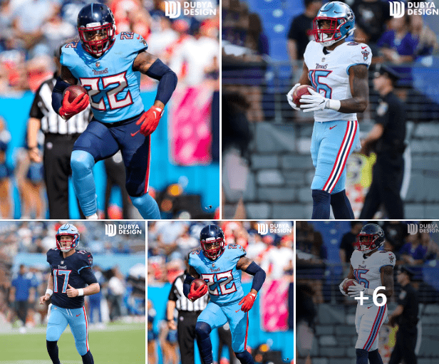
I still hate those numbers, but I kind of think the only way the Titans are ever going to get Houston to back off of the Oilers look is if they just went straight up Oilers cosplay just out of spite. Trying to own that powder blue by actually wearing a powder blue helmet would probably push in that direction, too. -
Damn those suck. It looks like a soccer team decided to start a baseball team in their spare time.
-
2
-
-
The Titans current uniforms are a total train wreck, but I’ve always kinda loved what they initially came up with. I’ve always liked the “Flaming Thumbtack” logo, the sword is an EXCELLENT alt logo, and the colors are really good. I also agree that their initial Titans uniforms were basically perfect, and every tweak they made to that set made it worse.
I guess that’s an unpopular opinion, but oh well

-
2
-
-
Man, Anthony Edwards. That guy is pretty decent at basketball.
-
I mean, whoever won this series was probably going to get absolutely curb stomped by Florida anyway, but holy hell, Toronto

-
On 4/22/2024 at 5:20 PM, SCL said:
Just needs to, it's too clean and time to move on from the drab.
Theres been a lot of talk above about an irrational love for the Raptors old split color unis. That’s how I feel about these. They’re 90s as all hell, and I absolutely love them.
-
9
-
5
-
 1
1
-
-
And if I care to comment on those other leagues branding choices, I will! In those appropriate threads, of course. Thank you for the information

-
 1
1
-
-
Hockey is increasingly more popular where I live. There was an outdoor game like ten minutes from my house a few years ago. It’s a lot to dredge up, but I don’t think there’s a single decision pro hockey has made in the past decade that I’ve really agreed with. And that extends to their branding, and even location choices.
I just don’t think this league is really for me anymore. Like, even this part of it I find cringey and bad now.
-
2
-
 1
1
-
 1
1
-
-
12 hours ago, PlayGloria said:
I really don't understand this take. You don't like the Yeti's so the entire league is a joke? I'm going to trust the process here, since the last two new identities in the league (VGK and the Kraken) were a complete success both from a branding standpoint as well as a uniform.
I'm not sure why it would be so absurd for a team to choose a name that is extremely popular in their new city. Why would they not choose it honestly if it is that popular? Why give people that will buy tickets, merch, etc the middle finger before the team even touches the ice? Especially a franchise that has been playing in front of 5,000 people the last couple of years.
All I'm saying is that if I was the new owner of that team, I would feed the frenzy as much as possible.
There’s a laundry list of grievances I have with the NHL, many of which I’ve said a million times on here. Hell, there’s an ENTIRE thread here dedicated to just how dysfunctional this league is and it’s like 15 years old and still active. None of this is new information.
Call me a fuddy duddy or a stick in the mud or whatever all you want. I just feel like names like Kraken and Yeti(s) fit the league kind of perfectly. Unserious and borderline minor league. Sue me, I guess

And frankly, I don’t care how good the Kraken brand is (personally, I think it’s overrated). It’s still dumb enough to ruin it for me.
-
2
-
2
-
-
HHV, if I may ask?
-
1 hour ago, Sec19Row53 said:
I get that it might be unpopular here, but I'd bet it will be popular where it counts - in the NFL's wallets. In being popular there, it's a pretty good indication that fans are supporting it, if only because advertising dollars and (more importantly) rights fees will continue through the roof. Mark Cuban won't be correct with his 'pigs get fat - hogs get slaughtered' line.
I understand where numerically 16 --> 18 is akin to 162 --> 182, but it's only one game per week, not three plus additional weeks to a season. This also isn't a net increase in game time, but I do agree that it's more playing time for the starters. If anyone can't point to real data that shows an increase in injury rate with a 17th game -- please do so.
I picture you in a monocle and a top hat sitting in an office above a busy factory sipping tea while saying this.-
2
-
-
Oh great. These are all terrible. And you know that the very worst one of them all, Yetis, is ABSOLUTELY going to win in a landslide.
This league is a perpetually unserious joke.
-
1
-
1
-
-
I’m getting a vague Street Sharks vibe from those art renderings posted above
-
2
-
-
On 4/28/2024 at 12:04 AM, See Red said:
I’m not surprised Hartman wasn’t drafted. He’s 25 and doesn’t have a great arm or vision. I feel like he benefitted by playing in a very unique offense at Wake with the slow read plays and, imo (but I’m not a scout so it’s worth nothing), wasn’t that impressive at ND despite being a fifth or sixth year starter, which is a huge advantage in college. He’s no threat to Daniels and I doubt Washington sees him as more than a guy who can maybe play the backup role eventually.
Change the names to RG III and Kirk Cousins and this definitely could be a write up about 2012. Cousins was obvs drafted, but man does this all feel familiar.
:censored:, change the names to Heath Schuler and Gus Ferotte and it could even be about 1992.
-
4
-
-
I do agree that there are elements of these CityConnects that can/will be incorporated into the main sets for some of these teams. But most of those that would really work (your White Sox example is a good one. As are the color additions for some of the teams), and some of the ones that have elements that would work (Colorado, Astros gradient) seem more like alts or slight tweaks. But this is the first one that really feels like it has some legs for a full rebrand, IMO. I don’t agree with you about some teams (Seattle, Angels especially), but some of that is probably my personal tastes. The only other one of these I’ve seen that really hit me in a good way was the Royals. But even that I don’t think is enough to supplant what they’re already wearing. Parts of this Rays set absolutely do, for me anyway.
The Rays are also a perfect candidate for a change, too. Their look is dreadfully boring IMO, and I’m hoping they brighten it up a bit with this new stadium they’re
exploiting from the taxpayersbuilding.-
5
-


2024-25 NHL Changes
in Sports Logo News
Posted
I’m personally fine with that. There’s enough of an interconnection with skating and skiing for it to be passable imo. The lines are blurred enough for me to overlook the finer details. And I don’t even think it has to be a straight connection to skiing/boarding, but a more broad representation of winter sports as a whole. And not many locales can do that without it coming across weird and out of place, IMO. Salt Lake City definitely can with its recent history with winter sports.