


scraw28
-
Posts
1,377 -
Joined
-
Last visited
Posts posted by scraw28
-
-
59 minutes ago, mee said:
Is there a way to have more modern looking helmets or is the 2d the only way?
Also happy to see I am not the only one hoping for an ORANGE endzone vs a BLUE endzone...
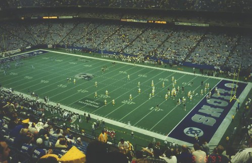
pittpack..... that field is absolutely perfect and a work of art....the modern looking helmet would be the riddell revo speed or the schutt air xp model? we need to stary a movement to the nfl and to whoever is in charge for the grounds crew at the big nfl events. i'm serious.....that just looks extravagant and has a big game feel to it
-
1 hour ago, pitt6pack said:
If they went with dueling helmets, Denver's endzone would be orange because of their helmet color, so I would love to see a return of those. I would still think Carolina would have a black endzone, but here is what an electric blue endzone would look like. I'll see what I can put together tomorrow.
sounds good
-
11 minutes ago, pitt6pack said:
I'm thinking they will also.
I'd think they'd still go with black, that's what they have always had for their endzones, plus the border of the conference logo is gold.
I thought that the NFC logo being in the left endzone for the Seahawks in XLVIII was going to be a one time thing also, but it seems lately the crews painting the fields just base off of previous years. The fact that the side for the home teams endzone hasn't gone back to the left endzone yet is another example (it was from VII to XLIV I believe).
Well here is what I'm thinking as of now what we can see in two weeks.

can I get one with the deuling helmets in the end zones and the gold confernce logos
-
1 hour ago, jc... said:
I think we could see an orange Broncos end zone. I think SBXLVIII was just an anomaly because of the cold weather, and maybe not being able to get into heavy detail.
that would probably work with the dueling helmets in the endzone
-
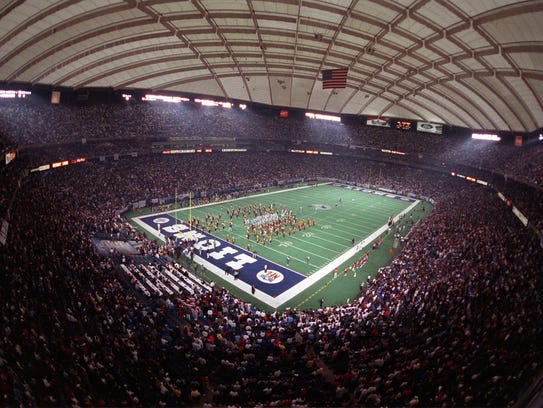
Here are some more for the silverdome era for the lions if you need some help

-
 1
1
-
-
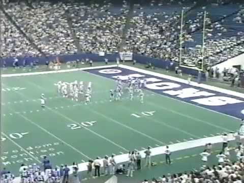
Municipal Stadium in Kansas city where the chiefs played before they moved to arrowhead had the opposing team end zones as well as the helmets on the 35 for every chiefs home game....and cleveland had the broncos name in the browns wordmark font for the 1986 afc championship game
-
still crossing my fingers for the return of the dueling helmets in the end zones
-
At least SD put up double digits. Can't say the same about SB 35 and 48. Those two are the worst in my opinion
This game was over a minute into the game when Steve Young hit Jerry Rice with a long TD pass.Super Bowl XXIX: January 29, 1995. Joe Robbie Stadium, Miami, Florida
San Diego Chargers - 26 San Francisco 49ers - 49

Many changes for this field, most notably the NFL 75 logo at midfield. Other changes include the Super Bowl logo at the 30's (this was the same year the kickoff was moved back to the 30), no conference logo in the endzone, and the number coloring was the same color as the conference for each teams sideline. Also the 49ers wordmark was different from past wordmarks used with a lager black outline.
This field ended up being a large amount of work, mostly done cleaning up the chargers wordmark and the NFL 75 logo because I only had poor resolution pictures for those. I also had to clean up the Super Bowl logo a bit as well as make the minor changes to the 49ers wordmark.
All in all, I'd say this was one of my least favorite fields before the templated logo era, although there are some good things in this field. What I disliked the most was the exicution of the Chargers wordmark and the way the NFL logo looks in the helmets. It doesn't help that this was a terrible game as well.
The 94 49ers where one of the best teams in the Super Bowl era, while the 94 Chargers were one of the worst. The 49ers were 18 point favorites and covered the spread by winning by 23, and it wasn't even that close.
This was one of the biggest mismatches in Super Bowl history and was the worst Super Bowl I had seen until this years
Yes Super Bowl XXXV was bad but the part where they scored three TDs in 30 seconds (a pick six and back to back kickoff returns for TDs) made that part of the game exciting.
Super Bowl XXXV also had the worst starting QBs (Trent Dilfer and Kerry Collins) in Super Bowl History. I can't think of another Super Bowl that had two worse starting QBs.
At least SD put up double digits. Can't say the same about SB 35 and 48. Those two are the worst in my opinion
This game was over a minute into the game when Steve Young hit Jerry Rice with a long TD pass.Super Bowl XXIX: January 29, 1995. Joe Robbie Stadium, Miami, Florida
San Diego Chargers - 26 San Francisco 49ers - 49
Many changes for this field, most notably the NFL 75 logo at midfield. Other changes include the Super Bowl logo at the 30's (this was the same year the kickoff was moved back to the 30), no conference logo in the endzone, and the number coloring was the same color as the conference for each teams sideline. Also the 49ers wordmark was different from past wordmarks used with a lager black outline.
This field ended up being a large amount of work, mostly done cleaning up the chargers wordmark and the NFL 75 logo because I only had poor resolution pictures for those. I also had to clean up the Super Bowl logo a bit as well as make the minor changes to the 49ers wordmark.
All in all, I'd say this was one of my least favorite fields before the templated logo era, although there are some good things in this field. What I disliked the most was the exicution of the Chargers wordmark and the way the NFL logo looks in the helmets. It doesn't help that this was a terrible game as well.
The 94 49ers where one of the best teams in the Super Bowl era, while the 94 Chargers were one of the worst. The 49ers were 18 point favorites and covered the spread by winning by 23, and it wasn't even that close.
This was one of the biggest mismatches in Super Bowl history and was the worst Super Bowl I had seen until this years
this could have been the steelers if they didn't choke away the game vs SD two weeks earlier....it would have been one of the best sb fields ever the first to five
-
-
todd marinovich with the LA Avengers and still baking

-
This thread got me thinking, what is Ray Allen's "right" jersey? Or are all of them right for Ray, who spent his first 7 seasons in Milwaukee, 5 in Seattle, and is currently in his 5th season in Boston


Ray Allen is a rather strange case for me, because at some point I got used to him in each uniform. If I had to choose one that was more "right" to me, though, it'd be the Bucks for purely nostalgic reasons. I know he won a title in Boston, but his time as a Buck spanned the time I paid the most attention to basketball (which I guess is why Nash in a Mavs uni isn't that weird to me, either). The most "wrong" Allen uniform to me would be the Sonics, but even that isn't too strange a sight to me.
That's easy; The Boston jersey is his "right" jersey and the other two are wrong. He won a champioship wearing a C's jersey, was part of a easily recognized "Big 3," and broke at least one prominent record (that I know of) wearing a C's jersey. Compared to his time in Boston, his years in MIL and SEA are relatively forgettable. I think "wrong jerseys" have more to do with just # of years played.
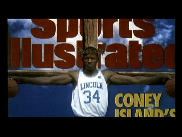
Ray Allen as Jesus Shuttlesworth in a Brooklyn Lincoln Uni
-
trevor pryce as a michigan wolverine

-
laron landry as a bodybuilding juicer (lol)

-
pat swilling as a detroit lion

-
John Cena in tights

-
-
Coming soon:

I was looking for Vick's Jersey when he played for the Mean Machine.
-

Mark Grace
Wrong position too.
I will give you that, but with the understanding he probably had as much of an impact with the 'Backs as he did with the Cubs, unlike the majority if not ALL the other entrants in this thread.
I disagree.
He was at the tail end of his career when he left Chicago, and if Arizona doesn't win it all in 2001, Gracey is only remembered as a Cub.
and jose canseco at the wrong position too
-
pro atlletes as pro wreslters


-
-
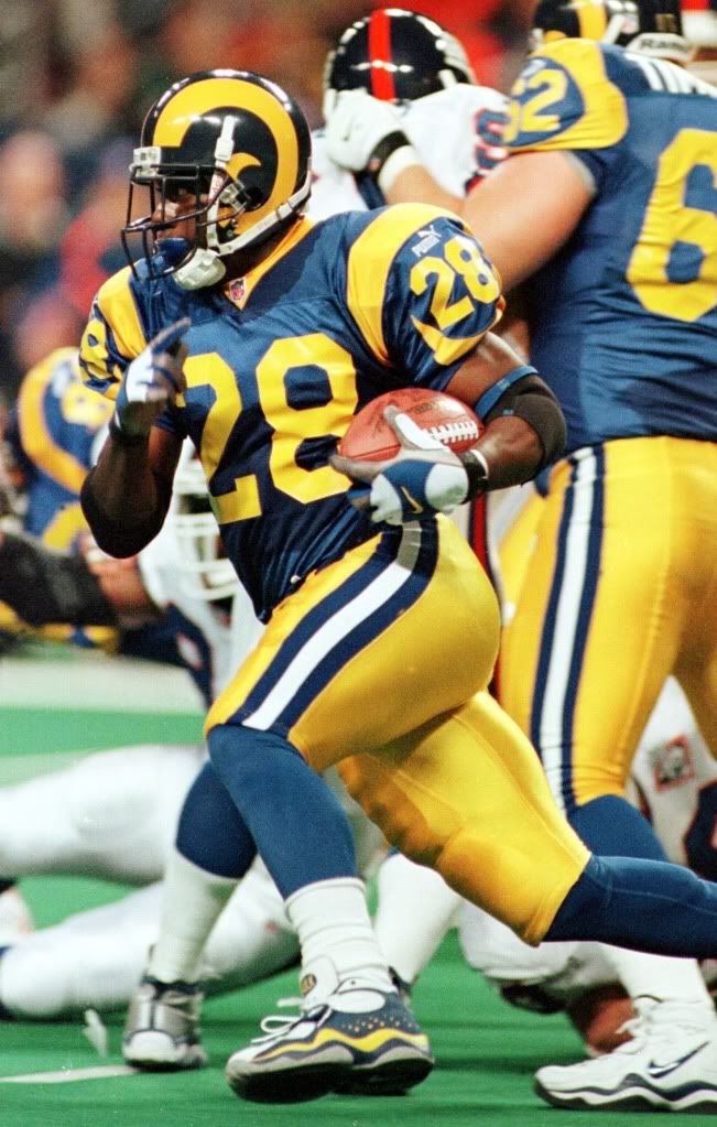
Ummm...Faulk played more years as a Ram, set all those ridiculous offensive records as a Ram, won a ring as a Ram, most likely played his way into the Hall as a Ram, and will likely be remembered by most as a Ram.
Unless you specifically mean that particular uniform is the "wrong" one, I'm going to have to dispute your claim here.
they need to go back to those full time
-
-
[Placard for Terrell Owens on the Bills]
It actually begs the question -- which uniform should Terrell be associated with? He was good on the 49ers, but he wasn't a super-duper star until the Eagles. And while he was a big deal both there and in Dallas, it always felt like he played more for Terrell Owens than for any team whose uniform he wore.
It's kind of like Randy Moss, but on a different scale. At this point, what team should Moss be associated with? Probably the Vikings, but it feels like forever since he's played there.
how long will it take for T.O. to throw Trent Edwards under the bus?
-
[Mod edit: completely unnecessary in this thread.]


Super Bowl Field Database - Super Bowl LVIII
in Concepts
Posted · Edited by scraw28
spelling
I agree Panthers Steelers would have looked good, if the pat would have won I wonder if they taken the flying elvis logo off if they would have went with the helmet endzone field