


nash61
-
Posts
7,665 -
Joined
-
Last visited
-
Days Won
6
Posts posted by nash61
-
-
4 hours ago, Sykotyk said:

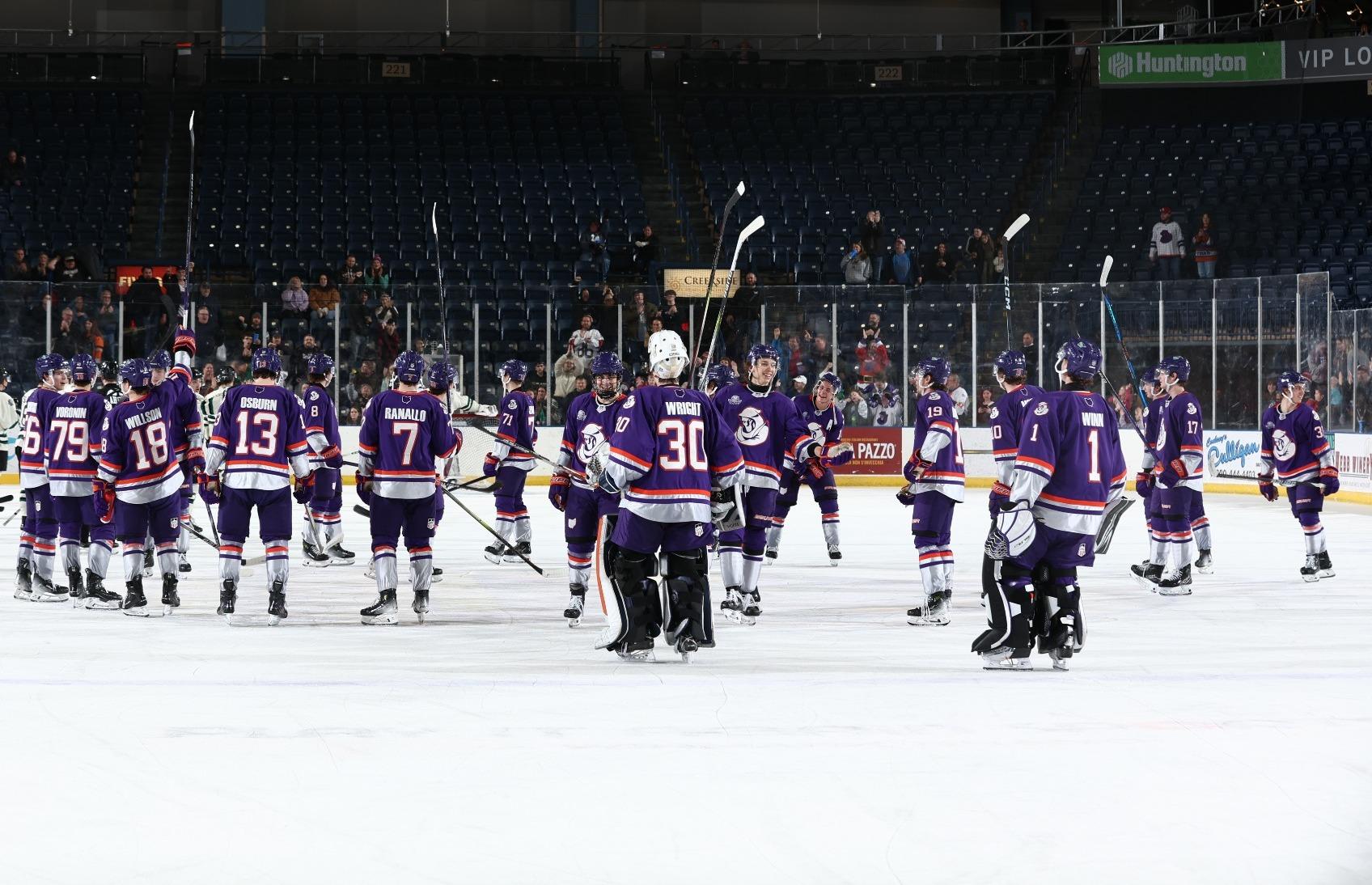
Your 2022-23 USHL Champion Youngstown Phantoms have purple/orange combo (and usually predominately white or black uniforms) but this is their purple with the secondary logo. It's a pretty sharp look. Orange could be more prominent.
The Orlando Solar Bears also use purple with orange, as did the Philadelphia Phantoms. Done right, I agree that it looks super sharp.
-
 10
10
-
-
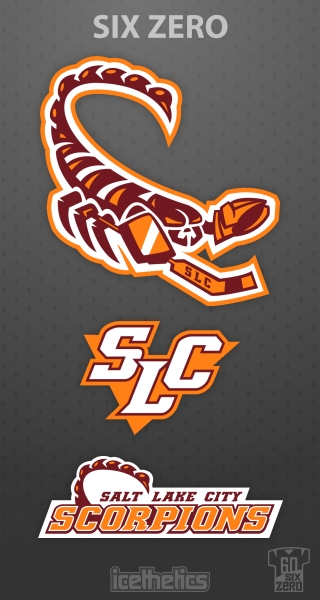
Utah
UtesYotes.
-
Icethetics' fantasy hockey league, the IceHL, had a Salt Lake City team, the Scorpions.
This entire identity would be incredible.
-
6
-
 1
1
-
-
39 minutes ago, MCM0313 said:
Do the Golden Eagles have large talons?
I get this reference.

-
1
-
 1
1
-
-
1 hour ago, CaliforniaGlowin said:
Is there enough time to get a new branding and uniforms by October?
I'm going to be the contrarian and say yes. The Jets did it in two months less time. (May 31 to Sept 6) I feel like Smith has been vocal enough that he has to have something in his back pocket. I think they follow the Jets lead and announce the name at the draft in June.
-
1
-
-
38 minutes ago, BottomlessPitt said:
When the Thrashers moved to Winnipeg, didn't the new Jets ownership have the logo & uniforms fashioned pretty quickly?
The sale was officially announced May 31, 2011, and the name was announced at the draft on June 24. Logos were unveiled July 22, and jerseys were Sept 6.
-
2
-
-
Salt Lake City Sun Devilzz. Let's go for the record for how many teams (AZ State, New Jersey), communities (Tempe, SLC), and religions (Mormons) we can alienate in one shot.
-
1
-
1
-
-
Carolina's "vintage-inspired" specialty jersey uses a serifed version of the current Canes C.
-
 2
2
-
 1
1
-
 2
2
-
-
Green buckets for the Leafs' St.Pats jerseys this year.
-
This had so much potential, but they leaned in too far to what they felt was their minor league duty to have an animal mascot.
Imagine this: a cap logo of either a single boxing glove, or two hanging gloves similar to the Red Sox logo, and a wordmark with the gloves hanging off the T in Knockouts. THEN you bring in the dog logos (again, missed opportunity for it not being a boxer breed), and you have a cohesive brand that still feels minor league, but had some class and flair to it. Finally, an alternate cap with the KO and you're one of the best sellers in MiLB.
-
On 2/23/2024 at 12:16 PM, TBGKon said:
Because its probably going to play up the Ohio State-Michigan rivalry.
Makes me wonder if they'll somehow design the jerseys to reflect the college teams.
While we have seen hideously large helmet logos in the Stadium Series, I still can't believe no team has used a helmet stripe yet.
-
1
-
-
I will sorely miss the Riptide brand. It was the closest we ever got to the Islanders Fisherman actually existing long term, and proved that seafoam works with navy and orange.
-
3
-
-
News out of New York today that the New York Riptide (NLL) will be moving to Ottawa next season, and will be known as the Black Bears.
The logo is a bear holding a lacrosse stick emerging from an O. I would post it, but I'm in phone.
-
 1
1
-
-
On 2/16/2024 at 2:16 AM, Morgan33 said:
*the best jersey the Blue Jackets have ever iced.
*Modeled after the best jersey the Blue Jackets have ever had. Should have had navy shoulders and red piping on this one.
-
The detailing and blue outline on the crest (!) are the best parts of this. The victory stripes finally being prominently featured by a team that has tried to minimalize them for so long is also nice, but the overall uniform feels lacking in uniformity.
-
1. Flyers (needs number outlines)
2. Rangers (why can't you just give us back white Lady Liberty)
3. Devils (we got a black jersey, so why not a black logo?)
4. Isles (NYI has had some stinkers, but this may be one of the worst)
-
17 hours ago, JohnnyCowboy5 said:
The lawsuit came out before the game and they went ahead and wore them anyways. They're not going anywhere. He just wants a cut.
-
25 minutes ago, HereComesThax said:
I haven’t posted on here in so long, but that’s my photo. Taken at a local location of a chain store.
Does the bottom have a single white stripe, or is it white over blue like the 04 jerseys?
-
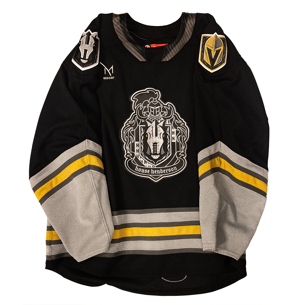
2 hours ago, Ridleylash said:
If Vegas wanted their jersey to match Seattle's, that was the best way to do it instead of trying to make up some old-timey knight logo.
Something like London, or even Henderson's new alt crest.
https://vegasteamstore.com/cdn/shop/files/year3jersey_photog.png?v=1703730720&width=1080
-
2
-
-
I would have loved to see them keep the touring model, but keep it in state. Using the example someone mentioned for NY Atlas, they could play in Buffalo one week, in Long Island another week, and Rochester another week. California could play in LA, San Diego, San Francisco, etc. Gives each team an opportunity to expand their fanbase and do something unheard of in major league sports.
-
On 12/1/2023 at 4:46 PM, Burmy said:
They haven't even announced their affiliation...so if they're the affiliate of anybody but Vegas & Henderson, it's gonna make even less sense.
(Kinda like the Reading Royals after the LA Kings dumped them)
They also channeled the logo design of Vegas/Henderson for one of their alternate logos. If this afilliation doesn't happen, they're gonna look reeeaaall dumb.
-
2
-
-
9 hours ago, JohnnyCowboy5 said:
Not sure why, but Twitter is giving me a sensitive content for these pictures.

-
First off, new helmet sponsor.
Second off, WHYYYYYYYYYYYYY
-
What? No Rome (insert adjective) (insert ridiculous local name no one has ever heard of)?
My ONLY nitpick on this is that I feel the Pontificating Penguin is too busy for the cap. The column R would be better, but that's the slightest thing. Overall, 9/10 for the uniforms, 10/10 for the logos, and 11/10 for the name.
-
4
-


/cdn.vox-cdn.com/uploads/chorus_asset/file/23233450/1237839123.jpg)
2024-25 NHL Changes
in Sports Logo News
Posted
Of Anaheim