

TheRealPepman
-
Posts
1,366 -
Joined
-
Last visited
Posts posted by TheRealPepman
-
-
Julius Peppers - Chicago Bears

Awkward.
-
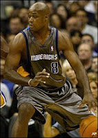
I like the Mavericks "trashbags"
-
I think this is the best logo the Pistons had.

Hell yeah. Although I've never been too big of a fan of taking recolored old logos and calling it new...this was nice and is still better than their current logo, mainly because of the fact that I dig the fact that there are actually pistons in the logo. It was the perfect upgrade to the "Bad Boys" Pistons identity, both in logo & uniforms.
Too bad they had to ruin it by updating the boring logo from back then and somehow making it bland & adding that red alternate for a couple of years. That was a mess, IMO.
I agree with both of you. Mixing generations looks really classy. This really defined the Detroit era in the early-mid 00s.
-
How about... Shaq in a Raptors jersey?

When was this?
Yeah, what the hell is that? Does Shaq just show up for random photo shots to see how he?d look in everyone?s uniforms?

That was in mid-2008 based from my research in Google. By the way, that really looks terrible.
-
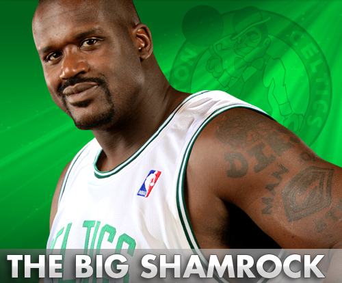
And not only that, every uniform Shaq's wearing since early 2008 is condidered "Wrong".
-
-
The OKC logo, which I hated, grew up on me.
-

T-Mac as a Knick. Weird stuff
EDIT: Since when is he #3? Hasnt he always been #1?
Earlier this season:

No PS.
-
-
"Spartans"

-
I was just asking, what's bad?
-


What font are these ff. words: O' Neal and Cleveland Cavaliers?
-
What font is this (the Celtics.Com script)

-
^^
Me too. But there are some samples in the previous page.
-
Nike National Teams Basketball 2008 Uniform Template please.
-
Also the #13:

And also the PHONE PALS script:
And the number of our National team:

-
What's the font of these images which have PEPSI in it?
1st:

2nd:
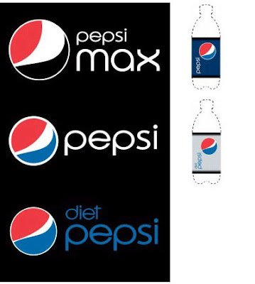
OK TY!
-
Florida SOD template please.
-
What's the font of the #20?
.jpg)
-
Does anyone have the SOD template?
-
What's the font of the term "TROPANG TEXTERS"???
-
double post
-
Can I request a template?
-

Templates Requests
in Concepts
Posted
Anyone have REV30LUTION jersey template?