


EJ_Barlik
-
Posts
1,102 -
Joined
-
Last visited
Posts posted by EJ_Barlik
-
-
OK - wow - somebody took their argument vitamins this morning.....
But let's deal with a known case of the "2nd" helmet, or at least what all of us on here presume will be the 2nd helmet - the Buccaneers.
I grew up a Bucs fans and endured scores of losing seasons, pretty much since birth, with the Bucs. Pewter wasn't even a gleam in their eye when I started watching. And yeah, there is a ton of ridicule for those "classic" Bucs creamsicle orange and white jersey combos. The Bucco Bruce helmet was white and it was always white. There was no potential alternate look. And then the Bucs go all pirate-flag on people, and the heavens opened. Hot takes, ridicule, malignment (my word) on every side. We hate the new look, etc. Eventually, everything calmed down, and the new look really started to look distinguished, in the sense it was a fresh start, a new opportunity, a new path for the franchise as a whole. Tampa wasn't just re-designing their uniforms, they were re-designing their entire path forward in the NFL. Hey NFL, this is the new Bucs! We're not what we used to be.....
So fast forward to the digital clock jerseys. 95% were hating these, mostly because (I perceive), the look and feel of the set was just, well, bad, for lack of a better word. The numbers were somewhat hard to read (at times). They even seemed like the neon glow of an alarm clock. In short, ugly. But hey, at least they were not the new Falcons level of ugliness, right? Just no.
---------------
Now you have the Bucs with 2 very distinct looks - the pewter with pewter helmets, and the orange/white with Bucco Bruce helmets. There is just no standing to think you could meld the 2 together - it doesn't work. You can't put the pirate flag helmet with the white orange because if too much pewter. Neither can you take Bucco Bruce and stick him on a pewter helmet. THAT, my friends, IMO, just doesn't work. It's Miami Heat-level mishmash. No no no.
That, in my opinion, is why the 2nd helmet rule exists - to allow teams to honor their heritage, and look correct doing it. We'll just have to see how everything works out when they ACTUALLY show up. (In other words, there's nothing stopping Tampa from putting the alternate pirate ship logo on a white helmet. Do I think they will? No. But they COULD. But last I checked, none of us can predict the future.)
Why don't we just wait and see what ACTUALLY happens with the Cardinals, Jets, Eagles, before we pronounce doom and gloom? It just might be the middle ground.
You entitled to an opinion on a prediction? Sure. But I'm entitled to wait and see too.
------------
Would you feel any better if the NFL went all A11FL on the helmets and started releasing concepts before the league even held a player selection? I'm gonna guess no.
-----------
That all being said - would the Cardinals look BAD with a black helmet? Let's hope not. But I think it more depends on HOW they pair it. Would the Falcons look better with a Red helmet and the current logo? Possibly - it all depends on HOW they pair it. If they wear a red helmet with the current black/red monstrosities, I think it's gonna be a new level of mis-match. If they pair it with the classic reds with block numbers - you just MIGHT have something.
Hopefully, common sense will prevail, and we won't just get color-for-color's-sake helmets from the various teams. Hopefully, we will get helmets that actually GO with the jersey / pants combo.
But as a famous guy used to say - you can't fix stupid.
-
 2
2
-
-
Here we go again: https://www.9news.com/article/sports/football/x-football-league/73-949fc1b6-7e05-41d4-8191-acb2cddf6d17
--> DENVER — Chicago pro football legend Mike Ditka is lending his name to a professional women's tackle football league that has its roots in the old Lingerie Football League.
--> Website was down: https://extfl.com/
---> League officials said they plan on expanding into 24 markets in the U.S. and also will expand with leagues in Europe, Australia, and South America.
Minor plotlines:
- Womens'
- 7-on-7
- Tackle
- Everyone eligible
- Teams: Denver Rush, Seattle Thunder, Los Angeles Black Storm, Austin Sound, Chicago Blitz, Atlanta Empire, Kansas City Force and Arizona Red Devils
The interesting one to me is the Chicago Blitz. I see a lawsuit coming......
-
18 minutes ago, coco1997 said:
I'd say even a 5th anniversary is unnecessary. 10th, 25th, 50th, 100th, and then every 25 year anniversary after that seems fair.
I'll trade you the 75th anniversary patch for 2 extra teams in the MLB playoffs....... LOL
-
 2
2
-
-
32 minutes ago, insert name said:
They already did that during the 50th Anniversary.
Kinda yeah - and it looks better than what happened for the 60th.....
But like someone else here said before, all these "special anniversary" patches are just for sales.
When do we realistically need them? 5th, 10th, 25th, 50th, 75th, 100th ?
-
On 12/18/2021 at 5:46 PM, O.C.D said:
Are there any other MLB team names that people find problematic?
Mets.....as the old TV commercial used to point out " What's a Met?"
On 1/1/2022 at 10:41 AM, insert name said:Mets 60th Anniversary logo. Completely crossed my mind 2022 is suppose to be their 60th season.
How to do a boring logo. I would have used the baseball, the NY skyline, removed the "Mets", and inserted "60th" and then along the bridge crossbeam: Anniversary
-
2
-
-
11 hours ago, DCarp1231 said:
Buccaneers announce the return of the throwbacks in 2023
Anybody got a good vector of that Bucco Bruce logo?
-
11 minutes ago, TruColor said:
All of the logos are up there as SVGs
Figured that was the case. I've not been able to re-size anything on the fly at websites where is wasn't an SVG. But, it's still odd to me that the site ends them in .PNG. I gotta believe that has something to do with the browser auto-changing it, or some javascript on their website auto-changing it.
I just wish they posted all the graphics (primaries, secondaries, tertiaries) up "somewhere" instead of just the "combo" logos. Chalking it up to wishful/hopeful thinking at this point.
They'll show up soon enough.
Since you replied - do you get your color information from the SVGs, or from the teams directly?
-
2 hours ago, MJWalker45 said:
Had they taken that pattern, desaturated it and placed it on an orange or blue jersey, that could have been a great look.
Agree that the "swamp green" didn't work. Was thinking the oval logo on a midnight black helmet (maybe?) might work for a 1-off. Orange jersey (white numbers outlined in Gator blue and black; white NOB), Black pants with Orange-White-Blue-White-Orange stripe and black sox.
-
2
-
-
Interestingly enough, Fox Sports has left a mack truck-sized hole in their website graphic security.
 Apparently, all the USFL "combo" logos can be had in 5000x5000 size in .PNG format (albeit not color optimized).
just insert the team's last name starting with a capital letter where I have "Team" (e.g., Stars, Panthers, Maulers, etc.)
https://b.fssta.com/uploads/application/usfl/team-logos/Team.vresize.5000.5000.medium.0.png
-
1
-
 2
2
-
-
On 2/20/2022 at 10:21 PM, TenaciousG said:
NOOOOOOOOOOOooooooooooooo
Bulldog Bold is my favorite number font in all of football. I know that’s a weird take, but I love it. Proprietary fonts rule (unless it’s crap like Kansas’ Trajan) and they set schools apart. Not everyone needs the same standard block. Even a modified block is distinct but still strong, like Florida or the Cowboys’ throwbacks.
Closest font I can find to the Florida Gators football jersey font is this one, but I don't think it's 100% accurate: https://www.wfonts.com/font/ncaa-florida-gators-2006
Speaking of the Gators, their new script helmets in the white and blue are really growing on me. I was a sucker not to touch the traditional Orange w/blue script, but the more I see the others, the more I think if they pair them right, they are gold.
I'd also like (sometime) to see them whip up a helmet with the oval gator logo on it. Can't yet put my finger on the shell color though. Might have to be an alternate in midnight black to make it work.
-
3 hours ago, Sodboy13 said:
First look at a Panthers jersey outside of an edited professional shoot:
That really makes the Plum jersey stripes look like light blue, white, <space>, white, light blue instead of the "presumed" light blue, champagne, <space>, champagne, light blue. Or maybe i
-
Well, it could be worse....thy could have gone with Copperplate, or Magneto, or Gil Sans, or Twentieth Century.....
-
1 hour ago, SFGiants58 said:
Well, he’s probably suiting up for a new team next season. Hopefully the Broncos, where he can wear a throwback-inspired uniform.Or, the Bucs, where he can wear an actual throwback uniform.
-
5 hours ago, Sport said:
Yes. Correct. The Jake Plummer unis overthought the simplicity of the brand. When you use those colors in that way with that Generic Helmet from Every Sporting Goods Store in the Country helmet it's not sharp like the Raiders or Giants, it's just boring. It's a nothing statement. You gotta do something from the neck down because the helmet isn't adding any punch on its own, but the incredibly 2004 uniforms they've been wearing since 2005 are the opposite of that.
A variation of this concept has been done a million times, but it's just too obvious. Do this, never change again.
Except this makes them the South Carolina Gamecocks, sans their rotating helmets (1 white, 2 different black, 1 garnet), albeit with fewer colors. The SCG look pretty much exactly like this in Garnet and Red.
-
Has anybody seen (yet) good graphics of the USFL team primary and secondary logos?? I'm not getting very far on google search and other "regular methods". Maybe they are too new?
And when I say good, I mean:
- non-jpg (I HATE .jpg with a passion for logos because of the blasted grainy-ness)
- non-small (i.e., I define small as 800x800 or less, given today's 4K and higher monitors)
-
On 2/18/2022 at 6:14 PM, TruColor said:
OT: All the Hex references here are making my head hurt.
The "source of truth" when it comes to colors, are the Pantone values. RGB/Hex and CMYK values are just simulations of the Pantone colors. They can change and/or diverge based on a lot of variables, including color profiles, color spaces, CIE-Lab measurements, etc. Personally, I've been getting a lot of questions about hex values lately which I find a bit odd. As soon as Pantone comes out with a new guide that uses a different paper stock, all of the RGB/hex and CMYK values are going to change. Still, these are a good way to approximate colors, but they aren't the end all.
Question - would the hex value references on trucolor.net be accurate representations of what colors should be displayed on a computer screen [at least for comparison purposes]? I realize Pantones are for printed papers, etc.
-
I think the thing we gotta remember here - at the end of the day - we are debating the supposed look of promo uniforms under less-than-controlled (read: unequal) lighting conditions to try to make them look good for promo shoots.
The real proof in the pudding will be the on-the-field look in sunshine, with the high-def cameras.
I mean, had they shot the promo uniforms on the field in sunlight, we'd be that much closer to the actual product. That can still be done with the "white curtain/green curtain" backdrop.
For that matter, they could have taken all 16 jersey combos, rested them on the 50 yard line , and shot them with a drone. Nobody's ever done THAT before, and it would definitely show you what they look like outdoors, on the field. All you gotta do then is turn the helmets sideways. Boom!
-
1 hour ago, leopard88 said:
. . . the Blitz and Bandits used decent amounts of blue and red, respectively...
In USFL 1.0, We had:
Chicago Blitz:
* Red (hex E4002B) which was really a "bright red"
* Blue (hex 003DA5), which was essentially NFL blue
* Silver (hex 8D9093)
* White
Tampa Bay Bandits
* Red (hex E4002B) which was really a "bright red"
* Black (Pantone "Black C", or what I'll call "true black")
* Silver (hex 8D9093)
* White
* Facemask Grey (hex A2AAAD)
In USFL 2.0, we have:
Tampa Bay Bandits
* Red (hex BA0C2F), which is closer to the red we all think of, but it's a few shades darker then you expect (half way to "brick red" kinda)
* Black (Pantone "Black C", or what I'll call "true black")
* Silver (hex A2AAAD) - yes, the old facemask grey
* White
So, in 1.0, the reds were the same! But in 2.0, the TBB red is different, and some might say, better. But the CB 1.0 blue was not a true blue, but an NFL blue (look it up).
-
1
-
-
3 hours ago, daniel75 said:
There’s too many gold helmets.
Actually, there are technically zero, even though they may look that way. (Although if you mean "gold" as in a family of gold tones, then I acquiesce to your point.)
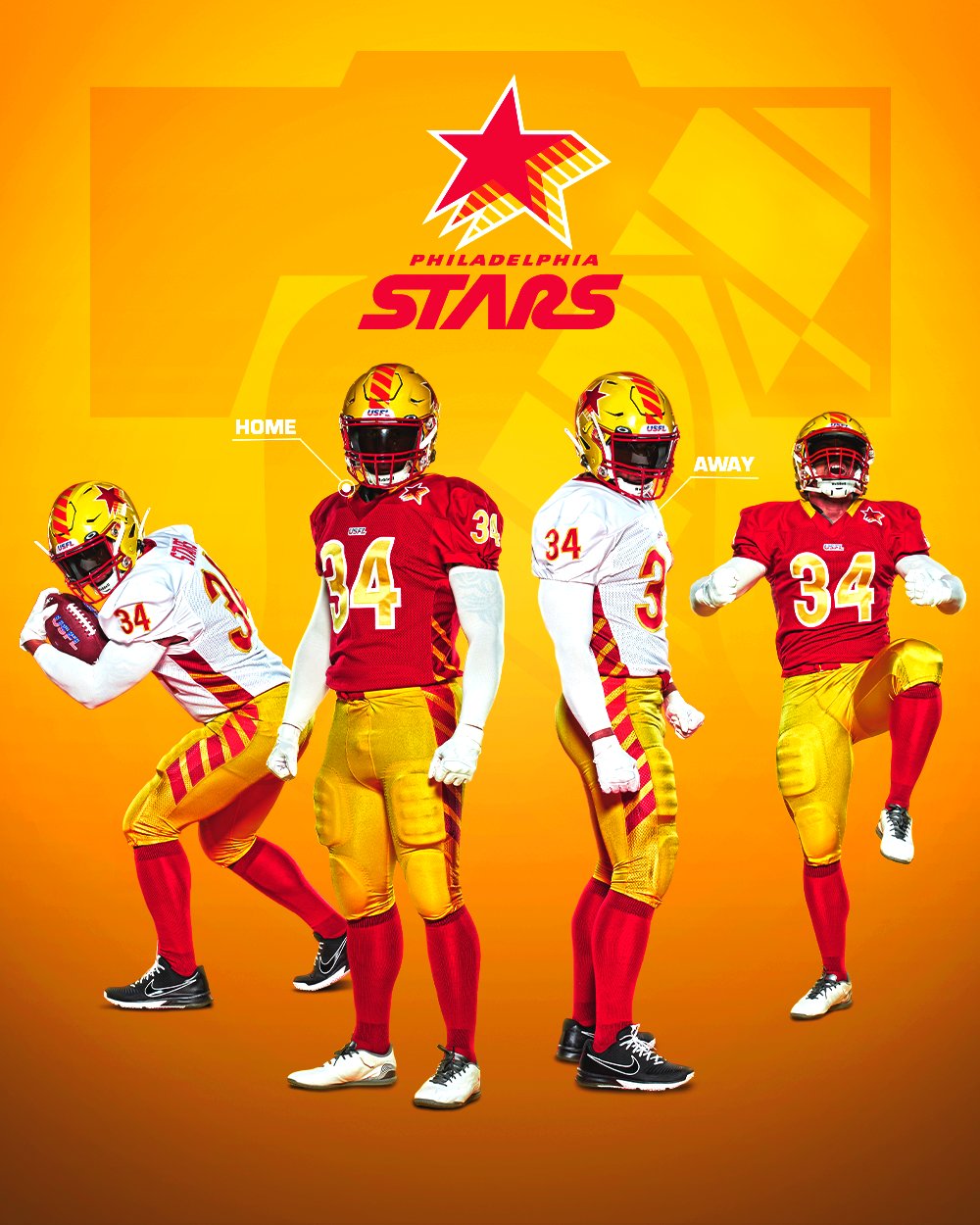
Michigan Panthers are "Champagne" (hex C5B783).
Philadelphia Stars are calling it "Gold", but it's really "Yellow" (hex FFB81C).
Birmingham Stallions are calling it "Gold", but it's really the same "Champagne" (hex C5B783) as Michigan.
But I do admit that the Champagne looks the closest to what we call "gold".
For comparison, I submit:
New Orleans Saints - Old Gold (hex D3BC8D)
Jax Jaguars - Bold Gold (hex 9A7611) and Light Gold (hex D29F13)
Of those 3 from the NFL, I think one of the Jags gold (take your pick) is the closest to a true gold as we're really gonna get.
IMO, the Champagne is really closer to what the Saints old gold is (or isn't). And the Stars definitely have the Pittsburgh Steelers yellow/gold (same hex FFB81C).
-
1
-
-
3 minutes ago, GDAWG said:
Every USFL uniform > Washington Commanders
I nominate this one for "post of the week".
-
2
-
-
Since no one posted a Maulers graphic to reply to, I'll just say I don't think they are too bad, but I do agree that grey pants and/or a grey helmet might have made a huge difference in the look. Also, they had a chance to put the secondary logo SOMEWHERE (helmet or the sleeve) and choose not to. Opportunity missed.
-
1
-
-
9 minutes ago, JQK said:
Except they're the Generals, not the Admirals...
I thought of that, right after I posted it....
-
2 hours ago, DCarp1231 said:
Helmet looks fantastic
That’s about it
Missed on a couple things here. 1 - needed the liberty bell alt logo on the sleeves. 2 -Striped side panels????? Ah, no. On the positive side, I do like the number font and they they didn't go monochrome with either combo. Good helmet.
-
3 hours ago, QCS said:
Quite literally, almost the perfect look for NOLA. Something just looks "off". Can't put my finger on it.....
-
3
-


NFL 2022 Changes
in Sports Logo News
Posted
Several of the logos aren't even legit (e.g., Giants, Colts [technically])
I never found the Falcons orange-tinted. But that "dirty red" (I think) is not even in the same color ballpark as the modern red.