


1clkgtramg
-
Posts
1,437 -
Joined
-
Last visited
-
Days Won
1
Posts posted by 1clkgtramg
-
-
My friend pitched a series to me and I thought I'd pass it along.
World Cup 2030 will be the 100th anniversary of the tournament. So how about someone make a series with uniforms for it but they're all throwbacks.
I might call dibs on this one. Been interested in tackling a World Cup thread again but couldn't think of anything fresh and unique to set it apart from the others
-
^ I agree, it should be in some other section.
Most of the work is good but when you get 10 bumps of just requests, it gets annoying.
Or possibly just message the person taking the requests?
-
Rude question. All of this is possible because of Chris. A lot of companies and whatnot are named after the founders name so why would you want to take that away from Chris? It was named with his name because it was his site obviously and everyone here knows who Chris Creamer is. So what if people don't know who he is? Those people likely know jack about logos anyway. I don't think that you put much thought into your conclusion of name inclusion being amateur. This is by far the most professionally done site of its kind so there is nothing to compare your views of it being amateur. Try to think of all the companies that include names in them, I guarantee you will find plenty professional ones.
-
Is there anything involved with adding a member as your friend, or is it just kind of there?
Nope. Just click the "Add me as a friend" button on a member's profile. That's all there is to it.
I think he's asking if there is any purpose to adding people as friends.... I don't believe there is one, just easy access to people you like/follow.
-
Glad I'm not the only one who thought about hockey in Africa. I tried it once a few years ago but quickly died out as I wasn't experienced in designing logos at the time.
I'd also like to see a proper Canadian Soccer league that follows the traditional promotions. I always feel that Canada gets left out, it's either 5 teams in a big American series or none.
I'd also like to see someone tackle the Canadian Basketball league properly. Like actually doing a 25 team league and treat it like its on the same level as the D league or the basketball equivalent of the CHL had Canada been great at producing basketball talent.
Great ideas.
-
 1
1
-
-
oh alright did not see you responded. how can i touch it up?
Get one of many free graphic programs like Paint.NET or whatever you prefer and then recolour it yourself.
-
anyone?
Bueller? Bueller?
But in all seriousness, he responded to you and he's not obligated to do anything for you.
-
^^ edit and use the full editor that redirects you to a new page - not just a quick edit - in case you still have trouble.
-
Hey Ren, I was wondering if you would be able to fix this one up for me please. I realize is is very small, but its the largest I can find.

I've also been trying to re-draw this one but I'm just so slow and bad with redrawing it, was wondering if it may be easier for you to take a stab at. (note: obviously omit the background in the image)
If you can't, no worries, thanks. -
Coronation and Sarah Burke are Helvetica
.
Thanks. I must have over written my Helvetica file because it is slightly different when I checked it prior to testing others. It definitively is in that family though, I'll keep looking around. I do feel kinda stupid now lmfao.
I have looked a little more and it appears to be Neue Helvetica 57 Condensed. Too bad I don't have $30 to spend on personal use
 Guess I will just have to stretch the normal Helvetica.
 -
I'm stumped on these. Maybe its because we have always had miss-matching fonts and signs but I cant find a font that is exact.
From what I gather so far
Gerrard = Clearview (with a tighter kerning?)
Sweeney = Roadway (with the lower case situated on the bottom rather than top)
Green Bush = Appears to be a tighter/condensed version of Roadway
Parkhurst = Appears to be a slightly bolder Roadway with very tight kerning. (btw the "E" is similar to the one in "SWEENEY RD")
Weston = Appears to be a stretched and thin Roadway
Lower Jarvis = Appears to be another Roadway but thin and stretched similar to "WESTON RD"
Coronation = Haven't bothered searching yet, should be a little easier to find though.
Sarah Burke = The "R" and "E" is what is throwing me off. I'm pretty sure this is the typical font used for the rural areas on Ontario but I can't find an exact font.
Any help or confirmation would be appreciated. Thanks.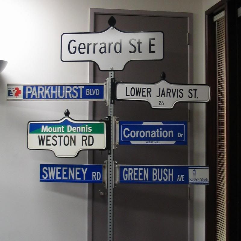

btw, very jealous of that guys collection of street signs. It's a real pain to acquire them now since they auction off anywhere from $100 to $500 a piece. -
Hey guys, maybe the font is too small but Whathtefont isnt helping me. I know I have seen this font before and it is popular, I may even have it somewhere. Anyone have any ideas?

hint hint to anyone following my License Plate series and knows what Quintana Roo can put 2 and 2 together.
edit: thanks Slapshot -
Vintge Video Game League in the concepts section was bumped again as it wasnt locked after the last bump. (Im on my phone so no report option)
-
This is like the 5th time this week that someone has made an account just to say "i joined just so I can say these are awesome". While I am all for new members, is there any way that on the screen when people create an account can it say in big bold letters "PLEASE REFRAIN FROM POSTING ON THREADS THAT HAVE BEEN INACTIVE FOR 6 MONTHS OR LONGER" or something along those lines?
Well, members and mods who know better comment on the thread resurrection and move the topic back to the top of the page again. They will fall off if people stopped trying to show off and point out the history of the thread.
Yes, if you see a thread that's been dormant for a while and bumped, just report the post and we'll get it taken care of.
.
I understand that, but at that point, the damage has been done. I have stopped from telling people to not bump because it is a bump in itself, I just report it and I have been reporting a lot lately lol. I'm just thinking more on the prevention side of things because most of the old thread that get bumped, just get locked, so they are still taking up space. Not a big deal, just more of a suggestion. People will keep bumping because they like to abuse the "freedom of speech" idea.
-
This is like the 5th time this week that someone has made an account just to say "i joined just so I can say these are awesome". While I am all for new members, is there any way that on the screen when people create an account can it say in big bold letters "PLEASE REFRAIN FROM POSTING ON THREADS THAT HAVE BEEN INACTIVE FOR 6 MONTHS OR LONGER" or something along those lines?
-
Dribbble has a little report button under the tags.
.
hmm I'm not seeing it, even when I Signed Up. Oh well, I liked Doug's post anyway
-
I have tried looking for report buttons on images and even the "artists" main hub but there never seems to be an option there. Do you guys just contact the site or something?
P.S. This was on Dribbble and Behance -
yes, I have another font request

I have found a few very similar but the pixels are too spaced apart. Most follow the typical cross like "t" and the "c" isn't the same as pictured here. I have tried WhatTheFont as usual but it separates each pixel as a separate letter so I'm running out of ideas. I feel stupid because this should be easy haha. I'm almost to the point of making it myself.
btw if it wasn't obvious, I'm looking for the pixeled font that reads "the corrs", not the normal one.
Thanks.
-
Thanks again Ron Swanson!! Are you like some Font God or something cause Whatthefont doesnt seem to like me very much haha.
-
I have another Big Shiny Tunes font here. I'm mostly looking for the font used for the tracklist on the red one. The lower case version is found at the top title of the blue one. Big Shiny Tunes really liked the grunge fonts.

-
Here's a tough one. Back in the mid-late 90's a Canadian Compilation album called Big Shiny Tunes was released annually by Much Music. The first and second album had this grunge font on the track list page that I really liked, and I never saw it again until I purchased Endgame by Rise Against which, to my surprise, has the exact same font.
Now Whatthefont.com wont pick this up and I can't seen to find info on it anywhere. It appears that there are 2 versions of each letter which makes this even more difficult to track down. So here is the back of Endgame. If anyone can help me, it would be greatly appreciated


Looks like you got a case of XBAND Rough there.
wow, what took me a decade took you 30 min haha. Thanks a lot sir
-
Here's a tough one. Back in the mid-late 90's a Canadian Compilation album called Big Shiny Tunes was released annually by Much Music. The first and second album had this grunge font on the track list page that I really liked, and I never saw it again until I purchased Endgame by Rise Against which, to my surprise, has the exact same font.
Now Whatthefont.com wont pick this up and I can't seen to find info on it anywhere. It appears that there are 2 versions of each letter which makes this even more difficult to track down. So here is the back of Endgame. If anyone can help me, it would be greatly appreciated -
Need help finding both fonts. The #1 Rated and Welcome To The Show. I've found similar fonts but nothing precise across all letters. Any help would be appreciated. Thanks.

Pretty basic fonts that you could easily find one similar in the standard font list. Try this site, should be easy.

Name That Font!
in General Design
Posted
This one should be really easy but for some reason, neither Whatthefont or Whatfontis can help me. I know I knew it at one point - might even be in the MS Word bank but I don't have it to check at the moment.
Anyone have any ideas?