


knnhrvy16
-
Posts
2,686 -
Joined
-
Last visited
Posts posted by knnhrvy16
-
-
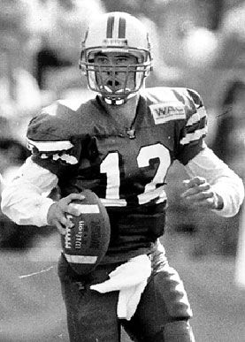
This is one of my favorite helmets in college football, and hope it never changes:

If you were to ask me why...well, I wouldn't be able to explain it perfectly, but to me it just has that look about it that says "this is a big-time college football helmet". Sounds silly I know, but that's pretty much the best I can come up with. And growing up, that "Illinois" script - albeit Giants-ish - was iconic to me personally. As a kid, having seen no other college team wear a script like that on their helmets, it was uniquely Illinois' to me.
-
Due to me living in Utah, my teams are sort of scattered all over the place, but here goes:
I remember asking someone from Utah about this on a cruise once. That was their exact response.
Haha! That's pretty funny, it pretty much is how we roll
 in regards to the NBA and MLS, it's obviously Jazz and RSL territory. But in the other sports, fanship can sway to any team, regardless of proximity. For example, my neighbor (a lifelong Utahan) is a die-hard Redskins fan.
 -
Due to me living in Utah, my teams are sort of scattered all over the place, but here goes:
Utah Jazz - Easy, hometown/homestate team, of course. It's hard to ever consider another team when 1) your childhood consisted of "Stockton to Malone!" and 2) the Jazz are seriously a Utah staple. If you're not a Jazz fan here, you're crazy. It's just how it goes here
 If you're a true Utahan, the Jazz run in your blood.
Real Salt Lake - When RSL first came to town, I didn't care much for soccer. Now, I watch it all the time. In the short time they've been here, RSL has become nearly as much a Utah staple as the Jazz. Utah is a very underrated soccer hotbed - many people don't realize just how HUGE soccer is here. All of my friends and family are very passionate RSL fans, so I'm around the subject of the team all the time. Plus, my dad works for Rio Tinto, which is the namesake of RSL's stadium. Every year, the company holds a party at the Stadium for employees and family in which you can meet the players and coaches. So, I've met a lot of the guys past and present - Williams, Kreis, Rimando, Mathis, the list goes on.
Los Angeles Dodgers - My grandfather grew up in Brooklyn and converted me to Dodger fandom by telling me incredible stories of watching Jackie, Pee Wee, The Duke, Campy, Gil, and Newk up close (his best story is of watching Jackie steal home. SO cool). He capped it off on my 15th birthday by buying me a Brooklyn Cooperstown collection cap and a box-set documentary about the Dodgers of the 40's and 50's. I've bled Dodger blue ever since.
Indianapolis Colts - It started out as a fandom for Peyton Manning, then eventually spread to the entire team. They're having a rough go right now and obviously Peyton is nearing the end unfortunately, but I've grown such a love for that team that I can't imagine myself cheering for anyone else.
Colorado Avalanche/Phoenix Coyotes/Anaheim Ducks - In hockey, my fandom is equally split between these three teams. Colorado, because I'd say their the most dominant team regarding number of fans here in Utah. I also loved Patrick Roy and Joe Sakic growing up. Phoenix, because I got a Coyotes jersey (the black "picassoyote" one) for my 12th birthday and started to follow them afterwards. Anaheim, because I was captivated by their 2003 cup run and they had one of my favorite identities in sports back then (some call the Disney look "gimmicky", but I thought it was unique and iconic).
University of Utah Utes - Growing up, I didn't really sway one way or the other regarding schools. That changed in 2004, when the Utes crashed the BCS. It was one of those captivating runs in sports that instantly sold me, and I've been a die-hard ever since. Plus, I had a crazy stepmom (now ex-stepmom, thank heavens) who was a BYU alum and crammed BYU down all us kids' throats at the time. And she was one of those really annoying BYU fans who thought because BYU was "God's school" that it was better than any school in the world, and had a really holier-than-thou attitude about it. She's the reason I can't stand BYU anymore, and certainly aided me in becoming a Utes fan
Utah State Aggies - Attended the school for two semesters last year, and was already a fan of the basketball team before that. It's one of those fanships that just sort of "happened". When college basketball season rolls around, they're my team (because the Utes are flat-out gosh-awful at baskeball. GOSH AWFUL.)
Stanford Cardinal (football) - One name: Andrew Luck. One of my favorite players in recent memory, he's had me cheering on the Cardinal football team throughout his career.
Air Force Falcons/Army Black Knights/Navy Midshipmen - Out of my upmost respect and love for our armed forces, I've rooted for the service academies for a long time and always wish them the best. Plus, I love watching those option offenses. SO fun.
-
For Iowa State, I liked this set:

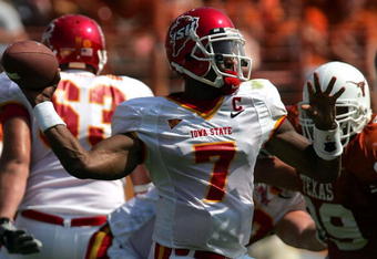
ALOT better than the current ones:
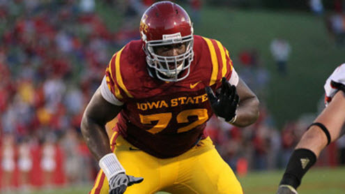
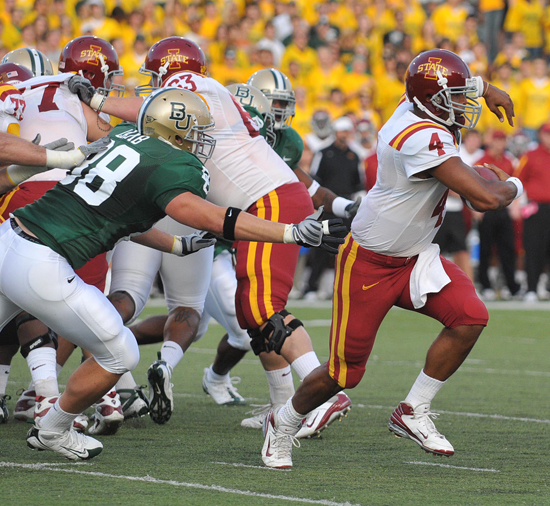
I just love that old Cy logo on the helmet, and the old uniforms were very sharp. I liked the lighter red, too. The currents just have too much of a USC vibe for me to get on board with them, and I think Cy is a much better logo than the I-STATE one by far.
-
I think with a few minor tweaks, the Padres' new set would be one of the top 5 in the league. Just put the swinging friar on the sleeve of each jersey (except the military alt) and outline the road script and numbers with sand, and voila. Perfect. The double sleeve piping is really, really great especially.
Seeing as how the Padres have been a "blue team" all my life, them keeping blue doesn't bother me at all. I guess it's just one of those examples of your particular generation influencing your preferences in uniforms. While I would have welcomed brown, the Padres will probably always be a "blue team" to me.
-
^^^Those are definitely up there on my list too, but I think that's more out of childhood nostalgia than anything. Considering the fact that Utah State had historically and should still today own navy blue in the state, I think BYU belongs in royal again.
I will say regardless, however, the Beck-Watkins era set is alot sharper than people give it credit for. It's usually kicked to the curb here because of the team's play in them, but I thought they were great. Especially when they went navy monochrome, like that Watkins picture. Good lookin' stuff.
-
My opinion regarding which uniforms are BYU's best seems to waver from time to time, but the more I look at the 1995-1997 set, the more it stands out as my favorite.
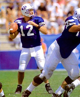
The only thing I would have changed would be to remove the "Y" from the sleeves. Other than that, the very tasteful addition of black and the change from three sleeve stripes to two (matching the helmet) really made for an outstanding uniform, and I really liked the number font. Yes, perhaps it was BFBS, but again, it was very tasteful and they added it the right way, as opposed to going all out with it (which they very well could have done). That opinion is particularly unpopular here in Utah, as most think either the current uniforms or the Young-McMahon uniforms are the best.
Also a rather unpopular opinion here (at least it was in Logan while I attended USU), I think this is the best Utah State has ever looked:
*EDIT: Had to find another picture because the previous link was broken. This is the only other decent picture I can find. A quick note, the "running bull" logo IS supposed to be on the sleeves, but it appears this may have been a version that didn't feature it.
Great template, the running bull logo (one of my favorites) on the sleeves, nice number font that matches well with the identity, sharp. Much better than what they're in right now - MUUUCH better.
-
Agreed on the striping elements, but I think those wordmarks are close to the very definition of "cluster
 ".
". Too clever by half, and very ugly to boot.
I don't think the Texas one is all that bad, but to each his own

-
No matter what your tastes in design may be, you can't deny that the 90's were a very creative era in sports uniform history.
One man's "creative" is another's "what the
ing ity were they thinking?"I actually agree with you regarding some teams, like, for example, the massive logos on the Bucks' alternate, Hawks' uniforms, and the monstrosities that were many uniforms in the CFL and NFL Europe at the time (example - 1995-ish Argonauts, Mad Dogs, Barracudas, etc.). However, uniforms like the Texas and MSU ones were very neat and incorporated creative elements without going over the top. Honestly, compared to the uniforms I mentioned above, that Texas uniform is much simpler. Yet, it still has a great deal going for it. That's the kind of creativity I was referring to (another that comes to mind is the tribal designs on the Vancouver Grizzlies' uniforms), when you can integrate unique elements into a uniform without making it a total clusterfudge.
-
I loved the '90s Reebok college basketball uniforms with the elaborate scripts.


I loved that Spartans uniform as a kid. The design on the collar, sleeve trim, and waistband were SO cool.
And I've never seen that Texas one before, I actually kind of like it. Totally dig the southwestern striping especially.
Even though I consider myself more traditional than not, I really enjoy and appreciate designs like these out of childhood nostalgia. No matter what your tastes in design may be, you can't deny that the 90's were a very creative era in sports uniform history.
-
Judging by the Marlins thread, it appears this opinion may fit here: it is my humble opinion that the Marlins DID NOT get it right the first time. To me, the 1993 set is a teal overload. As great of a color as it is, it's also one of those colors that you can have too much of..
Enter the 1997 uniforms...


There's my personal greatest Marlins set. The black cap balanced the teal and black beautifully, and did the teal a favor in helping it still pop, while no longer being gaudy. The only thing I'd have done differently would be to change the number colors on both jerseys from black to teal as a means of consistency, but even still, this is the best Florida ever looked in my eyes.
Oh, and that road script is beautiful. One of, if not THE, best baseball script ever.
I should note however, that the teal alternate was fantastic when paired with the black hat. That was an even better balance of the two colors.
-
Judging by the Marlins thread, it appears this opinion may fit here: it is my humble opinion that the Marlins DID NOT get it right the first time. To me, the 1993 set is a teal overload. As great of a color as it is, it's also one of those colors that you can have too much of..
Enter the 1997 uniforms...
There's my personal greatest Marlins set. The black cap balanced the teal and black beautifully, and did the teal a favor in helping it still pop, while no longer being gaudy. The only thing I'd have done differently would be to change the number colors on both jerseys from black to teal as a means of consistency, but even still, this is the best Florida ever looked in my eyes.
Oh, and that road script is beautiful. One of, if not THE, best baseball script ever.
-
Here's a bit of a different one:
I can EASILY tell differences between Wisconsin and Nebraska to the point where I believe neither team has to change anything about thier uniforms to differentiate themselves. They're just fine as they are with me.
-
When viewed like that, with the jersey and pants aligned perfectly, that uniform looks pretty decent IMO. Sure the facemask still looks out of place, and I don't care for the black collar outline (just make the whole thing black or red or white, and the pants strip doesn't need to taper into piping the way that it does, but it's not nearly as bad as people make it out to be.
I wonder how the Cards' set is going to translate onto the Nike cut next year. Arkansas' uniform has always reminded me in a way of Arizona's, so I wonder if they'll end up looking more similar when the switch is made.
-
I don't like the lack of red in the Winnipeg Jets' new set. It makes the red leaf in thier logo stick out like a terribly sore thumb on thier uniforms.
-
All of these are just wrong-especially the Argos one.
The ones pre-Stamps--I'll let slide...

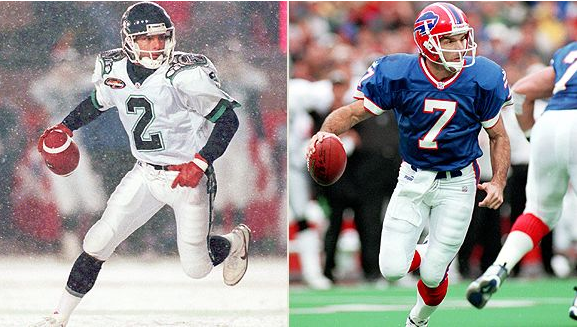

In AMERICA, pretty sure Flutie will always be associated with the Bills. Couldn't tell you what team(s) he played for in Canada.
I'd argue that some (not all, but some) may still associate him with Boston College primarily.
-
Speaking of Wazzou, I think I may be one of the few who absolutely LOVED thier "rebrand" of sorts. Even the double-grey. To me, that just looks awesome. Now, I wouldn't want it worn every week, but it's a great once-in-a-while uniform for sure.
The thing I loved most about thier "rebrand", though? They kept the cougar head - one of my favorite logos in all of college sports.
-
I guess I sort of understand the Miami "U" logic, but it's still stupid. I've always seen the "U" as strange rather than unique, and the fact it was adopted to (seemingly) go along with slogans sounds gimmicky. They could've used an "M" (two toned or not) or at the very least, hurricane flags. Just something that at least looked like it made sense.
I realize I'm likely in the HUGE minority here, but hey, that's what this thread is for!
-
Here's one....
I HATE the Miami "U". I've never, ever understood what the deal was with using it - it makes no sense to me. Why not use a dual-colored "M" in the same style?
And I warn you all that this part is indeed homer-driven, but I hate the fact that because of it's use, Miami is referred to as "The U". Utah was "The U" before Miami ever adopted the logo - they're still the right "The U" to me.
Also, not Miami related (
), BYU needs to go back to the royal blue. Navy belongs to USU, and royal looks better on BYU anyways. -
I'm still not used to J.S. Giguere in a Leafs uniform:

-

For those of us that don't worship at the alter of the NFL, this would be...?
(Unless you were commenting on the colours of New Orleans Saints being black, white and pewter while the Cleveland Browns being Charcoal and Slate, I apologize...)
(Just noticed the photobucket name: norb_Taylor.jpg. Who the fail is Norb Taylor?)
Could "norb" mean "New Orleans Running Back"? Did they have a Taylor back then? Or is that someone famous who finished up with the Saints and just doesn't look familiar?
That'd be Hall of Famer Jim Taylor, who made a name for himself primarily as a Packer.
-
Sorry to bump an old thread, but I've got a few to share:
These:
were FAR superior to these:

^^The 1995-96 look had a better color scheme in my opinion (Dark Green and Brick(?) go REALLY well together in my mind, especially with that gold trim), and I never did like the design of the 1980's-early 90's uniforms. I hated that wrap-around banner thing on the jerseys for some reason, and hated them when they came back in 2002 as well.
Though I'd tweak a few things (thicken the wordmark and simplify the numbers, namely), this:
Was better than this:

^^Mostly because of the colors and simplicity of the inagurals. To me, Red-Orange-Black is a better and more unique color scheme than Dark Red-Black-Gold. Though the current set is obviously a modernization of the previous set, there are some differences (striping patterns and colors obviously), and had the modernization more closely resembled the previous set, they would have been better. At the very least, they should have kept the color scheme red-orange-black.
-
Well I'm discovering more and more after talking with others that this is quite an unpopular opinion, but it's mine....I think Oregon State's beaver and script logo is one of the best in college, and the football helmet is one of the best. Also, I think the interlocking OS that so many people like works as an alternate, but wouldn't as a primary.
-
Alright everybody, I just added a paint version of andrewharrington's ProCombat template. Hope y'all like it!
It's a very good template, but is there a way that it can be a bit smaller? I tried resizing it in IrfanView and it did okay, but distorted most of it.
 ".
".
Unpopular Opinions
in Sports Logo General Discussion
Posted
I'm with you. It beautifully updated/cleaned up the late 90's look, which was okay, but the massive thunderbolts down the side were a bit too much. This here was a very sharp set, and I loved those colors together. Great balance.