


NH4
-
Posts
778 -
Joined
-
Last visited
-
Days Won
5
Posts posted by NH4
-
-
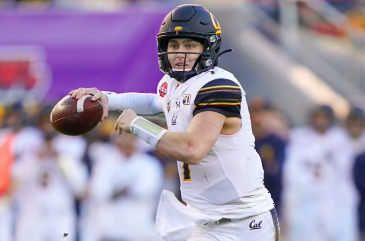
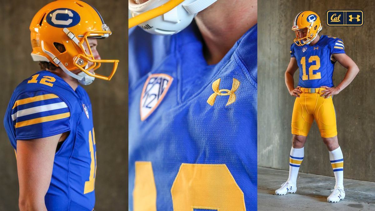
CAL GOLDEN BEARS

DESIGN
- I like the brand refresh Cal went through with Under Armour including the Sather Stripe
- I just made a couple changes to how the stripes are presented
- Kept the same font
HELMET
- Same matte blue helmet but added the stripe
- C/Bear logo on front bumper
JERSEY
- Blue jersey stays the same but I removed the blue sleeve cap on the white jersey
PANTS
SOCKS
- Blue socks with gold accents
THROWBACK
- I had to include Cal's amazing throwbacks
- Made the inner jersey stripe larger
- Switched the color of the sock stripes
Up next is a two-fer with two rivals that don't need many changes to some classic uniforms, Texas and Oklahoma. Thanks for looking and as always C&C is greatly appreciated!
-
 8
8
-
 1
1
-
On 12/16/2021 at 10:18 AM, -Akronite- said:
I actually might prefer the 2nd option there, though that might change if the stripes weren't truncated on the pants. Both options work well on the sleeves though.
9 minutes ago, jaytavo305 said:I think I prefer option 2 as well, the first feels a little blocky on the pants, if that makes sense. The stripes form a kind of awkward, rectangle shape. Option 2 looks really good.
Ok good because I like option 2 also, especially because it matches the helmet stripe too. Here's the updates
-
5
-
-
22 hours ago, -Akronite- said:
Pitt: No real notes but are both sleeve stripe patterns the same in terms of stripe width? Seems like it but the yellow (on the home) seems thicker than the blue (on the road) because of how the colors interact.
Mizzou: I like using sharp angles to match the logo since Mizzou doesn't have an established classic look like a lot of the SEC (and agreed, mismatching pants stripes a pet peeve even if it's untouchable look like LSU). To me, the sleeves are better than the pants, and I would prefer to see that same concept applied to both (slashing stripe creating two long points in opposite directions). As it is, other than pointiness I feel there's some disconnect between the three elements. And I definitely prefer the black helmet, it blends in the logo so well.
Pitt- I went back and measured the stripes and yeah they are the same size. I've noticed that in some of my other concepts, the stripe sizes look different but I measure them and they're the same size. I think it's just how the different colors interact
Missouri- I took your advice and come up with 2 concepts actually. The 1st is what you described, the pants stripes mirroring the sleeve stripes. And then in the 2nd, I changed the sleeve stripes to match the pants and helmet stripe where the point comes forward.
Let me know what you guys think. Thanks!
-
3
-
-
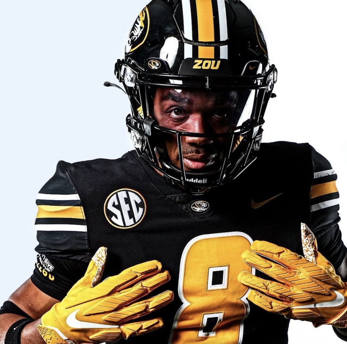
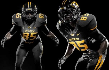
MISSOURI TIGERS
DESIGN
- Unlike Pitt, I might be the only one to not be a huge fan of Missouri's new uniforms
- I don't know if it's the mismatched pants striping or what but I like the old striped uniform better. A weird case of me liking a modern uniform better than a traditional uniform
- Tapered stripes added to helmet, jerseys, and pants
- Tiger logo released from the oval
- Same font
HELMET
- Black and gold helmet with black facemask
JERSEY
- New stripes added
- Chest text added
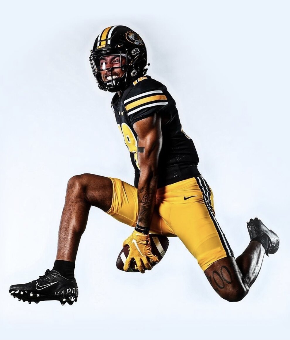
PANTS
- Gold, black, and white pants
- Stripes added back
SOCKS
- Black socks with gold accents
Up next we'll go out west with Cal. Thanks for looking and as always C&C is greatly appreciated!
-
8
-
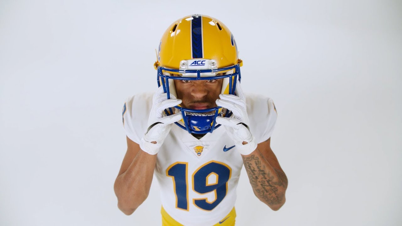
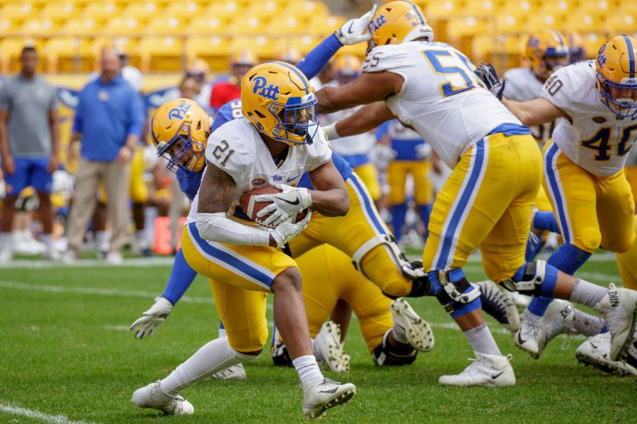
PITT PANTHERS
DESIGN
- Like pretty much everyone, I was ecstatic when Pitt went back to their old color scheme full time
-
I just added and edited a couple things that I think would make the uniform look better
- Widened helmet stripe to match pants stripe
- Replaced the number font with the one Pitt already has without the point
-
Added stripes to the jersey reminiscent of the old jersey stripes. Flipped the colors on the white jersey stripes
- I thought of adding the helmet & pants stripe to the jersey but I liked the old stripe much better
HELMET
- Gold helmet with blue facemask
- Widened stripe added
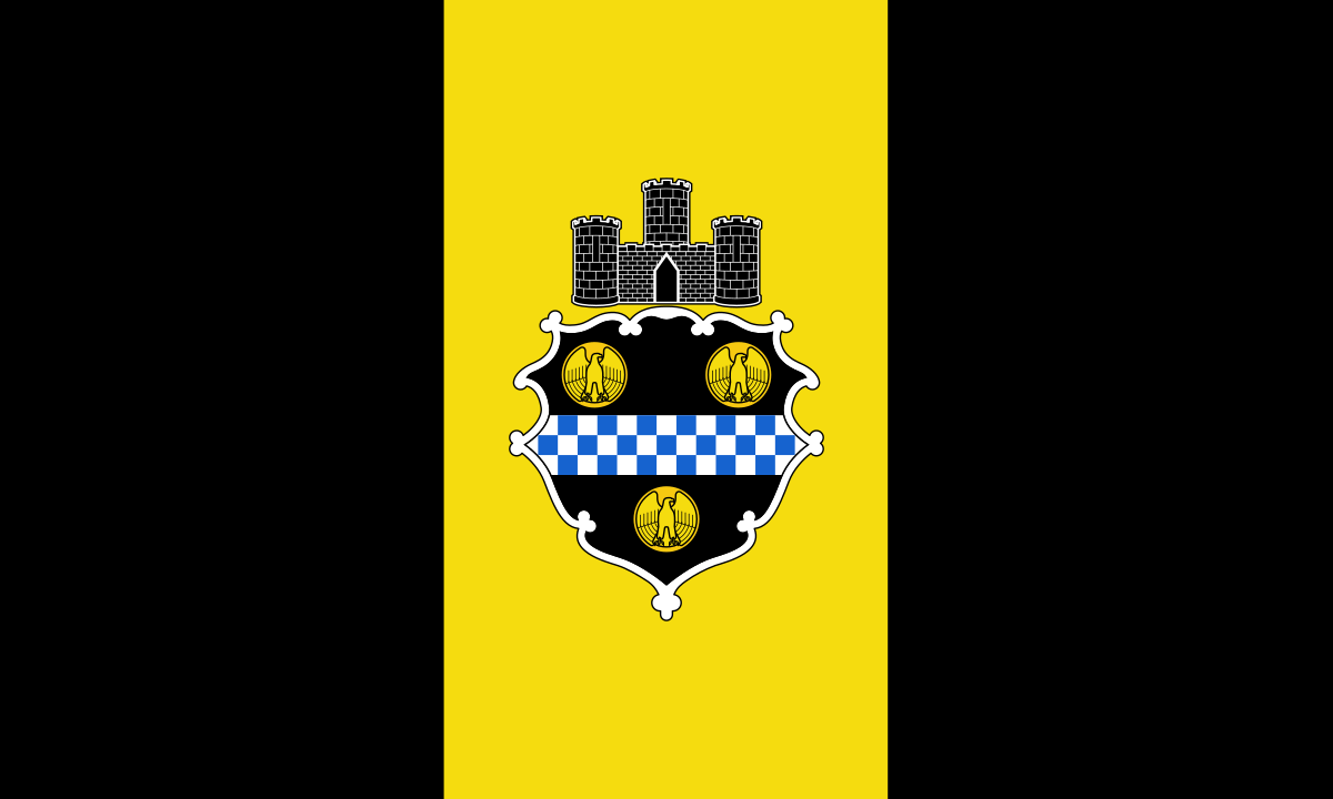
- Pittsburgh flag on the back
JERSEY
- New stripes added
- Moved TV numbers from sleeves to shoulders
PANTS
- Gold pants only
- They've added blue and white pants but I think those are unnecessary and I don't like the look (especially when paired like this)
SOCKS
- White socks with blue accents
Up next we'll continue with teams with cat nicknames, Missouri. Thanks for looking and as always C&C is greatly appreciated!
-
8
-
1
-
Ok so a little bit of a change, I'm going with South Alabama because I finished this draft and totally forgot about Pitt. Hand up, that goes to me being too excited about the Jaguars but I'll have Pitt up tomorrow.
SOUTH ALABAMA JAGUARS
DESIGN
- New truncated double-colored stripe based off the whiskers in the logos
- Same text and number font
HELMET
- White and red helmet with white facemask
- New stripe added
- Jaguar head is the only helmet logo. I really like the logo and don't understand why they insist on having the "JAGS" wordmark on the helmet
JERSEY
- New stripe added
- Chest text changed on the blue jersey from "SOUTH" to "JAGUARS"
PANTS
- White, red, and blue pants added
- New stripe added
SOCKS
- White socks with red accents
Thanks for looking and as always C&C is greatly appreciated.
-
2
-
 1
1
-
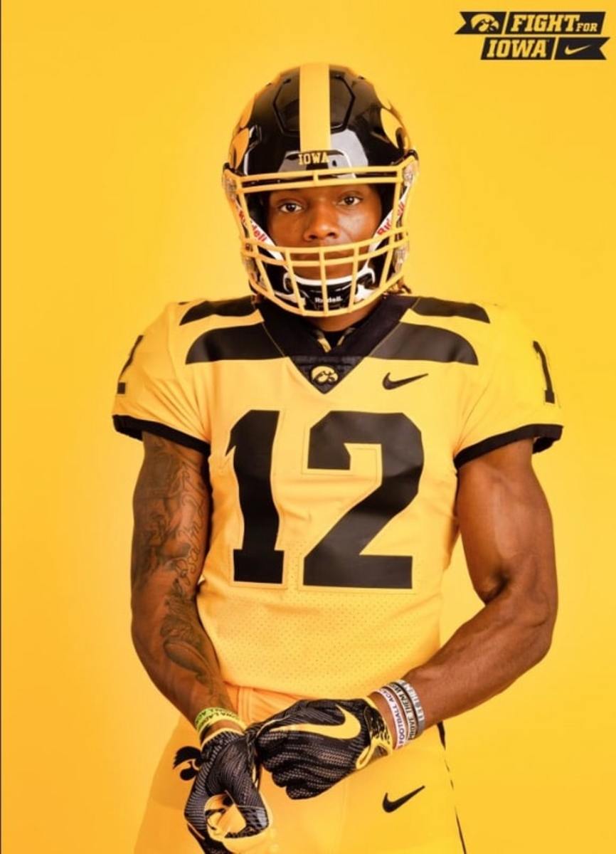
so here is Iowa's complete set with the new away jerseys
-
6
-
-
20 hours ago, sleuthpanther said:
The more I look at it, the more I like it. Weird seeing them without any white on the uniforms. Away Jersey needs yellow, but besides that I can dig it. Might be worth trying a modified version of those throwback (collarbone?) wing jerseys, I guess just wrapping the striping around the front as well
Thanks yeah I thought about putting the stripes on the collarbone but just thought that was a little too modern for a traditional looking team like Iowa. A one-off alternate tho would look sweet which I, now that I'm typing this out, sounds like a good idea and might add one.
7 hours ago, Discrim said:Purdue: You mostly ditched silver here. Given that I have no idea why the Boilers even bother with it, good on ya.
Colorado State: very well executed
Old Dominion: holy crap I love that stripe! While I don't mind the silver, the white logos look real good.
Iowa: the white jersey could stand to have a little gold, and until I read the description I thought the way the helmet stripe is was an oversight, but overall, good job.
Thank you! The ODU stripe is one of my favorites so I'm glad it's well received.
So I took the comments and added gold to the away jerseys
- Gold outlines on the numbers, chest text, and player name
- Gold stripes between the black stripes
- I tried to keep the stripes gold and add black shoulder caps, but that didn't look good with white sleeve cuffs and a collar. So I tried black cuffs and a collar, but that looked too bulky (I don't know if that's the right word but that's the best I could describe it) so I settled on this.
Thanks for the comments and let me know what you all think.
-
9
-
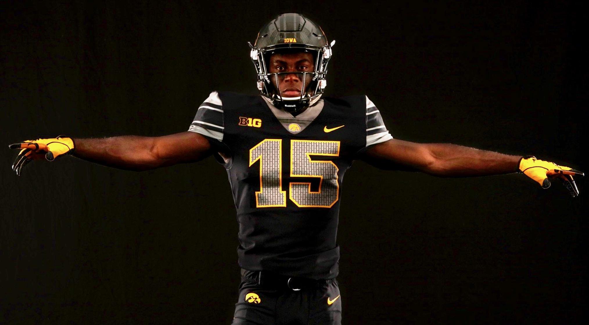
IOWA HAWKEYES
DESIGN
- I did the same thing with Iowa as I did with Kansas State, gave them a new look to replace an NFL look
- I don't think their current look is bad but I think they can do better than just a Steelers knockoffs
-
This new concept is sort of a mix of looks:
- Triple stripe and sleeve placement is from the 2017 alternate uniforms
- Curves at the end of the stripe reminescent of the "feathers" from the 90's and 2019 jerseys
- Chest text and number coloring from the 2015 alternate uniforms
- Gold helmet from the past and 2010 throwback
- Kept the same font but de-italicized it
HELMET
- Black and gold helmet with black facemask
- New stripe added
- Changed the "America Needs Farmers" sticker to one similar to the 2015 alternate helmet and moved it to the back
- Black front and back bumpers with
JERSEY
- New stripe added
- Chest text added. I like the black on white look for the numbers and chest text on the basketball uniforms so I didn't add a gold outline
PANTS
- Black and gold pants
- New stripe added
SOCKS
- Black socks with gold accents
Up next is a team that recently went through an amazing brand refresh and just won their first ever ACC Championship, Pittsburgh. Thanks for looking and as always C&C is greatly appreciated!
-
2
-
21 hours ago, jaytavo305 said:
Fantastic look for ODU! Im a sucker for a nice double blue scheme, haha. That crown stripe is really out of the box, and it looks awesome. I think the simple helmet and pants sans stripes fits the look perfectly. Love it!
Thank you I’m glad you like the helmet and pants because it was tough removing the stripe from both but it was a good move for sure.
20 hours ago, GriffinM6 said:I really like everything on ODU except for the removal of silver. I honestly think it fits in quite well with their identity.
Thank you! Yeah I originally had silver in my designs but once they unveiled the sky blue uniforms, I fell in love with the color and changed it. I also tried having navy, sky blue, silver, and white coexist but the silver muddied the look in my opinion.
-
1
-
-
OLD DOMINION MONARCHS
LOGO
- Replaced silver with white
- Just thought it creates a much cleaner look especially with my designs having more sky blue
UNIFORMS
DESIGN
- Jersey stripe comes from the crown in the logos
- I tried a horizontal stripe on the helmet (similar to a past ODU helmet) and on the pants where the UA template has stripes but I didn't like the look
- Font is from the university logo and is very similar to the font in the logo
- I love the sky blue jersey and pants ODU introduced this year so I included it a lot more in the uniforms
HELMET
- White, navy, and sky blue helmet with white facemask
- ODU on front bumper, MONARCHS on back bumper
JERSEY
- New stripe design and font added
- Replaced the chest text on the home and alt jerseys with "MONARCHS". ODU is 1 of only 2 NCAA schools with the Monarchs nickname (the other is D3 Methodist University) so I thought they should own it.
PANTS
- White, navy, and sky blue pants
SOCKS
- White socks with navy accents
Up next is a team that has historical jerseys but I think needs some new uniforms, Iowa. Thanks for looking and as always C&C is greatly appreciated!
-
6
-
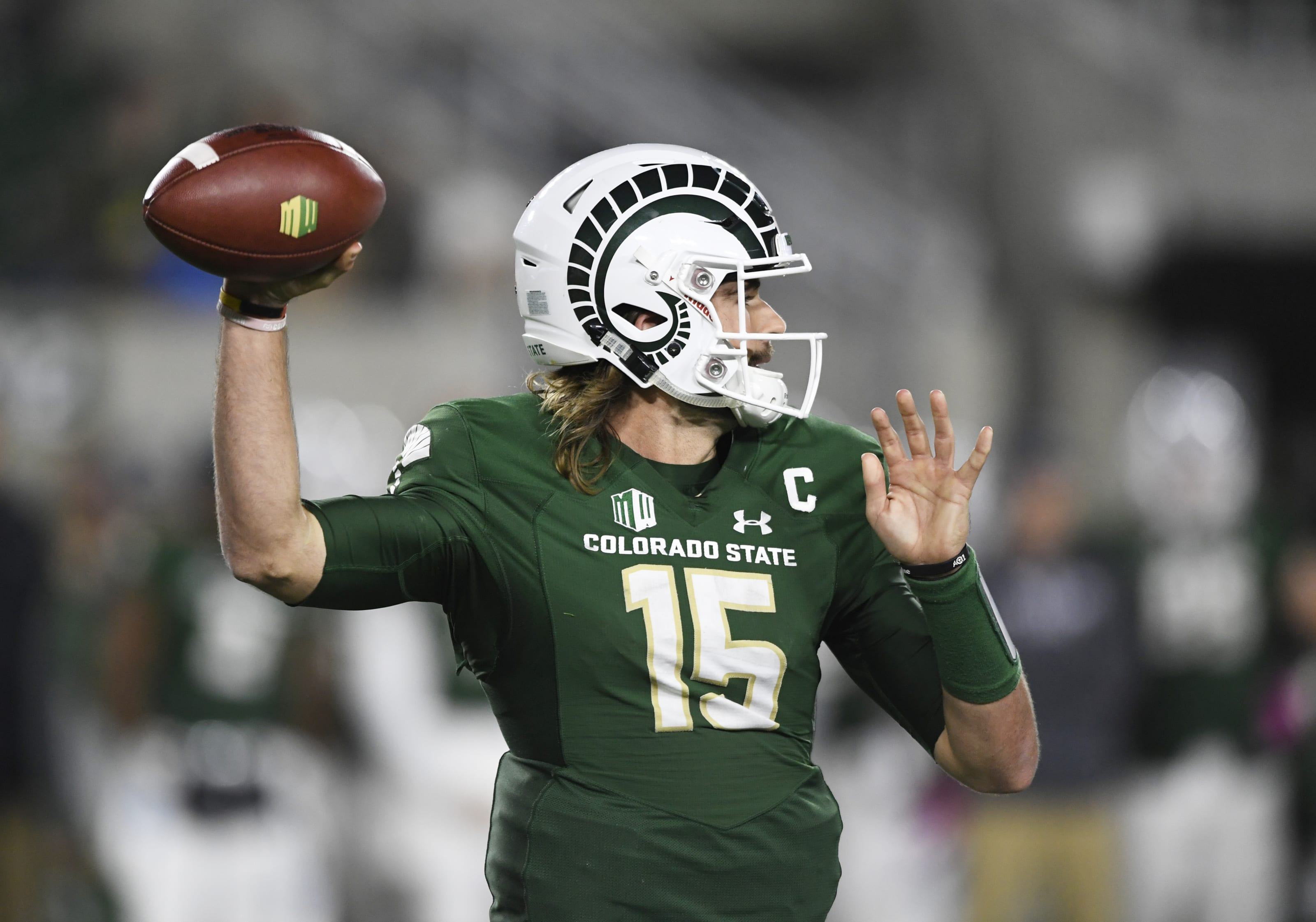
COLORADO STATE RAMS
DESIGN
- I love Colorado State's alternate uniforms so the Colorado flag is the basis for this uniform just recolored to their colors
- Instead of coloring the sleeve caps, I made the flag into a more traditional stripe design.
- I also like the uniqueness of the horns on the alternate helmet so I used that as the new helmet design
- Same font
HELMET
- Green helmet with green facemask. I don't mind the white helmet but it seems a little unnecessary for this team
- Updated helmet horns
- Colorado flag on back
JERSEY
- New stripe design added
- Changed number color on home jersey to gold. I like the color combo so the more gold the better
PANTS
- Gold, green, and white pants
- New stripe added
- I'm not sure how well the C and circle works vertically with the circle color blending into the outer stripes. I wanted to keep those the same color as they are in the horizontal stripes (for consistency sake) but let me know what you think.
SOCKS
- White socks with green accents
THROWBACK
- Based the throwbacks of the 2018 versions
- Same helmet design
- A logo on front bumper and shoulders
- Pants stay the same
I hope everyone had a good holiday weekend and I can't believe we're almost done with this season, but it's been a fun one for sure. Up next is Old Dominion. Thanks for looking and as always C&C is greatly appreciated!
-
10
-
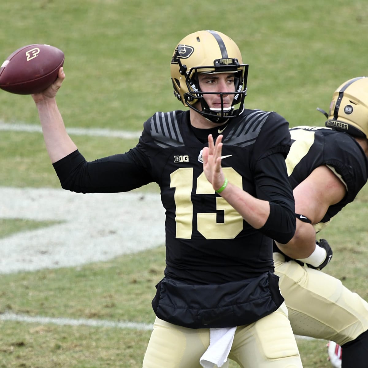
PURDUE BOILERMAKERS
DESIGN
- I think Purdue has a really solid identity so I continued that
- I did toy with the idea of train tracks being the main design but thought that was a little tacky and went with a single stripe
- Same font
HELMET
- Gold and black helmet with black facemask
- Gold helmet stays the same
- Black helmet train tracks replaced with single stripe, same as the gold helmet
- Front and back bumper changed from black with a gold outline to just gold
JERSEY
- Subliminal cowcatcher design stays
- Added sleeve numbers
PANTS
- Gold and black pants
- Single stripe added
SOCKS
- Black socks with gold accents
Thanks for looking and as always C&C is greatly appreciated!
-
6
-
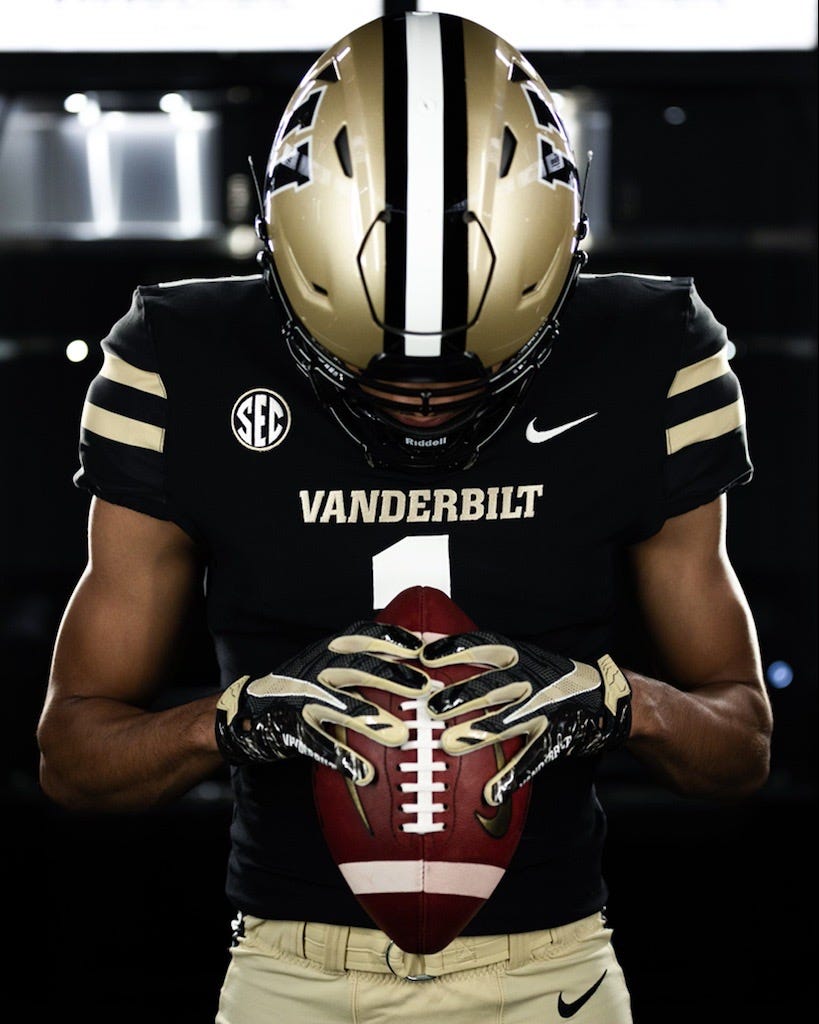
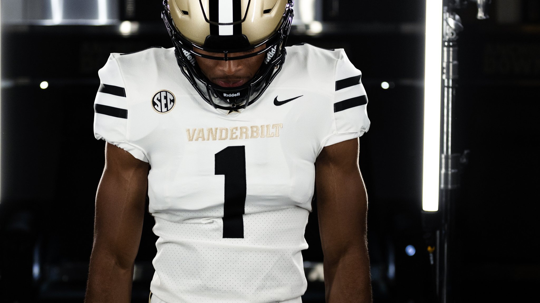
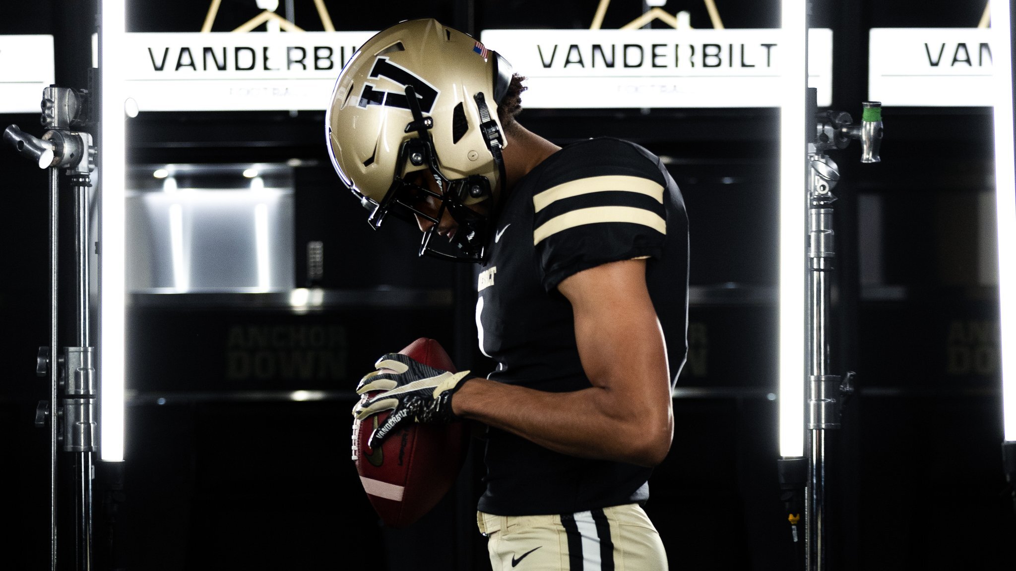
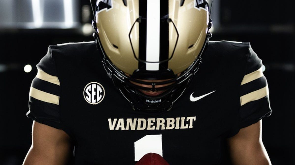
VANDERBILT COMMODORES
DESIGN
- I'm glad Vandy toned down the anchor look and went with some traditional uniforms this offseason
- But, with a unique name, I thought they could have a more unique look
- I really like what mbannon92 did with his concept of Vanderbilt. That's where I took inspiration for the stripes.
- The 4 stripe gold pattern represents a Commodore's sleeves
- Kept the same font
HELMET
- Gold and black helmet with black facemask
- V/Star logo returns. One of the few things I dislike about their current set is not having this logo on the helmets
- Re-colored circle and stars (I don't know what it's called) from the Tennessee flag on the back
JERSEY
- New stripe design added to the shoulder caps
- Black shoulder caps, cuffs, and collars
- Removed the chest text
- Added a gold outline to the numbers
PANTS
- Gold, black, and white pants
- New stripe added
SOCKS
- Black socks with gold accents
Thanks for looking and as always C&C is greatly appreciated!
-
6
-
50 minutes ago, -Akronite- said:
I've always felt Bowling Green had good helmets (similar to the Browns which is iconic), but their uniforms felt disjointed, like they picked modern elements at random to use (side panels, team name on the pants, various stripes & sleeve caps). This feels like the right move as it's simple, avoids being boiler-plate, and it's not so out-there that it'd have to be replaced within 5 years.
Like Boise State as well. I get why people dislike trends/fads (such as the giant, one-sided logo) but if you pioneered something and want to own it, why not? Same way I feel about the blue turf, nobody else needs to do that but Boise State can get away with it.
Thank you! Yeah Bowling Green has a lot of good elements but just have been hindered by templated uniforms so I thought this design would be able to stay for awhile, like you said.
-
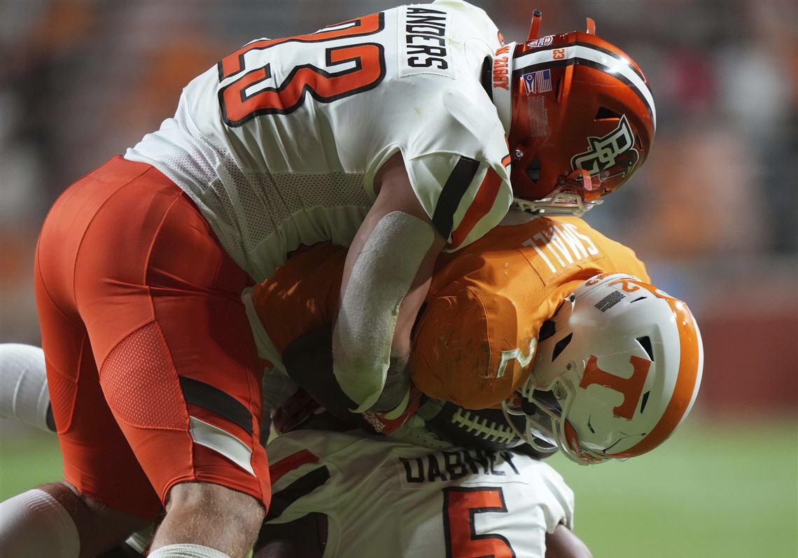
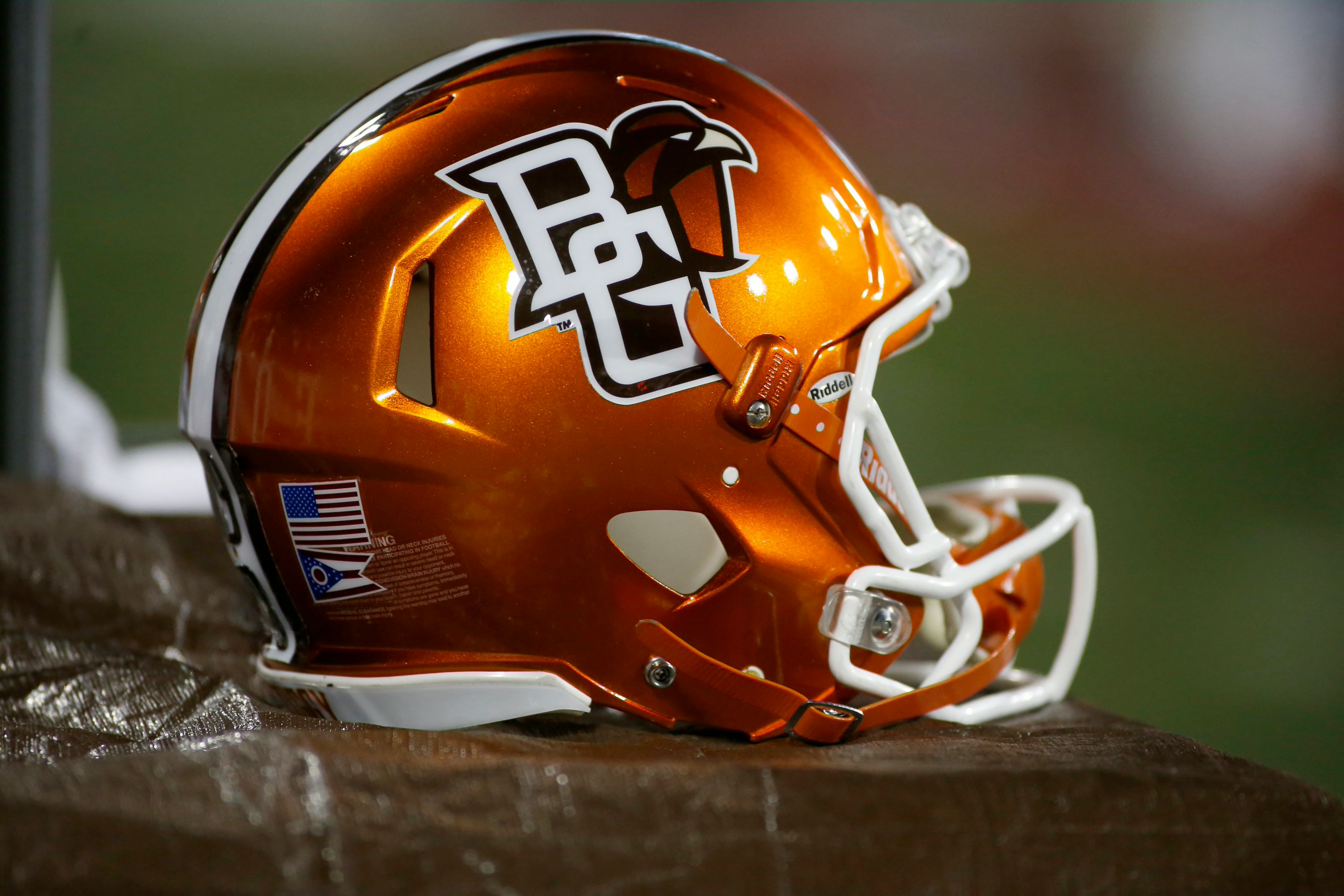
BOWLING GREEN FALCONS
DESIGN
- I based this design off of their truncated helmet stripe they used to have
- Went away from the Boise State template to this design
- Kept the same word font and added a new number font to match
HELMET
- Orange and brown helmet with brown or orange facemask
- Changed the logo to just the falcon head
- Pointed truncated stripe returns
- Ohio flag on the back
JERSEY
- New stripe design added to the shoulder caps
- Changed the number color on away from orange with a brown outline to brown with an orange outline
- New number font added
PANTS
- Brown, white, and orange pants
- New stripe added
SOCKS
- White socks with brown accents
Up next will be two black and gold teams, Vanderbilt and Purdue. Thanks for looking and as always C&C is greatly appreciated!
-
9
-
 1
1
-
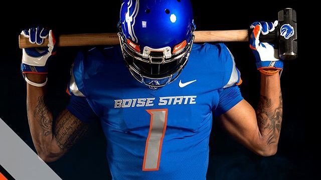
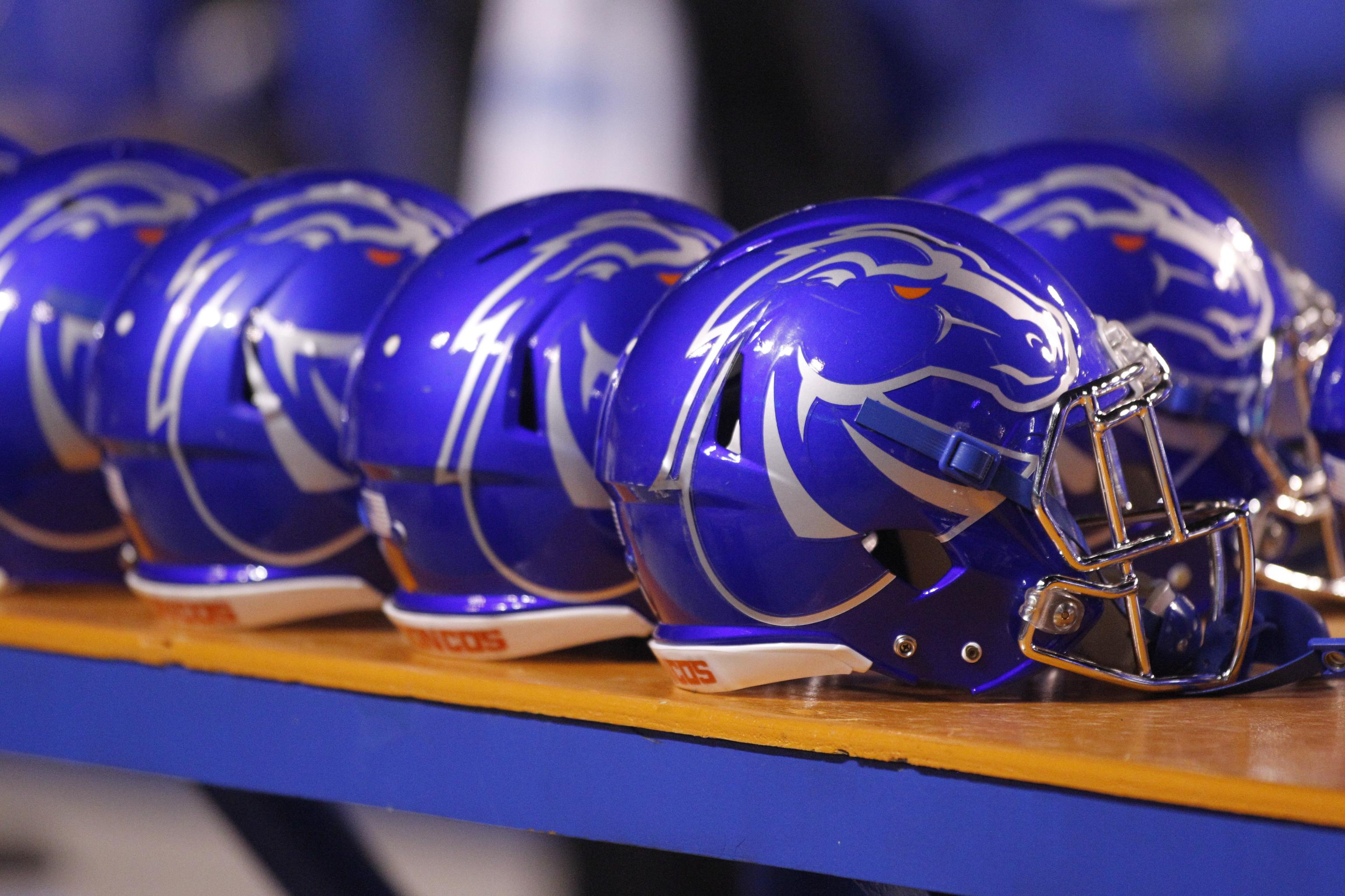
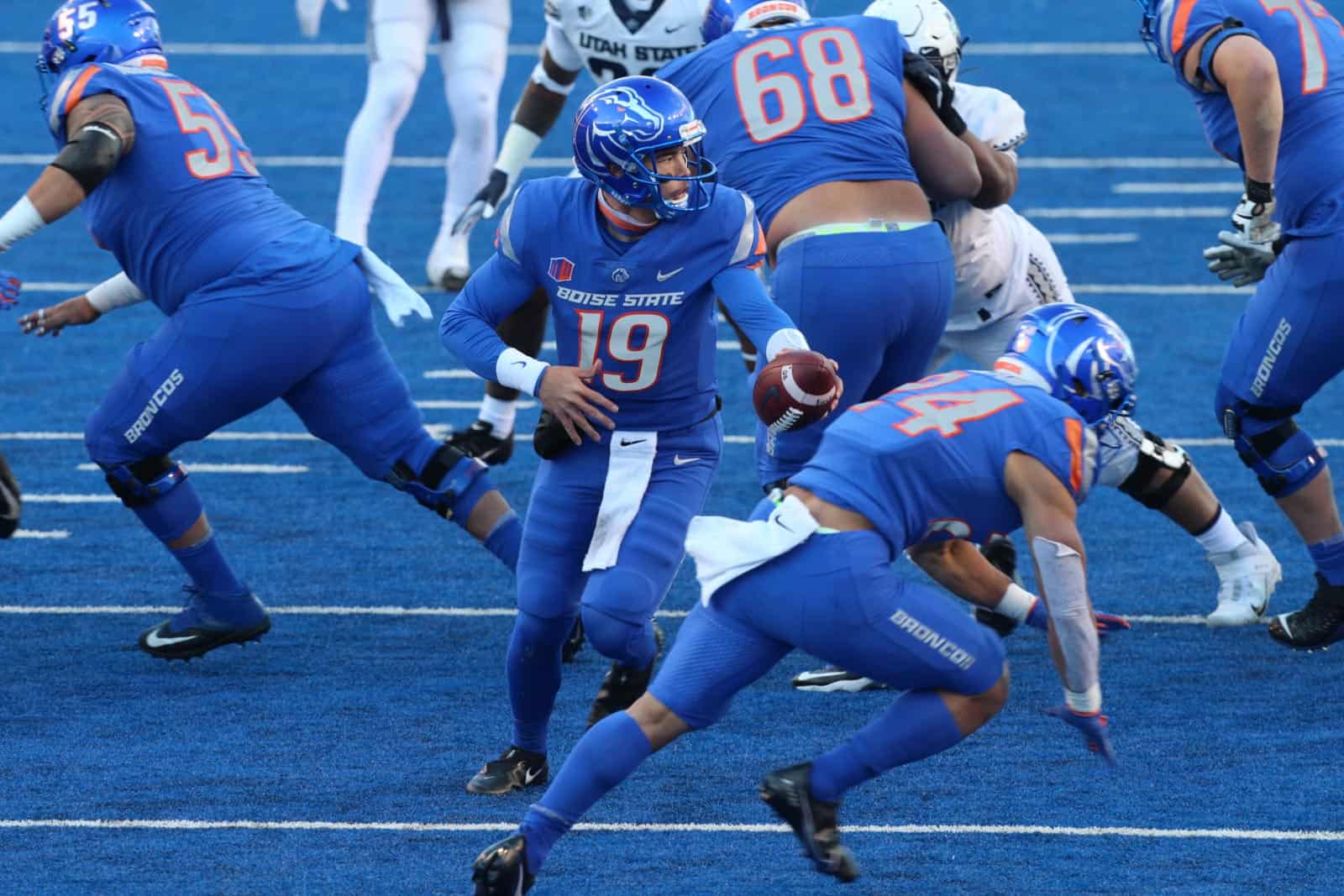
BOISE STATE BRONCOS
DESIGN
- I'm not a big fan of helmets with the logo on one side and numbers on the other but Boise State started the trend so I thought I'd keep it
- It's nice Boise State and Nike landed on a unique striping design that I think is cool (even though Nike has started using it as a templated design)
- Replaced silver with white for the facemask, numbers, wordmark, and stripes
- Kept the same number and word font
HELMET
- Blue, orange, and white helmet with white or blue facemask
- Ghost bronco logo replaced by primary logo
JERSEY
- Silver stripes and numbers changed to white
- Shoulder numbers added
PANTS
- White, blue, and orange pants
- Replaced leg text with stripes. Other Nike teams have this design and I like the look
SOCKS
- White socks with blue or orange accents
Thanks for looking and as always C&C is greatly appreciated!
-
9
-
NORTH CAROLINA STATE WOLFPACK
DESIGN
- So I hate pretty much everything about NC State's recent uniform re-design
- I appreciate them trying something unique with the shoulder stripes but they just don't work imo
- I went back to their previous design which I think is really solid
- I don't mind the new font but I like the old one way better so I went back to it
HELMET
- White and red helmet with red or white facemask
- Primary logo and Tuffy on both
- STATE on the front bumper and WOLFPACK on the back bumper
- Helmet stripe returns
JERSEY
- Shoulder stripes eliminated
- Old font returns to the numbers and chest text
PANTS
- White and red pants
- Stripe with hip logo returns
SOCKS
- White socks with red accents.
Up next is a team that has been revolutionary in terms of helmet designs, Boise State. Thanks for looking and as always C&C is greatly appreciated!
-
7
-
On 11/12/2021 at 12:52 PM, QCS said:
The problem with having such great designs is that there's nothing to comment on, this has all been excellent!
Haha thank you that’s what I hope for with these designs. I appreciate it!
-
1
-
-
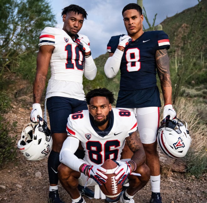
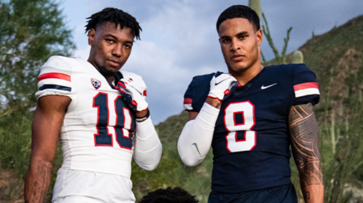
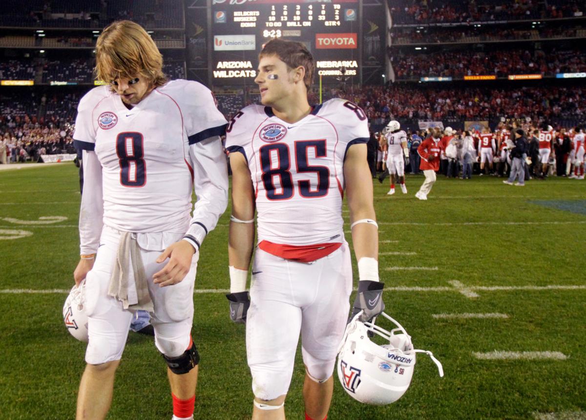
ARIZONA WILDCATS
DESIGN
- I'm so glad Arizona went back to their old uniform design but I made some tweaks to it
- Two-colored stripes throughout the uniform instead of the "Florida Gator treatment" on the jerseys
- Old number font is back to match the text font
HELMET
- White, blue, and red helmet with blue facemask
- I miss Arizona's blue helmets and they have a history of red helmets so I brought both back
- Stripes added to all helmets
JERSEY
- Updated stripes added to the home and alternate jerseys
- Brought back red as an alternate option
- New number font added
- Removed collar from white jersey
- Added a collar logo which they removed
PANTS
- White, blue, and red pants
- Stripes added to the blue pants. I know historically the blue pants don't have the stripes but I added them for consistency
SOCKS
- White socks with blue or red accents.
Thanks for looking and as always C&C is greatly appreciated!
-
7
-
1
-
On 11/10/2021 at 8:10 PM, jaytavo305 said:
Im not sure if I'm too late for coastal, but I think my only suggestion there would be to make the moons face the same way on the sleeves, not sure if you intended it to be the way you have it but it looks flipped on each shoulder, I'd make them both face forward with the point facing the front. Besides that there is no other suggestion I have, I think the entire recent string of uniforms you've come out with look great! Loving this series.
Thank you! And yes I did place the moons that way on purpose because I visualized how the flag would look on the sleeves and placed the moons that way
-
1
-
-
BAYLOR BEARS
DESIGN
- I don't mind Baylor's recent re-design but Nike did to Baylor what they did to West Virginia, made their uniforms plain
- The basketball uniforms are better so I took the stripe from those and changed them to a more traditional design
- I don't like the new font though so I went back to their old font and updated the number font
HELMET
- Green and gold helmet with green facemask
- New stripe added
JERSEY
- New stripes and number font added
- Chest wordmark added
PANTS
- Gold, green, and white pants with new stripe added
SOCKS
- Green socks with gold accents
Up next is a team that went back to their traditional uniform this past offseason, Arizona. Thanks for looking and as always C&C is greatly appreciated!
-
6
-
 1
1
-
17 hours ago, colinturner95 said:
Big fan of the last few teams. UMass looks much cleaner sans black. Coastal looks much more unique now than what they wear IRL. Minnesota looks much better too. Well done!
Thank you! That's what I was going for with each team and especially giving Coastal a more unique look to match a unique color scheme.
15 hours ago, -Akronite- said:Minnesota is a mess right now and I think this concept does a good job of simplifying things. They don't need an oar on their head or a chrome gold helmet, and their usage of white is frustrating & perplexing. The Gophers look their best in a solid color look, and while my initial reaction was "meh" to the stripes I appreciate their inspiration coming from the logo. I actually kinda like the 90s chest Ms but I think a lot of Minnesota fans hated that look so it was smart to make it less obnoxious.
Don't mind the gold helmet alt and I like not including white pants, but a gold jersey might be a good addition.
Thank you yeah I have those exact same thought about the oar/wood pattern and that Vegas gold chrome helmet, it just doesn't work with the rest of the color scheme. As for the gold alt, what about something like this?
I didn't include gold pants with the gold helmet because I thought that might be too much of a light color for a full uniform.
-
3
-
-
MINNESOTA GOLDEN GOPHERS
DESIGN
- Other than getting rid of PJ Fleck's Row the Boat pattern, Minnesota was kind of hard for me to create a design for
- I went with their logo and an old uniform for inspiration
- The traditional stripes are based on the serifs of the logo
- The extension of the stripes to the chest is based off of the infamous 90 jerseys. Just not as absurd
- Eliminated Vegas Gold from the color scheme
- Kept the same font just made the numbers thicker
HELMET
- Glossy maroon and gold facemask with maroon facemask
- M Logo is the only logo on the helmet
JERSEY
- New stripes added
- No white as I think gold works well on the maroon jerseys without white cluttering it up
PANTS
- Maroon and gold pants
SOCKS
- Maroon socks with gold accents
Up next is Baylor. Thanks for looking and as always C&C is greatly appreciated!
-
7


/cdn.vox-cdn.com/uploads/chorus_image/image/55451657/Screenshot_2017_06_26_14.23.00.1498501227.png)
/cdn.vox-cdn.com/uploads/chorus_image/image/55058379/Screen_Shot_2017_06_02_at_3.04.05_AM.0.png)
/cdn.vox-cdn.com/uploads/chorus_asset/file/22870336/1235263229.jpg)
/cdn.vox-cdn.com/uploads/chorus_asset/file/9309555/usa_today_10299370.jpg)
/cdn.vox-cdn.com/uploads/chorus_image/image/69466922/IMG_20210617_011132.0.jpg)
:no_upscale()/cdn.vox-cdn.com/uploads/chorus_image/image/57397191/usa_today_8925685.0.jpg)
:format(png)/cdn.vox-cdn.com/uploads/chorus_image/image/47664161/HERE_S_YOUR_IOWA_HAWKEYE_BLACKOUT_UNIFORMS_FOR_TONIGHT___Black_Heart_Gold_Pants.0.0.png)
:format(jpeg)/cdn.vox-cdn.com/uploads/chorus_image/image/45943044/usa-today-8095464.0.jpg)
/cdn.vox-cdn.com/uploads/chorus_asset/file/22493062/1179901452.jpg)
/cdn.vox-cdn.com/uploads/chorus_image/image/70183047/usa_today_17199691.0.jpg)
/cdn.vox-cdn.com/uploads/chorus_image/image/68735067/1289939106.0.jpg)
/cdn.vox-cdn.com/uploads/chorus_asset/file/22342181/usa_today_15048884.jpg)
/cdn.vox-cdn.com/photo_images/3907286/123697629.jpg)
/cdn.vox-cdn.com/uploads/chorus_asset/file/22542024/1177498595.jpg)
/cdn.vox-cdn.com/uploads/chorus_asset/file/12545865/494099368.jpg.jpg)
/cdn.vox-cdn.com/uploads/chorus_image/image/67746086/619488594.5.jpg)
/cloudfront-us-east-1.images.arcpublishing.com/gray/UPWNPKYHSBDYRLUIKUTFC7HRYI.jpg)
/cdn.vox-cdn.com/uploads/chorus_asset/file/19342164/1185107629.jpg.jpg)
/cdn.vox-cdn.com/uploads/chorus_image/image/58768565/New_Gopher_Football_Uniforms.0.jpeg)
/cdn.vox-cdn.com/uploads/chorus_image/image/61066819/maroon_white_maroon.0.jpg)
College Football Uniform Concepts FBS, FCS, D2 & D3- Lehigh Mountain Hawks
in Concepts
Posted
TEXAS LONGHORNS
DESIGN
HELMET
JERSEY
PANTS
SOCKS