


Orgo
-
Posts
661 -
Joined
-
Last visited
Posts posted by Orgo
-
-
When clicking on the hyperlinks on the "What's New on the Logo Forums," wouldn't it be better to show the most recent post and not the first page of the thread?
Granted, most of us who peruse the forums go straight to the boards.sportslogos.net website, but it'd be nice to see the newest posts first.
-
Found on my local craigslist:

http://minneapolis.craigslist.org/ram/spo/4687746896.html
I emailed the guy and he said he would drop it to $60 if I bought it that day. It's one thing to claim a knockoff is authentic, but to also claim it's game-worn? Some poor guy who doesn't know the difference will be out $60. Anyone know where I can report this junk?
Technically, the guy could wear the jersey to a live NFL game and claim that it's game worn (and s/he would be sorta kinda right). I've seen that move lots of times on eBay, and they bury this info deep in the description. Douche move.
This may not be the first time a counterfeit Mighty Ducks Wild Wing jersey has been shared, but this is noteworthy: http://www.ebay.ca/itm/Anaheim-Ducks-Teemu-Selanne-Wild-Wing-Jersey-New-w-Tags-Fight-Strap-STITCHED-/161501653711?pt=U_Hockey_Fan_Shop&hash=item259a3faacf

If you notice, the manufacturer actually took the time to make Wild Wing, the chunks of ice, the water, all of it, as crests! Anyone who's ever seen a real thing knows the whole thing was sublimated directly onto the fabric. The only crests are the logos on the shoulders, that's it.
Made me laugh.
From the description:
1. EVERYTHING on this jersey is stitched, including the main logo on the front. Other jerseys of this type have the main logo printed, don't go for those.
That's rich. If you're willing to drop a few hundred on a jersey on a place like eBay, you better do your research first.
(insert obligatory wish for Wild Wing remakes)
-
Wow great work on all the logos... I gotta ask for this one...
Toronto Tecumsehs from the old NHA
I'm looking for something more like a clean-up version than a too-modernized version
I mean I'd love to keep the vintage look of the logo rater than having something too modern
Thanks in advance

This one has me on the fence, not sure if I did it any justice. I decided to go with the logo below because between the two it just looked better.


Nice work on the Tecumsehs logo, ren. I think you picked the better logo, since it's got a much more dignified Redskins/Blackhawks vibe.
-
Hey ren, nice work!
I've largely spectated, but can I bug you with either of these?
 or
or 
I can't find a bigger image of the Goldeyes logo. Danke!
-
Put up in the last few days:


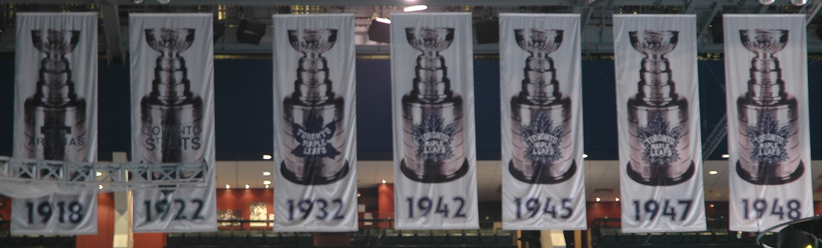
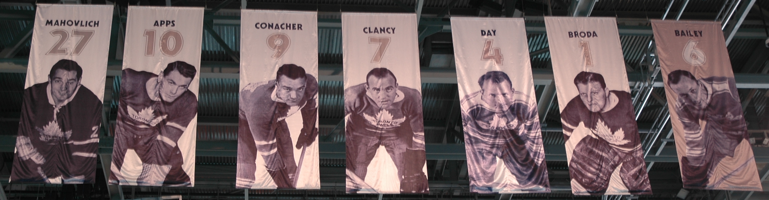
With regards to the best banners, I like when teams get creative. On top of the Flames, the Leafs and Flyers put images of the players on, which I love (although I wish the Flyers were uniform in the perspective of their pictures, i.e. Not having full-body shots, head shots, and partial shots like they do now). Also, the Leafs and Blackhawks put pictures of the Cup on their banners. I like how the Red Wings put the years a player played for the team on their banners, as well as a captain's patch (not sure why they didn't do it for Lidstrom, though). And, as shown above, the Bruins' retired numbers are really cool
The black stuff behind "Stanley Cup Champions" for the Flyers look terrible. Almost like a WordArt effect. I wonder why the Leafs didn't use blue on their banners. Higher visibility?
-
Not digging those Devils Stanley Cup banners. They should be special, but those just scream "meh" to me
It's the Devils. Bland and tradition is their M.O.
-
Popping by to say that your work is marvelous!
Love the Rockets and the Detroit Tigers one, although I thought people would pick the 1927 Tigers logo to improve.
-

The letters on the nameplate are spaced too far apart. Seeing higher numbers in a Devils uniform is weird, too. Wonder if Ryder gets to keep 73.
-
The last Hartford Whalers set had too much grey on it. Losing a green-clad team sucks, as well.
-
 3
3
-
-
@sportslogosnet Anthony LeBlanc said on the radio today that the switch would probably not be able to take place until the 2014-15 season
PHX patch stays for another year.
-
Anybody know of where I can find a replay of the stream?
hxxp://postarchives.entensity.net/040805/flash.php?flash=banana.swf
uhhhhhhhhhhhhhhhhhhhhhhhhhhhhhhhhhhhhhhhhhh
This is about as bad as the time I searched admiral's avatar on Google Images.
-
Yep, there's a bunch of mint 90's authentics on eBay that still come in bags. If you buy 'em off the shelf, there's probably no plastic bag.
-
1
-
-

No hem stripes on the blue, and the loss of the bird/feather pattern of the white makes me weep (figuratively).
Also, I really liked the Thrashers logo.
-
I'm almost equally shocked they have not reproduced them period, they could easily sell a couple hundred (legit RBK/CCM ones).
Since the demand is there I am surprised we have not seen Burger King and Wild Wing fakes yet.
I think they'd be kind of hard due to neither of them being "normal" jersey templates. Wildwing with the full jersey logo and the Burger King with the weird full jersey stripes and upper chest logo.
Also most people who are looking for counterfeit jerseys don't know why those jerseys are so big, so the counterfeit market is more for current jerseys.
I don't have a Wild Wing (don't I wish that I do), but the front logo is screened, right? That can't be a real patch.
I'd understand if they don't want to make replicas--the jerseys kinda look embarassing. But that's what makes them valuable in the first place.
-
Cool thread. I actually started a similar one a while back.. http://boards.sports...-the-same-time/
One of my favorites is
For a second there, I thought the Gretzky-era Kings were playing the Forum Blue-era Kings. Never seen the Spawn outfits in action before.
-
im not sure if anyone dislikes the CBJ's identity but i think its the best in the NHL. the logo, the jerseys, the alt, the whole package is just beautiful and full of Ohio spirit

The CCM version was better.

All the dissing of the Columbus alt makes me sad. It looks really nice to me
 .
.I really like the old CBJ thirds (the logo is great compared to the old CBJ one), but the black and the navy are a little too close together for me. Thank goodness for the red and white to separate the two from each other. I haven't seen it in real life yet, though (who ever has Blue Jackets stuff in WPG anyway?).
-
The Leafs shouldn't change back to the 35-point leaf as their main logo, curse or no curse.
-
Side note, but while I don't mind celebrating Conference Championships, it seems pretty unnecessary to hang banners for them in years you won the Cup.
A team would probably hang a conference championship banner if they are a relatively newer franchise or don't win a lot of Cups. If you're a team like MTL then I guess you can't find room for extra Conference Champs banners.
-
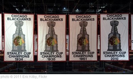
At least the Stanley Cup Banner looked pretty good (simple, no giant Stanley Cup on it cough Lightning cough)
Tampa Bay isn't the only team to have the Stanley Cup featured prominently on their banners:
Also, here's a link to LA's banner. Not terrible, but nothing special either.
I haven't been to the ACC yet, but how visible are the Leafs logos on the banner? It always bugged me and I was wondering if it's just a crappy camera.
How to screw up your retired numbers:

That's a damn shame. From my crappy SD TV, I did a double-take and wondered why the numbers looked like they were redone with a Kabel font.
-
Quality is just getting worse and worse.

Is it just me or the jersey itself fake as well? That Reebok vector looks pretty darn awful.


Unused Logos and Uniforms
in Sports Logo General Discussion
Posted
That's pretty neat. I know this is a one-year logo, but now I'll never be able to unsee the bottom tip of the triangle not touching the circle.