


ChicagoOakland
-
Posts
560 -
Joined
-
Last visited
Posts posted by ChicagoOakland
-
-
On 4/7/2018 at 12:32 AM, MiK said:
Never heard of Checker's or Rally's but had the sign not said burgers • fries • colas i would have put money down that they specialized in auto parts.
Ironically, there WAS a Checkers auto parts...which also had a Checkers/Rallys-esque logo arrangement before O'Reilly bought them.

-
While we're on the subject of clothing brands popular with skaters in the mid 2000's...

-
 2
2
-
-
8 hours ago, Zeus89725 said:
There are two of those literally right next to each other where I live and I’m kicking myself for not posting that.
Thank goodness I don't live where you live, because I'd constantly end up walking into the wrong one.
-
2
-
-
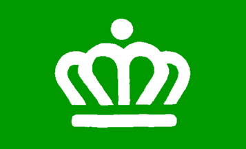
6 hours ago, QueenCitySwarm said:
Yeah I don't know why they haven't yet. I'm not sure if our council members even know we have a flag.
Well, that's one thing Charlotte and Raleigh have in common.
Speaking of Raleigh, our flag might need a sprucing up (yes, that was intentional):
-
13 hours ago, QueenCitySwarm said:
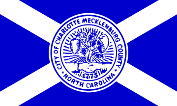
This is the current flag of Charlotte. It has a hornet's nest for the nickname of the region, and a handshake for cooperation I think?
This is either the civic flag or the flag of Mecklenburg County, I don't know. However, it's so much better than what we have now. Personally, I'd like to see this flag with a blue/teal background, as I don't think that green really works with the city.
I honestly thought the second one WAS your flag. I've been to Charlotte a few times and I've seen that symbol pretty much everywhere.
It's a well designed logo and a lot of people already associate it with Charlotte; they might as well pull the trigger and make that the official flag. -
On 2/25/2018 at 4:00 AM, Captain Tsubasa said:
No. 0268 - A quartered cross to symbolise medical care, cardinal points on a compass, "debating, cooperating, or whimsically, elegant and having fun on the ice rinks" and geese "making a bee-line (or vee-line) for Rochester". I can't quite follow most of that symbolism, but hey, the design does look nice!
")
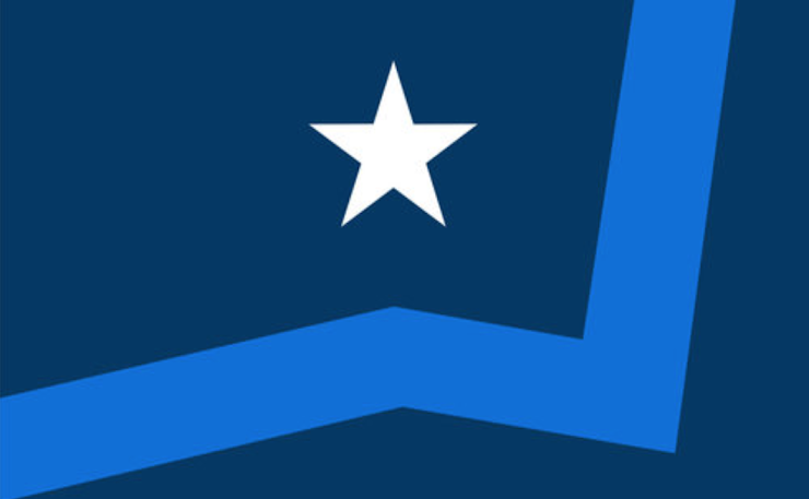
No. 0281 - The North Star shining over Rochester
The last one is my favorite and the one above it is up there too. I also love the design which incorporates the Zumbro River; it's pretty clever that the star is located about right where the Mayo Clinic is.
I can't help it, I like this neon-looking flag too.
-
2
-
-
26 minutes ago, NYUNDERDOGS said:
How the hell has nobody posted this yet?
Because ALL of their logos are associated with failure.
-
9
-
-
All I ask is that if they go with the Fatbacks, they commit to it and play some Fatback Band in between innings.
-
Meanwhile in Fayetteville, the soon-to-be relocated Buies Creek Astros are deciding between the Woodpeckers and the *gag* FATBACKS as their new team name.
-
1
-
-
9 hours ago, stumpygremlin said:

This is the winner.
This looks like the bootleg version of Denver's city flag.

-
2
-
-
^Right team, wrong name.
-
1
-
-
Damn, I was hoping Greenberg would buy the Canes. I've got a bad feeling about this, this move has incompetence written all over it.
(But when Karmanos is involved, what move doesn't?) -
10 hours ago, SilverBullet1929 said:
These pics made me curious as to why the Rays dropped their inaugural uniforms so relatively quickly. They only spent 3 seasons in them. Considering how long the process of making a complete uniform overhaul takes, it's safe to assume they decided on dropping their inaugural set within 2 years of wearing them, if not less. I have to believe it's rare for any team to revamp their look so soon after their inception. Even if the uniform is ugly usually a new team sticks to their initial look for a while. Anyone have any insight as to how this happened?
The '90s ended. That's about it.
-
3
-
-
7 minutes ago, the admiral said:
Maybe Seattle will fail to submit an expansion bid again. I would much rather see Seattle get the Hurricanes, not just for alignment but because their smug hockey-hipster fanbase would adapt to Seattle just fine.
I really am the only Canes fan on these boards, aren't I?
With that said, I wouldn't even be shocked if they move...and honestly it's probably for the best if they do. -
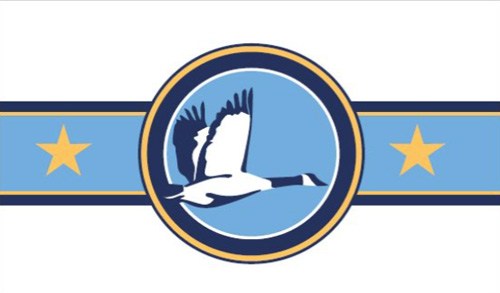
So my former hometown of Rochester, Minnesota is holding a contest to replace...whatever the heck this is.

They're doing a two round voting system with the intention of unveiling a new flag next spring. (link here.)Here's what came out of round 1:


-
Oh God, I thought you were joking about Split's flag.
That might be worse than the infamous Pocatello flag. -
8 minutes ago, dmmdoublem said:
MLB
2006-2007 KICU (Oakland A's)
Wow. You brought me back with that one. If only I could find a picture of it.
-
11 hours ago, The Golden One said:
Warriors new banner
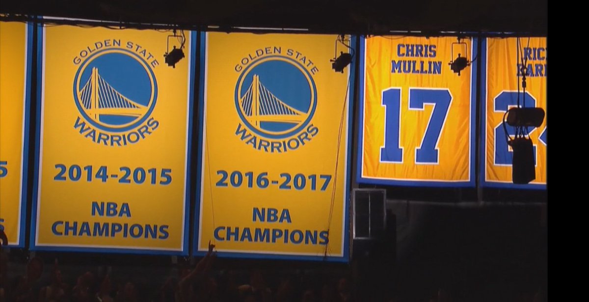
The Warriors have come a long way from where they were when I was growing up, when they only had the one banner for 1975.

They didn't even have the retired numbers on banners until they retired Mullin's number; they used to be just listed under the suites. (look by Vince Carter's head for proof.)

-
Take it from someone who lived in Chicago for a sizable portion of their life:
There's no such thing as a fan of the Cubs and White Sox. Much like the old Yankees/Dodgers/Giants rivalry, the teams don't just represent their city, they represent their specific neighborhoods (Cubs=North Side and White Sox=South Side) and in a city as historically segregated as Chicago there's really no middle ground to take.
-
3
-
-
On 10/10/2017 at 9:47 PM, Tracy Jordan said:
I'm liking this new NBA On ESPN scorebug tweak:
My only bug (pun intended) is spelling out the number of timeouts for each team instead of using yellow boxes or something similar.
-
2
-
-
Too bad I can't read it without a magnifying glass.
-
3
-
-
18 hours ago, BJ Sands said:
Of course it was a Giants fan who wore this atrocity.
-
44 minutes ago, Discogod said:
Nah, we'd need a wise-cracking, shades wearing, hi-top sporting dinosaur thrown in the mix for peak 90's.
/cdn.vox-cdn.com/uploads/chorus_image/image/49268013/Screen_Shot_2016-04-08_at_12.46.08_PM.0.0.png)
There you go.
-
6
-
-
On 8/29/2017 at 0:48 PM, Matito said:
Wait, the Suns almost used that weird 90s "S" thing in their logo? Why is this not bigger news?

Oh my god, this literally made me laugh out loud. We've reached peak '90s.
-
5
-


Minor/Independent/Collegiate League Baseball Logo/Uniform Changes
in Sports Logo News
Posted
The blue cheese numbers are equal parts fantastic and terrible.