


jigokusabre
-
Posts
225 -
Joined
-
Last visited
Posts posted by jigokusabre
-
-
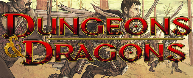
What font was used for the modern D&D book logo?
-

Josh Johnson, Toronto Blue Jay.
I'll raise you R.A. Dickey as a Blue Jay.

To be fair, RA Dickey wore blue for most of his career... and he's not exactly been long associated with any one team.
-
Josh Johnson, Toronto Blue Jay.
-
You're telling me the Champion era replicas are the same quality as the current NBA replicas?
Labor costs haven't gone up? Minimum wage has gone up from 5.25 in 2001 to 7.25 today. And yes, replica jerseys were printed in the United States by Reebok (not sure about Nike) So assuming all labor makes minimum wage in the US, that alone has gone up.
You can defiantly argue that labor costs have not increased overseas and you may or may not be right, I don't know that for sure. But the costs have certainly gone up from the factory to the supplier.
What about all the other cost increases I listed out? Should companies eat those?
So, that accounts for a ~35% increase in cost. What accounts for the 150% increase in price?
-
I think these aren't as great as people usually say they are (at least online) and think their current uniforms are even better.
I find the oversized flying elvis on the shoulder a bit tacky.

You could fill volumes with how wrong you are...
-
Saw this in another thread:
Great piece and some good points. I owned a sporting apparel store from 1994 until 2001. I haven't purchased and NFL jersey since then. The NFL can complain all they want, but expecting people to spend 100 bucks on a flimsy cheaply made screen printed jersey is ridicoulous.
$100 would be fine for an authentic jersey. They want $300 for the authentic though... that's insane.
-
 1
1
-
-
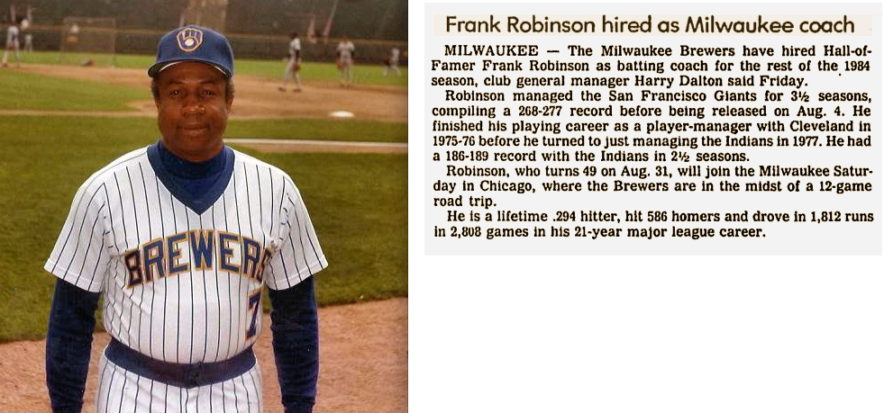
I am just now realizing how unpopular this opinion is. The Milwaukee Brewers "Beerbarrel Man" is terrible. It's from the 70s and it looks it. And the hat is the worst part of the fan-designed spring training uniform winner.
Not unpopular with me.
-
Just out of curiosity, does everyone here that mercilessly flames people for saving money and getting jerseys on eBay, etc, all pay for all the music they listen to?
I'm aware it's a bit different.
Well, buying a fake jersey is less like downloading and MP3 and more like holding a tape recorder to the radio.
I will never flame someone for buying a jersey second hand. The licencing fees (which lets face it, is the real cost-factor) for MLB/NFL jerseys prices them out of any semblance of a reasonable price range. Besides, I'd rather buy an actual jersey from the Marlins 1993 season on eBay than hope that M&N or Majestic will eventually make a throwback (and probably botch, it too).
There's a line between buying smart and buying knock-offs.
-
-
its a well executed idea with an aesthetic that fits traditional baseball and includes some of their past visual equity. its appropriate, timeless, well built, will look great and be consistent across all applications and gives them a modern identity that replaces a sloppy, overly complex, turn of the century identity. the new colors help separate them from almost every other MLB team giving them something that is really unique and memorable.
It seems lazy to me, too. Standard block letter/number font and the old Star H logo. There seems to be little imagination, little "design" involved. It looks very "generic" to me. You could not say the same of, say, the New Bobcats jerseys, or the new look Marlins. Even if you think they're terrible, they're not "lazy."
That being said, if you like the boring, generic and dated... you're going to say that it looks "clean" and "traditional" and "timeless," because those are the virtues that appeal to you.
-
Even Wrigley Field is corporately sponsored.
bzzzt
I know what he's trying to say about Nationals Park and Marlins Park, though. They do just sound like mere placeholders. You'd expect such massive and modern structures to have names of their own, not just "(Team Name) Park," especially considering these massive engines of commerce aren't terribly parklike. Yankee Stadium works because we're used to it and because it uses the singular instead of the plural (not that Marlin Park would be much better). "Capital Diamond" is my preference for the Nationals' park, rather than, well, Nationals Park. I don't have one for Miami.
Then there's the strange case of the Rangers, who came out of the Ameriquest fiasco going from the oddly specific yet unspecific "The Ballpark In Arlington" to the more contrived "Rangers Ballpark In Arlington," as if there were other ballparks in Arlington to challenge the Rangers' fallacious employment of the definite article. Couldn't have just gone all the way back, huh.
I'd like them to name it after someone like they used to do sometimes...an owner, or whoever. But I guess that's a bad idea because it looks bad to take the honor away once naming rights are sold.
I do like your "Capital Diamond" idea. Even if it's a placeholder, it does not have to sound like one for the interim. As for Nationals/Marlins Park, I am OK with the "s" on the end. We used to have "Royals Stadium" and I never had a problem with that. I think it's the "Park" part that bugs me. "Marlins Stadium" and "Nationals Stadium" sound better to me. I'd be all for those names if I really thought the intent was to keep 'em.
They aren't stadiums, they're ballparks. An important distinction for teams who were previously in Football Stadiums. Maybe Marlins/Nationals Field would be acceptable, but Marlins/Nationals Stadium? No, thanks. The only way I could see renaming Marlins park might be for Carl Barger (Barger Park, Barger Field, etc.), since he brought baseball to Miami and they took away the previous honor of retiring the #5.
-
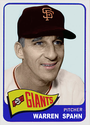
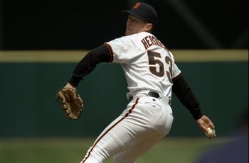
The San Fransisco Giant's all WTF rotation:
Randy Johnson:

Warren Spahn:
Steve Carlton:

Orel Hershiser:
Don Larsen

-
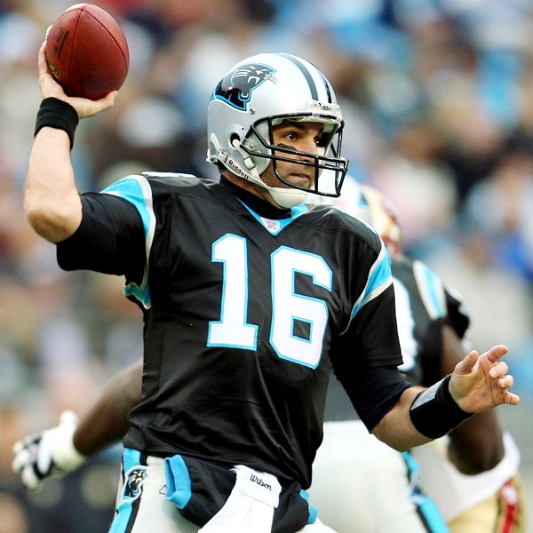
Has anyone posted Vinny Testaverde?


-
The findmyfont site could not make heads or tails of it.
-
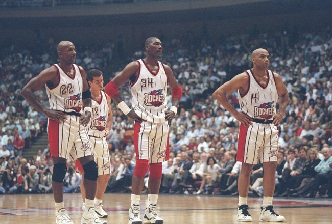
Speaking of Barkley (and Drexler)
-
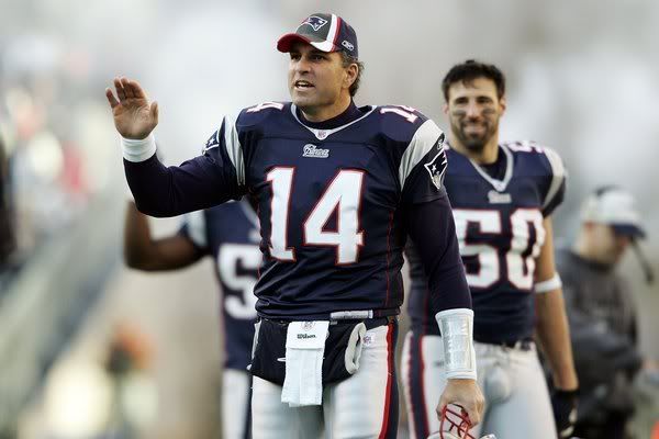
I don't want to quote a huge pic but I really like that Patriots uniform. If you replaced the royal blue with navy and used the current font I think it would be a winner.
I dislike the Navy. The Patriots should be RED, WHITE and BLUE, not burgundy, white and navy. I can see not liking the italics/drop shadow numbers.

This doesn't look bad.
-
These uniforms are very good.

There are definitely some elements that I don't like, and a lot of room for improvement, but overall, I'd have to say that it's the best the Patriots have ever looked.
I like these better:


Though I wished they kept using these pants:

-
Dennis Eckersly made the trip to St. Louis, along with LaRussa and McGuire.

Kevin Appier went to Disneyland

Speaking of Disneyland... every there looked like they were in the wrong uniforms in 1997. No one more so than Rickey Henderson

-
I think that these are the best jerseys in Blue Jays history:


I'd agree, if it wasn't for the 2012 set.
Personally, I hate new jerseys that are just copies of old jerseys. It smacks of laziness... though I might feel differently if the Marlins went back to their 1993 look.
-
There's also Andre Tippett in the "Flying Elvis" Patriots jersey

-
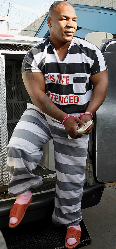
I guess the Plainfield Correctional Facility would be the correct uniform?
-
Question: Did the Blue Jays actually wear stirrups with that uniform set?
It's so rare to see players actually wear stirrups.... I am not enough of a fan to say with certainty.
-
I hated those graphite jerseys... they have no business in a black alternate.
-
I think that these are the best jerseys in Blue Jays history:

The Big Ol' Counterfeit Jersey Thread
in Sports Logo General Discussion
Posted
In what sense are you "collecting jerseys" if you're buying knockoffs? It's not a collection... it's a facsimile. It would be a like my showing off my awesome baseball card collection by printing:
Would it be dumb of me to spend $100K of my hard earned money for a piece of ink and cardboard? Yeah, you could make that argument... and it would be perfectly reasonable. Collecting as a hobby is a bit ridiculous when you think about it logically. The value of collecting, though, is in getting something that is difficult to find. If you have a stockpile of fake jerseys (or self-printed baseball cards) you're not a collector... you're a poser.