


razorback447
-
Posts
972 -
Joined
-
Last visited
Posts posted by razorback447
-
-
2 hours ago, SportsFan12 said:
I wasn’t sure these uniforms would look good, but I can now rest assured based on these genuine reactions by these players!
Meanwhile the rest of the team was like…
-
 1
1
-
-
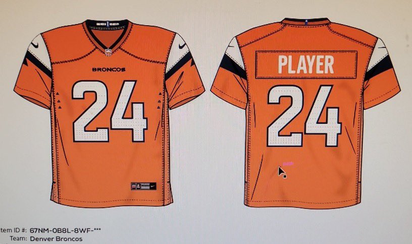
15 hours ago, KouPilot said:
So Looking at the leaks of the Broncos Jerseyan just seeing this in the background on the broncos studio's x account. I wonder if this is the idea with the stripe?
The stripe looks like it’s pulling from the angles of the logo to me. It’s similar to blue outline above the eye paired with a thicker blue line on the back end like the extension down the center neck.
-
3
-
-
10 minutes ago, DCarp1231 said:
Texans uniform descriptions
Bold Bull? Is there where we start diverting in to City Connect type uniforms that are just absurd? -
What type of helmet is this? It seems the Oklahoma OL is wearing them.
-
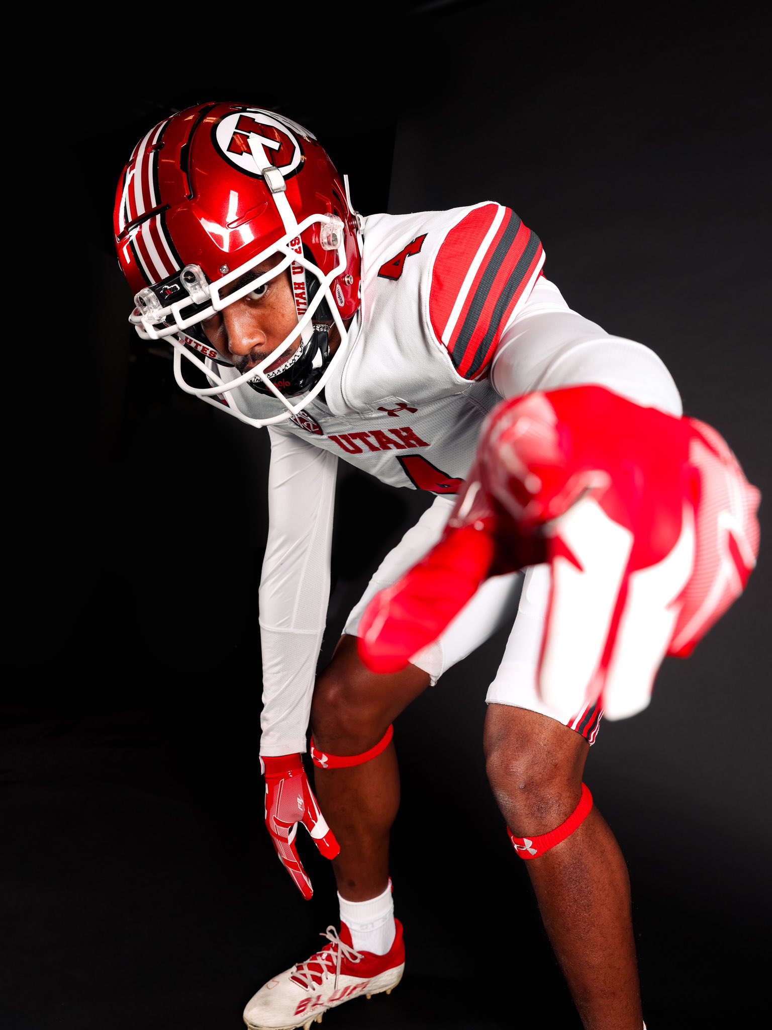
On 11/17/2023 at 12:00 PM, upperV03 said:
Arizona State is going white/maroon/maroon with Tillman decals on the helmets vs. Oregon:
Utah is going red/white/white at Arizona:
The Wildcats will be wearing their military appreciation uniforms with camo numbers & sleeve caps and gray pants:
Big win for Arizona today but man that uniform looked awful on TV. It just looked like plain white sleeve caps with gray pants which was a terrible combo.-
1
-
-
23 hours ago, cajunaggie08 said:
These are fantastic. They should really consider using it full time. It would stand out way more than what they currently use.
-
4
-
-
24 minutes ago, Webfooter said:
These look fantastic live. It’s a really nice look up against the silver metallic numbers that TCU is wearing.
I’m sure he’ll trot out some beyond ugly gimmick uniforms but so far he’s 1-0.
-
4
-
-
14 hours ago, crashcarson15 said:
To some degree there's always going to be a mismatch when you have an overly metallic helmet paired with non-metallic pants, but I thought the pants from the Champion-era fauxback they did in 2019 did a much better job of matching the helmet than the more mustardy shade does. Would prefer to see the school do this shade of gold across the board.
Why in the world is this not their full time look? It’s perfect.-
4
-
-
1 hour ago, Coltsfootball2016 said:
Like Oregon, they have a new helmet on a weekly basis.
Unlike Oregon, it’s usually bad.-
1
-
-
On 6/22/2023 at 9:57 AM, colinturner95 said:
- The tapered stripes suck.
- The tonal stripes suck.
- The single layer numbers suck.
It's actually making me miss these.
The iconic jaws of Husky stadium. An all-time classic look.-
 6
6
-
 1
1
-
8 hours ago, aawagner011 said:
Honestly can’t say I’ve seen a single one that was decent.
We haven’t worn these in 7 years but I will die on the hill that they were one of the only ones that looked great in chrome. Probably would have looked like on our red jerseys but they were perfection on the whites.
-
8
-
-
On 1/20/2022 at 8:08 AM, fl00dsm0k3 said:
I
I don't watch much football, but I love the navy blue Broncos design, even better with navy pants. The packers home jersey is all time classic, but I like their away look better.
This would have been an all-time classic uniform matchup if we’d still been in our traditional orange uniforms. Although we also probably would have lost because that set was also cursed in Super Bowls.-
1
-
-
Boise State and North Texas last night was a textbook example of everything not to do with your uniforms in 2022. Just an ugly, ugly matchup.
-
5
-
-
On 11/19/2022 at 9:04 PM, MJWalker45 said:
Too bad they'll probably be buried under the stadium unless they pull out a win from behind.
Do you run the South Carolina football Twitter account.
-
2
-
5
-
-
4 hours ago, upperV03 said:
Oregon picks out their uni combos well before the season even starts, so when they picked this look for this game they had no way of knowing the Utes would choose all-white. I’d argue this would’ve been a fantastic choice for this game (one of the better possible choices, in fact) had the Utes gone with something like red/white/red or some other combo with red or black helmets and pants. I do get your point, but it’s not like the Ducks found out the Utes were going all-white and then decided on this look.
It’d be nice if Oregon used this as a teaching moment as to why picking uniforms before the season even starts is a bad idea.
Also, I’d absolutely kill for schools to actually get on the phone and talk out uniform choices before deciding. It’s painful how many matchups we get like this where you have both teams wearing white helmets when neither usually wears white helmets. A simple call could solve that problem. How many perfect uniform combo matchups do we miss out on annually because schools don’t communicate?
-
2
-
-
New helmet of the year right there from Tennessee. That thing is perfect.
-
3
-
-
On 11/4/2022 at 10:48 AM, upperV03 said:
Cal is breaking out new road throwbacks tomorrow at USC and they’re absolutely gorgeous:
They’ve worn the blue Joe Roth throwbacks at home vs. whichever one of USC or UCLA they have on the schedule (should see them vs. UCLA in 3 weeks) , but now they have the matching road set that’ll presumably be reserved for their trips to LA from now on. Gonna be an absolutely gorgeous matchup in the Coliseum tomorrow.
They looked amazing in the yellow lids tonight. That should really be their full time look going forward.-
1
-
-
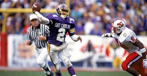
4 hours ago, Ted Cunningham said:
Yeah, these are really nice uniforms. Your comment reminded me that they were wearing them tonight, so I just tuned in. (Happy surprise that it's a close game, too.) The archetypal ECU uniform, for me at least, has a purple helmet. One of my earliest non-WVU/non-Big East college football memories was an ECU/NC State game from the early-ish 90s. And I liked the Vikings because they wore purple, so I took a passing interest in ECU then too.
Those uniforms are similar to the ones they're wearing tonight, so they resonate with me on multiple levels.
As for Memphis, I feel like they do this a lot with the colors they choose to use: Sometimes they completely eschew blue. There was a bowl game a few years ago where Memphis wore grey and white. This time, it's black and white. I'm not sure what the thinking is, unless they just like keeping their various uniform designs to a single color and white? Haha.
Here's what tonight's game looks like, for context. (There is a dearth of photos for this game. Memphis has black pants, since this is best shot I could find of their uniforms, in-game.):
Just a great look for ECU. They’ve looked so bad for so many years that I hope they consider this for a regular spot in the rotation. -
2 hours ago, dont care said:
Navy’s is really uninspired. Oh our campus has marble and gold so well put it on our uniform. You know what other schools have marble and gold used around campus. Basically every other school you can think of
That’s the meaning behind it? Man I thought it was supposed to be crashing waves in a bad storm when I saw it. That made sense to me with it being Navy and I thought it was a really unique idea. Guess not.-
2
-
-
2 hours ago, RayFinkle said:
Maryland looks decent. Indiana, not so decent.
Some uniforms choices just baffle me. First, Indiana’s uniform looks terrible in general but, second, why would you ever wear that busy uniform against the one team in the B1G that always has a busy uniform. There’s so much going on between the uniforms and Maryland’s helmets that it almost hurts your eyes.
This game choice drives me as nuts as the schools that pick to wear alternate white helmets against the one school on their schedule that always has a white helmet. I’m looking at you 2018 Iowa State versus Texas. You could choose any other game on the schedule but you still voluntarily picked that one.
-
6 hours ago, WSU151 said:
Northwestern with throwback white face masks looks pretty awesome.
https://mobile.twitter.com/NUFBFamily/status/1330250023360196610
I knew something felt different with today’s look but I couldn’t figure it out. They looked fantastic out there and the whole game I kept thinking that it seems like we never see them in that combo anymore.-
1
-
-
34 minutes ago, MJWalker45 said:
Yes they are. I think leaving them white with silver in the striping would also be a better look.
Agreed. I do think it looks better in this pic though than the one above. The helmet definitely looks good with the matching facemask. -
Oregon and Colorado are both going to look perfect this weekend. Love it.
-
11 hours ago, upperV03 said:
It’s officially game week for the Ducks and the rest of the Pac-12, so time for Ducks fans like myself to speculate on what the team will be wearing on Saturday. I posted a while back saying that the Ducks will be carrying over the same set as last season, but likely with a new alternate (probably black/neon green based on this season’s cleat colorways) added into the rotation. I expect to see that new alternate debuted against UCLA on November 20th. The players actually had a photo/video day yesterday in which they wore the mono apple green uniforms, but I do not expect that to be an indication of what they’ll be wearing on Saturday vs. Stanford, as that’s been the standard combo used for preseason photo shoots in recent years. We should know by Thursday or Friday what they’ll be wearing, but I’m really hoping and thinking that they’ll go with the yellow/apple green/yellow combo, as it’s the one “core” combo that wasn’t worn last season and I think they’ll wanna go with the classic combination right off the bat, saving the new alternate and the nightmare green set for other two home games against UCLA and UW. Here is what the classic yellow/green/yellow combo looks like in the current set:
They didn’t wear their best look a single time last year? Someone really dropped the ball there.-
4
-


 on our red jerseys but they were perfection on the whites.


2024 NFL Changes
in Sports Logo News
Posted
I’ve been saying it all day but it’s a design from 10 years ago. Matte helmet, white helmet, sleeve caps over designed, numbers/words down the pants stripe. Just checking all the boxes from that period of Nike design.
Reminds me a lot of the mess Arkansas went through in 2012-2013.