


SportsFan12
-
Posts
2,502 -
Joined
-
Last visited
-
Days Won
13
Posts posted by SportsFan12
-
-
4 hours ago, VikWings said:
Honestly if they just throw out the blue pants, orange socks and white helmets it would go a long way.
I can live with the numerous options having been forced to look at these two bland uniforms for most of my life:

That is one positive of the new set is that we will get more variety and they hopefully won't get as stale over time.
-
 2
2
-
 6
6
-
 2
2
-
-
1. Jets — Very solid all around aside from matching socks. No stupid gimmicks or weird design elements is a huge plus, and even their crappy black alternate at least uses the same template as the other sets, which sadly is worth noting in today's NFL.
2. Lions — Lack of pant stripes is the obvious issue with these. Alternate is decent and better than their old Color Rush, and they at least use the correct logo on the helmet unlike the Texans.
3. Texans — Home and road sets are fine, although I was hoping they would incorporate more red. Alternate uniforms/helmets are weird and don't look like the Texans.
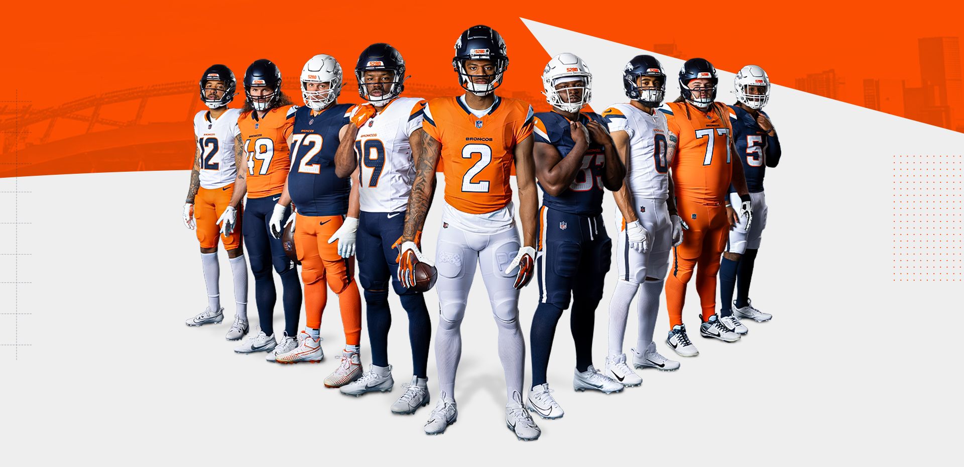
4. Broncos - Just okay. I like the mix and match possibilities, but the white helmet is awful. At least it isn't the primary as was rumored. The sock situation looks like it's gonna be a disaster, which doesn't help.
-
1
-
-
Do the Texans have any photos of the uniforms that aren't closeups in dark lighting or awkward angles of players flexing/posing? The site doesn't seem to have much. Also looking for some different combinations if they did that at all.
-
1
-
-
1 hour ago, Froob said:
I think they should be. I like when the numbers are the same color as the primary jersey.
I agree. They added more orange to the road jerseys, but it still feels like orange is the home color and navy is the road color, which has been an issue since they made orange the primary in 2012. Was hoping the rebrand would solve this issue since they got to start from scratch.
-
1
-
-
It's sad that we've reached a point where it's considered an "upgrade" if a team doesn't completely screw up their redesign, no matter how uninspiring it is.
This whole process has become exhausting with all the teasers, leaks, hype videos, fake names of colors, gimmicky names of uniforms, backstories behind the most trivial uniform details, etc. I miss when a team would say they are releasing the uniforms on a certain date and then post photos of players in those uniforms on that date.
Oh, and I can't even remember the last team to release a new uniform that didn't feature at least one Color Rush/monochrome uniform option. Is it a requirement at this point?
-
2
-
-
1 hour ago, tBBP said:
I'll do a full critique on all this later, but these are my two quick response thoughts:
1.) City Edition/CityConnect design ideology is becoming/has become like a parasite to this new era of branding...
2.) ...This uniform set looks less like Denver Broncos and more like Denver Colorados.
#2 is so accurate. Didn’t even cross my mind until now. The team name is the Broncos and the uniforms are about Mountains and elevation.
-
3
-
-
I'm glad the team can now mix and match somewhat sensibly and that the panels are gone. The jerseys look decent actually, but the pants/sock situations are a mess, as is expected from Nike at this point. That white helmet, navy hersey, orange pants, orange socks look is beyond ridiculous.
The uniforms overall look better and more interesting than the severely outdated previous set, but my goodness that white helmet just makes no sense at all. It looks worse than when it was paired with the orange Color Rush last year. I used to love when the Broncos would wear navy, but I'm not so sure I will anymore.
Overall, I can live these and look forward to some new uniform matchups, especially within the AFC West. Would love to see the white over orange when they play at the Raiders or Chargers for instance.
-
9
-
1
-
-
Denver's new navy uniforms:
The alternate helmet rule continues to ruin uniforms. It should only be allowed for throwbacks, as I said on Day 1.
-
1
-
 5
5
-
-
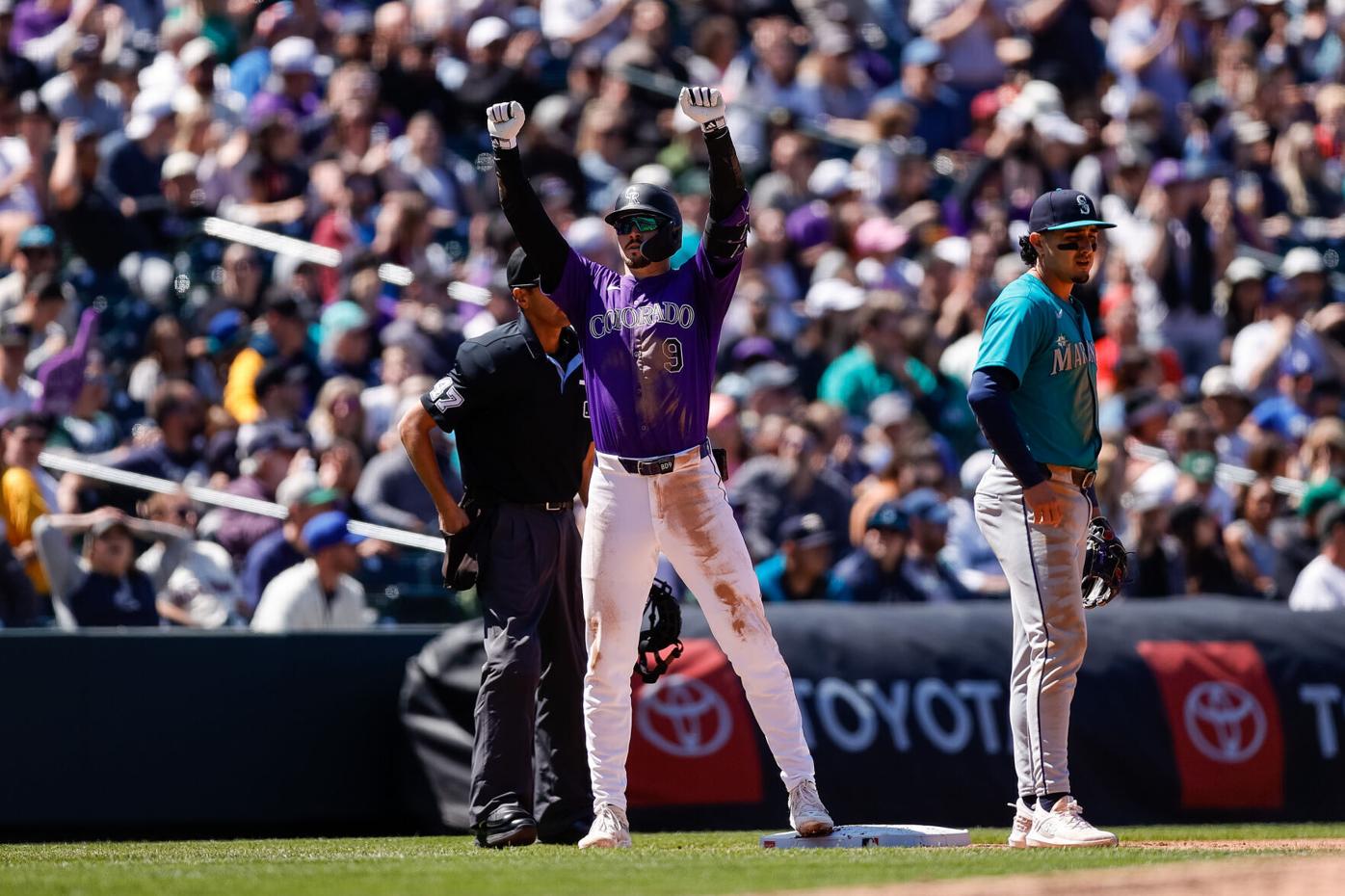
Loved this uniform matchup in Colorado yesterday.
-
13
-
 4
4
-
-
56 minutes ago, HOOVER said:
So many "that's fire" comments in this short clip that I want to light myself on fire.
I wasn’t sure these uniforms would look good, but I can now rest assured based on these genuine reactions by these players!
-
1
-
-
10 hours ago, Krz said:
I’m honestly really excited for the Texans reveal. It’s been a while since we’ve had a team come up with something new and more “out there” compared to the recent simplifying or throwback looks.
Commanders two seasons ago?
-
2 hours ago, DCarp1231 said:
Longest tenured redesigns under Nike-
• Seahawks 13 seasons (2012- )
• Vikings 12 seasons (2013- )
• Dolphins 12 seasons* (2013- )
• Jaguars 7 seasons (2018- )
• Titans 7 seasons (2018- )
The Titans being on this list is laughable.
I really hope they and Jacksonville and Seattle are working on something.
-
1
-
-
Are the Lions advertising their blue pants as the default white jersey option? They did that with the 2017 set and then it gradually became the least used option behind all-white and white on gray. I always love unique pant colors, but the lack of a pant stripe is aggravating as hell.
-
3
-
-
Are we officially free from those atrocious gray uniforms? Hopefully solid white pants too.
I sure hope they keep the blue helmet for the alternate black jersey, which actually looks fine with the blue numbers. I can tolerate an unnecessary black alternate if it features a heavy dose of the team's actual primary color like it seems to here. I just miss when it was okay to wear a non-black helmet with a black jersey.
Overall, this was one of the odder, more unexpected redesigns I can ever remember. Their previous set wasn't bad and I didn't expect these to be drastically different but so far so good.

-
3
-
-
19 hours ago, Big Yellow Flag said:
Wearing an alternate draws attention. That's why they're (also) used to celebrate special occasions. And they sell.
The A's gray is utilitarian. No piping, nothing fancy, just a gray jersey to denote the road team and Oakland because it has to say something. Nobody's running out to buy it (except me, and even then from China because screw Fisher).
I would argue that some alternates don’t draw much attention, especially ones that are used frequently and are generic colors, but since there is so little green in this league, the A’s kelly green certainly does I guess. Fair point.
-
1
-
-
A’s have worn green once in 18 games. The gray jerseys say Oakland too. I don’t understand. It was voted best in the league and it never sees the field anymore.
-
59 minutes ago, MCM0313 said:
Please, just once in the preseason and then never again. I wonder if Buhlahkay there wants to go to war?
For what it’s worth, the brief, largely buried ESPN article has about two thousand likes. Most people (unlike Buhlahkay there) really enjoyed the combinations shown.
I’m not on Twitter (which I refuse to call X). Could any of you go on there and refute his stupid request? Pretty please? Maybe something like “they’re the New York Jets, not the New York Ass”?
The admin seemed to be replying to a bunch of comments. Most of them were reasonable requesting the regular green over white. No idea why they responded to this one.
-
1
-
-
The internet will ruin the Jets for us. Don't worry.
-
2
-
1
-
 2
2
-
3
-
 2
2
-
 1
1
-
 6
6
-
-
4 hours ago, TruColor said:
Every individual NFL team uses an SVG for their primary marks in the upper left-hand corner of their sites. It's there.
Thanks!
-
Anyone got a vector file of the new logo?
-
To everyone who fears that the white jersey with black pants look will still be in the rotation for the Jets:
Maybe the fact that they didn't even model it in these shoots is a sign that it's not in the team's plans. Yes, they didn't originally plan on it or model it with the previous 2019-2023 set, but now that they have used that combo before and still chose not to include it could potentially mean something.
I could be wrong or that could change when Breece Hall tweets that he wants to wear black pants, but I'm still optimistic. Plus there also isn't any black on the other jerseys, so it may not even be allowed or encouraged.
-
6
-
-
Jaguars throwback is awesome news. Hopefully the black is reserved for London and we'll start seeing teal throwbacks in primetime in Duval rather than all-black.
Not sure if anyone saw this. Not sure how they are doing this before the schedule is even out:
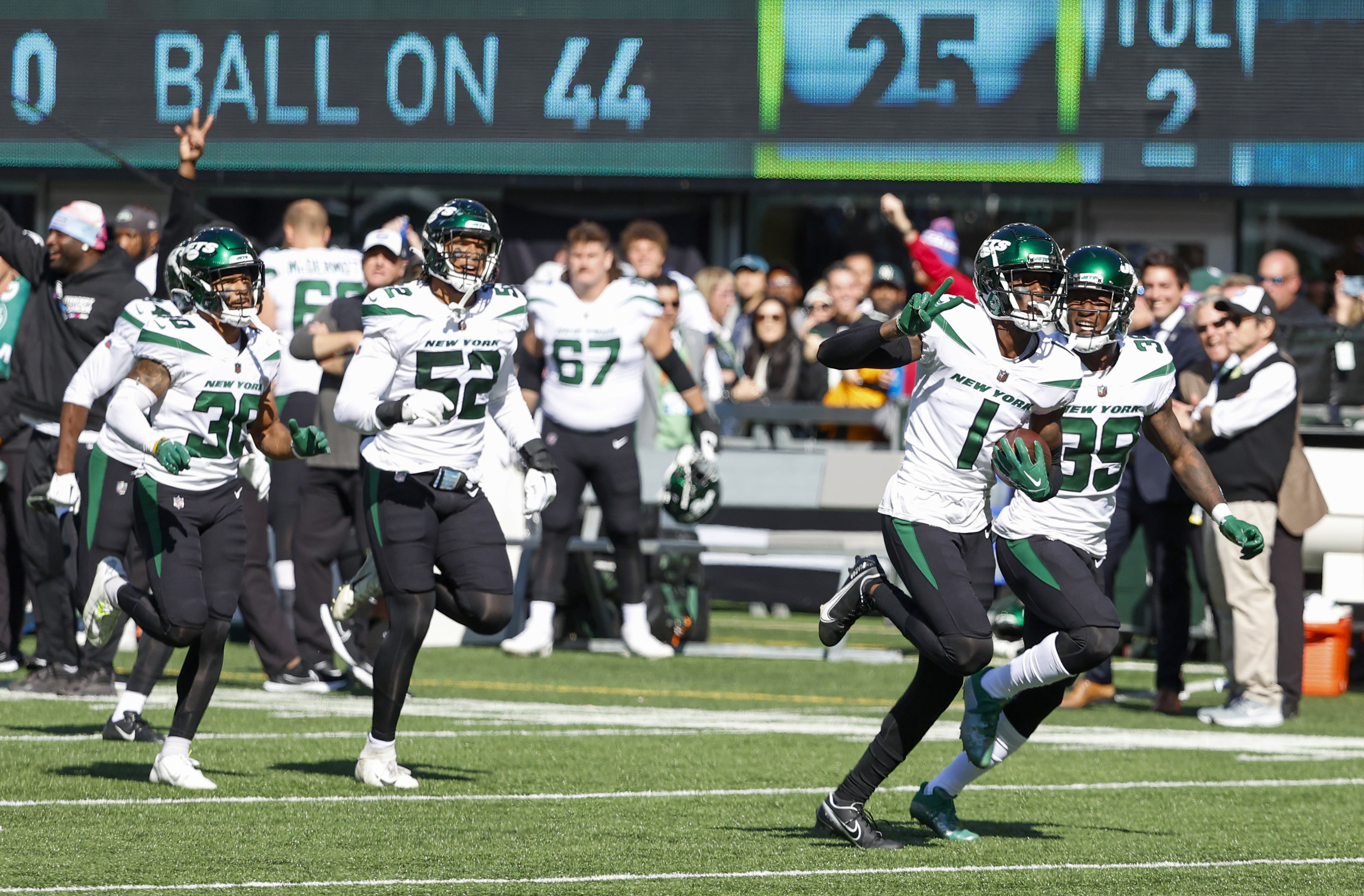
Jets look good. I was a bit worried they wouldn't bother adding green pants with the white jersey, but they did, and I can tolerate the matching green socks. Black alts do have more green, which was badly needed, but a they're now likely gonna be worn three times with no other alternates, which is too much for me.
-
2
-
 1
1
-
-
I thought the Red Sox were doing red on Friday, CC on Saturdays and white on Sundays? They’ve worn the yellows the entire series. What a joke.
-
3
-
-
16 hours ago, DrunkKidCatholic said:
Those are black jerseys?
-
1
-


/cdn.vox-cdn.com/uploads/chorus_asset/file/9365463/20171001115003.jpg)


2024 NFL Changes
in Sports Logo News
Posted
Pretty sure this is a Guardian cap: