


SportsFan12
-
Posts
2,502 -
Joined
-
Last visited
-
Days Won
13
Posts posted by SportsFan12
-
-
This rule sucks. It’s just gonna tempt more teams to add helmets they don’t need and eliminate color from uniforms like the two helmet rule has already done.
-
Twins go road navies, and then back to back Twin Cities alts to close out the series against the Dodgers. The new home whites would've looked great for this matchup.
-
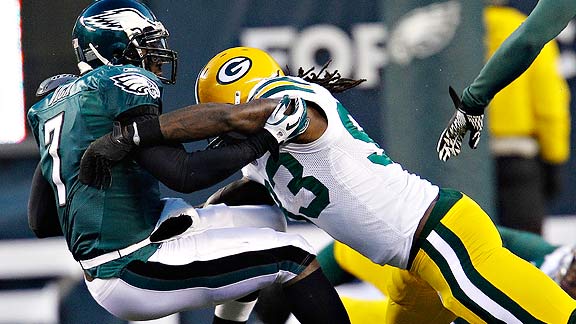
Packers Eagles in Brazil should finally have the Eagles in midnight green vs. Green Bay. Hasn't happened since the Reebok era in the 2010 playoffs when Vick was QB.

-
 3
3
-
-
2 hours ago, SilverBullet1929 said:
Marlins blue jerseys are for home day games (except for Opening day) so every Sunday but also any weekday day games.
Home Friday games are the black alternate. Home Saturdays are the City Connect.
Gray is obviously road with black as the road alternate. They tend to use gray for road night games and black for road day games but they don't always stick to the road jersey schedule for various reasons.
They're very consistent with their home uniform schedule.
So basically the home whites won't ever be worn for a weekend series game? And does this mean the blue jerseys won't be worn on the road or at night at all? That would be disappointing. They would really pop under. the lights. They did wear black on the road last Sunday. I hate when teams limit their uniform usage like this.
-
23 hours ago, CreamSoda said:
The Rockies purple jersey looks more like an electric blue or something. It’s really an odd hue this year.
Compare the jersey with the purple in the scorebug.
I noticed this too, especially in the sun. Not good considering their purple is a unique MLB color and blue is anything but that.
-
These will be worn for all Friday home games. I hate when teams designate a specific weekend day for a uniform. It eliminates mystery and prevents traditional uniforms from being worn popular days to watch baseball.
-
3 hours ago, DCarp1231 said:
File this under “uniforms a player will never wear”
I always like when big-name players switch teams during a re-design year. Looks less weird and a little more natural without any prior visual associations or memories of the uniform.
-
4
-
-
Marlins are rocking the blues again today, which means it isn't just a Sunday thing. That makes me happy.
Still no sign of the Angels' red tops though, which they generally wear pretty regularly.
Nice to see the A's in the kelly greens last night for 11 innings.
-
4
-
-
39 minutes ago, NYCdog said:
Not sure if it was already posted. No new uniforms for the Seahawks.
Bad news, although not surprising. Their uniforms aren't good and the team has been mostly average since they won their Super Bowl in them. Russ is gone, LOB is gone, Carroll is gone...Idk what they're trying to hold onto exactly. The navy blue is so stale.
-
4
-
 1
1
-
 2
2
-
 1
1
-
-
I find it odd that teams like the Mets, White Sox, and A’s, who keep losing, insist on wearing their standard white home jerseys every game. Cant hurt to switch it up.
The A’s especially disappoint me with how great and unique their Kelly greens are. They’ve been opposed to those since the second half of last season it seems like. I don’t get it.
-
6 hours ago, CaliforniaGlowin said:
Sunday home I think. I guess on the road it's up to the home team so who knows.
I guess if a team with a light blue jersey like the Rays or teal like the Mariners ever wore one of those, that could be a potential conflict, but otherwise they can probably wear it whenever.
-
2 hours ago, CaliforniaGlowin said:
From what I heard it's black on Fridays and blue on Sundays.
Sunday home games or all Sunday games? I really hope it's not reserved for just one day out of the week.
-
The Marlins’ electric blue jerseys looked awesome today. I really hope those are prioritized over the boring black jerseys.
-
9
-
 1
1
-
-
6 hours ago, Sec19Row53 said:
No it doesn't. The Arizona Cardinals also have multiple pants options. White pants too wear with the white jersey; red pants to wear with the red jersey; and black pants to wear with the black jersey.
The full post uses wording that seems to suggest that it will be a mix and match situation.
-
1
-
-
17 hours ago, Pharos04 said:
The multiple pants options part at least means it won't be an Arizona Cardinals full-time mono situation. Let's just hope pants options refers to pants with stripes...
And yeah, players' opinions mean nothing. No player is gonna say their team's new uniforms suck. And most of the time they like them anyway because they're ICCCYYYY
-
 1
1
-
-
This is good, but they should just make it the primary rather than wearing it for presumably just one game. (Probably at Miami). I guess no new uniforms for them.
-
6
-
-
2 hours ago, ptay said:
If you're a fan of a team with new uniforms/logos on the way, you should not be worried nor excited. It's all about acceptance.
You already know they're going to look like crap........ mono looks out the wazoo, plain, all-white "socks" (aka leggings), weird numeral fonts, no stripes on the pants.
Acceptance is the key. Expect absolute garbage and you'll be at peace.
Don't forget sparkly helmet logo and large city wordmark across chest.
-
2
-
-
This would've been a homerun. So unique and brilliant color balance, which is a foreign concept to Nike.
-
22
-
1
-
-
53 minutes ago, JustABallCoach said:
In game mock up looks great
Great is a stretch. This is still a bad angle where we can't see much and it's still way too navy. Is that actually the shoulder pattern? I didn't notice any red at first.
-
1
-
1
-
-
13 hours ago, DTConcepts said:
The reason is, in all likelihood, that it costs less to manufacture.
This is Nike and NFL we're talking about. I hardly think money is the issue.
-
6 minutes ago, MCM0313 said:
Split the difference - blue helmet and socks, red numbers and pants.
I was hoping for something like this, but with Nike everything’s gotta be predominately one color for unknown reasons.
-
First the Falcons ditch the red numbers and now possibly the Texans? Seems like this is done just so that it looks different than the previous uniform, but it eliminates contrast and makes the uniform too heavy on one generic color.
How many navy number, navy pant teams do we need? Already have the Titans, Seahawks, Pats, and Bears.
-
9
-
-
2 hours ago, TBGKon said:
Interesting nugget I came across recently. This is a relatively new style of hat. Fansedge/Fanatics has every team shows but one, which is Houston. In a sponsored ad, I happen to come across the Houston version and it's red centric.
Fansedge Gallery of the hat model
Might be nothing, but could be hinting at that red-forward identity coming soon. Could also be nothing since the Jets hat uses the assumed old logo.
Definitely is unrelated to what the new uniform might look like. The Bears one is orange and not navy and several other teams use secondary colors.
-
10 hours ago, FiddySicks said:
The Eagles changing back to Kelly green is a tough one for me. I feel like that particular shade would get old after awhile in a way the midnight green hasn’t.
It’s similar to the Chargers current change. Like most people, I was DYING for them to ditch the navy and just go powder and gold. But after seeing it for a few seasons? I kinda hate it. It looks washed out and kind of frilly. I know that’s not a popular opinion, but I miss them having a splash of navy to ground that set a bit better.
Lighter colors in football are just hard to pull off in general imo. It looks fresh and clean, but it doesn’t fit the feel of the sport that well (imo), and grows old pretty quick I think. It’s one of the (many) reasons why I don’t want the Bucs to ever switch back to the throwback unis full time. They look bright and fun for a game or two, no doubt. But sit through a few ten loss seasons in that pastel 70s kitchen look and tell me it doesn’t get old fast.
I completely agree. The same can be said about the Broncos switching from navy to orange. The brighter color alternates aren’t meant to be full-time looks. Would be overkill. I wish the Chargers would wear the navy alts for more than one game to at least level things out a bit more.
-
2
-
1
-


2024 NFL Changes
in Sports Logo News
Posted
Like the Jets would EVER pair the black jersey with anything other than black pants. It's too freaking FIRE to set aside and wear a somewhat appealing combo like black over green or black over white.