


TheFallenHaveRisen
-
Posts
670 -
Joined
-
Last visited
Posts posted by TheFallenHaveRisen
-
-
-
-
Not sure how popular this is, but the Pelicans need to ditch the Navy, Red & Gold and go with the Mardi Gras color scheme full time
-
 1
1
-
-
-
Mostly for the guy on the right

-
The only fun Patriots team to watch was 2007, and even then it was only fun to watch in SB42
-
1
-
-
Even though it's better looking, it's still the wrong one for him at this point

-
From more recent times, the old-style Cleveland Browns meeting the Minnesota Vikings in the first year of their new uni set in 2013, which as it turned out was the only meeting between these two uniform sets.
In the same vein


-
The Jets should full time go to double green and white, it's a good way to add a color which is needed without resorting to Black
-
Terry Labonte in a Dupont Rainbow firesuit

-
If the Clippers put a wordmark on every jersey except for the black one, they would be an OK set, not good but OK
-
The Jazz have the worst color scheme in sports
Yeah, it really is terrible. Should have gone back to purple instead of adding navy blue.
This was perfect for them in my opinion
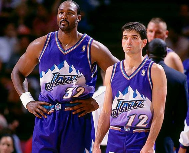
Purple, Light Blue & White with Copper accents
-
The Jazz have the worst color scheme in sports
-
1
-
-
The Clippers new logo and jersey are very ugly
I know that this thread is called Unpopular Opinions, but jesus, do you kiss your mother with that mouth?
-
I don't see what others see in Sam Hornish Jr. as a NASCAR Sprint Cup driver and how he still has potential.
I think he's an absolute terrible driver and shouldn't be racing in the Sprint Cup series. He's missing something to really compete.
He strikes me as a Regan Smith type, good in Busch Series, below average in Cup Series
-
Did the post 2000 Patriots ever play the pre 2002 Seahawks?
They didn't play from 1993-2004, so no

-
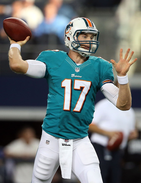
If the Bucs switched fonts to their old Practice Jersey fonts (Keeping the outlines and stuff) and used the Old logos and wordmarks, then their identity would be fine
No, the old practice jersey font is much worse than the current. Look at how terrible the 7 looks:
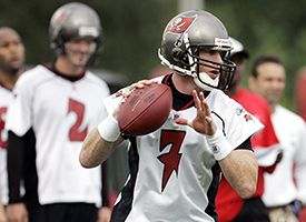
It fits the theme of "Swashbuckling Buccaneer" way more than the NIKE catalog font they have now
-
1
-
-
If the Bucs switched fonts to their old Practice Jersey fonts (Keeping the outlines and stuff) and used the Old logos and wordmarks, then their identity would be fine
-
I wanted to put this in the NFL Changes 2014+ Thread, but then I realized it might be an unpopular opinion...
I love the Redskins throwbacks they have worn for the past 3 years. The dark burgundy and tan(?) is an absolutely perfect combination of colors. If the Redskins were to get new uniforms they should strongly take a look at those for inspiration.
I love it, but the NFL's bull :censored: 1 helmet rule eliminated it as a good uniform IMO
-

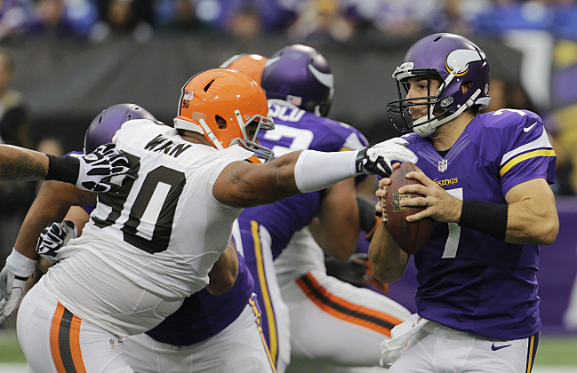
Only year both these teams had these uniforms made by NIKE

Last year for Vikings uniforms, first year for Seahawks
-
1
-
-

One of the few times Jarrett ran in 2003 with that UPS logo, they switched to their new one in time for Texas (The 7th race, this was the 2nd) -
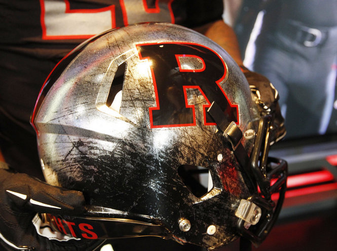
The Bucs unis are too CLEAN?
The Bucs got close, if they went for a look similar to the Rutgers one I posted, more rustic and weathered, then I think their idea would have worked. The problem with their identity is they overdesigned it, like a Volkswagen, it's too clean and doesn't have enough soul.^^^^^
The problem is no team can pull chrome off right.
Lolololololololololololololololololololololololol
Clean ≠ Good
Pirates are stereotypically dirty, the Bucs uniforms however, are not. The numbers remind people of an alarm clock, digital clocks weren't invented until 200 years after the existance of pirates.

I mean you're not wrong, but there is no way anyone actually interpreted my post as meaning those pirates
-
The Bucs unis are too CLEAN?
The Bucs got close, if they went for a look similar to the Rutgers one I posted, more rustic and weathered, then I think their idea would have worked. The problem with their identity is they overdesigned it, like a Volkswagen, it's too clean and doesn't have enough soul.^^^^^
The problem is no team can pull chrome off right.
Lolololololololololololololololololololololololol
Clean ≠ Good
Pirates are stereotypically dirty, the Bucs uniforms however, are not. The numbers remind people of an alarm clock, digital clocks weren't invented until 200 years after the existance of pirates.
To give it a pop culture reference, the Bucs uniforms are Steve the Pirates from the movie Dodgeball when he cleans up at the end

Something like this
Tinted Bucs pewter would look 1000x better than the helmet they have now.
-
TheFallenHaveRisen: Do NASCAR paint scheme cars that were only driven for a season or two count? I've found some rare photos of cars that only were around for a few years.
I'd say the would, but I may be a bit biased. I tried to go with things that didn't even happen for a full year


.jpg)

Unpopular Opinions
in Sports Logo General Discussion
Posted
The Utah Jazz over the course of their entire history as a team have 1 design element worth drawing upon, the Rock gradient city jerseys. Take those and change the team name to fit the look and they'd have a top 3 brand identity in the NBA
Every year that the New Orleans NBA team has spent only using Mardi Gras colors during the event itself is a wasted year branding wise, the sooner they give up on this current identity and embrace the aesthetic year round the better.
The Pacers should eliminate white from their look entirely with this current primary uniform set, all they need to use is Navy & Yellow.
The 76ers are the only team that actually pull of Red & Blue in the NBA well, the Wizards need to go back to the Blue, Gold & Black or do something new and the Pistons need to embrace the Blue & Black + Gray's look they've been dabbling with with their alternates. The Clippers need to go back to Sky Blue & Orange. The Pelicans as mentioned above need to just embrace Mardi Gras.
The Magic either need to go back to a Penny & Shaq era inspired look which incorporates the sublimated stars of the TMac era, or fully embrace the Galaxy motif. Either way, the sooner they get out of these Dwight Howard era relics the better.
The 76ers Parchment jerseys from 2 years ago were the best look they've had since Allen Iverson took them to the finals, they should have replaced the whites with that instantly.