SuperLeafsFan
-
Posts
549 -
Joined
-
Last visited
Posts posted by SuperLeafsFan
-
-
As good as the Boston Celtics uniforms look, I wouldn't mind it if they used gold as an accent color. Not only would it work with the Irish motif, but it would be a nice tribute to their championship legacy.
Gold would be better than the black they use in their alts.
No doubt. Heck, they have gold in their logo. Either use that shade or lighten it up a bit and use it.
You guys are talking about this as if they've never worn these

Reverse the colors and we gotta winner for what the Celtics could do if they ever change there uniforms.
-
Hey ren, I was wondering if you ever thought about doing some non-sports logos, like Speedee (Mcdonald's original mascot):

-

The Lightning should have never changed these... Sure the logo is poorly designed but so are a lot of the so called "classic" logos in the NHL (NYI, Buffalo). The colours more than made up for it... same with the Stanley Cup triumph associated with it.
Just take the Edge logo and slap it on these already............
-

I love it. Once again, you've impressed me with a awesome looking update. Love the Pats one as well, you made the logo look quite sharp.
-
I'd almost like to see what the background silhouette would look like without the black outline, I think that might make this even better.
This has been an awesome thread to follow, Ren, your work is solid.
Already left for work but I'll repost it tonight without the blk outline on bison. Thank you!
Hey ren, did you see my comment? If not, I'm gonna repost my request:

Would love a tweaked version of this.
-
Hey Ren, love everything you've done in this thread. Some of these are just to die for. If it's not too much work, could you do this Denver Rockets logo?

Many thanks, and MERRRY CHRISTMAS!!!!
-
Marcin Gortat:(this qualifies now)

-
Okay:

I Hate This Logo. I just personally think that a bee and a fleur-de-lis shouldn't be merged together.
-
Already posted this but it applies here as well:
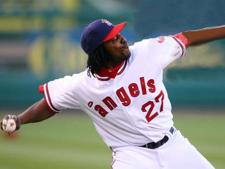
The Angels 1971 set is fantastic in every way possible. Shame it was only worn for a year, considering it looks great even to this day. The little A just looks so sharp along with the jerseys. Would love to see this sweater make a comeback as a full-time alt.
Players in the "wrong" uniforms
in Sports Logo General Discussion
Posted
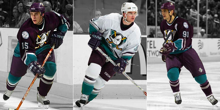
Nah man, Fed as a Duck is way weirder (Same for Lupul and Kunitz LOL):