


pokecat12
-
Posts
209 -
Joined
-
Last visited
Posts posted by pokecat12
-
-
3 hours ago, WSU151 said:
This is the same guy who thinks the awkward/bent UK logo is better, right?
Mitch's taste will be pretty awful until they bring back the big block K.
Power K BABY!!!!! There are a lot of us UK fans that miss the Power K, but usually in peoples minds now refers to the dark times when the football team was weak. I mean, they still are not where they need to be yet, but it would be nice to represent the early-mid 80's for a throwback uni today.
-
 1
1
-
-
2 hours ago, SFCOM1 said:
The latest pic from pre-LA I was able to find, was a Getty photo from a preseason game in 1981. This had Al Davis with QB Steve Plunket warming up in the background. The pic had a clear shot of the outfield at the coliseum, there where no bleachers, so the orientation of the gridiron had to be Home Plate to Center field.
Do you mean QB Jim Plunkett? Steve Plunkett was the lead singer for Autograph, but I like the way you think

-
1
-
-
Hmm. That first logo, with some modifications of course, wouldn't be a terrible logo for the Arizona Diamondbacks.Ballpark Business is reporting that the Nogales Desert Ghosts of the all-but-defunct independent American West Baseball League have apparently been resurrected as the Yuma Desert Ghosts of the proposed indy Western Association of Professional Baseball. Flynnagain Productions is responsible for designing the team's new logo package.
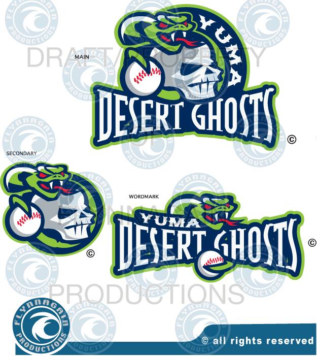
http://ballparkbiz.wordpress.com/2013/12/31/nogales-desert-ghosts-and-new-league-take-on-yuma/
Still not sure what league they're playing in, or if they'll ever play a game, but the Yuma Desert Ghosts have started trickling out their uniform design starting with their home and away caps.


But yeah. That second logo looks like a
 .
.This just brings back the UK Wildcat penis tongue nightmare all over again. Now THIS looks more like a legitimate argument than PenisTongueGate.
-
Oaklahomas Big 12 ring
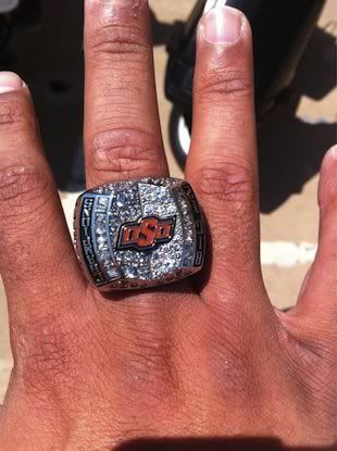
Awesome ring! But why are the logo and letters inverted?
The ring is upside down. Hard to tell but with intricate detail, but the OSU is facing outward.
Thanks for noticing that. I see the O and U correctly now. Never in the last 11 years of that logo did I notice it looks the same upside down at a distance.
-
Oaklahomas Big 12 ring
Awesome ring! But why are the logo and letters inverted?
-
That's really closer to Futura than Avant Garde, but it's kind of a mashup of both really
It's based on Avant Garde.
This is correct. The lower case "s" is what gives it away. I've had to use this to match names in the Adidas font and this is pretty spot on.

 .
.
CCSLC Championship Ring Thread
in Sports Logo General Discussion
Posted
One of the things I noticed is the Players name, Chiefs Kingdom and World Champions are in the Chiefs font. Spectacular design!