


noodlesnchips
-
Posts
63 -
Joined
-
Last visited
Posts posted by noodlesnchips
-
-
It'll be interesting to see how they paint that on the field. I don't have a good feeling as to where this is heading.
-
I was wondering the other day, I wonder if anyone has ever looked up how many time the NFL/NFC has scored in the AFL/AFC end zones and vice versa? I may have to do some research.
-
It's growing on me. They seem to have improved every year since the horrible 51 wash out job. I have to believe that was due to the turf though maybe?
-
 1
1
-
-
35 minutes ago, amkirby10 said:
So I did made my own concept of what I expect the field to look like, but it basically ended up being virtually identical to Pitt's concept, so there's no reason to post it. Just for fun, I also decided to make a couple concepts of what I would have liked to see for the game.

As you can see, the big changes were adding the conference logos to the end zones, and swapping the Super Bowl and NFL logos, so that one big Super Bowl logo would be at the 50 and two smaller NFL logos at the 25s. I've always liked the idea of the Super Bowl logo at the 50 as opposed to the NFL logo. The other changes I made were white outlines on the team scripts in the end zone. The Chiefs one was small, one pixel wide, because I thought it looked better straight on the yellow, as can be seen on the actual field. The Buccaneers one was a lot thicker, at 3 pixels, but I think it looks much better with the white outline than it did just black on red.
This concept was largely the same as the other, with the obvious changes in end zone colors, from yellow to red for the Chiefs, and from red to pewter for the Buccaneers. I also removed the white outline from the Chiefs, and changed the Buccaneers script color from pewter to red to coincide with the change in the end zone color. I like the look of the pewter end zone for TB, actually.
I'd be interested in any feedback on my concepts, if you guys liked them or not. I've followed this thread for several years now and have always found it fun, it inspired me to start making my own fields on Photoshop.
That Pewter endzone is super nice!!!
-
I just don't understand why you wouldn't want the conference logos anywhere on the field. That is so crazy.
-
2
-
-
What if they went crazy and did orange for Tampa?? What would that look like Pitt??
-
We'll have to keep an eye out on Twitter most likely.
-
Pitt6pack, have you ever thought about doing the Rose Bowl fields or maybe the BCS/Playoff National Championship games?
-
1
-
-
They should let us all design the field for the upcoming XFL Championship!!!!
-
It's been pretty difficult to get a look at the field this week. Anyone else having any luck?? I know they moved the weatherbug cam those dastardly devils LOL.
-
15 hours ago, gregor630 said:
I think a lot of us are big fans of the field styles before like SB48, which were all about the unity of design across the entire field. Conference logos for the team represented, their logos, and word mark for the year. Whether it were just the logo or the helmet logo, it was always something I looked forward to seeing. Since SB48, it's all just looked kinda random and thrown together.
In the end, it's just us nerds caring more than the average fan about how a football field is designed for a single game lol
You're probably right. We can all dream anyway though LOL.
-
1
-
-
21 minutes ago, RayFinkle said:
Crazy that I don't even really care about the game. I just wanted to see a field that pops a bit. I think this one will.
I will probably be looking at the field more than watching the play on the field. LOL. Kind of like I do when the Rose Bowl is on.
The NFL should let the Rose Bowl crew design the Super Bowl field.
-
3
-
-
1 minute ago, crosby87rules said:
Sideline boxes same color as end zones. No helmet for the 49ers, just their normal logo.
Yes sir!!!
-
3
-
-
Why do they not want the conference logos in there? Are they trying to get people to focus on the "League" and not have conference loyalty? I don't get it.
-
Confirmed: Chiefs yellow end zone!!!
-
2
-
-
Watch them not even paint the end zones like the College Championship. I shall rent my clothes and sit in a pile of ashes to mourn.
-
It's a helmet
-
2
-
-
OH MAN!!! Are they painting the numbers??!!! No helmet for the Chiefs.
-
1
-
-
4 hours ago, jc... said:
Weatherbug link is down. Must have caught us snooping.

I saw last night they had monitors set up so they may be rehearsing something and cut the feed off for that. I hope anyway.
-
I would be down with this for sure. Love those conference boxes from XL. If the Chiefs endzone was yellow or the 49ers gold...it'd be an all time classic.
-
1
-
-
Call me crazy but what if...they put the super bowl logo at the 50 like in the XXXI-XXXVII games but then put the NFL 100 logo in the endzones with the team name and logo and colors and put the team helmets on the 25's??? Just small team helmets. 2 of the 49ers on their 25 and 2 Chiefs on their 25. Down closer to the sidelines. Would that look gaudy and cluttered?
-
29 minutes ago, pitt6pack said:
Awesome pic!
Looks like a silver outline of just the 100 part, and a darker shade of blue for the NFL logo, than the 100. Doesn't look to have any 3D effects, but we have seen in past years shading and gradients added to the Super Bowl logos within the last two days before the game, when they re-paint the field. So something to look out for, but to me it looks like this is the logo they're going to go with.
Yes sir. I expect the colors to be darker/brighter depending on the shade used by the time the game rolls around. I'm sure the field will have been painted 2 or 3 times by then.
-
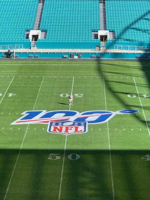
A good picture of the midfield logo. if I could figure out how to get it on here.
-
1
-
-
I think today is the day everybody!!! Will they finish off the endzones??!!! Wooohoooo!!!!!


Super Bowl Field Database - Super Bowl LVIII
in Concepts
Posted
ALMOST TIME!!!!!