


Mac the Knife
-
Posts
12,776 -
Joined
-
Last visited
-
Days Won
1
Posts posted by Mac the Knife
-
-
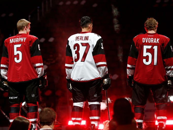
Here's what I don't understand about the Raleigh (sorry, they're Raleigh's team, I'm gonna call 'em that) Hurricanes... I'll do the same for the Charlotte Panthers...
What happens when, inevitably, the organization has to part company with Brind'Amour, presuming they have to fire him? The team already has already spent the past decade alienating its fan base. Right or wrong, the Ron Francis firing was handled with about the same tact Jerry Jones used when he dealt with Tom Landry back in '89. Brind'Amour's a great guy and popular with the few fans the team has left - what happens when they have to ****can him?
-
"With the second pick in the 2018 NHL Draft, the Carolina Hurricanes select...
SpoilerBaker Mayfield, Quarterback, Oklahoma."

-
 1
1
-
-
On 3/7/2018 at 10:23 PM, the admiral said:
Well, apparently Raleigh is gonna have a lot of stupid hockey!
Nothing new there... and we won't have it for that much longer. This guy's ultimately going to move the team or sell it to someone who will.
On 3/21/2018 at 5:15 PM, Ice_Cap said:Because despite the insistence of the southern fans here on this site? They really do have an inferiority complex compared to any NHL market north of the Mason-Dixon line.
Only when it comes to hockey itself. But rightfully so - the southern markets are, by and large, inferior when it comes to pro hockey.
5 hours ago, LMU said:They're following the "bolt the South to resurrect a beloved Canadian franchise" model. Vive les Nordiques!
Again, let us have a Major League Baseball franchise, and the Hurricanes can go anywhere. I'd jettison them, the Durham Bulls and the Carolina Mudcats in a heartbeat to get the A's to move to Raleigh... or even the (Devil) Rays, provided we could rebrand the team when they moved.
-
I came across the Philadelphia Soul's 2017 ArenaBowl ring today. Wow. Did they really put a big budget into that one.

-
Unpopular opinion: where football jerseys are concerned, with rare exception, all jerseys that don't use the old-school, varsity style numeral font? Suck.
-
2
-
-
1 hour ago, FinsUp1214 said:
Nope, I assure you I’m fine. I just have a different opinion than you and that should be okay. Thanks for the concern though.
")

Aw, c'mon... if that guy's not the epitome of "70's macho despite wearing a friggin' hoop earring," what is?
-
On 3/8/2018 at 2:25 PM, DNAsports said:
There should be more gray alternates in the NFL.
Get rid of the color rash, and I'd be all for it.
On 3/9/2018 at 2:32 PM, daniel75 said:Devil Rays name and colors are far superior to the Rays.
I'll back you up on this. Every time I hear "Rays" I don't think sun. I think of my brother in law. Or Ray Romano. If they *had* to rebrand, which they didn't, they should've went with Stingrays, or went all the way and picked something so completely different that it never would be considered similar (e.g., the Houston Colt .45's going to Astros).
On 4/4/2018 at 10:51 PM, kroywen said:Okay, unpopular opinion: I grew up during the 90s, and I hate the retro 90s trend going on right now. Fashion was never tackier than in the 90s, and sports uniforms epitomized that.
The "let's go back 20-30 years" thing has been going on my entire lifetime. In the 70's the 50's were retro. In the 80's, people thought it cool to either look like hippies, or go the complete opposite direction and call themselves 'yuppies.' Fashion in the 1990's was nothing compared to the 70's when it came to being tacky - including when it came to sports uniforms... and with respect to the latter, the NFL of the 2010's alone makes this decade dwarf every past decade, in all sports, combined.
On 4/7/2018 at 1:53 AM, Jimmy Lethal said:While it needs some green in there, the orca is the best logo the Canucks have ever had.
Because nothing epitomizes Johnny Canuck like a whale. It's like Uncle Sam being represented by a rabbit.
On 4/11/2018 at 12:48 PM, SFGiants58 said:I know now that I’ll get heat for that opinion, but I’ve long felt this way. The “Browns” name should rest in the same grave as the Oilers’ identity.
Also, Baltimore Ravens > Baltimore Browns. When a local name is that good, you can’t pass it up.
I won't argue with you on Ravens > Browns, but I'll take the rest of the argument in the opposite direction and suggest that not only should the Browns identity not have been mothballed, but that Bob McNair should've demanded that for his $700 million franchise fee, Houston should've got the Oilers name and branding so as to revive it. I've got nothing against the Houston Texans, but the Houston Oilers identity and brand were inconic, even when the team sucked wind.
On 4/12/2018 at 10:25 AM, KRZYBDGRZ said:Ok I just found out that my high schools hockey team is using the buffaslug home jerseys, with a new logo on it. Is it wrong that I love it?
You love the jersey design? No problem. You love the Buffaslug logo? See below.
24 minutes ago, FinsUp1214 said:Best logo the Pirates have ever had:

You should, immediately upon reading this, go to Google, look up your nearest psychiatrist, call them and arrange an appointment. Because you are in obvious need of help.
Now, my unpopular opinion, in the form of a question:
Where's a John Wilkes Booth, Charles Guiteau, Leon Czolgosz or Lee Harvey Oswald when you really need one?
-
-
On 2/10/2018 at 9:37 AM, tigerslionspistonshabs said:
Connecticut Governor invites the Hurricanes to play a home game in Hartford next season
As someone who has lived in Raleigh longer than the Hurricanes have? They're welcome to play 41 games a year there next season if they like. The only caveat? We get a Major League Baseball team in trade for 41 games. We'll even take the Marlins.
-
On 8/16/2017 at 5:04 PM, TrueYankee26 said:
Patriots 5 super bowl wins were against animal mascots. 1 Bovine, 1 Feline, 3 Birds.
Only one against Eagles, though... and not the latest one.
Here's one: of the 18 franchises to be part of the Arena Football League in 2011, only one remains in that league today - the Philadelphia Soul.
-
6 hours ago, BrandMooreArt said:
translating all that into visuals, i can imagine 2 different strategies. 1) traditional and professional - with the NFL/Nike pushing variations and abominations of team identities, a very simple approach to teams would appeal to the audience they’re speaking to and represent a purity if football
2) design of the future. represent the league in a way that feels forward thinking and innovative. league uniforms that would be inspired by Oregon, or totally re-think what a football uniform needs. maybe there a cold/warm weather gear set or the inspiration comes from somewhere else, like track or speed skating.
I agree with this assessment. While I expect the color schemes to be a little on the outlandish side, the overall branding is going to seem way toned down from XFL 2K1 - more traditional. Fewer Memphis Maniax and Los Angeles Xtreme, and more Boston Breakers and Oakland Invaders. A less is more approach.
-
1
-
-
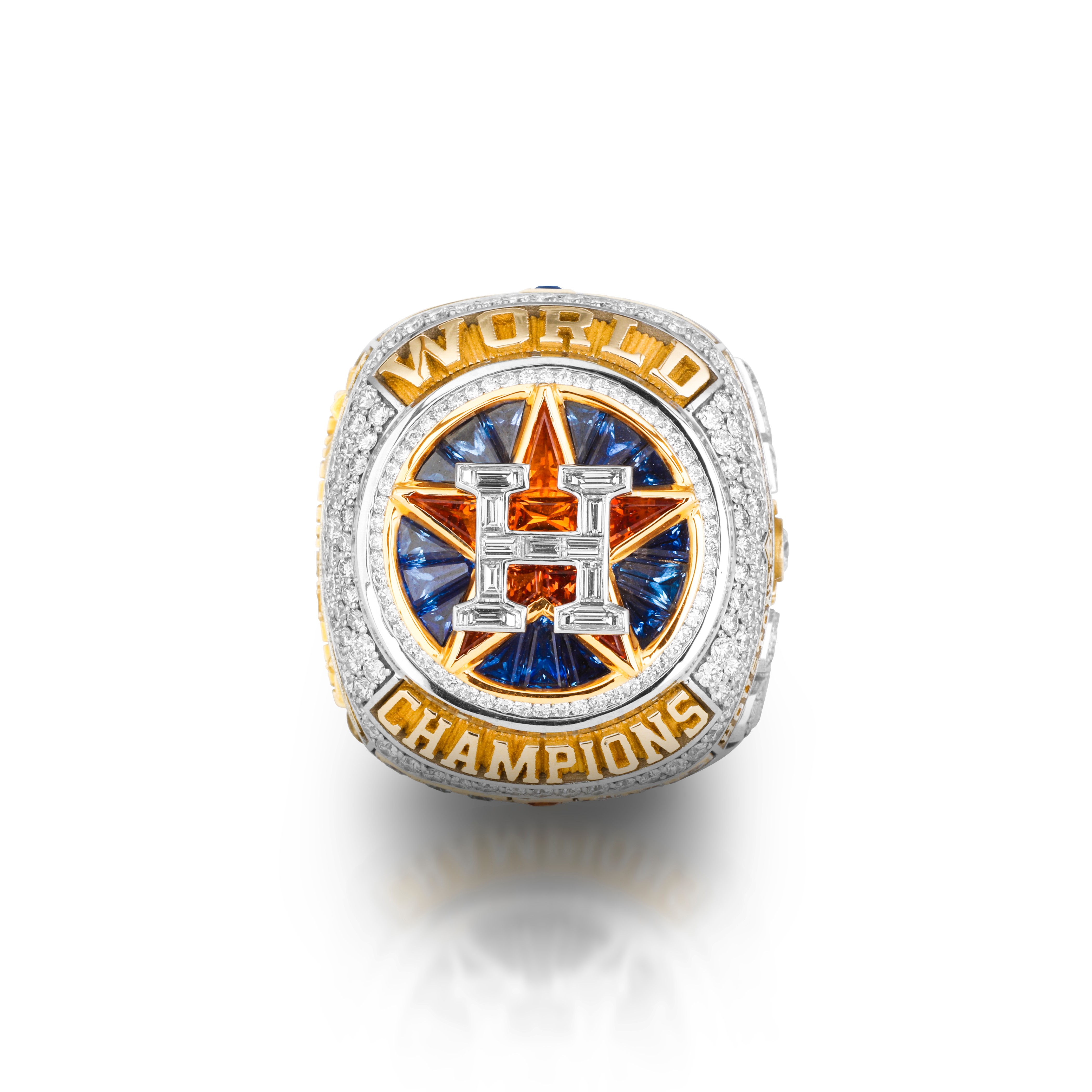
What do you suppose the odds are of, instead of incorporating team-specific elements on the ring top, the Panthers or Broncos opt to really emphasize the SB50 logo as the centerpiece? Unlikely perhaps, but it'd sure make the 50 ring distinctive from its predecessors.
-
On 1/11/2016 at 0:21 AM, Bucfan56 said:
Possible leak of the Royals new rings?


 On 1/11/2016 at 3:33 AM, Championship Sports Rings said:
NO Way. That ring is being sold on ebay as a fan ring. No way Jostens or who would be making the auctual rings for the Royals would let it slip.
I've got to say... that's one helluva fan ring then. Best one I think I've ever seen.
-
1
-
-
I am okay with the baseball world series, but american football champs have no business calling themselves world champs it´s just lame, the game is played literally nowhere else in the world.
Canadians would disagree with you, as would Brits and Germans, but I digress...
If it's played only one place on Earth, by default its champions are world champions, no?
-
Which design to do you like the best?
Me, I like the one on the right, kind of pops more than the other two!

Is it possible to both like and dislike each and every one of these at the same time?
For example, the "World Champions" layout on the ring at left is done in a beautiful font, but the rounded shape of the top of the ring I'm not as fond of. The middle ring meanwhile has a solid, traditional (by 21st century standards) style'd top, but lacks character. The ring on the right suffers from the same traits. Had the Giants incorporated that gold "World Champions" encirclement on all three rings, but in a block form akin to the shaping of the middle ring, plus utilized the interlocking "SF" layout from the third ring (at right)? They'd have one dynamite looking championship ring. As it is, they have three decent, but rather bland looks that I don't think will stand the test of time design-wise.
-
I was actually surprised the Seahawks rings were as similar as they are. The '14 ring is a significant drop in styling however, and sends a bit of motivational statement of its own if you think about it.
-
Any idea what the Yotes are using?
Yeah. The City of Glendale's money.

-
National Football League 2016
American Conference
North Division - Cincinnati, Cleveland, Indianapolis, Pittsburgh
South Division - Houston, Jacksonville, Miami, Tennessee
East Division - Baltimore, Buffalo, New England, NY Jets
West Division - Denver, Kansas City, Los Angeles, Oakland
National Conference
North Division - Chicago, Detroit, Green Bay, Minnesota
South Division - Carolina, Dallas, New Orleans, Tampa
East Division - Atlanta, NY Giants, Philadelphia, Washington
West Division - Arizona, Los Angeles, San Francisco, Seattle
-or-
American Conference
North Division - Cincinnati, Cleveland, Indianapolis, Pittsburgh
South Division - Houston, Jacksonville, Miami, Tennessee
East Division - Baltimore, Buffalo, New England, NY Jets
West Division - Denver, Kansas City, Los Angeles, San Diego
National Conference
North Division - Chicago, Detroit, Green Bay, Minnesota
South Division - Carolina, Dallas, New Orleans, Tampa
East Division - Atlanta, NY Giants, Philadelphia, Washington
West Division - Arizona, Los Angeles, San Francisco, Seattle
-or-
American Conference
North Division - Cincinnati, Cleveland, Indianapolis, Pittsburgh
South Division - Atlanta, Jacksonville, Miami, Tennessee
East Division - Baltimore, Buffalo, New England, NY Jets
West Division - Denver, Houston, Kansas City, Oakland
National Conference
North Division - Chicago, Detroit, Green Bay, Minnesota
South Division - Dallas, New Orleans, St. Louis, Tampa
East Division - Carolina, NY Giants, Philadelphia, Washington
West Division - Arizona, Los Angeles Chargers, San Francisco, Seattle
-
I'm not too impressed with Jostens these days. They keep rehashing old designs like crazy. The ring looks nice, but I'm a fan of having color in it. The Blackhawks first 2 rings were better. Especially the 2nd
The teams have as much to do with ring designs as the manufacturers nowadays. Odds are whomever was making the decision saw a previous ring and said, "I want something like that one, but for us."
What’s Wrong With the Chicago Blackhawk’s Championship Rings?
Their last three Stanley Cup rings are shown below; the oldest on the left and the newest on the right. They show a disturbing design trend:
(Click picture below for a larger picture)

In my opinion, the Blackhawk’s championship rings are getting progressively worse.
The 2009-10 championship ring, shown on the left, is a gorgeous ring – perhaps one of the finest Stanley Cup Rings ever made. It’s huge, packed with diamonds, and displays the team’s logo and a Stanley Cup trophy.
Although the top lacks any color, the sides contain yellow gold and complement the championship ring quite well.
The middle Stanley Cup ring, from the 2012-13 season, has a center red stone and in my opinion is a downgrade from the team’s previous championship ring. This ring also contains color on the side, and typically when a team wins a second championship in a short time span, the championship ring is almost always larger and contains more bling than the first ring – except in this case.
The team’s most recent championship ring, from the 2014-15 season looks to be slightly larger than the middle ring, however, the lack of color on the top and sides is a glaring omission.
The latest championship ring could certainly use some color as it contains a sterile, non-creative design.
All three championship rings were designed and manufactured by Jostens, and as I said before, looks like these Stanley Cup rings are heading in the wrong direction.
What do the members think? Any thoughts or opinions?
I honestly prefer the '15 ring to the other two, with the '10 ring second and the '13 ring (with the red) looking (at least in the depiction) just God awful. To be original with the '15 ring, I'd probably have done the hair and feathers in stones of their respective colors - it would have really given it some uniqueness and some 'pop.'
-
The Marlins were named for Florida because Wayne Huizenga is one of those Broward County snobs who thinks Miami is just a cesspool of drugs and ethnics.
What about Florida Marlins, which sounds a lot better than Miami Marlins IMO
I think they both sound fine but Miami works better now as in present day for a couple of reasons. They aren't the only MLB team in Florida anymore as they were when they were created. Also, they're now literally playing in the city of Miami, as they used to play an hour north in Miami Gardens, technically a different city and even a different county. Also, there were legal issues with the city of Miami asking for the name change as a perk for helping to build the new ballpark. All of these things are well known, so I'm sure most knew all of this. But yes, Florida Marlins sounds wonderful as well, probably better honestly.
But I'll add a fun trivia fact... when the team was created in 1991, the first owner actually wanted them to be specifically called the "South Florida Marlins"... the Miami name was involved as well but the Florida name was chosen because they predicted (correctly) that in the future a second Florida team would be born and they wanted to kinda grab fans from all over the state before that 2nd team could build its fanbase. In a sense, it worked.
Actually, Huizenga wanted initially to name the team the "Florida Flamingos," complete with a predominately pink and black color scheme, but fortunately someone talked him out of it. He also wanted to use "South Florida," but MLB's marketing arm nixed that.
Oddly enough, there's only one professional sports league that regulates whether a team is required to use a city name vs. a state name vs. a regional name... the Arena Football League.
-
What about Florida Marlins, which sounds a lot better than Miami Marlins IMO
How?
Florida Marlins rolls off the tongue.
What about Florida Marlins, which sounds a lot better than Miami Marlins IMO
They were created when there were no other MLB teams in Florida
And they changed it soon after there was another team in Florida.
Also, there are 7 states in the US that have and will have more than one pro team per league in each state:
California
Florida
Missouri
New York
Ohio
Pennsylvania
Texas
Of the teams in those states (not counting New York), only two currently use the state names (Texas Rangers and Florida Panthers), and those two teams are named after something. To me, California Kings sounds just as good as the LA Kings (and better than the unabbreviated Los Angeles Kings). Adding in teams that recently changed their names, you have the California Angels, California (Golden) Seals, and Florida Marlins. All of which sound good.
Some work better than others, and for different reasons. "California Angels" worked, for example, as it distinguished the franchise from the Los Angeles Dodgers and had a unique identity (no one else was using "California") all its own. "Texas Rangers" worked due to its connection with the law enforcement agency. "Colorado Rockies" worked because of its previous use by the NHL as well as memories of John Denver's song "Rocky Mountain High."
"Florida Marlins" was a bad choice, but honestly they should've stuck with it. "New England Patriots" was a bad choice, but it was picked on the fly after a poorly conceived effort to rebrand as the "Bay State Patriots." "Golden State Warriors" was devised as a means of enlisting support in Oakland while not pissing off San Franciscans too much. "Carolina Panthers" was a futile attempt at extending an expansion team's fan base not only across the North/South Carolina state line, but to further eastern and coastal cities where it had no chance of succeeding.
By and large I'm a fan of "regional" names, especially in cases where the team's not playing in a "large market proper" (e.g., Anaheim, Arlington Texas). But in as many cases as not, the reasons behind that branding don't seem to pan out.
-
During the 1984 calendar year, Tampa Stadium hosted two pro football league championship games.
-
1
-
-
Anyone want to talk about the design of these rings? What a cool picture and tweet!

________________
What has to be the absolute first championship ring ever produced, shown in the center of the photo above, the Hockey HOF features the first championship ring ever presented - back from 1893.
Look how different that championship ring is from today's mega-blinged out championship rings!
Although my championship ring blog does not cover Hockey rings as much as it should, the last decade of Hockey championship rings rival Pro Football and Baseball's finest championship rings.
I'll begin with the disclaimer that I'm a lifelong Penguins fan, but even without that link I thought the Pens cup rings depicted are impressive. The 1893 ring is wonderful - simple, understated, yet a fitting emblem of a champion.
-
Of all the original American Football teams, the Chiefs are the only team that won both an AFL title and the Super Bowl.
If you count the 1960-62 New York Titans and the 1963-69 New York Jets as separate AFL franchises, which would make you the only person ever to do so.
-
1
-


Minor/Independent/Collegiate League Baseball Logo/Uniform Changes
in Sports Logo News
Posted
Nice to see OT Sports get some business... that catfish just looks wrong in Brewers colors, though.