


cubsfan2015
-
Posts
856 -
Joined
-
Last visited
Posts posted by cubsfan2015
-
-
 ,I've now dropped to 2 stars. How the hell does that happen?
 -
Frekkin BPL logos.
-
-
Another one about the NFL:
I like the old Chargers jerseys better than the new ones. Something about how that lightning bolt looks on a darker background. I just think it's cool.
It is cool. I don't think it's unpopular to like the navy blue Chargers. The powder blue is really great, but the navy blue is still great, too. It's like Van Halen and Van Hagar.
What about that other singer for Van Halen that we always forget about?
But anyway,Solid Blue Chargers are such a beauty.
-
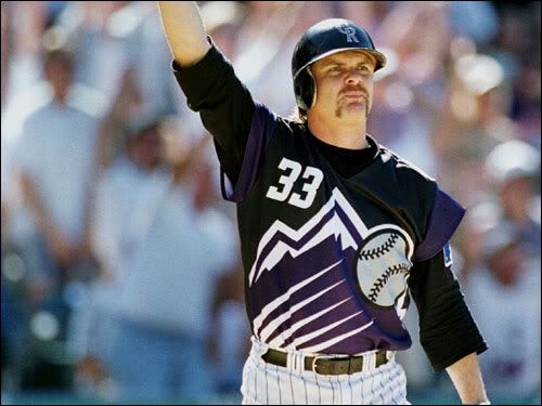
I loved these:

-
I don't know if this is unpopular,but I like patches.
-
Ya know whats odd? The first one.
They didn't have cool designs like in this day and age so the went like a typical ring (AKA wedding ring).
But i think 2007 is my favorite for some reason.
-
David Price:

-
I think the Marlins need to go back to the old logo,uniforms and stuff. It was so beautiful.
That's not unpopular.
Me thinking that the Thunder logo isn't hideous is unpopular.
-
I think the Marlins need to go back to the old logo,uniforms and stuff. It was so beautiful.
-
 1
1
-
-
Is anyone else having trouble with IE as far as quoting and cut/paste? I can't do either on IE. I've tried it on Google Chrome and it works fine.
I've tried it on IE and it dosen't do
. So that's why I use Chrome full time now. -
When I think red on the Wild's alt,I think of all of the preadtor's meat that the wild animals would eat.
-

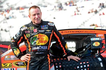
Kyle Petty


One of many uniforms that look unusual on Mark Martin.
Speaking of that....
Kurt Busch in Indycar

-
500 posts.When can I change my member title?
EDIT: hey, my 2000th post.
Near that.
-
When can I change my member title?
-
If there is a like button,why not a dislike button?
-

that right there is some pretty good concepts
btw,what do you use?
-
Spurs:feista court,but normal logo
What kind of fiesta, the baseline one or the 90's teal/pink paint area?
80's pacers with wordmark at center and blue half and yellow half
With white lines I suppose? Please specify it more like how TV15 requests.
Or would you like me to do my thing w/ your requests?
90's era,and i want it on the court,for the baseline,i want the regular black and sliver
for the pacers,i do want white lines,but for the baselines,i want half blue and half yellow
-
NASCAR Ortho Van Series.
-
80's pacers with wordmark at center and blue half and yellow half
Spurs:feista court,but normal logo
-
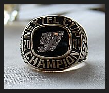
Jeff Gordon's 1997 Winston Million ring

1997 Brickyard 400 winner Ricky Rudd's ring:

2002 The Winston Champion Ryan Newman's ring

Kurt Busch's 2004 Nextel Cup ring:
-
-
-
In reality, the "One Day" uniforms would have looked like this:
Wait. So you mean to tell me that they would've introduced a logo with even more black in it than the one they use now, yet run with a jersey set completely devoid of even a hint of it?
What is it with this franchise and their apparent inability to use black correctly?
You forgot their black-included unis first used in 1993 or 1994.
 ,I've now dropped to 2 stars. How the hell does that happen?


Unpopular Opinions
in Sports Logo General Discussion
Posted
I agree with you.Miami Marlins sounds better,IMO,but state names are awful like the Clippers logo.
Also,why call the Patriots from New England?Just should have kept the Boston name,or the unpopular 1-month "Bay State Patriots" name in 1970.