


alecgoff
-
Posts
187 -
Joined
-
Last visited
-
Days Won
1
Posts posted by alecgoff
-
-
Possible Hint at the Knicks City edition uniforms from this T-shirt. Looks like 70's and 80's inspired logo with black drop-shadow from the 90's and 00's.
-
 8
8
-
-
What a great design, but it just needs to be put in the wash!
-
3
-
-
-

Jersey looks good, but the "S" looks a little over-sized.
-
6
-
-
Jersey looks good
-
9
-
-
Missed opportunity to bring back the red igloo and red number outlines.
-
5
-
-
Here we go. Giving me a lot of Heritage Classic Winnipeg Jets vibes with that striping pattern
-
Looks like just a "logo" reveal, an not the actual jersey
-
3
-
-
Most importantly, they are using era-accurate helmet decals. In the past, they haven't been as meticulous with their color rush uniforms.
-
2
-
-
-
Where have I seen this font before?
I can spot the difference, but its just too close...
-
12
-
-
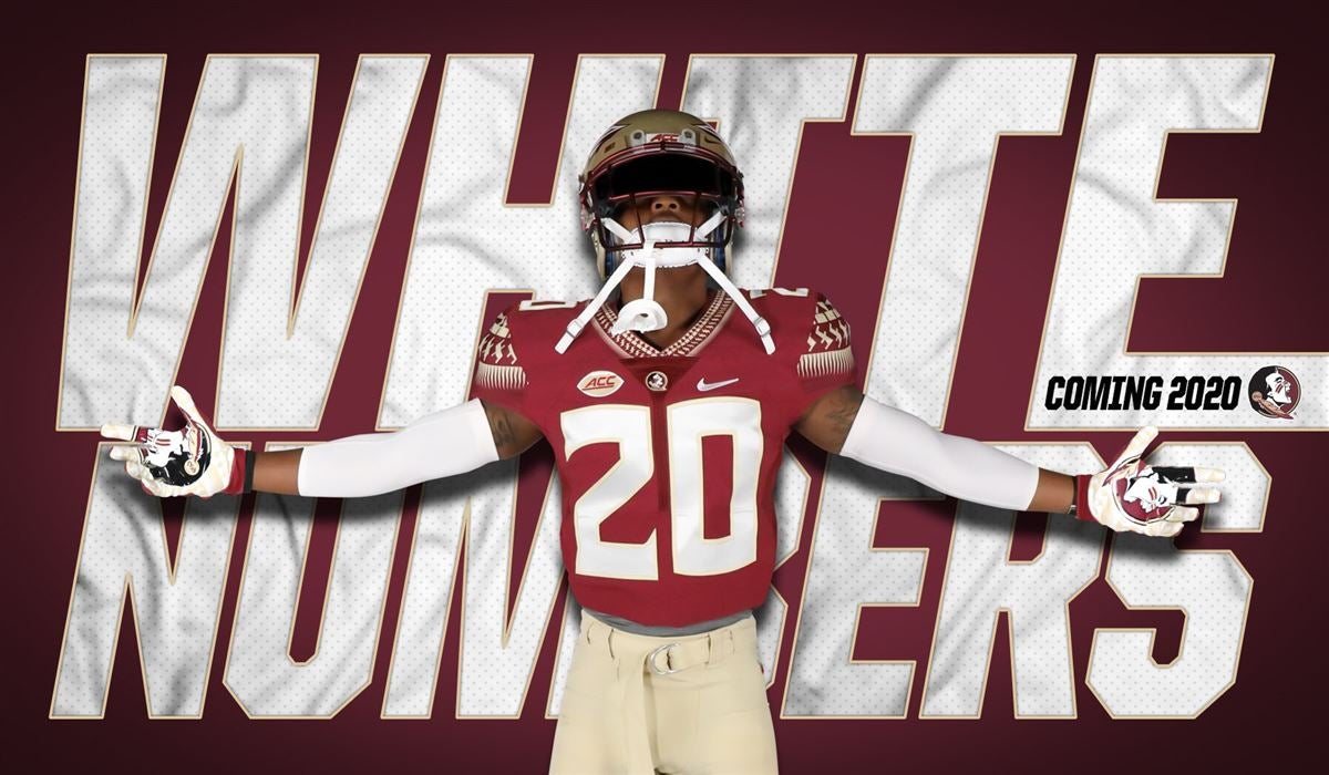
It was announced a while back that Florida State is finally going back to white numbers on their home uniforms. Now they won't look like Boston College and hopefully they'll stop playing like them too...
t
-
15
-
-
-


 Jersey looks good


2021-2022 NHL Jersey Changes
in Sports Logo News
Posted
New Islanders UBS arena inaugural season logo.