


JuicedSportsNow
-
Posts
50 -
Joined
-
Last visited
Posts posted by JuicedSportsNow
-
-
4 hours ago, BadSeed84 said:
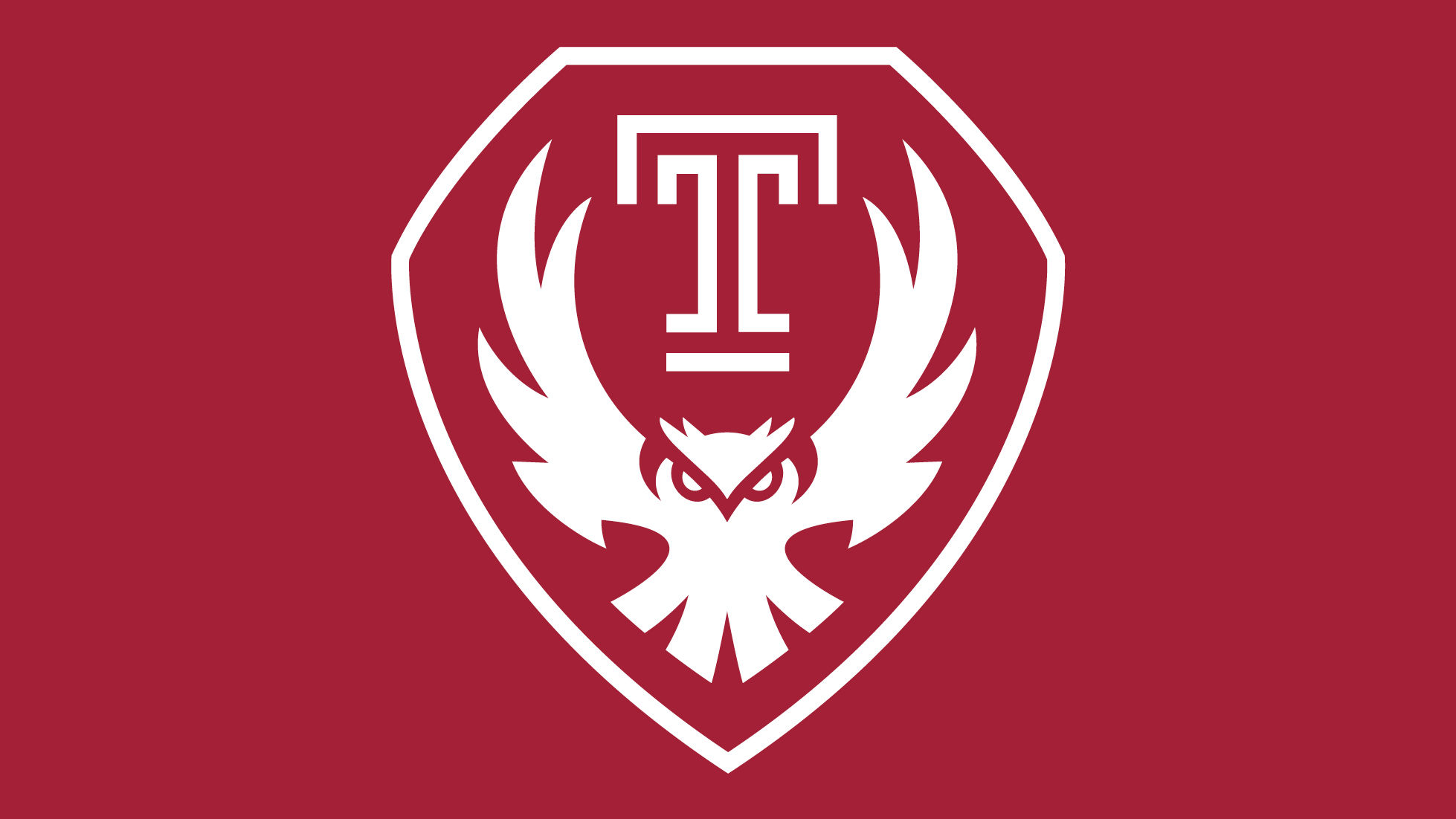
Temple has replaced their athletics logo.
https://news.temple.edu/news/2023-07-31/new-logo-signals-new-era-temple
I really like this, the old one while classic had overstayed its welcome (and they hid have the head behind OWLS lately I see.

I really enjoyed the article about this new mark. An excerpt:
"Leading sports branding strategist Joe Bosack, TYL ’94, founder and creative director at Joe Bosack and Co., was tasked with refreshing his alma mater’s athletics logo. “I’ve worked on brand identity for athletics departments at hundreds of colleges and universities across the country, but when Temple reached out, I was thrilled for the opportunity,” Bosack said.
To develop the mark, he set out to recreate the genesis of the T by involving students. Throughout the 2021 fall semester of Associate Professor Bryan Satalino’s senior capstone course in graphic and interactive design, Bosack worked alongside students creating drawings, responding to feedback from focus groups of alumni and stakeholders and presenting final designs to university leadership.
For Brett Sweeney, TYL ’22, the most interesting aspect of the class was being able to test the designs on real people. “One of our most beloved logos didn’t read well with the focus group—they said it was more of just a bird than an Owl,” said Sweeney. “But then we had a chance to adjust it.”
New mark signals a new Era-
 1
1
-
-
5 minutes ago, AstroCree said:
Their new uniforms look fine. I can't wait for the Suns to NEVER wear them in favor for some gimmicky city shirt that says "DESERT CACTUS" or something.
lol
This year its gonna be El Valle. Another black jersey to go with their PHX one.
-
2 hours ago, McCall said:
Yeah, I don't get why they had to put those on there. They've felt random and out of place on the last few sets, but even worse so on here because there's so much else going on.
And looking at this full uniform shot, I believe even more now that the ball needs to be orange. Too much white and too little orange on the jersey, and vice versa on the shorts. Especially with the aforementioned spikes.
Their love affair with those darn spikes is annoying as it really doesn't mesh well with this new, line heavy set. I saw that yesterday and cringed. Its just an unnecessary carryover, like those silver Utah side panel things on their uniform.
All of that said, this definitely pushes back against the 'minimalism' movement that the Cavs/Jazz went towards. I think its important to have a pendulum that features a mix of looks. In that regard, its a winner.
-
1
-
 1
1
-
-
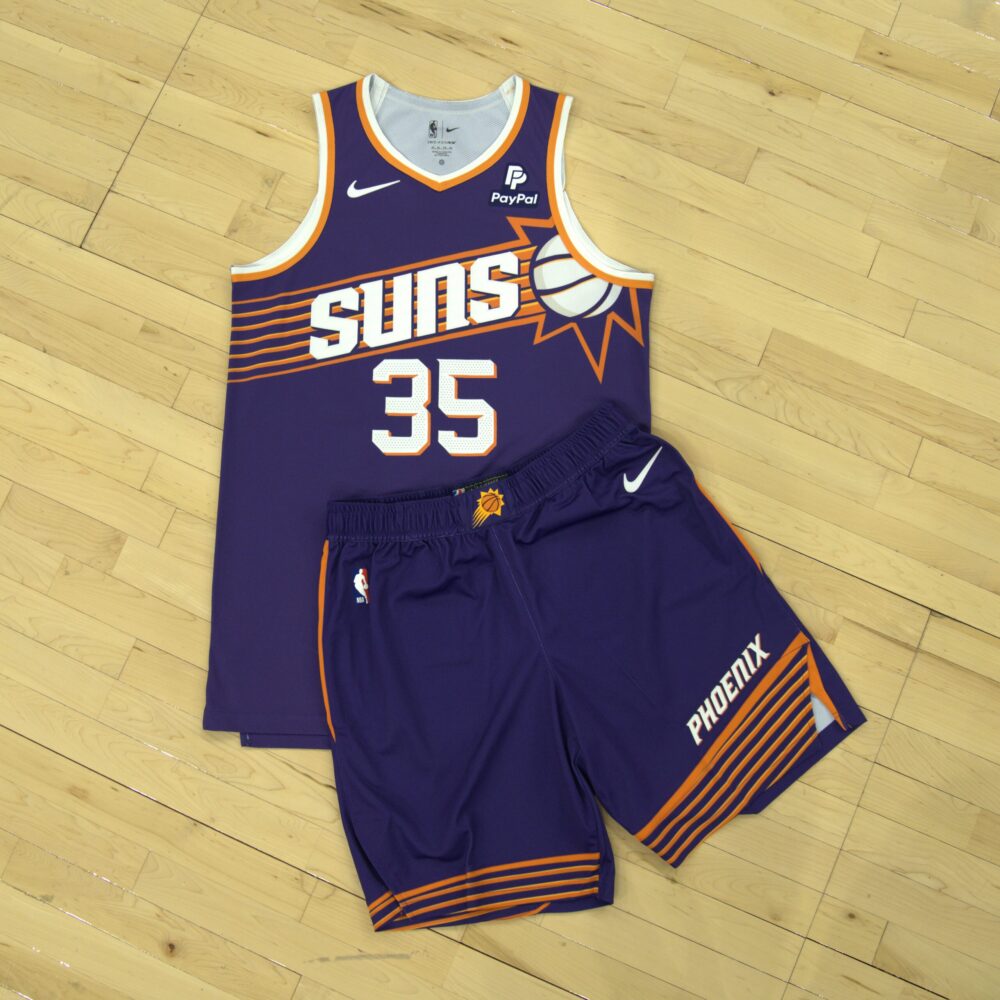
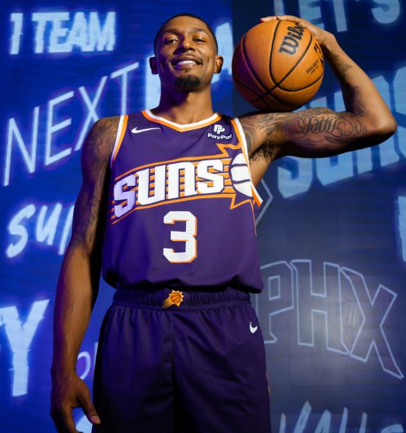
2 minutes ago, JuicedSportsNow said:
New:
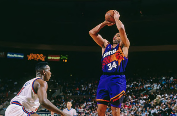
For context. This was the look the Suns introduced in the mid 2010s
And the 90s Sunbursts
it's basically a merger of the 2010s and the 90s to create a modern look.
-
3
-
 1
1
-
-
10 minutes ago, Lights Out said:
The way the ball is cut off so we can barely see any of it is going to bother me forever. It's a shame, because otherwise, this is a great update of the classics. Much better than the last time they tried to do that.
New:
For context. This was the look the Suns introduced in the mid 2010s
And the 90s Sunbursts
-
1
-
-
2 minutes ago, VampyrRabbit said:
Is it just me, or is the shade of purple darker on the shorts than the jersey? And if it is, then how have Nike not managed to colour match the uniform properly?
It certainly looks that way, but it could be the lighting.
-
2
-
-
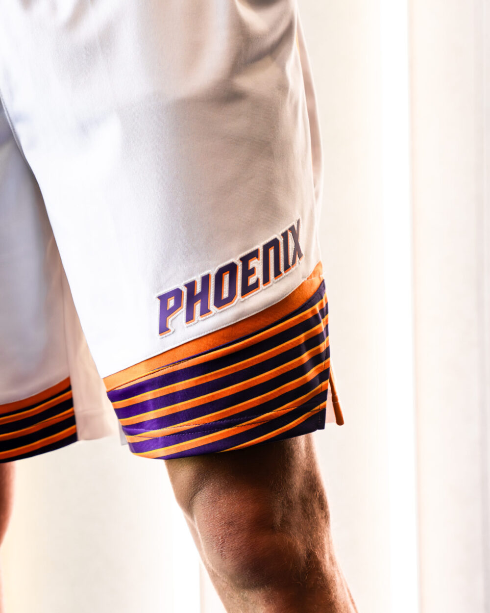
2 minutes ago, JuicedSportsNow said:
New Suns jerseys have been officially unveiled.
-
5
-
-
New Suns jerseys have been officially unveiled.
-
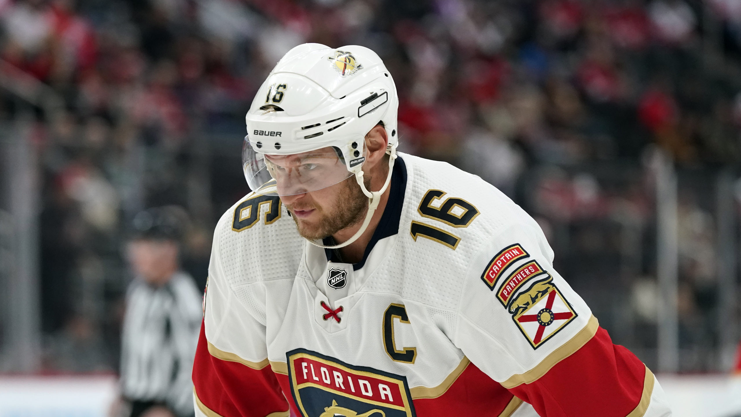
10 minutes ago, tBBP said:
I'm inclined to agree with you...to a point.
I DEFINITELY agree with you about the leaping panther. I feel the basic essence of that could have been updated more in the artistic style of the current (read: less detailed, more refined)—which is pretty much exactly what they did with their 30th anniversary logo.
I don't dislike their current primary crest; I'd have preferred one more like the above.
Secondly, the tawny brown definitely adds something that the former yellow did not, but least among which is of course the fact that a number of the panthers found in Florida are that color (or close to it)—although the tradeoff is losing the "brightness" of the sun. Eh...design considerations.
Where my point stops, however, is with the sweaters themselves. I do agree that the triangular yoke could have become a staple feature of their look (along the triangular shape of the leaping panther). That said, something about triangular yokes and normal horizontal stripe never has seemed "right" to me—but that's also relatively minor. The big thing to me dealt with the backs of those jerseys—especially the white ones—and in going back to the Year of the Rat and working back up, it really jumped out at me how Walmart-esque they looked:
Now they eventually tightened that up by the turn of the century, but for some reason they kept the offset outlines on the white sweaters, which didn't help the "cheap-ish" look at all:
(That was a good-looking sweater)
(Those...not so much.)
That said, that era also gave us one of my favorite (and I believe one of the best) third jerseys/alternate uniforms ever in life:
Look at that...simply gorgeous.

Now, with all that said, even though I feel the Panthers may have overdone it with the 101st Airborne branding direction, I'll give them credit for at least jumping in with both feet and really owning it. It did create some rather unique cues in NHL aesthetics that as of right now only they can claim, chief among them being the shoulder-mounted TV numbers, but then also their unique way of designating their captain and alternates via the "ranger tabs" above their sleeve patches.
I also really like, clever as it is, how the scripts switch between FLORIDA and PANTHERS depending on placement on the jersey itself and between home and away jerseys.
I actually REALLY like their current look, but the one part I don't care for is how that broad stripe doesn't wrap around the back. (To be sure, I can't stand that on soccer jerseys, either, though I understand the reason for it.)
I do wonder how different the white sweaters would look with red numbers in place of navy... though I'm sure that choice for better legibility. But with all that's rolled into this look I don't know that there's a more cohesive(ly complex yet streamlined!) brand, top to bottom, in the NHL right now than this one.
(And now we may all dig ourselves out of the weeds on this one...lol.)
This was awesomely thorough. As a Panthers fan since the 90s I appreciate the depth you went into and then realized you're a Knights fan, which certainly surprised me. Congrats on the Cup. I agree that the system is surprisingly layered and complex while looking simple and I appreciate how the Panthers have a more polished color scheme. I do think eventually they'll throw the modernized cat on the jersey, but I also sense they're wary of it being more popular than the shield and are trying not to reignite that discussion.
-
 1
1
-
-
16 minutes ago, DJT said:
Do we know when the Suns are showing their new uniforms? I thought I saw fans/season ticket holders were getting a sneak peek sometime soon.
I'm expecting them to drop/further leak by late July. One Reddit user said they were invited to an 'Exclusive Preview' on the July 23rd but that there was no cameras/phones allowed. Really hoping they do a nice job with the streaking Sun as the mockups have been all over the place.
The latest rumor is that Suns will be inside the burst lines.
-
I want to like the Statement jerseys, but the new Sacramento font would've been so much cooler. This just feels too random from the two new jerseys they released, and the purple and black look kinda muddled as a gradient. Not a huge fan, though I've definitely seen much worse.
-
6
-
-
1 hour ago, TaylorMade said:
Magic 35th anniversary logo
https://www.nba.com/magic/news/orlando-magic-unveil-new-logo-for-35th-anniversary-season-20230615
I genuinely like the logo and I think its clever...
That said, is the official 35th Anniversary logo of the Orlando Magic actually 'sponsored?' Like the official logo is actually sponsored? Because if so, that's further proof of unending ad-creep.
Anyways, cool logo. Will they be rocking the classic jerseys this coming year?
-
4
-
-
huge improvement the last few years. It's fun to actually look forward to the reveal again. I like the mix of colors.
-
2
-
-
3 minutes ago, spartacat_12 said:
Why is the wordmark arched so drastically? The originals didn't look like that and it just leaves a ton of empty space along the sides.
Also, why is the number so tightly placed to the wordmark? The originals had space and looked better...
-
22 minutes ago, spartacat_12 said:
I think they were ambitiously trying to create a 'global brand' that had mass appeal beyond the state of Utah. And the tech space loves the extreme minimalism when it comes to design, so I can see why they thought a black & white J note was the way to go.
From everything I've gathered, this is accurate. It was an ambitious idea, but alienating your own fans in service of 'hypothetical' non-regional fans is a big swing with a brand this generic. Plus, as we all know, winning + marketable stars is what ultimately brings in new fans...-
6
-
-
38 minutes ago, JuicedSportsNow said:
Jazz rebrand already being trashed in their own newspaper haha
Andy Larsen: The Utah Jazz’s new jerseys are awful — and clearly, the team knows that
From the article: "At first, Smith wanted the team to rebrand to simply black and white, but the league office and Nike refused that, seeing as the San Antonio Spurs and Brooklyn Nets already own that color scheme. Their compromise was this: the Jazz could go to black and white if they added a third primary color. So instead of choosing any one of the colors the team had already worn, he picked a new one: a unique highlighter yellow."
Jazz didn't even want yellow. But they had to pick something. Did they go to the 2014 Nike Store when they did it?-
4
-
-
Jazz rebrand already being trashed in their own newspaper haha
Andy Larsen: The Utah Jazz’s new jerseys are awful — and clearly, the team knows that
-
4
-
1
-
-
19 minutes ago, Discrim said:
Looking at the black, volt and white...I gotta applaud the Jazz here. They've managed to create something that has brought the OKC Thunder's long stranglehold on Worst Uniforms in the NBA to a screeching end.

Here's my theory: This is similar to what the Hawks did when they unveiled volt. They basically said, the red and the pac man logo is here to stay, but we're going to mess around with everything else over time -- remember, volt was being pushed hard by Nike at the time. My guess is that the Jazz are trying to do the same thing. They simplified the note logo, started slipping in purple after the leaks got horrible reception, and over time are going to stick with the 'minimal' logo and purple and tweak (or overhaul lol) everything else around it like the Hawks have.
But here's the issue:
These jerseys feel like a prototype that someone rushed because they forgot. They clearly put thought into their future purple jersey (which is a cool take on the classic they'll be shoehorning in this season), so why would they create a brand around it that's do disconnected? The black, white, and yellow lacks any personality or visual excitement, unless glowing in the dark and looking like a highlighter is your idea of a good time. The side cutoff stripes on each jersey is... I guess a callback to their previous cutoff striping, but is so subtle and such an afterthought that even that feels thrown in?
Unlike the Hawks, they brought nothing interesting to their primary 3 jerseys. At least the Hawks tried with the feather pattern and color combos. And while they failed, they've been consistent with some variation of red, yellow, black ever since. That is the Hawks now after their dalliance with red, navy, and silver. Whereas this is practically a paint by numbers, straight out of the catalog, rejected by Oregon/Baylor practice uni collection.
Curious to see how sales are this season for the Utah Jazz.
-
5
-
-
15 hours ago, officeglenn said:
That's one of the best All Star game logos in any sport that I've seen in some time. And I love how the font is a non-traditional font. The palm trees as the Ls and the way everything is pieced together *chef's kiss*
Another thing I appreciate about this logo: it feels like a tribute to every color the Panthers have worn:
- Red, Navy, Gold = Their current colors
- Yellow = from their original uniforms- Light blue = from that weird one-off Penguins knock off that they created
As for orange, idk, but I still thought that was cool. Also, the retro look is awesome. And I like the change of pace with a circle instead of some badge looking shape. Great job Panthers and NHL-
2
-
-
Not sure if this was noted here, but the Suns have decided to delay their new uniforms (Association (white) and Icon (purple)). They'll be sticking with their current set through at least next season, with only the City and Statement set to change.
-
4
-


:format(webp)/cdn.vox-cdn.com/uploads/chorus_image/image/38885768/176638849.0.0.jpg)


/cdn.vox-cdn.com/uploads/chorus_asset/file/24660849/usa_today_20655876.jpg)

College athletics identity changes
in Sports Logo News
Posted
There's another version of the owl without the T. This is appears to be a partial mark used on merch, but I wouldn't be shocked if it eventually ends up on uniforms, etc.