


qckgnc
-
Posts
125 -
Joined
-
Last visited
Posts posted by qckgnc
-
-
On 8/29/2023 at 2:26 PM, B-mer said:
Here it is. How does it fit?

Like it belongs with the rest of the NHL logos, they’re in I would’ve struggled to find it amongst the group if they were not in alphabetical order.-
 1
1
-
-
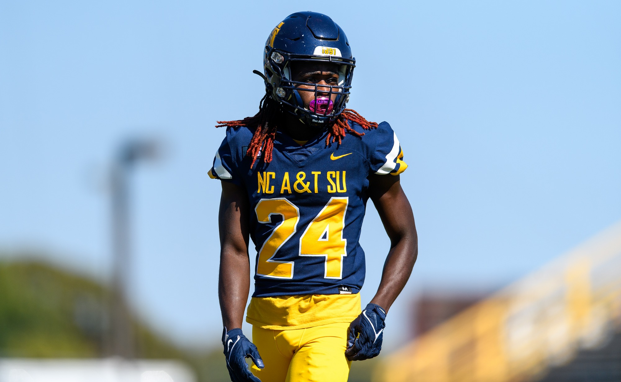
On 5/10/2023 at 8:07 PM, NH4 said:
NC A&T AGGIES
DESIGN
- NC A&T has had a lot of Nike templated (and bad) uniforms so it was hard to think of a design for them
- I took the curve and bevel in the A and made that the design stripe
- Used the same font and updated the number font
HELMET
- Same helmet but added a white outline to the logo to make it pop
- "A&T" on the front bumper and "AGGIES" on the back bumper
JERSEY
- Added the new stripe
- Updated the chest text and number font
PANTS
- Blue, gold, and white pants
- Added the new stripe
Up next will be Duquesne. Thanks for looking and as always C&C is greatly appreciated!
I like this design (as a proud Aggie I approve). I’ve always struggled to come up with ideas for us too, my only concept is one with 4 stripes on the sleeves and pants to represent the A&T Four (civil rights movement) but the four stripes always looks a bit wonky imo.-
 1
1
-
Love that Chubby Checker throwback with the classic colors for Charlotte.
-
1
-
-
On 7/31/2023 at 9:13 AM, heavybass said:
The NBA Hornets don't exist because of the NFL Hornets... the NBA Hornets are the NBA BOBCATS
*Internal Screaming*
Seriously, I appreciate a good WFL/Hornets concept when I can find one. Would add that Honey Gold home jersey to my collection.
-
Loving the updates for Orlando and San Antonio, my only suggestion would be adding silver to the snakeskin pattern on the Outlaws uniforms.
-
Normally not a fan of underarm stripes and piping but I really appreciate how it works with this set. Go Gens!
-
On 11/21/2021 at 8:20 PM, WideRight said:
And a bit of news. The Chicago Machine lost a trademark infringement lawsuit from a small machining company in Michigan, so they have to drop the M (originally from the Montreal Machine). I have 2 options here, I can modify the Chicago Enforcers logo or I can create a new logo. I am leaning towards the latter. It will be a new logo, but one with significant inspiration from the Montreal Machine M, so not entirely new, which is something I am trying to avoid, using borrowed, or otherwises sourced logos whenever possible. That new logo will be revealed soon.
You could do the Enforcers logo with the machine cog "C" from the Chicago Machine (MLL, not a football team). I know you dont intend to use any arena logos but the old Danville Demolition logo (bulldozer) would make a solid secondary for the Machine, its more professional than a majority of indoor/arena stuff.
-
1
-
-
On 10/5/2021 at 9:37 PM, Bomba Tomba said:
They could use the logo of the failed Baltimore Bombers.
This is what I meant, I have a habit of calling them the Marauders because of the plane they are named after. But Blitz, Bombers, and Marauders would all work.
-
The blitz definitely need a new logo & I still feel like the Baltimore Marauders branding works best for that nickname. Blitz = bombing and the B26 Maruader that brand was based around was a bomber plane. The Maulers could easily use the old Berlin Thunder logo as an update & The Outlaws could use the Longhorn skull from the XFL team, minus the spade shape in the nose. Maybe the Renegades stick it out until the modern era and change to something like the AAF Apollos branding.. Not too sure what could or should be done to update the last two. I was never a fan of the Gamblers or Invaders logos because they didn't represent their respective nicknames well imho. The Invaders logo looked more like a God (Zues) or Titans throwing the bolt while the Gamblers could've been named the Texans and kept their brand the exact same (it was too boring for such a cool name). I was the ArenaFL gladiators had better logos because that name >>> Invaders (also imho).
-
6 hours ago, neo_prankster said:
Can we expect maybe a plane logo as a nod to the LAX airport?
That or something that evokes the Expressway, I'm not sure which one the team was named after but something like a supercar or diesel truck would be unique for a sports logo.
-
Seattle and Ohio are both very solid looking sets that could last through today without major changes. I'm almost certain Seattle will eventually have a black and/or red alternate but a sunset gold alternate would be the winner IMO. Very interested in seeing what direction you take the Express in later seasons.
-
.
-
1
-
-
5 hours ago, WideRight said:
I will be releasing uniform sets for all 4 expansion teams starting early next week. That is the LA Express (v2), the Seattle Dragons, Atlanta Fire, and Ohio Glory.
But I have a question for you today. Looking at these CFL-USA and WLAF/NFLE Identities, which, if any do you see as possible "evolutions" of teams currently in the league. I have a couple in mind, but would love to see if you think any of these identities could morph into an evolved look for a USFL club.
WLAF: Riders, Surge, Skyhawks, Monarchs, Galaxy
NFLE: Thunder, Fire, Admirals, Centurions, Sea Devils, Claymores
CFL-USA: Posse, Gold Miners, Barracudas, Mad Dogs, Stallions (already used a bit), or the short-lived Ottawa Renegades.
Let me know which, if any, and what team you think would "evolve" into the new look.
I think the Riders and Posse brands can work well together to form one brand, possibly the Rengades logo as well. Maybe Vegas or another shot at an OKC franchise can take that brand on, unrelated but the AF2 OKC Wranglers logo makes for a nice modernized "cowboy riding horse" logo if you're interested.
The Galaxy logo would make a cool rebrand for Orlando, should you go the route of them changing the name later out of pressure akin to the Skins. I could see some argument on Renegades = Savages as an in universe excuse to rebrand the team. That or Houston somehow giving up/losing the Gamblers brand, I dont see it but who saw the Oilers leaving until it actually started to happen?
Fingers crossed that the Monarchs logo goes to a Charlotte team just so that I can have another reason to stan this fictional league but I could see Cincy, Baltimore, NYC, Louisville, and Memphis all as cities that brand would work in.
Claymore logo would make a cool second or update for StL later on. I could also see it being forced onto the Generals as well but it fits StL better imo.
Admirals would easily be a revived Boston, Baltimore, Norfolk/Hampton Roads, or San Diego team. While Sea Devils could fit any of those as well as a potential Miami team.
Gold Miners work mostly out west in San Fran or Sacramento, whichever city could have a cool little rivalry with Denver out west. The Gold Miners could work out east for a Charlotte team too, since the first documented gold rush in our country's history happened around that area.
Reign Fire would be an easy update to make for Atlanta later and the Berlin Thunder could become the Maulers secondary or update.
I'm not a fan of the Surge, Mad Dogs, and Skyhawks brands at all. The Skyhawks logo would almost need a complete overhaul to not look like old clipart. The Surge logo would make a great primary for a HS that starts with S, maybe one of those West Coast cities could use it as a part of their overall image but I wouldnt make it the primary or nickname for anyone. The Mad Dog looks goofy.
-
1
-
-
2 hours ago, heavybass said:
Woot! Called it... the logo was the most expressive of the list, fits the seattle green vibe and can show what the XFL Seattle Dragons how to do it right.
Idk if I'm in the minority on this but the original New York Dragons logo looked great on those bright red helmets, the unis were lacking for arena in my opinion but they did it right imo.
I like this dragon logo as well but I agree on the red facemask that was suggested.
-
2
-
-
It's Admirals for me, I'm a sucker for rare color choices like Salmon. All of these would be great picks with that being said.
-
I always liked the Glory logo but I do wonder if that logo and branding looks too similar to what the Feds have going in Washington, I always imagined it would make a good foundation for a more modern Feds logo (or a faux back depending on the scenario).
Rather than previous scenarios where teams have had similar colors these would be teams with essentially the same mascot and similar branding. I think the same issue would be the case with "Riders" for a potential Dallas franchise. I'm hoping for Seattle Sea Devils.
-
+1 on Columbus as long as it's not the Rage, that logo and mascot screams minor league baseball imo. Columbus would be cool with an Aviation based identity, maybe the Skyhawks from the WFL or the old Barnstormers identity from the AFL (a brand that definitely shouldn't go to waste).
Barnstormers or the Centurion logo that was proposed for ATL. The Scarlet and silver scheme fits in Columbus anyway.
-
2
-
-
13 hours ago, Skycast said:
Overall I dig the new Panthers logo, especially the oval, but I think the purple needs to be more prominent inside the logo on the helmet.
I agree with this, color the upper half of the Panther in the wine color (do the same for the helmet logo) and use the champagne for the inner circle as well. Everything else could stay the same.
-
1
-
-
On 8/2/2021 at 1:33 PM, WideRight said:
The 1992 season of my alt-history USFL simulation is in the playoffs, and with the offseason approaching, the first of the new Nike-designed uniforms is about to be released. 1993 is the first year the league has a league-wide contract with Nike. Only 1 team is being updated this year, the Michigan Panthers. In future years it will be 3-4 per year very likely. Some will be minor modernizations, some will be significant transformations. Here is the old Michigan uniform, and just for the Chris Creamer crowd, the first look at the 1993 Michigan Panthers (with commentary to follow)
Pretty accurate to the actual 1983 look. But now here is the 1993 look. You can guess where the inspiration comes from. (If you click on the image and then again, you should get a full size version via Imgur.)
Some quick notes. As cited in the image, the new version of the panther is directly from the U. of Houston, which, I feel, has the best panther/cougar logo ever and allowed me to incorporate more white and champagne into the look. The rest of the uniform is basically a version of the NFL Carolina Panthers. Looks like Nike must have jumped on this just before the NFL expansion franchise was official. Of course, with the USFL already having the Panthers, maybe the NFL team in Carolina (if one even exists) will be something else.
A perfect style for the 90s, hopefully the team can modernize the look after the mid-late 2000s like my Carolina Panthers should have.
-
I agree that Philly has the weakest branding in the Atlantic, the Philadelphia Bell (WFL) always had a better branding imo. I could still live without the Gens in red though.
-
9 hours ago, neo_prankster said:
Michigan should definitely keep their colors.
The Philadelphia Stars' branding will definitely look outdated halfway into the 90's. So yeah, they could use a Nike makeover.
As for the Bandits, they could use a Nike update too. I mean, will Smokey and the Bandit still be culturally relevant in the 90's?
With the Generals and Stars in the same division, one of them should replace red as the dominant jersey color with their Nike makeover.
A darker green for the Gens would be cool, I always assumed the red and blue were based on the pants for the Marines dress uniform but hunter green or jade would pair nicely with the gold.
The Bombers identity would be a great way to further tie the Blitz name into the city of Baltimore while leaning into the dark blue and white colors even more.
The UFL had a nice set of logos to pull from as well as the other mentioned leagues.
-
1
-
-
I'm going with Tampa because part of the lore behind the Broncos rebrand was that they never won a SB in their better looking orange crush uniforms so a change was needed. That fits Tampa in-universe better than any of the other teams provided (imho). A darker red and silver would make for a nice combo on a modern palette and would make the difference between them and Memphis even more noticeable, keeping black to a minimum on the uniform to keep them and Houston from looking alike.
-
1
-
-
I'm thinking that the Panthers may update to the logo used by the Carolina Panthers, switch the black for wine and the silver for champagne and you could lift the entire identity as an update for Michigan. The entire branding screams 90s and the uniforms need to be updated IRL. Also pretty sure I know who is about to move to STL.
I have no idea on the Gamblers update.
-
1
-
-
22 hours ago, WideRight said:
OK, 4 Concepts for St. Louis, all using purple and either gold or athletic gold. One uses silver as well, and I do use 2 different purples, depending on the design. So we have the Knights, Monarchs, Surge and Mad Dogs all as options.
IMO, Knights or Monarchs and the other two names don't make it past the concept phase (in universe). Maybe the team can let the fans vote on a name since they are so similar and it could honestly go either way.
I will say that the Knights stick out a little more just for the use of silver but I also believe the Monarchs could work with the same helmet so I'm still stuck on which name should win.


USFL/XFL Merger Hypothetical Relocation: Ohio Gamblers
in Concepts
Posted
There is already a riverboat connected team, could merge the brands fwiw (regardless of the location).