


Silence of the Rams
-
Posts
1,129 -
Joined
-
Last visited
Posts posted by Silence of the Rams
-
-
8 hours ago, VandyDelphia Mike said:

If the Braves want to use their spring training webcast package in a post-Bally world, it wouldn't be the worst.
MLB 2K esque
-
Funny you should do this because Reno's triple a team is called the Aces
-
 1
1
-
-
8 hours ago, WideRight said:
I don't sleep enough, so I often work on concepts between 4am-6:30am, when I prepare to go to work, then many evenings, if my wife wants to work on her quilting I head back to the computer and do more. Mostly my USFL project, but sometimes I get inspired to do other things. You should have seen me during COVID when I spent 14 months working from home every day. Lots of series that year.
This one is not going to have anywhere near the pacing of the AAFL project, maybe one new design a week if we are lucky.
I'm going to say the same thing I said to Mr. Grossi post 30 in 30. Get some rest where you can. Also (don't take this the wrong way) I'm actually glad this is more spread out.
-
Um dare I ask, do you sleep? This is like the 3rd series in 4 months.
That being said. Honestly if the bidwells weren't so cheap I'd say this is realistic
-
41 minutes ago, johne9109 said:
Los Angeles RamsXMetallica
With Rams having a design that covers most of their helmet I decided to find a logo that could work in a similar manner. That led me to Metallica. I took their logo and put it in an orientation in the vein of the Ram horns.
The design is cool don't get me wrong. One issue though. The band is from San Francisco, not Los Angeles. So putting them with the Rams is a bit sacrilege.
-
1
-
-
On 2/19/2024 at 3:44 PM, johne9109 said:
Kansas City ChiefsXTech N9ne
As promised before and predicted by @maxwasson here is the Chiefs crossed with Tech N9ne. I put Tech's logo inside of the arrowhead logo of the chiefs
I get the theme for the series but you know Swifties are now going to be coming after you after you made this choice

In all seriousness I like how the logo kinda keeps the thematic
-
 1
1
-
-
We created a multiverse
4 minutes ago, WideRight said:Here we are, guys. The design for the 16th and final team, the Memphis Mallards.
Finally a navy jersey, though a lot of the look is based on the Kelly Green. I also added a secondary logo just to have a different version of the mallard on the sleeve.
So, we have our 16 teams. I will post a few of the unused designs from the unused cities over the next few days, but this is the project, the best possible, voted on by fans, 16-team spring football league. Not every team is what I would have picked, but I think that groupthink actually produced a pretty good looking and functional league. Now if we just had a few multi-billionaires willing to fund this we could make it happen.
-
Miami because why not do what the rock couldn't. Get a Spring League team in South Beach
-
On 2/16/2024 at 2:13 PM, neo_prankster said:
Atlanta.
Give them a team that hopefully won't give up halftime leads.
*Cries in San Francisco*
-
On 2/7/2024 at 9:31 AM, noodlesnchips said:
He probably eats everything plain with no seasonings too.
I would say something on that but I'm the guy who has his burger plain with just cheese so I have 0 room to talk
-
13 minutes ago, BengalErnst said:
Dallas
Yes. They deserve at least one winning football team. Yes I have 0 chill
-
Just because I'm biased. San Jose
-
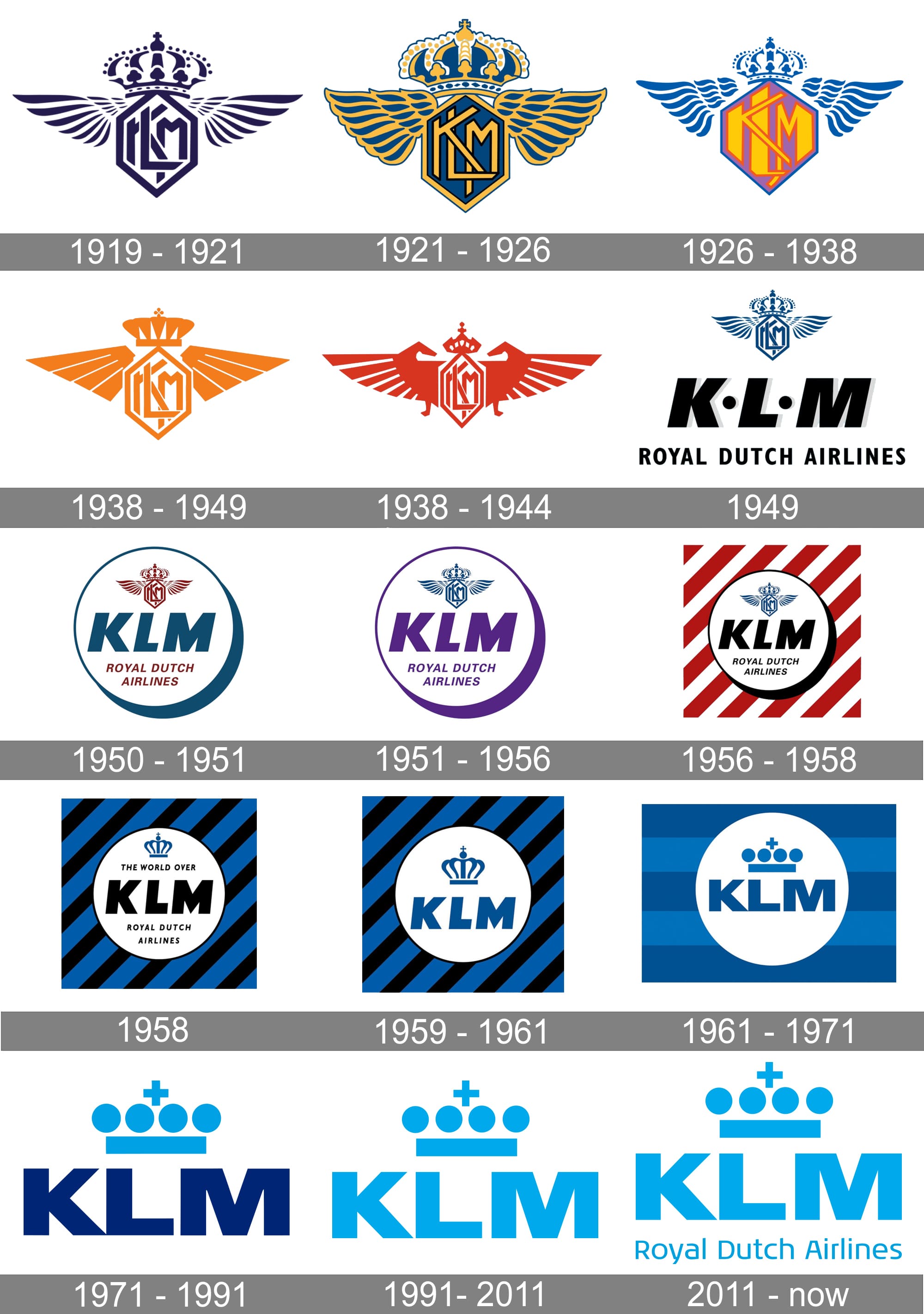
1 hour ago, edjb93 said:
KLM ROYAL DUTCH AIRLINES
The world's oldest airline still in operation has one of the most recognizable brands in the air: its iconic blue fuselage. Throughout the years since the 70s, it saw various changes but the overall theme remained the same—which brings me to the concept I made for "The Flying Dutchman". If you're curious, I specifically took the 2002 redesign as an inspiration—although the 2014 version is a modified one.
With a white tail, blue fuselage, and white belly, I thought that the helmet should be white as well, and there should be a differently-colored shoulder yoke to signify the overall separation of colors on the fuselage. I went with traditional football socks instead of mono-colored ones to conform with the theme. The KLM logo on the sleeves is enclosed in a circle, paying homage to the old logos.
For the alternate, I went with the airline's Orange Pride livery, but instead of making it half-orange, half-blue, I made the uniform orange-themed all throughout. While the wavy design on the sleeves look similar to my United Airlines concept, the Orange Pride was unveiled after 2014, and so I had to conform to that. The Dutch tricolor is featured as an accent, just the actual livery, and the KLM logo remained blue on a white background.
Ok Google. Play "Super Max" on loop. Love the orange alt
-
1
-
-
San Diego Destroyers gets the W for me
Also a quick note. Pepsi recently changed their logo so that one is inaccurate. Just a minor nitpick.
-
4 hours ago, RamosLynn said:
It's that time of the year again! The previous endzone design lasted 8 super bowls (XLII-XLIX), so we are due for a new one as this has lasted eight already (50-LVII).
I wanna be optimistic but I'm also not holding my breath
-
Ok I have to ask since you mentioned the abdominal show monster. Are heat and snow Meiser in consideration.
-
This thread has slightly become the "That's interesting, I never knew that" thread. Regardless this is actually cool.
-
1
-
-
4 hours ago, simtek34 said:
Interesting. Maybe this is supposed to be a full graphics refresh for NBC Sports. While I'm always on the side of a top/corner of the screen scorebug, I don't dislike this one. Curious if if/when it will go to the rest of NBC Sports and the local NBCSN stations, as they're still using the 2015 graphics package
the motorsports package needs to change soon as well
-
2 hours ago, johne9109 said:
San DIego Padres X P.O.D.
FOr the Padres I had to go with my favortie band P.O.D. There might be bigger names that have come out of San Diego, but they are always the first name that I think of when I hear SD. I used the bands newest wordmark as I felt it most closely fit in with the Padres look. The Padre logo on the sleeve has een replaced by a grim reaper swinging his sickle that the band has featured on some merch and then the Trinity logo is on the hat. The back features the term Warriors which the band uses in reference to their fans
The fact that I believe they also do Rey Mysterio's theme (correct me if I'm wrong) makes this even more perfect.
-
1
-
-
This is more a question for when we come to it. Because there are technically only 2 other teams that play in the area (49ers in Santa Clara and the Earthquakes) are the sharks going to have the Giants and or Warriors as options.
-
Kinda ironic that the A's logo is replaced by the Money sign based on recent events.
In all seriousness this is definitely cool and unexpected
-
1
-
-
3 hours ago, coco1997 said:
Looks good! The Beach Boys are my favorite band, so I love this. Personally I would have saved the Boys for the Dodgers, but this works, too.
The dodgers don't give off "Good Vibrations"
....Ill see myself out
-
1
-
-
2 hours ago, Blindsay said:
what? Me steal from Madden? Never….. well EA’s customer service has been so bad these days they kinda deserve it…)
You have done the world a massive service. Thank you soldier
-
1
-
-
For the SF teams. The obvious Journey, Metallica like ones are probably gonna be in (obviously I don't know what the plan is so I could be wrong) but while maybe not the giants. I was thinking maybe Heuey Lewis and the News could be a dark horse option.
-
1
-


My Ideal Fanatics NHL Redesign - Edmonton Oilers (11/32)
in Concepts
Posted
Post2Post Productions will gladly join you on the blast crusade