


Silence of the Rams
-
Posts
1,130 -
Joined
-
Last visited
Posts posted by Silence of the Rams
-
-
7 hours ago, coco1997 said:
Thanks! I actually won't be doing any more teams other than maybe tweaking some previously posted clubs. The Dodgers are on the first page of this thread
Of course I figured out that the dodgers were done the moment I hit reply. Also ok. Just figured I'd throw it out there
-
 2
2
-
-
On 3/8/2021 at 1:36 PM, coco1997 said:
Thanks!
We've reached the final team in the series, the Houston Astros!
ASTROS HOME
ASTROS ROAD
ASTROS HOME/ROAD ALT
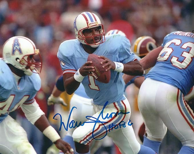
Despite not being much of a football fan, I’ve always loved the Houston Oilers’ uniforms, and for some reason their logo left a huge impression on me as a kid and helped spark my interest in sports design. Because in my re-colored universe both the Cubs and Tigers wear navy and orange, I decided the Astros would require a very different color scheme. Also, I figure one of the Texas teams should sport red, white and blue, so Houston it is. Therefore, in my recolored league, the Rangers look like the Spurs and the Astros look like the Rangers.
C&C appreciated! I'll post the Rangers in Dallas Stars colors next.Incoming triggered Nashvillians
 anyway. For the franchises you haven't done yet. Maybe look to the Overwatch Leauge for options. Especially with toronto and the dodgers (with the valliant)
-
1
-
-
59 minutes ago, pitt6pack said:
My hope is that, maybe they had a logo for Super Bowl LVI, similar to the templated logos of the past decade, but they've scrapped it in favor of a different or re-worked design? I'm taking this as a positive, and hoping that this somehow means they are going to change the logo system. I've seen more and more in recent years, from regular, non logo watching people, about how bad the logos have been, and how corporate and indistinguishable they are becoming. Best case, we start getting logos that are more personalized to the host city. It could just be that they are behind on the logo process. I'm holding out hope for a new, and better logo system.
Well seeing as we have nothing. I guess you can use my frankenstein-ed super bowl logo for your predictions

-
Keep an eye on FS1 and FOX this week
-
2 hours ago, Mr. Krabs said:
You think if NBC were to have broadcast this game as originally scheduled, they would have revamped their graphics like they usually do?
-
1
-
-
11 hours ago, jlog3000 said:
@Silence of the Rams Your custom field version looks so dope and epic. If only today's and future Super Bowl fields would look like this. Having the helmet in the left and right parts of the field, plus on the endzones, their team logos and their conference logos (on its current modern look). Plus I believe that each team's wordmarks should have a big wide version for the team name and the small thin version for the city/state/region name (like Seattle did in SB L in 2006 (2005 season) and Arizonza did in SB LIII in 2009 (2008 season).
Thanks. I don't know if you caught this but I put the top part of the conference championship game logos instead of just the conference logos because if you think about it. They are the conference champions so it would make sense. Also Seattle did that in Super Bowl XL not L (They did take one that game
 )
)
-
1
-
-
Figure throw my hat into the ring.
-
6
-
-
5 hours ago, DDG88 said:
Thanks. Got to say you kind of inspired it when you started adding the walls and stuff to your Super Bowl fields. I have done about 22 NFL stadiums. Working on the Rose Bowl. Have a Coors Field and Pepsi Center (or Ball Arena now) that is interchangeable for the Nuggets and the Avalanche. (Yeah, I live in Denver) It's a long process, about 20-40 hours to do one depending on how symmetrical the stadium is and if I can get a good seating chart and photos.
My guess is you're teasing a thread
-
4 hours ago, pitt6pack said:
If I could find a way to do it legally, I for sure would sell them, as a way to raise money to fund the Gridiron Uniforms Database. I'd definitely have to print a couple for myself first, to get them to come out right. Plus, I think I need to go back and edit all of the Super Bowl fields from 13 through 54, and update the directional arrows to be the appropriate size. That will be an undertaking in it's own.
redbubble is a destination I'd consider
-
On 1/19/2021 at 8:04 AM, pitt6pack said:
Had to do some retro style fields for fun:
Any chance of the other combos in this style
-
On 1/13/2021 at 5:33 PM, Kramerica Industries said:
Are my eyes playing tricks with me or does it appear the clock on NBC's banner is slightly skewed to the right compared to normal?
I might edit this post later for the sake of visuals, but I've noticed this with both games. And...it's annoying me.
The Rolex 24 would be an event to look out for if you want to seek a graphics change
-
You might want to rethink the MU connecting logo. Because let's just say it looks like something you'd see as a logo for that site
-
1
-
-
Suggestion: Maybe don't "Tuck" the snow games in just yet
-
2
-
-
Heads up. Don't call the football defense the alabama gang. Hueytown's own Bobby Allison may have an issue with that (lol)
-
Anyone have a good .psd or gimp compatible hockey template
-
8 hours ago, TrueYankee26 said:
The new FOX graphics will not carry over to the MLB postseason. Still using the flat 2017 graphics over the 2020 parallelogram ones.
I think because of "Disease that shall not be named" we should give them a Mulligan on this one
-
40 minutes ago, Megildur said:
I've got some fun stuff in the works --a metallic gold San Francisco team
-
2
-
-
Gonna say these for Detroit and it stems from cars
Detroit Stingrays
Detroit Mustangs
Detroit Vipers
Detroit Chargers
Detroit Challengers
Detroit Cobras
And last but not least
Detroit Firebirds
-
5 hours ago, SNBSlugger said:
Better in every. Single. Way. I'm astonished at the kinds of people that get to design pro sports uniforms. I'm a Niner fan. Don't care for the Rams at all, and the new uniforms are just offensively bad. Your concept is simple, clean, and integrates the new brand nicely.
I'm a 49er fan as well (family has been since they were in the AAFC so not a bandwagon in case of anyone asking) and my name is @Silence of the Rams for that reason. i will say this is a clean concept though
-
1
-
-
Switch out the purple for blue and change the logos and I'm getting major Montreal Allouettes vibes
-
1
-
-
4 hours ago, The AFC South said:
CBS was to debut a new graphics package for March Madness, but now we have to wait another year to see it.
Or til NFL starts
-
2
-
-
Really quickly does anyone have the default WWE supercard season 2 Template in a psd. Been looking for one for a while but couldn't find it
-
1 hour ago, CubsRule2040 said:
Is it confirmed that NASCAR switched to the new graphics, or will MLB and NASCAR continue using their existing packages they've been using since 2017 and 2018, respectively?
We are supposed to know on Sunday
-
Welp the title said impossible so this ain't false advertising
-
2
-


Recoloring MLB (Formerly Un-Blue & Redding MLB) - Mariners in 2023 All-Star Game colors 7/25
in Concepts
Posted
Padres are in san diego. The AHL's Gulls may be the better option