


scottyeagle
-
Posts
223 -
Joined
-
Last visited
Posts posted by scottyeagle
-
-
3 hours ago, raysox said:
I think this entire series is a pretty solid one. I think you may be trending in the right direction with the last few, but my biggest gripe had been that for the most part, not every city has a recognizable flag to be represented as a jersey. I think Edmonton, Carolina, and Dallas were the biggest offenders. Chicago's works because people outside the city know what the flag looks like. I think concepts and ideas are, for better or worse, more in line with the NBA launch. I think you're on the right path with ones like Minnesota, Florida, and Arizona
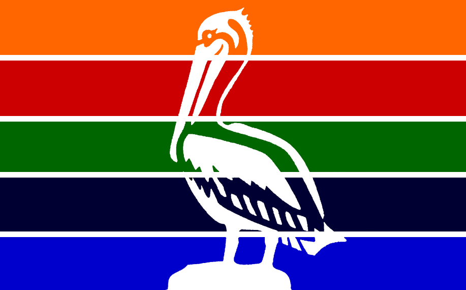
Once again, you've done great so far and that's just a personal gripe to push this to the next level. I will be expecting a Tampa flag alternate for the Lightning however.I'd love to see the end result of a Lightning concept that combines the Tampa flag with this beauty.

-
 1
1
-
-
This may be immaterial if you are moving the team to Jacksonville, but I don't think the inline of the C is adding much when it doesn't appear anywhere else in the branding. Filling it black, in my opinion, doesn't really throw off the color balance and creates a stronger C
-
Strong Lions vibes on that blue alt
-
5
-
-
Really excited about this! Your first basketball league helped me find these boards in the first place. Don't forget to update Houston's logo changes on the uniform package as well
-
1
-
-
I would use the white W logo you have on the helmet. The one you are using now gets very lost. The update to the BC logo is better, but I would be aware of the stalking lion's placement. With where the B is, it kind of looks like there's a notch cut out of his butt.
-
1
-
-
Or even just changing the EE to white so the logo isn't as compartmentalized with its colors!
BC's jerseys give me a real late 00's Oregon State vibe (not necessarily a bad thing). I agree that the raised/lowered numbers is an interesting idea, but not something that should exist in real life. For the logos, I would like to see more consistency in the line widths. You've got really thick lines on the head-only logo and really thin ones on the full body. It might make sense to find a happy medium for those.

Première ligue de soccer du Québec Redesign (22/09: All Team Logos Added)
in Concepts
Posted
Love what you've managed to do with these identities. My only suggestion would be to change the color of the year in the Longueuil badge; the green gets lost in that lighter blue.