


Weapon X
-
Posts
166 -
Joined
-
Last visited
Posts posted by Weapon X
-
-
Desperately needs red socks.
-
 16
16
-
 2
2
-
-
I hope I never actually start an NFL redesign series because a lot of my ideal looks for these teams look nearly identical to what you've posted.
The only CC I can think of that aren't just minor creative differences are:
Eagles
- Don't care for having the collars be colored while the cuffs aren't. Should be one or the other imo.
- Number font still isn't working for me. It maybe could be with just an outline instead of the drop shadow but the grey and white lose themselves within each other. (like the black, charcoal, and grey do for the birds rn)
Seahawks
- that green has to be more of an accent color with how dominant it is. (A shade closer to their throwback green would be nice but that probably wouldnt mesh well with the blue you have)
Jets
- the traditional stripes on the pants and socks clash with the sharp stripes on the shoulders a little.
Ravens
- would prefer TV numbers with some design on the sleeve caps. (could be a small sublimated pattern or just the B or the crest/sheild logo they use)
Lions
- maybe would see where white could fit on the home look (other than the numbers) if possible. Have no idea where it would come from though and it already looks great, so not a big deal.
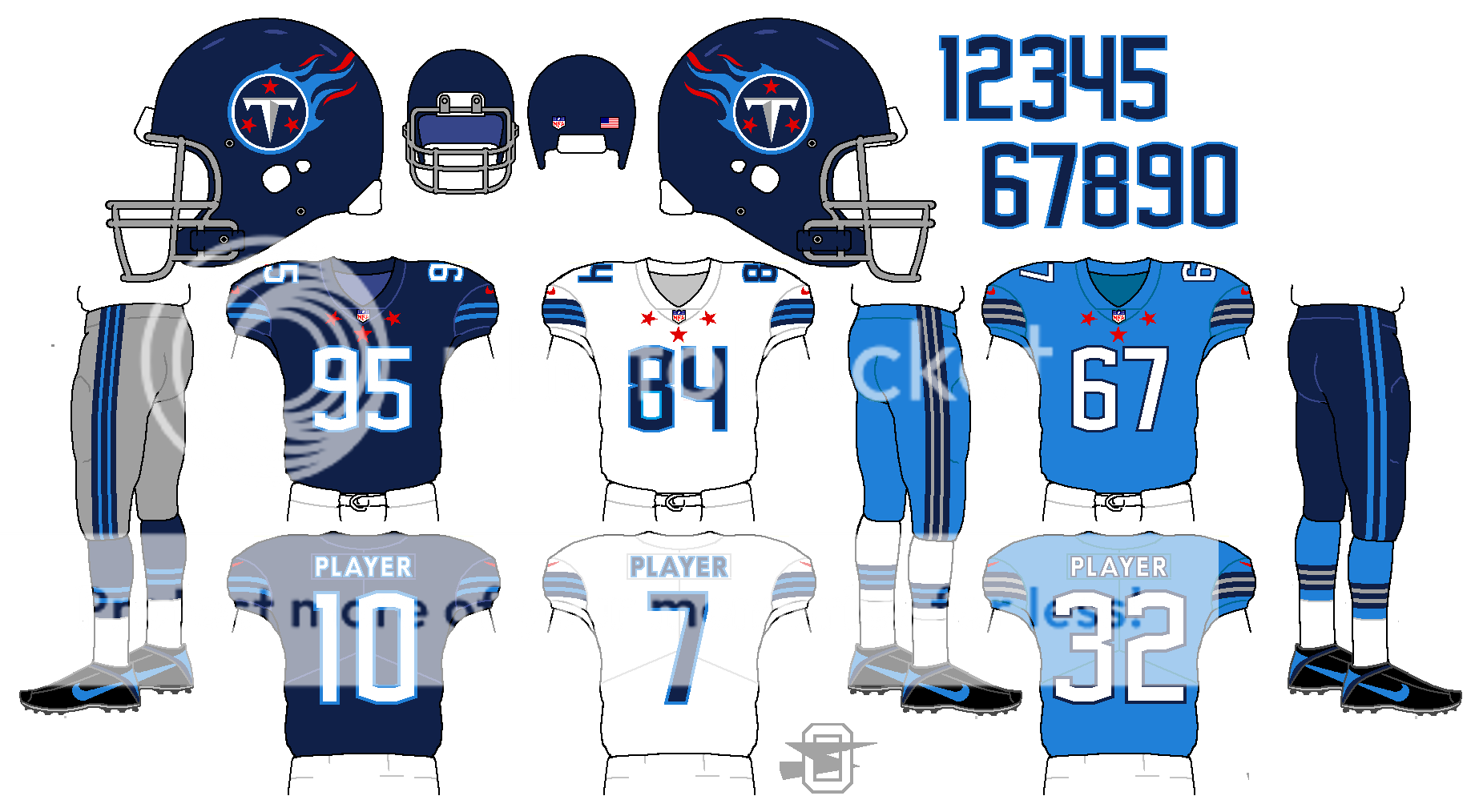
Titans
- While the original look is 10x nicer than what they have now, I wouldnt consider it a great one. Would love to see what a unique take from you could look like. If you're going to go with this one thought, somehting on the sleeve cap would be nice. Maybe a one color wordmark too?
Overall, even if none of it is too ambitous, it looks great and is presented cleanly!
-
 1
1
-
-
On 11/15/2021 at 2:55 PM, EddieJ1984 said:
It looks better than the reverse imo (Black jersey over white pants) since the white jerseys still have green numbers, so its a better balance of black and green.
But the green pants still look better (and I too would love gray pants)
I completely disagree on that, I think I would even rather see black jerseys with green pants before this look again.
-
3
-
-
Love it from the head down, don't really care for the recolored logo on the helmet.
-
1
-
-
On 10/20/2019 at 3:10 PM, alxy8s said:
Been pretty lucky on the whole, but will never get over the 2018 College Football Playoff National Championship.
By the time "2nd & 26" happened, I was beyond convinced Georgia was going to lose (and really already should have; Bama had missed a pretty short FG at the end of regulation), so it wasn't the gut punch you'd imagine. These two calls happened at the start of the 3rd quarter:

The "Tyler Simmons was onside" play which should have given Georgia the ball inside the 5 and a chance to go up 20-0 and then:
Three plays later, the defender pulls Swift's facemask a full 180 degrees and the entire crew pretends they don't see it. First and only time I've ever broken something during a game (RIP couch!). I don't know that I've ever enjoyed a sporting event less. We've had 3 postseason games with Alabama, and they're always so tense and miserable. Knowing the boys are going to have to play a damn near perfect game, have them actually do just that, and see it go up in flames is such a special experience.
No Minnesota Miracle or Rams no-call?
-
On 8/29/2019 at 4:03 PM, oldschoolvikings said:
This one was part of another NFL thread I was working on;
The stars nike-ify it enough for it to look like something nike would actually make while actually looking good unlike what nike would make. Probably my favorite concept you've made.
-
2
-
-
I hope we won’t have to add the Jets to this list in April.
-
1
-
-
When Dean Spanos moves the Chargers to the XFL I’ll tell him you got a new uniform already whipped up for him.
-
6
-
-
.jpg.aa78357b17df6b5b252340d9e28587e4.jpg)
Westbrook when he was drafted.
(Sorry for the potato quality)
-
2
-
-
On 3/23/2017 at 3:04 AM, Cujo said:
Not a uniform, but this "inaccuracy" always bugged tf outta me on Tecmo.


Cunningham, Kelly and Kosar for all you millennials. Get off my lawn.
Cunningham in tecmo was the equivalent to Vick in Madden 2004
human cheat code
-
On 1/29/2017 at 8:57 PM, pitt6pack said:
Packers at Eagles Wild Card 2010
Thanks for reminding me about that game
 but nonetheless that looks so much better than what they currently have their current one has too much empty space on the sides of the end zones.
-
1
-
-
This might have already been asked but could you do the 1980s and 90s logo please.


.jpg.aa78357b17df6b5b252340d9e28587e4.jpg)
 but nonetheless that looks so much better than what they currently have their current one has too much empty space on the sides of the end zones.

2024 NFL Changes
in Sports Logo News
Posted
"Your Feedback" lol
I submitted what felt like a 4-page thesis statement on how they only needed to make small changes to their current set, needed to maintain good color balance if they did change, and had to do their best to not invite Titans comparisons eith the use of "houston blue".
Seems like they wanted to reinvent the wheel from the get-go, or they just took their favorite ideas from the feedback and mashed them up in a set with no cohesion.
Sorry, felt like ranting.