


ldconcepts
-
Posts
1,493 -
Joined
-
Last visited
-
Days Won
7
Posts posted by ldconcepts
-
-
Love the Beauts and Whale looks especially.
(Also cool to see the Montreal logo I designed used on a jersey concept for the first time!)
-
 2
2
-
-
1 hour ago, Ridleylash said:
Seems like it'll be another wordmark jersey, which I'm sure might piss off some people. I'm just happy they're embracing navy again.
Hopefully they'll be using navy buckets instead of the yellow ones and then at the very least pull a Vegas and have both as options for the normal set.
I think the wordmark you’re looking at is the name bar?
-
-
-
4 hours ago, chcarlson23 said:
Well when the AdiZero system was introduced the crests all had the jersey material as the base for most of the logo. So this could just be the edge of the logo. What is weird tho, is that most logos outer edge was tackle twill, and the inside was the jersey material. So this is definitely a puzzling teaser.
This is what I’m seeing… stand-alone M on Millers-style chest stripes?
Spoiler-
6
-
-
Quote
New branding will debut with a "soft launch" in September, with a complete rebranding scheduled for October. Some of the rebranding will include a redefined color palette and modern twists on classic logos and wordmarks.
While the Coyotes' draft hat makes me doubt that anything but a black and white Kachina set will be worn in the fall, I like the sound of this.
-
2
-
-
8 hours ago, nash61 said:
I'm curious if ALL the teams have it, then how teams like Toronto and Tampa are gonna do it.
It’s possible that it was presented to an option to all teams and not necessarily used (Seattle?), but Tampa could easily have faux beveling stitched in. Teams with more complex logos with small shapes would have more issues.
-
1
-
-
Seems like this isn’t only a Flames thing.
-
9
-
-
Instead on being stuck on the Reverse Retro forever, I can see/hope that if a league-wide fourth jersey program is coming back, a new theme provoking new ideas would be introduced every cycle… for example, a “Hallmark Hybrid” line where teams would release new designs based on a unique element from their uniform history.
-
Just now, officeglenn said:
I was OK with this until "modernized look." That sounds like a recipe for disaster.
On the one hand, I'm tired of teams bringing back older uniforms without fixing any of the weird inconsistencies of the era (see Flames and their stripe widths). On the other hand, I don't trust the Oilers whatsoever with uniform decisions. The only "modernization" of the royal blues I'd tolerate would be to keep their current number style.
-
5
-
-
Not a perfect black Canes jersey, but definitely better than their current third IMO
-
4
-
-
1 hour ago, raysox said:
Hm, if it were up to me, the only thing I’d change about their current home and away jerseys is to go back to the yellow-black-white-black-yellow stripes on their away jerseys. Anything more than that is an overcorrection IMO, the spoked B with serifs is the best iteration yet.
-
2
-
-
16 minutes ago, DTConcepts said:
I think one of the weirder things that nobody's talked about yet is the fact that Icethetics has reported that the Islanders will be getting a new logo next year. I can't imagine that either Lou Lamoriello or the Isles fanbase at large is going to let them put out a whole new identity, so I imagine it'll just be a touch of gold to their current logo. Here are a few quick and dirty mockups I made of what I think is possible.

All that being said, the Isles are known for their awful logo/jersey changes, so I guess we'll just have to wait and see.
99% sure he means a normal anniversary logo
-
9
-
-
Bunch of little bits of info from Icethetics today, nothing too groundbreaking but some notable Canes and Oilers rumours.
-
2
-
-
45 minutes ago, chcarlson23 said:
Could you elaborate further?
I forget from where, but look up “paint.net gravity plugin” and it should come up. If you’d put text on top of a rectangle, put it over a curve and fill in the space between the curve and the bottom of the layer, the plugin should curve the text (or pattern).
-
1
-
-
On 3/12/2019 at 9:27 PM, NoE38 said:
In Paint.net, is there a way to get a pattern to curve without having to manually retrace it?
Gravity plugin.
-
1
-
-
-
The Devils look better without hem stripes IMO. Their old striping pattern on the sleeves only would be perfect.
-
I like the general idea and colour distribution for the Whalers, though I would make the curves in the stripes more uniform.
-
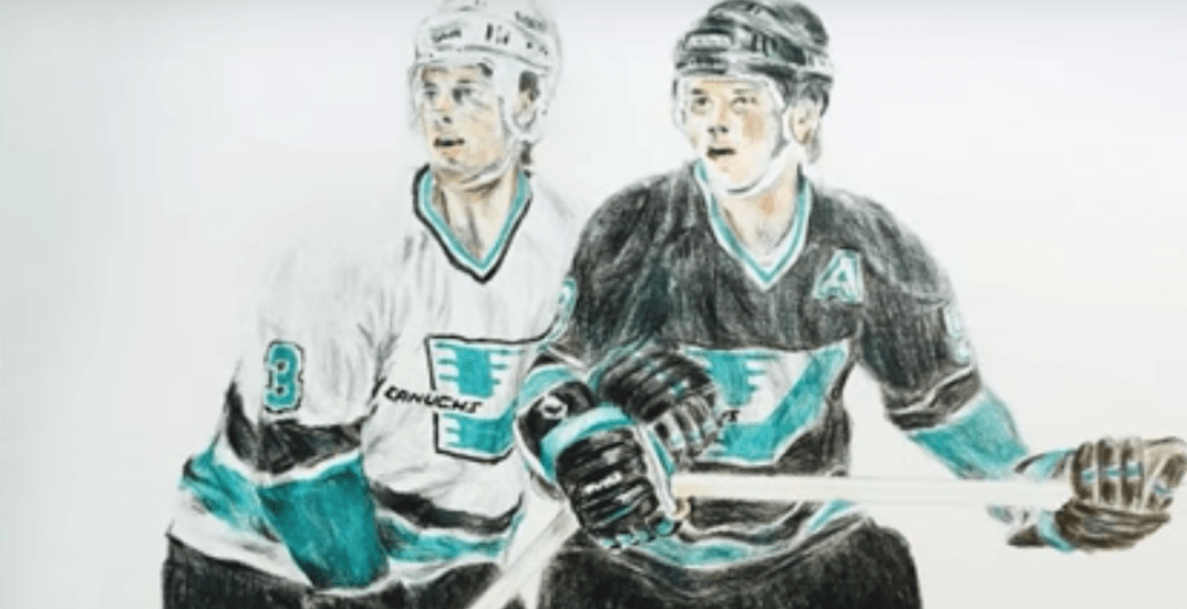
I think you're trying to many ideas at once for the Sharks. Interesting though!
-
2
-
-
On 2017-03-10 at 0:19 AM, Lights Out said:
Yet another Edge prototype has emerged on eBay - this time, a Red Wings proto sans hem stripe:


This shows that Toronto could've used their second Edge set since the beginning...
-
I see what you mean. The way a flat jersey is presented doesn't do justice to the idea. As much as I love their current set, I like this more!
-
Look much better! I'd just also match the hem stripes.
-
Just took a look through this thread, and it's refreshing to see a new take on NHL identities. I'm not sure if you'd update a concept from ~1.5 years ago, but I think you're almost there with the Canucks concept. I'd just eliminate the grey for white, keep the same pattern on the sleeves and use blue pants.
I also really like your Penguins concept, the away jersey is perfect, but I'd just use the home sock pattern throughout the entire home jersey, while ditching the full sleeve/yoke black.


2022-2023 NHL Jersey Changes
in Sports Logo News
Posted
Unless we’re talking about a minor change, this would feel completely unnecessary.
They could prove me wrong but I’ve yet to see an idea that improves upon their classic design.