


PrimalCookie
-
Posts
2,155 -
Joined
-
Last visited
Posts posted by PrimalCookie
-
-
-
The best the Jets have ever looked was a complete accident:

80s helmet, Namath uniforms. Adapt it to the modern templates by making the shoulder stripe white-green-white (and vice versa) like others have suggested. Boom, you're done.
(Unrelated side note: I've always been pro-black helmet for the Falcons... this picture might have me reconsidering.)
-
 11
11
-
 1
1
-
-
8 hours ago, upperV03 said:
This year’s anthem jackets and travel gear are slowly starting to appear on MLS Store/Fanatics. One interesting one so far is Orlando, which hints at then incorporating red into their new away kit:
I would expect the shirt to still be primarily white, but with some red and purple accents.
FINALLY! I've been wanting them to incorporate red into the aways for a long time now. I'm happy just being a purple/gold team with the homes, but red is a big part of the team's USL history and should be around in some form.
-
2
-
-
23 hours ago, Ridleylash said:
Given the Saints' 50th logo on the side of the stands and the use of the Rams' old logo on all the screens showing the scores, Google's images are definitely from 2016. Dunno if I'd necessarily call that "current".
2016's plenty recent, it was just...
oh.
oh no.
oh god.
-
3
-
-
12 hours ago, DCarp1231 said:
Really wish this had orange door numbers instead of blue. Feel like it would've tied the whole thing together. Still looks nice though
-
1
-
-
51 minutes ago, DCarp1231 said:
Is Green Light Racing more competitive than Jordan Anderson Racing and Big Machine? Those are the three teams outside of Kaulig in the Xfinity with alliances to RCR. I’d imagine Wendy’s would want to be on the most competitive car.
Chances are RCR wouldn’t want to field a one-off third car unless they decided to put Suarez in the 3.
If it was Kaulig, they definitely would’ve announced it alongside the Wendy’s reveal.
Big Machine 5 maybe? Only ran 2 races last year with Jade Buford but if Suarez comes with funding I can see them bringing it back.
-
I think FSU would get thrashed by Alabama and Georgia, and will likely be thrashed by whichever of Michigan or Washington they play.
BUT
What are we even doing here if we leave out an undefeated P5 champion? If we're valuing the results of imaginary games over real ones, why bother having a season at all? Just pick the "best 4" in July and get it over with. Alabama, Georgia, Ohio State, Michigan. There you go. Who needs to play games?
I'm a Florida fan. I want FSU to miss out because it'd be hilarious if they did. But Vegas odds do not and should not decide the field, what you did over the course of the season decides it. We have three undefeated champions, and the two 12-1 champions played each other. This should be an incredibly easy decision that's only complicated because the one on the outside looking in is Alabama.
-
3
-
-
It’s unfortunate, I don’t think there’s any way FSU’s better than Alabama, but you can’t leave out an undefeated P5 champion. They earned it, but the playoff game will be very ugly.
-
40 minutes ago, McCall said:
I feel the city's history of success in spring football merits more than one season to be judged on. You can just go back to 2019 and see the Apollos were #2 in the AAF in attendance at just over 19.5k per game. Now they played at UCF, which is a newer stadium. But I think it can still work. Hopefully if/when they come back, they can go back to UCF or even Exploria Stadium.
Honestly, I think that history of success is part of the reason the city largely passed on the Guardians last year. Orlando loved the Renegades, then the league folded. Orlando loved the Thunder, then the league folded. Orlando loved the Rage, then the league folded. Orlando loved the Apollos, then the league folded. So why should we care about the Guardians? The league probably won't exist in a few years anyway. At least, that was the thinking. In a way it was a self-fulfilling prophecy now that the Guardians got passed up for the merger, but I doubt many will care too much.
-
10 hours ago, kaleb_girod said:
Are you a Florida fan, because personally I’ve never heard of this being a lifelong fan? Tbh, that “superstition” sounds really dumb if true. I’d be very welcome to blue over orange every now and then. It’s still a really
nice, clean look that you could argue is better than the blue over white combo. Reminds me of the Browns going brown over orange.
Imo, while I prefer the blue, for a team with an orange helmet, we don’t use the orange pants enough like we should.
I am, and I've heard people say it for a while whenever that combo gets brought up. I don't know who coined it first, and the only results on Google are the CCSLC and Reddit, but I know I've heard it multiple times in real life so yeah.
I think it's our worst of the 3 home combos, but it still looks pretty good so I'm open to it as a once-per-season thing. Same thing with orange pants on the road. My personal "ideal" schedule would be
- Biggest home game of the season plus Tennessee: O/B/B
- Kentucky or some other blue dominant team: O/O/W
- Homecoming: 1966 throwback W/B/W
- One cupcake: O/B/O
- All other games (should be 2 assuming a 7 game home slate): O/B/W
-
1
-
-
On 11/25/2023 at 6:48 AM, kaleb_girod said:
Florida will be going all-blue again tonight against FSU. There’s a part of me though who really would’ve loved to see the ultra rare blue jersey/orange pants combo.
Personally, it’s not a bad look in anyway and better than the all-blue. It’s really never made sense to me why Florida hasn’t worn this combo more after it was worn a lot under Spurrier. At the end of the day, aside from the all-black alternate, Florida doesn’t really have any bad combos.
The longstanding superstition among Gator fans regarding orange/blue/orange is "look like Illinois, play like Illinois." IIRC the only win in that combo is 2016 North Texas.
Granted, Florida plays like Illinois regardless of the combo now, but still.
-
 1
1
-
-
I'm biased, but I'd like to nominate Florida-LSU as one of the week's best:
Excellent color matchup between two classic uniforms under the lights. IMO the best possible look for this matchup.
...and with that said, let us never speak of this game ever again.
-
5
-
 1
1
-
-
The thing is, a lot of the positives for Miami in free agency (weather, taxes, etc) also theoretically apply to Orlando and I don't think a single player has ever tried to force a trade here.
I'm not arguing Orlando is more desirable, obviously we're not, but the gap isn't so wide that any Miami team will naturally become a top 3 FA destination while any Orlando team naturally becomes a bottom 5-10 one. It's the reputation of each organization that does that, and the Heat have only missed the playoffs 4 times since 2003. Players would see that and want a part of it no matter where the team is located.
-
1
-
-
10 hours ago, Lights Out said:
There's a reason why UH, Rice and the Rockets have all paid tribute to the Oilers but nobody will ever do the same for the Texans.
That reason is the Oilers are gone and the Texans aren't. Flip the order - Texans are the original team that left, Oilers replaced them - and those teams would be paying tribute to the Texans.
-
1
-
-
Count me as one who would miss the Texans. I wasn't around for the Oilers (not even the Tennessee Oilers) so I have no attachment to them aside from "nice throwback" and the current Texans look is one of my favorites in the league. Textbook definition of a modern classic IMO. The logo is great, the uniforms are great, the colors are basic but work well, etc. I'm so disappointed that they're changing things up next year, they should look exactly like they do now (with the exception of bringing back red socks when they wear navy pants) for eternity.
-
5
-
-
The courts that work the best are the ones that are two-tone monochrome. Grizzlies, Mavericks, Jazz, Timberwolves, Hawks, Cavaliers, Nets, and Raptors. Cavs are by far the best because that one could probably pass for a normal court
-
1
-
-
Remember when the Bucks had to can their cream alternates because they'd blend in with the court and mess up the CGI sponsors? I guess that problem got fixed, because otherwise there's about to be a lot of players disappearing into the green (or black, or purple, or blue, etc) screen.
-
1
-
-
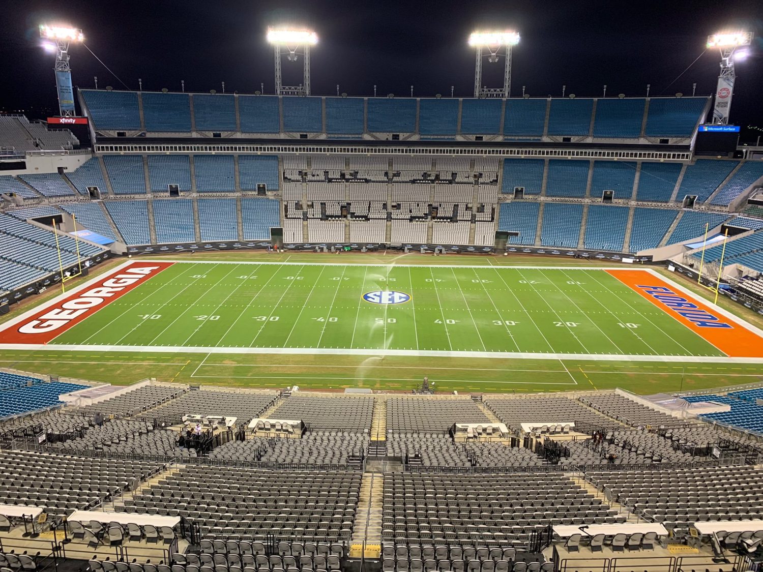
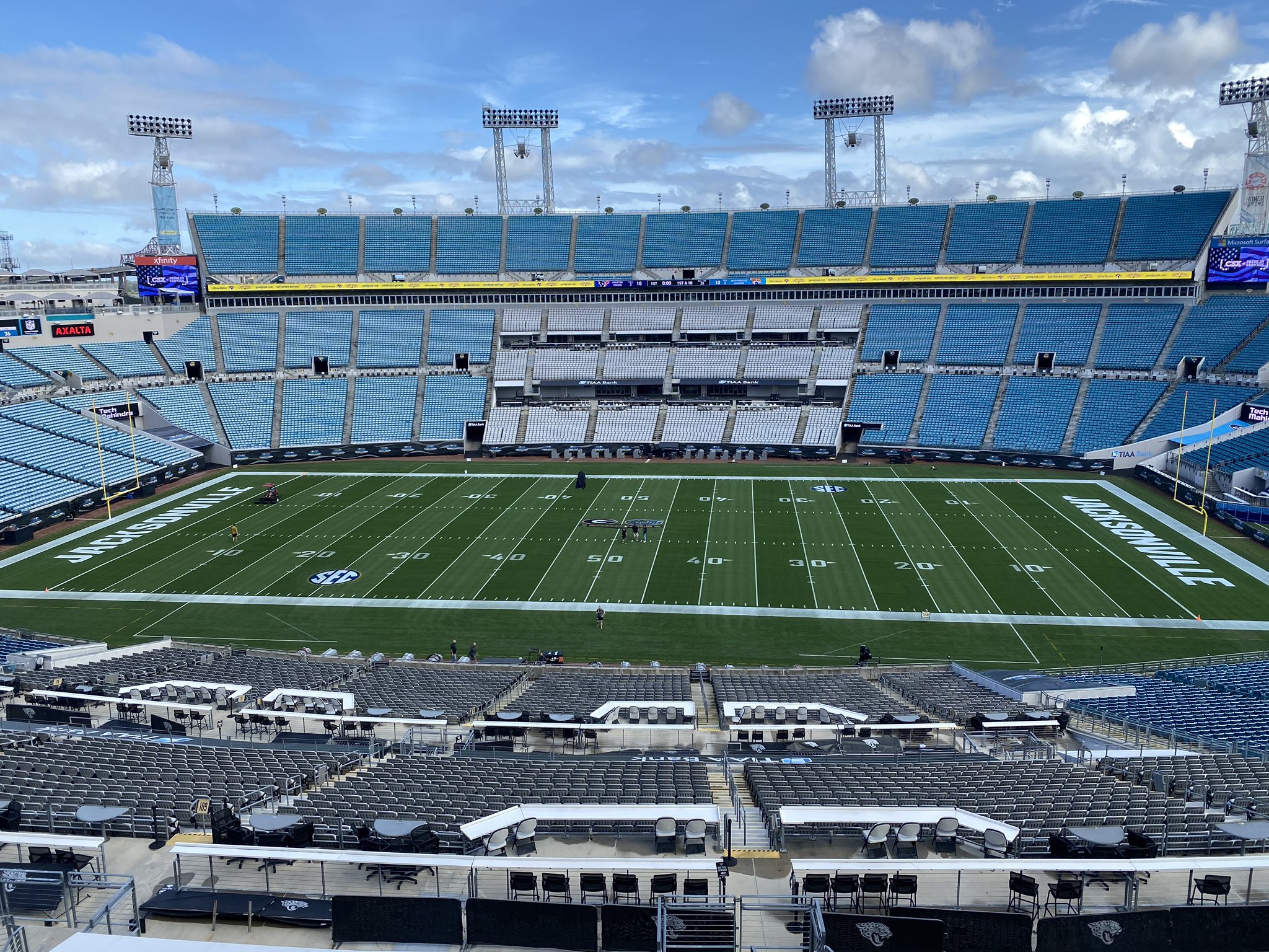
5 hours ago, aawagner011 said:
My longstanding complaint of Jacksonville treating the endzones the same as the team’s home stadium continues. It creates a mismatched look when one team is presented with a white wordmark and the other is in team colors.
There have been a few instances they deviated from this. I particularly liked this design. It felt balanced and both team’s colors were equally represented.
This one was quite good, too, but I’d have like it better if Georgia had a black wordmark or perhaps a black endzone with red wordmark. I just like the balance since Florida has both of their primary colors heavily shown. Or Florida could go with a blue endzone with white wordmark outlined in orange.
Anything beats 2020, but that was simply due to covid causing the schedule to get shuffled around. The Jaguars had a game the following day which caused plain endzones and a small midfield logo. I think the Jags always play away the week of the Georgia-Florida game.
On the bright side, they've mirrored the 2022 increase in the size of the Florida wordmark (before, after) so it looks much more cohesive now, even with the different fill colors.
My personal preference would be both endzones fully painted like the second example, but I'd also be fine with either making the Florida wordmark white or the Georgia one red.
-
For anyone keeping track, that's the 6th [City] FC (or something like it) in the last 8 expansion teams, and 10th overall:
1. FC Dallas (2004)
2. Toronto FC (2007)
3. New York City FC (2015)
4. Los Angeles FC (2018)
5. FC Cincinnati (2019)
6. Nashville SC (2020)
7. Austin FC (2021)
8. CF Montreal (2021)
9. Charlotte FC (2022)
10. San Diego FC (2025)
Creativity is dead. Can't wait for Las Vegas FC and Phoenix FC in 2026
-
1
-
 1
1
-
-
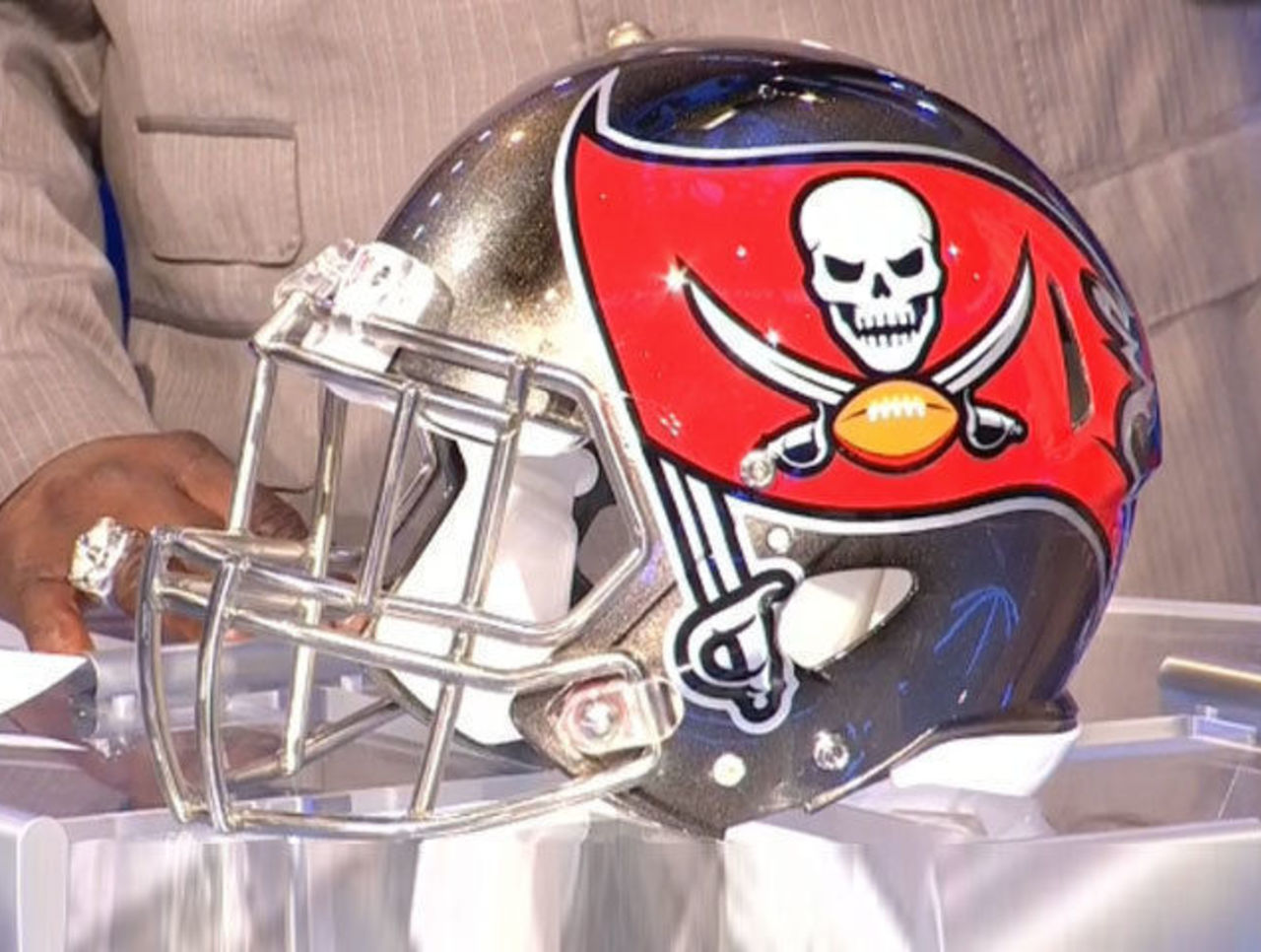
4 hours ago, Old School Fool said:
Funny you mentioned that because a forgotten element of the Buccaneers 2014 rebrand was that the Helmet had cannonball wear marks as stripes for the helmet. Unfortunately, as with the Jaguars 2-tone helmet, the idea of a spray or gradient effect didn't look how it should have in game. They got rid of it within a season or two.
Seems like it was dropped after preseason, since this picture's from week 1 of 2014:
-
1
-
-
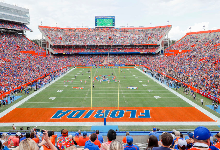
New home for Florida, away/alternates still TBA:
The orange collar is terrible. Ruins an otherwise decent look with how badly it sticks out
-
5
-
-
I've always been curious - why was it so hard to make royal blue helmets back then? As far as I can tell the first time someone wore them was the 2000 Giants. I'm sure it took as long as it did because of tradition and they probably could've been made earlier, but still. That's ridiculous that it took that long for a royal team to match their helmet to the rest of their uniform.
-
Penn State wearing throwbacks for homecoming vs UMass
-
8
-
1
-
-
4 hours ago, upperV03 said:
Utah is going black/white/black at Oregon State. Certainly not my favorite combo of theirs, but it’s a good choice to counter the Beavs’ mono-orange.
I would've preferred white helmets/pants in this case since black is an Oregon State color and red wouldn't contrast well with orange, but it'll still look fine enough.


:format(jpeg)/cdn.vox-cdn.com/uploads/chorus_image/image/37039804/20140808_ads_av1_277.JPG.0.jpg)
/cdn.vox-cdn.com/uploads/chorus_image/image/38187660/454890656.0.jpg)
2024 NASCAR Schemes
in Sports Logo News
Posted
Eh, Preseason Thunder cars usually aren't too detailed. The actual scheme will probably like the rest of the Rush cars have been, black with yellow and red accents... wait, hold on, this is the actual scheme? Good lord. Wow.
It'll be hard to top this one for the worst scheme of the year award.