


bushy
-
Posts
162 -
Joined
-
Last visited
Posts posted by bushy
-
-
On 5/3/2024 at 1:10 PM, bbush24 said:
The fact that for 6 of 7 games in a series, the Nuggets are wearing two different uniforms that both refer to the elevation of their city is just a joke. I cannot wait until this gimmicky city era is dead.
I really don’t even understand the fascination with them being the mile high city. Like we get it. Can you focus on your actual team name now ? 5280 this, 5280 that. It sucks.
-
 5
5
-
 1
1
-
-
On 5/1/2024 at 8:52 PM, jb1322 said:
Local Heat reporters are indicating a white version of the Heat culture jersey next season.
oh my god kill me now.
we shouldn’t even wear those monstrosities after the season we had.
-
2
-
 1
1
-
-
I don’t think I’ve heard the term “monochrome” used more than on this forum.
-
4
-
 1
1
-
-
On 5/1/2024 at 12:19 AM, SantosD_ said:
I hate the current trend in the NBA of only white accessories
I actually like it. But I feel like when there’s a chance to use colored accessories or even black for good contrast, they don’t pull the trigger. It’s really weird. -
On 5/1/2024 at 10:06 AM, KittSmith_95 said:
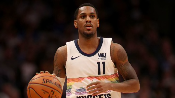
The Nuggets issue is mainly colour distribution. There's not enough maroon on either jersey, and too much white on the Navy IMO.
If anything, I really like the sublimated rainbow City jerseys they did back to back, and wish those had become the basis for their Home & Away set. It was a good way of modernizing a classic look, and it stands out much more than the Navy, Maroon and Gold they settled for.

That’s honestly their best rainbow set to me. It’s super sleek.
-
I’m in the minority, but the rainbow jerseys are super overrated to me. Better than what they have now, but I don’t get the appeal. I can’t even say it’s because I didn’t grow up with them, because there’s plenty of other 80’s-90’s jerseys I prefer. Tbh, I prefer mostly the classics than the current sets. The rainbows just do nothing for me.
Everything from 2003-2018 Nuggets was my favorite.
-
4
-
 1
1
-
-
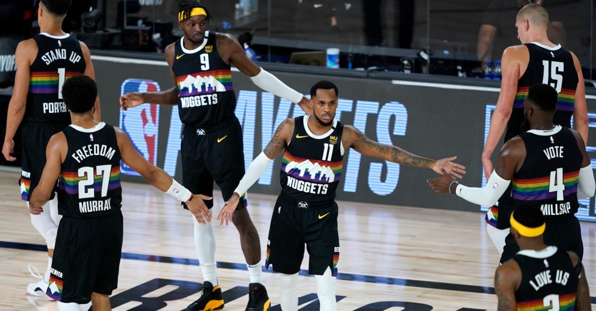
On 4/23/2024 at 2:35 PM, jp1409 said:
Nuggets current branding is awful... Their alt heavy playoffs runs with a home court that doesn't match are incredibly bush league.
they’ve got the worst brand in basketball IMO. Sucks that they won in them. They’ll never change now that it’s tied into history.
what’s even funnier is the city jerseys they actually won the title in were the best in their set and will never be seen again lmao.
-
3
-
-
Wow they look better than I thought they would.
-
The Pistons really love wearing them ugly black jerseys.
-
 1
1
-
-
On 3/1/2024 at 10:40 AM, burgundy said:
They were unveiled with both pairs of white pants available.
I was watching an episode of WCW Nitro from August 1997 and someone in the crowd was wearing that blue Elway jersey. I had no idea they were 27 years old, good lord.-
3
-
-
decided to color the Suns ball orange and add the yellow starburst.
….I actually, kinda prefer how they are in real life now ? Not sure what it is, but i definitely don’t mind the white ball anymore. Kinda has its own identity.
-
2
-
-
What do you guys think of these minor edits ? Just added an outline to the wordmark.
-
7
-
-
14 hours ago, gosioux76 said:
This might just be me looking through nostalgia-tinted glasses, but I'd love it if they kept the Classic edition jerseys full time. Even the logo. Watching them play in that set, on that court, just feels right. I also like the updates to the colors they used on the classics. To me, they're a perfect basketball uniform.
They've also seemingly sold out of all the apparel related to the Classic edition. Either that or was an intentionally limited supply. The jerseys seemed to have been online for a day or two before they were gone.
I'm hoping that's an indication of high demand.
Like this?
Would also love to see Utah rebrand to this
-
10
-
2
-
1
-
-
Why are the Raptors changing again??? I don’t love their current set, but it’s not bad either. I swesr some of these teams change every 3-4 years. Rockets changed there’s recently too.
-
1
-
-
I honestly really like these !
Only thing I dislike is how hard it is to read the colored jerseys. Wish they had a white outline on them.
If I’m being picky, I’d use more baby blue. If I’m being super critical, I’d go San Diego colors.
But I really love the classic design and use of nautical theming. Good work.

-
2 hours ago, HOOVER said:
And another from Jake Buff:
so basically the Celtics. -
I thinks at this point I hate city jerseys. Probably every game I’ve watched this season someone is wearing them.
-
3
-
-
6 hours ago, canzman said:
Super Bowl LVIII
NFC Champion vs. AFC Champion
49ers vs. Chiefs
I really do not look forward to seeing this matchup.-
4
-
-
As someone who doesn’t like either team, is there a better uniform matchup than Bills vs Chiefs ?
I hate both as a Dolphins fan but love their jerseys.
-
1
-
-
Clippers & Grizzlies both wearing different shades of blue.
I love color vs color, but this isn’t it. And I’m sooooo over every game featuring City jerseys.
-
I personally love the bottom row too. I don’t care that it was “generic”. Was special to me and the fact that it was only ever worn once. I loved them.
These are also the only sleeved jersey I like.
-
Red arm sleeves with the green Celtics jersey is hard.
-
6 hours ago, NYCdog said:
Dunkstronaut at center court. I love how this logo incorporates both the Type R logo as well as the former shark toothed rocket logo on the leg. Great base for a rebrand.
I can’t even lie… I love this.-
3
-
-
As a Heat fan, I’m so embarrassed by this set. I love the whole Heat Culture moniker but it’s jumped the shark making it an actually branding aesthetic. No one wants to hear how hard you work, you just show it.
-
4
-
1
-


2023 - 2024 NBA changes
in Sports Logo News
Posted
feels like I haven’t seen the Mavs wear that jersey since Dirk was playing.
shame, it actually looks better in the Nike template as opposed to the adidas cut.