


bushy
-
Posts
156 -
Joined
-
Last visited
Posts posted by bushy
-
-
On 10/11/2023 at 4:26 PM, MNtwins3 said:
UCF unveiled this year's Space Game uniforms for Nov 11 vs Oklahoma State
can’t lie; those are hard-
 2
2
-
-
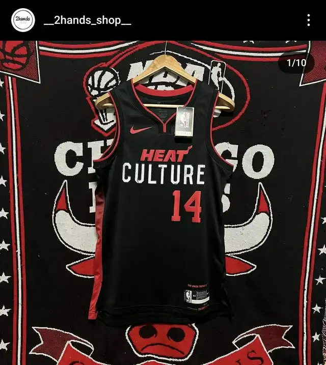
On 10/1/2023 at 6:24 PM, sawakita33 said:
Great find @fortunat1! They also have a better look of the Heat Culture jersey.

embarrassing. First Heat city jersey I have no interest in. I even liked the Mashups ! These are just horrible-
2
-
-
Wish the NBA & Nike would just do away with city jerseys at this point. They’re so ugly.
-
10
-
 1
1
-
 1
1
-
-
1 hour ago, Cujo said:
You mean do stuff like this, which is 100000x inferior to just doing true throwbacks?
Those are super clean. That with the current logo on the helmet.

-
1
-
 1
1
-
 1
1
-
2
-
 3
3
-
 2
2
-
-
21 hours ago, Carolingian Steamroller said:
Well it does match the orange helmet and I would argue that helmet should have a color balance that leans toward the brown rather than orange. I think it matches the jersey terrifically. Now the pants have a wider brown center stripe but then you mess with the striping proportions on the helmet compared to the non-alternate helmet and I think it's simpler just to roll with the stripes they did.
Again, I don't think they messed up at all. I thought it looked really slick.
Addendum: This swapped helmet/pant stripe deal is also found in the U.
As a Canes fan, I hate that they do this.
-
3
-
-
Lol I thought the Jets & the Vikings both changed their sets again. Had idea they were throwbacks.
What made them wear them for the first game of the season?
-
On 7/27/2023 at 6:07 PM, alecgoff said:
A simple fix could go a long way.
It’s crazy how much better that looks.

Reminds of how the Lakers did their retro inspired rebrand but messed up the collar/piping just to make it distinguishable from their actual retro’s and it just sticks out like a sore thumb.
-
2
-
-
Is it weird that I’ve gotten used to the ads on jerseys ? They look so weird with that blank space now lol
-
3
-
1
-
1
-
-
Celtics green jerseys with white accessories look soooo good. I hate when they wear black accessories with any of their regular home & away. Never looked right.
-
5
-
-
On 5/3/2023 at 2:28 PM, kimball said:
I need to see these side by side ... I didn't even realize they changed them. Huh.
And, yeah, the older versions are better. The red on the shorts is too gaudy and the red outline on the gold print is too much.
Dumb change.
Wow I never noticed that. No wonder I was thinking they looked like the Globe Trotters.
My god that looks bad.
-
The purple Lakers jersey is so ugly.
-
1
-
-
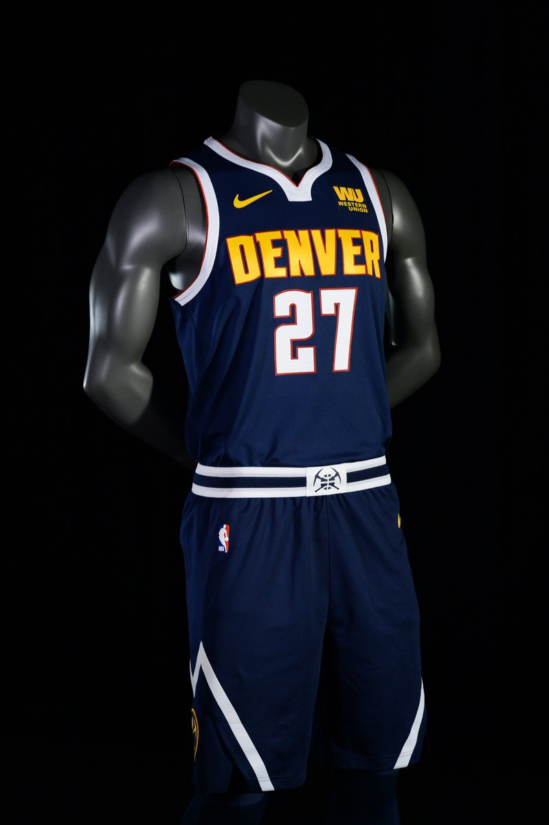
14 hours ago, pelicanfan said:
the nuggets current unis look pretty normal to me. a little bit too normal… there’s nothing wrong with them at all. but they definitely don’t stick out like how their old uniforms used to. i really do miss that baby blue. i wonder how’d they look if they just took this design but recolor it to their old colors. design wise it’s a really solid uniform. but color wise i think they’re one of the more forgettable looks as of right now…
i also just wanna say how it’s absolutely criminal how nike has never made a baby blue jersey for them…
They just went fromsuch a fun, exciting color scheme to something so drab and boring. Along with their overly simple court.
And their alternate having “Mile High City” as the word mark and doesn’t even match the rest of the set puts it over the top for me as the worst.
-
3
-
-
it’s insane to me. The Nuggets had some of the best uniforms in the league, and their current set is absolutely the worst in the league to me. Like I honestly hate watching them play with just how their jerseys and court look. It’s so awful.
-
7
-
 1
1
-
 1
1
-
1
-
-
Why the hell is the Arizona wordmark so huge ???
-
1
-
-
Can’t lie, the more and more I see the Cavs jersey set I love them. Because I sure as hell thought they looked like practice jerseys at first.
the only thing I’m not a huge fan of is wordmarks on jerseys that don’t have an arch on them.
and I don’t love the all maroon jersey & accessories combo.
-
On 4/7/2023 at 7:38 AM, TrueYankee26 said:
As a black 31 year old person also from an urban area they should have went with something similar to what the Mavs had in 2019-20
That just looks like a stereotype lol
-
4
-
-
On 4/6/2023 at 7:31 PM, andregunts said:
so I live in Brooklyn not too far from the arena and I’m 38, black and kinda “urban”
I’ve realize this thread is filled with people “not” like me.
You guys cry and whine anything different and too loud. I knew from when I first saw it that when I came in here it’s gonna be a bunch of crybaby nonsense.
I LOOOOOOVVVVVVEEEEE THIS JERSEY.
what do you guys want another black/white Jersey that is almost identical to every other jersey that the Net has?!?!
remember this is a “city” jersey not the barn rural antiquated jersey.
its audacious and bold and I think it’s FIRE.
Keep crying guys, things are gonna get more different going forward

I’m black, live in Atlanta, (Jamaican as well) and actually 27. I still prefer the more traditional stuff and think these “out there” designs are ugly asf.
I hate most of the city jerseys I’m not gonna lie to you. I don’t doubt there’s a market for them and people will rock whatever they think looks cool, but most of this :censored: is garbage in my opinion.
-
11
-
1
-
-
Those Knicks Statement jerseys are so ugly man.
and I feel like I haven’t seen them play in anything but that all season.
Can’t wait til the playoffs so we don’t have to see alternates anymore tbh.
-
3
-
-
Looks so weird to see the Heat finally wear their regular white jerseys at home. I can probably count on 2 hands how often I’ve seen them or the regular set this season.
also, I hate that we wear black accessories with the white jerseys. I miss the days when we wore white on white.
-
1
-
-
Man I hate what NBA jerseys have become. I’m watching the Lakers/Warriors game and you can barely tell who’s who.
Lakers playing in their white/blue/yellow Minneapolis retro jerseys & Golden State playing in black jerseys and a black court at home lmao.
And this isn’t coming from a “old man yells at cloud perspective” either. I’m only 26 and grew up watching the NBA in the 2010’s to now.
-
10
-
-
Celtics look great with the white jerseys and green accessories. I wish more teams did directly contrasting accessories colors using their secondary accents with their jerseys. Never made sense to me when I see them wear black accessories with white jerseys.
-
11
-
-
Everyone is entitled to their opinions, but I feel like a lot of takes are such massive overreactions. How are the helmets they wore “horrendous”. To not like them is one thing, but horrendous ? Lmao
-
7
-
-
Both my Dolphins and the Bengals look great !!!! Love the matchup, the colors, everything. And those white helmets for the Bengals are CLEAAAAAN.
-
 1
1
-
3
-
1
-
 1
1
-
-
What’s terrible about it lol
-
1
-


2023 - 2024 NBA changes
in Sports Logo News
Posted
I have this some Goran jersey. Love it ! Would have liked to see other color variations of it.