


kewp80
-
Posts
2,794 -
Joined
-
Last visited
Posts posted by kewp80
-
-
Splitting the Oklahoma teams in different divisions just wouldn't seem right. Which is what they would more than likely have to do if they want a championship game. Unless they bring in two more eastern or northern schools, or they do what the B1G did and split Texas and Oklahoma and name the divisions something stupid like "Spaghetti" and "Meatballs", and hope for two Red River Rivalries a year.
-
I honestly hate everything about this.
-
What the hell is that green guy supposed to be? A moldy burrito dressed as Davy Crockett?
-
I don't really have a problem with the Olympic banners. It's a sport of individuals, and at the time of the Olympics, those were Miami's individuals.
I guess I see your point.
I gotta say as well. Have never seen a trainer get memorialized in any way by a team. Owners, GM's, broadcasters, or players yes, but what's the story on him?
-
The Miami Heat continue their proud tradition of superfluous banners with the addition of a HOF notation on Zo's retired jersey.
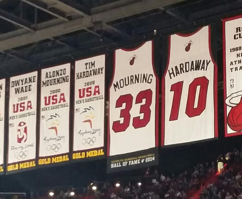
Wow. Do they really put up banners for players on the team who won gold medals in the Olympics? That just seems really dumb. They didn't win them for the Heat... they won them for the pride of their nation. Jeez. I'd like to see an NHL team try and do that

Here's a serious question though: who would get the raise Shaq's number up in their rafters? Or has that happened already? I really don't follow the NBA.
-
Is that really a gradient on the numbers?
Looks like their sort of trying to mimic the orange rainbow jerseys. Except: 1) there's an orange stroke between each shade of orange and 2) it's at an angle. I'll pass judgement until I see some real pics, but looks like a slight downgrade to me.
Also, what is that a patch of? It's hard to make out since it's the same color as the uniform...
-
Would anybody know where to find/if they make numbers for Telegraphico?
-
I kinda like that logo better than the one they use now.
-
Please! Please! Please! Go with Moonshiners!

Canaries would be a nice subtle nod to the mining industry too.
-
Oregon needs constant updating...
-
Really liking that Nashville Sounds rebrand. Can't wait to see more. Cool take on the color palette.
Thank goodness the Kitsap (What is Kitsap?) is getting a new logo. That thing is horribly dated.
-
Man those 'RANGERS' scripts just look weird and awkward. It's like the outline couldn't decide to be just an outline or a drop shadow. Plus the shadow seems to be dropping opposite ways on some letters. WTF mate?
-
I propose a coup/purge of our fearless Generalissimo
-
 1
1
-
-
Way to pull my leg there Mac.

Pretty sure his was brought up in another thread, but pretty crazy how close they were to moving. Would love a Seattle-Vancouver rivalry in hockey.
-
Fantastic work as usual! Couple questions:
What is up with the Clemson Tiger-Soldier? And isn't it Tulsa Golden Hurricanes, not Tornadoes?
Keep up the outstanding work ren!
-
Asked this in the college football bowls thread, but figured I would ask here as well. Anyone know what font this Fiesta Bowl wordmark is in? Or something that is similar?

-
Saw this on my facebook news feed. Pretty sure this was made by someone here on the forums in an all sports city thread. Felt I would share to make sure no one is getting ripped off on this.

Here's the link: http://www.productiontees.com/products/1edd0cbd9837d63e?fbs=6017442979132
-
Definitely want to see that state outline/viking ship logo in a bigger size. I'm barely seeing a ship.
And side logos over top of the pants stripe? Ewwwww.
Thought I was going to like this. It's a cool idea and all, but way too busy and jumbled. Glad they ended up not using it. I guess leave the state outline for the Twins.
-
Definitely want to see that state outline/viking ship logo in a bigger size. I'm barely seeing a ship.
And side logos over top of the pants stripe? Ewwwww.
-
Ok, I have two unrelated questions:
First is, what is the little green bar on my profile page that says "6 Neutral"?
And second, can we have a rule or something so that people don't quote posts with like 5 or 6 images in them? Especially in the concepts forum. I just feel it's really unnecessary to have someone quote the whole concept I've just seen just to say "Great work!" or "Really like it". It seems most people are good at it, but it just kinda ticks me off a little bit to load the same pictures twice in one page.
Thank you for your time

-
To be honest, I think the best defense (even more so than watermarks and all that) is being an active part of a network like Dribbble, Behance, or even here. I've gotten tips from people I've spoken to maybe once before on work that was being shared without attribution, all because I was visible and active on those networks.
So, while it may be tempting to shell up and watermark the ever-living
 out of your work, keep creating, keep posting it, and the general community will (usually) keep an eye out for your work. Think about it -- there are guys who post work all the time, and you know their styles. I hate to use the ever-common example of Fraser, but his work is unique and he spreads it far and wide. When someone steals his work, everyone knows because they've seen it somewhere. The more often you create those exposure opportunities, the more likely you'll be alerted by a fellow community member (if you don't catch it yourself).
If I see something familiar, I always look around to see if it's something I recognize for a reason, and then let the artist know. Yu Masuda's Bengal actually made it on to one of MVPTees' shirts, so I sent him a quick note.
We're much stronger as a community, think of it that way. It sucks that it happens, but threads like this give me a little bit of hope that our work is somewhat protected still.
Great post.
After this thread opened up I have felt that this community could end up being like a back up to the dribbbles, behances, twitters, or what have you in the internet world.
I'm really glad that this topic has grown on the boards... perhaps we could have this pinned for any future incidents so that we can continue to protect and back up the great work that is done by the community members here. Just a suggestion.
-
If someone would invite me so I can comment on these :censored: hole's posts I would love to do so. Also wouldn't mind being able to post some stuff of mine
All this crap seems really stupid, but this is one of the many downsides to the age of social media and the internet. Don't get me wrong there's lots of positives, and I think Dribbble is an awesome site, but you gotta think things like this would totally happen. I'm down to help out anyway I can.
Last I saw Doug your comment was still up. There were 2 likes including mine.
-
Does anyone have the raster version of the Baseball template Chris uses on his site?
Like this.
image
Anyone have the vector version of this template?
Never mind, found it on vector portal.
Hey Drew, if you still need a raster version of this I could probably fix one up real quick.
Do you mind making a SVG version?
Naw man, I'll get on it tomorrow.
-
Does anyone have the raster version of the Baseball template Chris uses on his site?
Like this.

Anyone have the vector version of this template?
Never mind, found it on vector portal.
Hey Drew, if you still need a raster version of this I could probably fix one up real quick.


 out of your work, keep creating, keep posting it, and the general community will (usually) keep an eye out for your work. Think about it -- there are guys who post work all the time, and you know their styles. I hate to use the ever-common example of Fraser, but his work is unique and he spreads it far and wide. When someone steals his work, everyone knows because they've seen it somewhere. The more often you create those exposure opportunities, the more likely you'll be alerted by a fellow community member (if you don't catch it yourself).
Division 1 College Conference Realignment
in Sports In General
Posted
Not sure travel distance should be a concern for the Big X(II) when you have the B1G stretching from Nebraska and Minnesota to New Jersey and Maryland. Plus the SEC EAST stretching from Missouri the Florida. It's the new nature of college athletics that we are getting from these super conferences. If the schools in the Big X(II) can't afford to do that then maybe they should just die off. It would make deciding the playoff a hell of a lot easier too.