


ImmortalChef
-
Posts
348 -
Joined
-
Last visited
Posts posted by ImmortalChef
-
-
1 hour ago, MCM0313 said:
What do you think about this unused variation?:

It's just as bad as the rest
-
 1
1
-
-
1 minute ago, Rj0498 said:
In honor of being march i will say this, I think the st pats day unis are good.


I like the Knicks and Celtics gold ones but I hate the rest of 'em
-
-
Half a season with the Magic

-
Right team, wrong uniform
-
2
-
-
Westbrook and Ibaka in a Sonics uni is any Seattle residents dream

-
1
-
-
Bill Laimbeer played with the Cavs before the Pistons GM discovered him

-
3
-
-
8 hours ago, Cujo said:
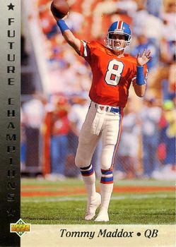

Maddox with the Steelers is right, since he won a Super Bowl with them,but him on the Broncos is really wrong
-
52 minutes ago, insert name said:
I think he meant these,

I love those unis, they look classy and modern at the same time
-
1
-
-
2 hours ago, oldschoolvikings said:
So, I've always hated the Nashville Predators' logo. I just think it's embarrassingly amateurish. It's kind of a cross between a Hanna-Barbara funny animal and an 80's heavy metal logo. So, I've avoided doing a concept for them, because I didn't want to use that logo, but I couldn't really think of a replacement. Then, while putting together a lecture (on cave painting, for an Art Appreciation class, strangely enough) I came across this image;

It's a fossilized footprint from a Saber Tooth Tiger, apparently. So I decided to work with that and came up with this;
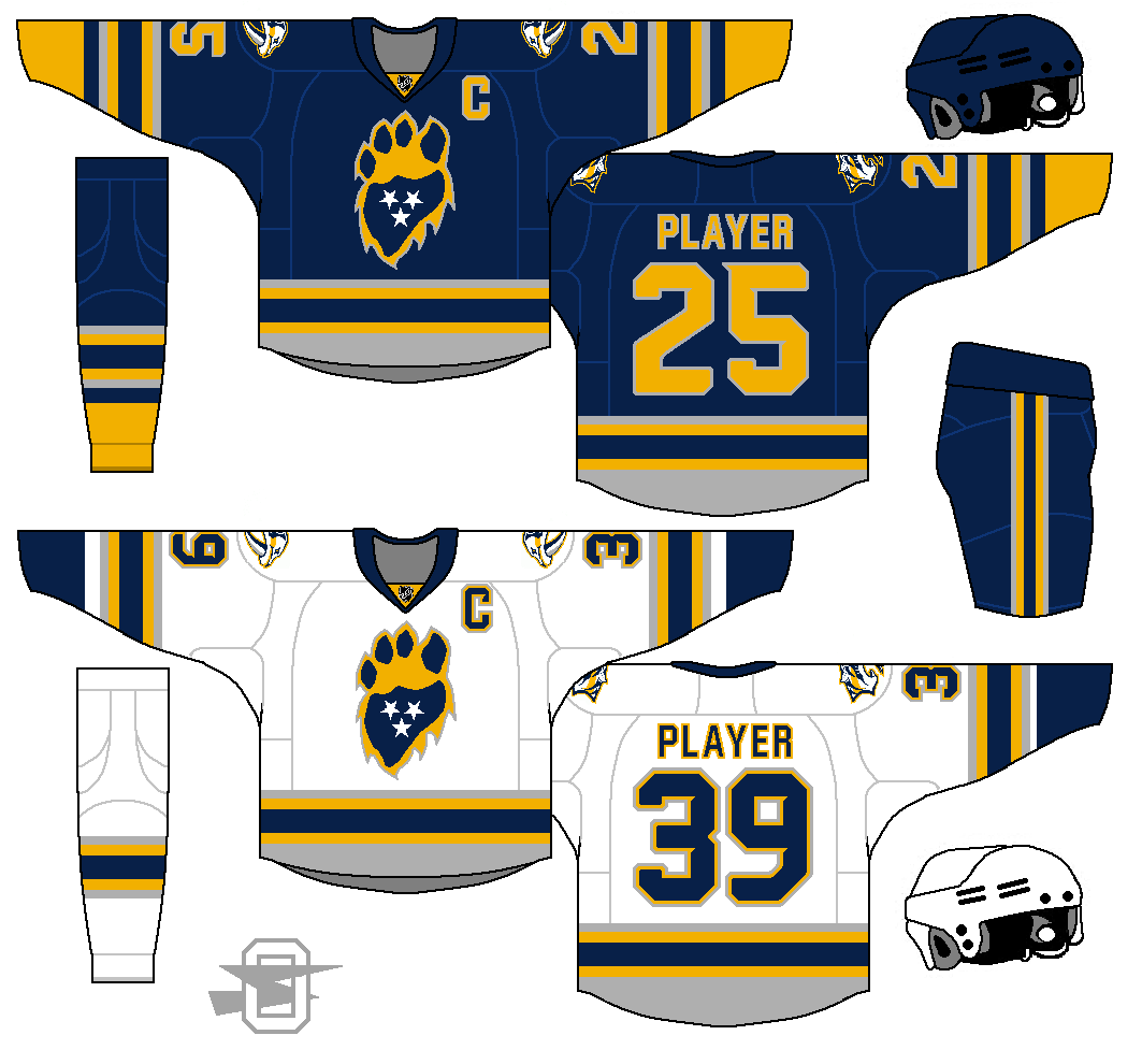
(I kept the goofy cartoon cat as a shoulder patch, but I could get talked out of it.)
I hate the Predators logo as well, but I do not think that this logo is any better. At this point the Preds should rebrand, sonce their name is already pretty terrible
-
I hate the Predators logo and identity as a whole
-
5
-
-
19 minutes ago, rickyISking said:
The furthest one on the left is the best, should have gone with that one.
")
The only problem is that it looks like a Mariners logo
-
1
-
-
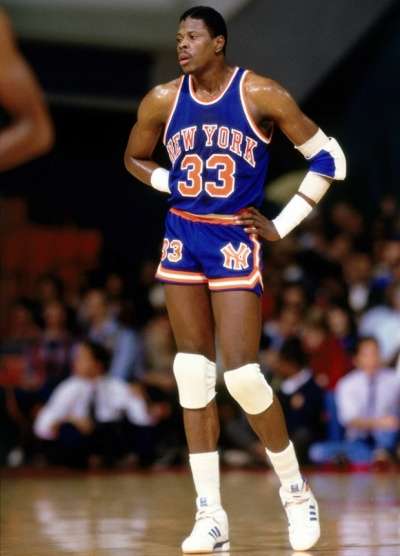
The Bulls pose for a team photo with the Champion logo covered, most likely for copyright reasons

-
Eddie Jones in the 1995 Rookie Challenge, the jerseys were all the same design but with different team names, another picture from that game, and another rookie challenge with a whos who of players


-
2
-
-
NBA all star game in the Houston Astrodome, circa. 1989

-
1
-
-
These are all really cool, especially the Toronto Towers one and the Jazz one
-
4 minutes ago, Cujo said:

Rod Smart, to me is He Hate Me. But, I also remember his stint with the Panthers. I would not say it is a wrong uni though
-
3
-
-
On 2/28/2017 at 6:55 PM, SabresRule7361 said:
Andre Miller
I would say Miller has no "right" uni since he is a journeyman
-
2
-
-
I don't really wztch baseball, but I do look at the MLB logos on sportslogos.net sometimes, and I think that every MLB logo is great, even the D-Backs
-
3
-
-
7 minutes ago, Dnice said:
Pretty much, I can't think of journeymen in MLB they way some hop around in the NBA for 7+ teams and get decent playing time.
Bartolo Colon
-
1
-
-
9 minutes ago, DG_Now said:
Shaq's Magic beat Jordan's Bulls. It really happened, even if we all pretend it didn't.
And Jordan scored 49 points while wearing the number 12 in that game.
-
1
-
-
51 minutes ago, MCM0313 said:
Flying Elvis, mid-90s Hawks, and Wizards logo are all decent-to-good in my book. (I've always had a soft spot for Flying Elvis, myself.) That green Bucks jersey was just a bad design. If they'd used the same template as the white and the purple it would've looked fine.
The Dolphins' logo isn't bad in a vacuum, but it looks more like a cruise line logo than a football logo. It also bucks team tradition by removing all traces of facial expression from the dolphin, and also the little helmet with an M on it. In every other iteration the dolphin was looking at the viewer; the pre-1997 versions all seemed to be smiling, and the 1997-2012 version was fierce-looking. This dolphin has barely distinguishable facial features, no expression, and no helmet. It's also worth noting that the previous logos were jumping through the sun-hoops, giving them an active posture; this one looks almost limp.
I don't think that the new Dolphins logo is better than the old ones, I just don't think its a bad logo
-
Some logos/jerseys I don't get all the hate for


-
1 hour ago, insert name said:

I don't really count that because it was just a marketing scheme by the Sox to gain as much money as possible


Rare NBA Getty Images, Google & Internet Find
in Sports Logo General Discussion
Posted
Dr. J playing against the Nuggets in the ABA