


eastfirst107
-
Posts
129 -
Joined
-
Last visited
Posts posted by eastfirst107
-
-
Cubs-inspired Austin Peay:

Saint Leo borrowing the Cards' STL:
-
 1
1
-
-
On 12/2/2020 at 1:50 PM, Gothamite said:
This could be the single biggest upgrade of the decade.
I mean, wow.
Hi, gang...I actually designed the original logo, and I'm right there with you that the new one is a massive upgrade.
The backstory: the league came together fairly quickly and they needed something to put on the banner for the introductory press conference in late 2005. I was doing some media relations for the league office at the time and was asked to work up a logo on short notice (I have some "I know how to use PhotoShop" abilities but I'm far from a professional designer). I was definitely not expecting that the original design was something that would be used for the long haul, but...just...nobody ever changed it.
I'm flattered that the team owners found the original design (and its "interlocking letters" cousin, below) acceptable enough to keep around for 15 seasons, but whew, a refresh was definitely long past due, and I think the designers nailed the new one.
-
8
-
-
A cleaned-up brand evolution done right: Kansas City T-Bones, American Association.
. Previous look:
-
1
-
-
On 1/24/2020 at 3:20 PM, NicDB said:
Maybe we're just spoiled in this part of the country where the Northwoods League has avoided the fly by night reputation of a lot of college summer leagues and has actually proven to be more stable than many affiliated minor leagues. Something they've done with a league full of teams with dignified identities..... and the Green Bay Booyah."Traverse City Pit Spitters" ain't swimming in the deep end of the "dignified identities" pool, either...
-
2
-
-
On 11/10/2019 at 12:05 PM, the admiral said:
Always gotta wonder how long Rouyn-Noranda can hang on in the dear old LHJMQ. Town and arena look like something out of Slap Shot, but more so. I'd hate to see them wind up in another suburb of Montreal; who will keep Val d'Or company?
Have there been any reports of the Huskies being in trouble, or are you just looking at the fact that it's an older arena and an out-of-the-way town and deciding to speculate that they're not long for the world?
- Rouyn-Noranda's attendance was better than four other QMJHL teams last season (Gatineau, Bathurst, Baie-Comeau, Val-d'Or.)
- If we eliminated the towns and arenas in the Q that look like something out of Slap Shot, you'd have about six teams left.
- Teams in the Montreal area have a pretty poor track record in the Q (Laval, Longueuil, Verdun, Mtl Rocket, Saint-Jean). Blainville is barely hanging on. Trois-Rivieres is renovating its arena; if anyone were to move, it would probably be there.
-
1
-
-
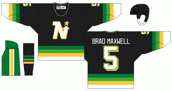
On 11/1/2019 at 3:37 PM, Eastport76 said:
Loved the gradient, Hated the black and green pants.
Also, the Nordiques nearly changed logo shortly before they moved to Denver. I think the husky is definitely a great idea for the Nordiques, but this logo need a massive update.
Definitely a great idea for a shoulder patch if the classic "N" igloo becomes the crest. In case if they're back.
Speaking of unused logos with a husky in them, the QMJHL's Rouyn-Noranda Huskies were originally the Rouyn-Noranda Blizzards for a couple of months but changed the name shortly before the team's first season (a college elsewhere in the province was using the name and raised a fuss). https://ici.radio-canada.ca/nouvelle/744493/huskies-blizzards-hockey-lhjmq-20e-rouyn-noranda
-
2
-
-
34 minutes ago, DustDevil61 said:
Me too, though their logos needed some work. I think an older Missoula team used the name Timberjacks…if they went with that I’d be cool with it.Indeed.
-
2
-
-
The blue in the roundel of the Nationals' sleeve patch logo isn't the same shade as the navy blue jerseys and it's been driving me up the wall all playoffs.
-
2
-
-
On 7/2/2019 at 5:00 PM, MattMill said:
I see these seemingly screen printed jerseys on the auction block a lot. How’s the general quality? They all look more like t shirts, yet they are bought up pretty quickly
The gimmicks will continue as long as we let them.
These guys make a lot of the minor-league one-offs: https://www.otsports.com/special-event-baseball-jerseys
The quality is okay - not the same as a regular-season jersey, but definitely a step up from t-shirts (it's a "Breathable, durable Euromesh or Pro Euromesh fabric," FWIW).
-
1
-
-
The Reds' front chest logo and front uni number almost but don't quite line up:
They used to, BTW...
-
5
-
-
NCAA basketball jerseys cluttered with too many doo-dads above the team name.
Also...the fact that the old Marlins' uni number font matched nothing else in their branding always irritated me.
-
6
-
-
On 4/20/2019 at 2:14 AM, Sykotyk said:
Braves were probably the most notorious for that.
Then there's the Mets who saw the B-Mets become the Rumble Ponies and their AAA affiliate switched to Syracuse and suddenly they're now the Mets.
The Braves have traditionally owned most of their affiliates (the High-A club, whether it's been in Durham, Myrtle Beach, Lynchburg or Kissimmee, has always been an exception), so naturally they'd just keep the brand the same, since there's no chance of the team ever switching affiliates.
-
On 4/20/2019 at 3:44 PM, Gothamite said:
Thats not too uncommon across the minor leagues.
Oh, I know...it's just the Cubs are the only ones I've ever noticed doing this (seemingly imposing it, perhaps, and often rather obtrusively) for all of their affiliates, without fail, for years.
Elsewhere, it seems like it may be up to the minor-league team. The Binghamton Rumble Ponies and Columbia Fireflies, for example, don't seem to have any Mets identification on their jerseys.
-
10 hours ago, Pizzaman7294 said:
Peoria Chiefs (while affiliated with the Cubs)
Interesting, it looks like most of the Cubs' affiliates have some sort of CHC patch on their jerseys, even going back a number of years, and even if it in no way fits with a team's color scheme...probably an organization-wide thing.
-
2
-
-
Shawinigan throwbacks. Doesn't look like they went with the fantastic socks from the original, though.


-
1
-
-
3 hours ago, jrodsep said:
Why couldn't Amarillo gone with Armadillos?
Their independent team thought of that 20 years ago. Logo could use some work, but classy-looking uniforms.


-
3
-
-
1 hour ago, MBurmy said:
Man, the quality of Studio Simon's work is so much better than Brandiose's.
-
2
-
-
(Apologies in advance for threadjacking this...)
I dunno, it's not a bad-looking script on the '93-'94 road grays there, along with the button front and toned-down piping...I like it better than the late '80s pullovers.
 2 hours ago, insert name said:
1993-94 during a really dark embarrassing time. It's probably the worst non-alternative uniform the Mets have ever worn.

-
1
-
-
2 hours ago, BeerGuyJordan said:
If Brandoise gets a hold of it, we'll probably wind up with the Amarillo Armadillos. Which is actually not bad, by their standards.
Don't know if anyone actually calls armadillos "dillas," but that was the name of Amarillo's independent-league team for a good 15+ years.
-
Won't always be the web site, it looks like.

-
1
-


/cdn.vox-cdn.com/uploads/chorus_image/image/59613209/usa_today_10814899.0.jpg)


College Baseball MLB Inspired Uniform Elements
in Sports Logo General Discussion
Posted
Long Beach State with the Pirates vests:
Southern Cal with Padres lettering: