


DJT
-
Posts
196 -
Joined
-
Last visited
Posts posted by DJT
-
-
20 hours ago, DJT said:
Another report on the supposed Jazz rebrand (again).
Q: Any updates on the rebrand and if it is, in fact, happening this summer?
A: I can confirm that the rebrand is in fact happening, but what all that entails I am not completely sure.
As I reported in March, there will be new uniforms next season, and I’ve heard that mountains will be a prominent feature in the team’s design, though my guess would be the Jazz Note logo also remains.
I have also heard that the jerseys are more geared towards what Jazz fans have traditionally preferred, and a step back from the outside-the-box approach they took with the ultra-simplistic black, white, and yellow uniform scheme.
My belief is the Jazz would like to have some of the elements of the rebrand completed before the June 26-27 draft, but I haven’t heard a release date.
https://kslsports.com/516216/utah-jazz-mailbag-latest-rebrand-rumors/
Conrad did say to not get our hopes up about this rebrand though. So take this with a grain of salt.
-
 1
1
-
-
Another report on the supposed Jazz rebrand (again).
Q: Any updates on the rebrand and if it is, in fact, happening this summer?
A: I can confirm that the rebrand is in fact happening, but what all that entails I am not completely sure.
As I reported in March, there will be new uniforms next season, and I’ve heard that mountains will be a prominent feature in the team’s design, though my guess would be the Jazz Note logo also remains.
I have also heard that the jerseys are more geared towards what Jazz fans have traditionally preferred, and a step back from the outside-the-box approach they took with the ultra-simplistic black, white, and yellow uniform scheme.
My belief is the Jazz would like to have some of the elements of the rebrand completed before the June 26-27 draft, but I haven’t heard a release date.
https://kslsports.com/516216/utah-jazz-mailbag-latest-rebrand-rumors/
-
9
-
-
5 hours ago, Foxxtrot44 said:
I will accept the Yeti name on the condition that the aesthetics lean into the ski/winter sports styles of the late 80's and early 90's.
That means the Yeti will need to be in a cool pair of polarized sunglassesand that the color scheme will be

Ryan Smith gets his highlighter color. Fans get a local culture connection. Kids get a silly name. Hockey purists get to choke on their tongues at the utter steeziness of it all. Win-Win-Win-Win.
I am not a crackpot.
Maybe some leg warmers too
-
1
-
-
I’m leaning Outlaws.
-
The crazy thing is a lot of Jazz fans actually liked the all blue look. It will forever be my least favorite.
-
20 minutes ago, MiK said:
I think I’d prefer black over the darker blue but definitely fits the winter aesthetic.
-
2
-
-
I think the name will dictate a lot. If it’s Yeti’s could be the purple/light blue/dark blue wintery look. If it’s Outlaws I don’t see how purple could be a prominent color.
-
15 minutes ago, Foxxtrot44 said:
With today's trademarks, we have a pretty clear vision of the bracket
Yetis
Outlaws
Fury
Venom
HC
Blizzard
Ice
Mammoth
Talking to people it seems like this is a horse race between Yetis, Outlaws, and "Why isn't Raptors an option?"
Odd that of all the fossil choices available in Utah, they would go with Mammoth. I mean, we have a lot of them, but they aren't the iconic Woolly Mammoth.
I tend to think we have enough "yee-haw" imagery and history to pull from to make Outlaws really stand out. But also I don't care that we're all a bunch of squares.I haven’t heard Ice or Mammoth until now. I think Black Diamonds will replace one of those and possibly Raptors replacing the other (if Toronto doesn’t throw a fit).
-
A hockey team logo where it’s someone skiing down a mountain. Seems fitting?
-
1
-
-
I’m hoping the bracket includes a little mock logo of sorts but I think that’s wishful thinking.
Funny fact my friend reminded me of. We would draw logos and nba jerseys when we were little and re-did every team + added more for states without teams. The Utah team was Utah Blizzard. But now I don’t like it for an nhl team haha.
Yetis and Outlaws are my favorites so far. Black Diamonds could be interesting but I feel it may be harder to pull off.
-
1
-
-
Ryan Smith said on the Pat McAfee show they will do a bracket to choose the name. Pat and other people on the show booed.
-
There’s a fan event tomorrow at the arena. I’m doubting they announce colors or anything but that would be nice. Introducing the players and coach and stuff like that.
-
Hear me out. Utah Zzaj
-
1
-
-
Gonna need to see the full set to really have an opinion on these.
-
1
-
 1
1
-
-
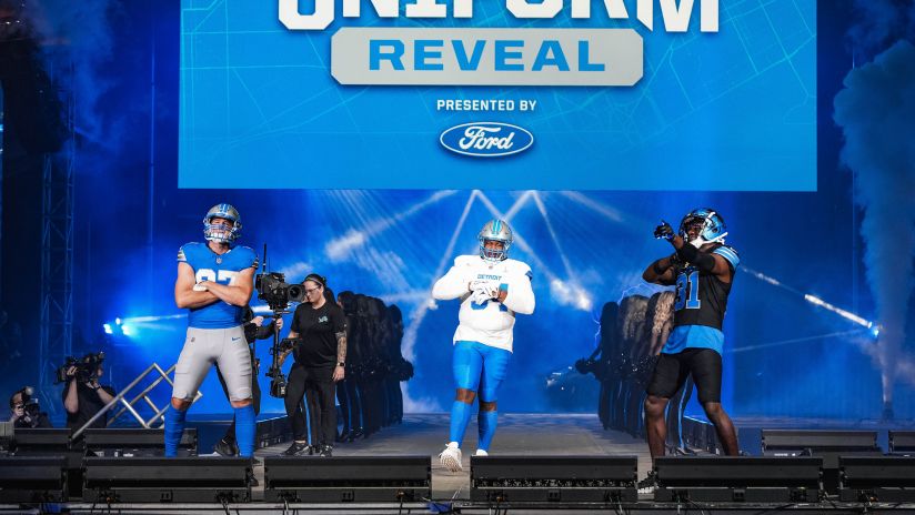
Lets get this one going a little quicker than the Lions one.
I actually like these quite a bit. Really hope the pants don't mess it all up.
-
3
-
 2
2
-
-
Still not thrilled on any choices so far. And I really hope they can crank something out good and fast so it doesn't have to be Utah HC for a year.
Utah Fury apparently is a book series.
Utah Yeti - still not sure how I feel about it
Utah Dragons - same as yeti
Utah Swarm - sounds decent but really don't need another black n yellow
Utah Blizzard - hard no. Avalanche is right there.
Utah Venom - Snakes? Scorpions? Vipers? "here come the Venom on the ice" no thanks
-
1
-
-
Figured i'd follow the rules and start its own thread.
I honestly think this is a great choice. The home set is perfect.
-
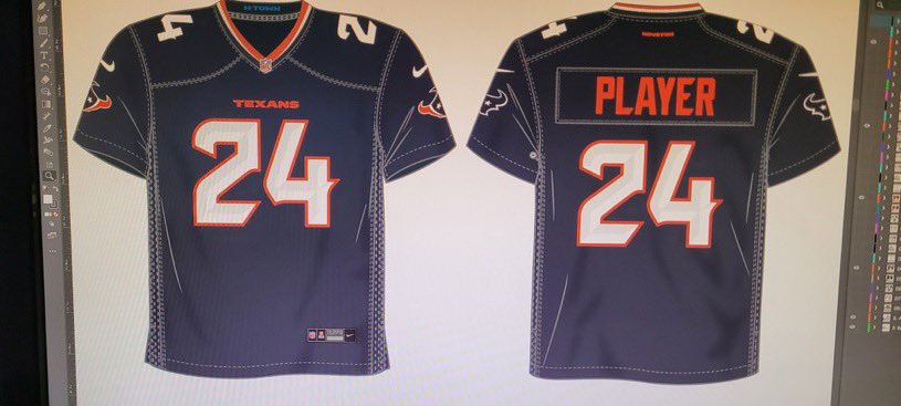
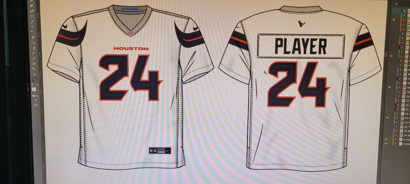
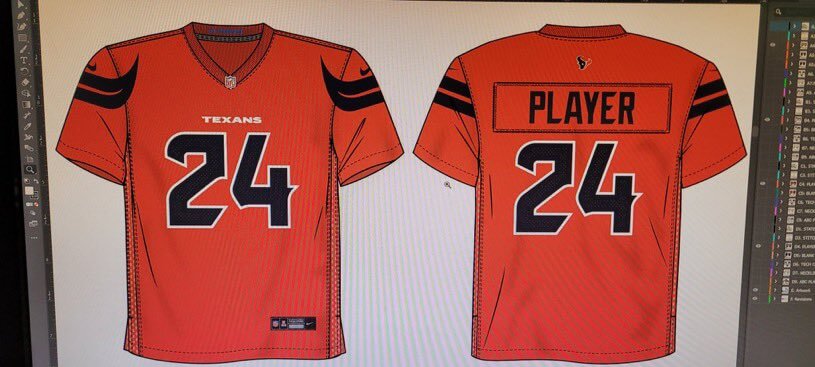
Weren’t there supposed to be mountains on the broncos jersey? But I like those.
-
Press conference tomorrow. Also a post by NHL and delta center said name and colors coming soon.
-
30 minutes ago, FinsUp1214 said:
In Smith’s defense, his taste in logos and typography seems to be much more minimal from what I can gather. The Jazz logo and word marks, as well as a lot of thier CounterPoint streetwear merch series, are more minimal in design. Where Smith goes galaxy brain is in color choices, and if I had any worries whatsoever about the brand, it’d be in the potential for a bad color scheme. In all honesty, I don’t think a potential logo for this team is going to be excessively detailed and certainly not AI-esque. I think - key word, think - Smith will keep the logo(s) more simple than not.I think with all the backlash he got from the Jazz rebrand he will have learned his lesson. He’s a smart guy and does listen to feedback. The Jazz didn’t wear the yellow jersey for the 2nd half of the season because people (not me) hated it so much.
-
1
-
-
1 hour ago, CaliforniaGlowin said:
Man has this thread gotten name jacked.
I mean its a pretty big topic for the NHL. A team relocating to another state.
-
3
-
-
I'm still liking the Utah Storm but that would probably open the floodgates to Stormin Mormons.
Utah Gulls I also kinda like since its the state bird. But another bird team.
Utah Yeti seems popular and i'm not sure about it.
I'd expect more surveys to come out asking for input from fans.
-
15 hours ago, MCM0313 said:
I never cared for how those were purple in the front and black in the back, and they’re very late-nineties/early-aughts, vaguely industrial-looking uniforms - but they have a heck of a lot more personality than the junk they’ve been wearing for the past decade-plus (however long it’s been since they dropped purple, really).
I'm not sure why but I loved the purple front and black back. I think there could be modern version of it that would look amazing, if not by the raptors another team.
-
3
-
-
I still like just Utah Golden Eagles. Although then it may be too close to Golden Knights.
I also like the name Utah Range but it’s too close to Rangers.
Sting, Swarm, Stingers, Scorpions, Gulls or Storm would all be good choices I think.


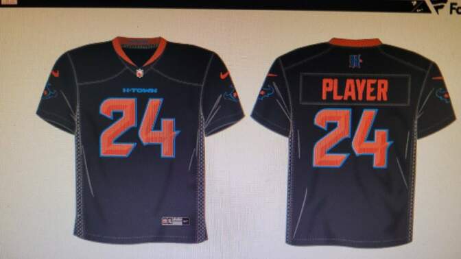

/cdn.vox-cdn.com/uploads/chorus_image/image/73289722/BRONCOSUNILEAK.0.jpeg)
:no_upscale()/cdn.vox-cdn.com/uploads/chorus_asset/file/25408154/BRONCOSUNILEAKWHITE.jpeg)

24-25 NBA changes
in Sports Logo News
Posted
I think this is likely as well. It will be a much better set then their current one.