


tjs11
-
Posts
333 -
Joined
-
Last visited
Posts posted by tjs11
-
-
Just now, BBTV said:
How is "football team captain" a military rank? Are hockey captains also a military rank?
Not what I said at all, really don't know how you got there. The same word is used for a military rank and the leaders of the team. I'm sure they worked backwards from that, read up on other military ranks, and justified their dumb system with that.
-
7 hours ago, BBTV said:
Makes sense. Playing football is basically the same as being in the military.

Team "Captain" is a military rank. Makes sense that they'd reference military rankings when making the decision on how many stars to put on the patch. I don't think anyone at any point was insinuating that playing football is the same thing as being in the military.
-
 2
2
-
-
I was just made aware of this very useful tool in Photoshop. I won't get to use this much with my work, but immediately thought of this thread. Hope it helps.
Video and instructions below.
https://helpx.adobe.com/photoshop/how-to/match-font-image.html
-
2
-
-
On 7/31/2021 at 7:08 PM, Cujo said:
[placard for Kris Bryant on the Giants]
Had to watch those last couple innings from 2016 after they tore it all down. Always brings back the same emotions. Baez, Bryant, and Rizzo are and always will be Cubs. Even if they win more rings, nothing compares to that Series and the historic aspect of it.
-
2
-
-
I lived in WI for a year or 2 when I was really young and was TERRIFIED of Snappy. Coincidentally, 25 years later I moved back to Wisconsin a few months ago. One last chance to confront my fears....Snappy I'm coming for you.
-
5
-
-
I'm not sure if it's the facemask color or the chin strap color but I really like the old Cyclone helmets better. Might also have something to do with the bumper logo.

-
4
-
-
1 hour ago, RoughRiders99 said:
Is there a way to create a photoshop graphic file (such as standings or playoff bracket) where I could put multiple teams in one location but only show one team at a time. Kind of like a drop down menu thing?
I'm trying to look for ways to save time "admin-ing" my sports fantasy stuff.
If I'm understanding this correctly, you could easily just put the logos on different layers and hide the ones you don't want. Use folders to get it tidy. Not a drop down menu, but I'm not aware of photoshop having that kind of capability.
-
2
-
-
6 hours ago, walkerws said:
While I love the black squirrels, they wouldn’t be any better. You’d still have to shoehorn in speed. The squirrels are Canadians anyway. Lol
This is off topic, but I was unaware of black squirrels association with Kent State and went down a rabbit hole on them. My lifelong best friend was named after a family friend of his dad's who allegedly was responsible for introducing black squirrels to Iowa. It was always a quirky story that he told a lot and he just found his namesake funny. Turns out, not true at all and not really a unique story either. I probably should keep it to myself and let him keep the story lol
-
1
-
-
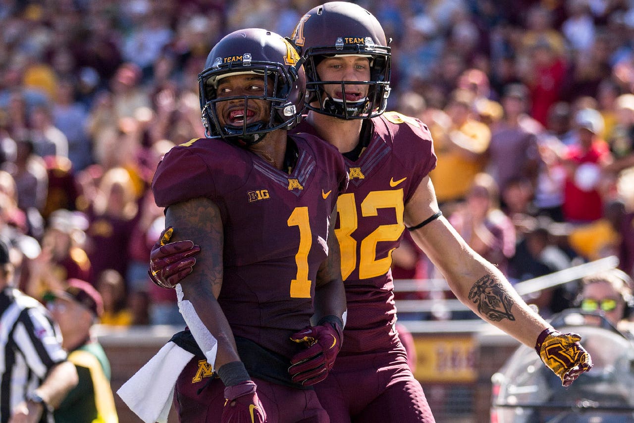
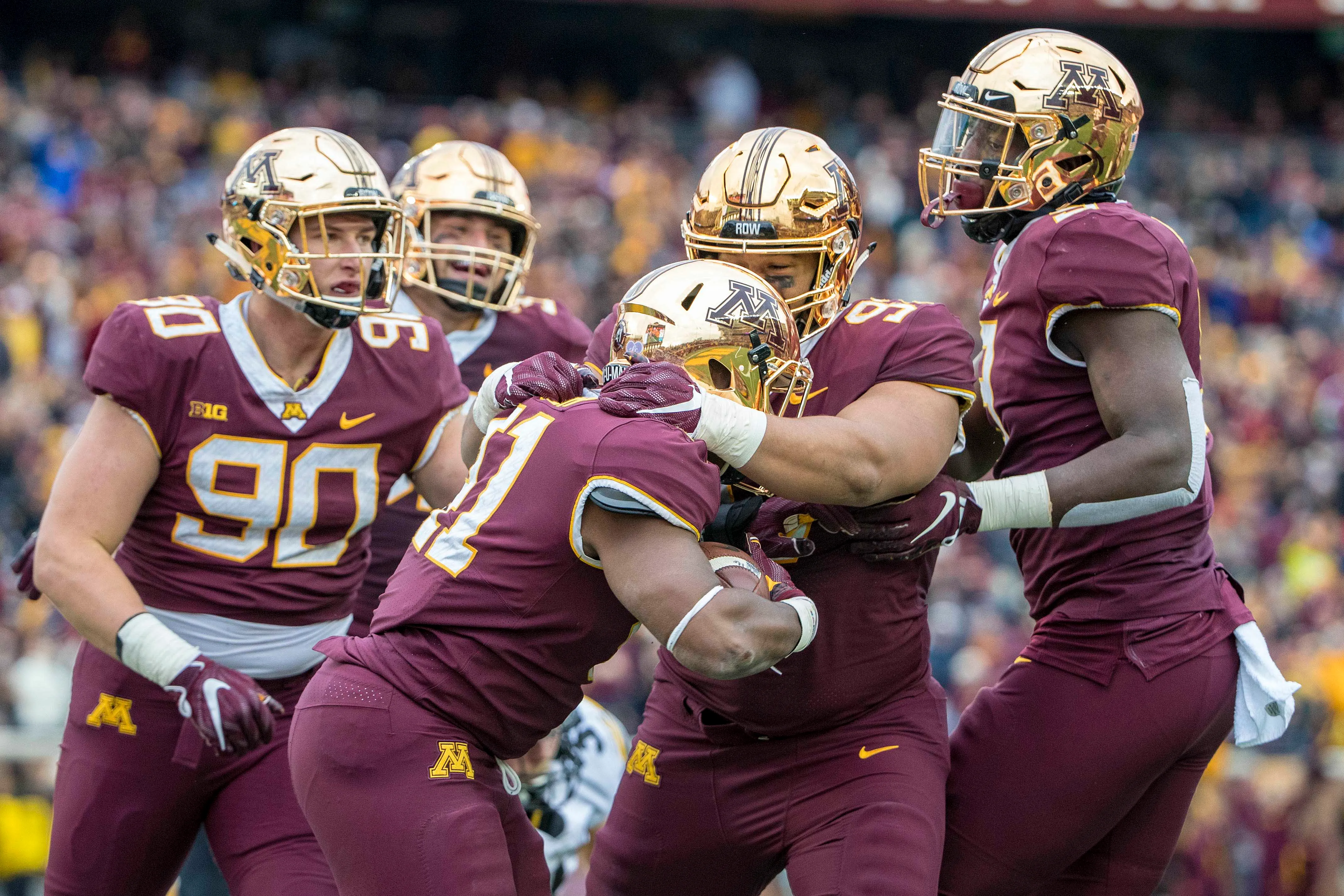
35 minutes ago, MNtwins3 said:
Minnesota going chrome/maroon/maroon vs Michigan
I'm still not over them changing from this set
to this:
-
18
-
-
On 9/1/2020 at 9:50 PM, henburg said:
That's a neat story and a nice subtle patch. That striping on his uniform could be adapted to today for a potentially cool alternate.
RE: ISU's new patch https://news.sportslogos.net/2020/09/01/iowa-state-cyclones-to-wear-jack-trice-uniform-patch/college/
Couldn't agree more. I love the subtlety and design-adds to the uniform without text or unnecessary logo repetition in a lot of anniversary patches for example. It gets a little cluttered with the nike logo, the Big12 logo, and collar logo, but all in all I love it. The fact that the Jack Trice story isn't more widely known is a shame (as is that Jack Trice Stadium is the only D1 stadium named after an african-american).
They DID try to create a Jack Trice style throw back in 2013. Not really a fan. Might be cooler if they implemented them into shoulder stripes instead of just trying to throw back. (EDIT: I realize now that they mention these in that article).
-
2
-
-
ahh i see. good find!
-
16 hours ago, Old School Fool said:
To continue the Pippen party, here he is in a throwback that he never wore but Jordan did.
so if he never wore that uniform, where is that picture from? Is it a photoshop or a preseason game or something?
-
or maybe the people here don't give enough credit to the non-uniform obsessive's taste. Just because the general public isn't on a board obsessing over uniform changes, they still might appreciate good uniform design.
Really sick of the
 generalization. Uniforms can be unique or full of personality, and people can like them without being the stereotype implied with that emoji. It's just a dumb dig and criticism at the general public at this point, used by people who care about uniforms to try and elevate themselves higher than the public.
I think Maryland has done a great job at making A their identity and I'd like to see that or D continue on. Really dislike B and C, but A is unique and gives a little personality to the team.
-
10
-
-
42 minutes ago, Maroon&Gold said:
Joe Mauer was a top 5 catcher in baseball history while wearing the pinstripes. In the gold drop-shadow he was a below average first baseman
I think that should go in this thread
") can't disagree with you though! glad he only ever played for the Twins.
can't disagree with you though! glad he only ever played for the Twins.
-
Interesting choice where they split it horizontally. You have the pretty thin bottom of the top part of the S, and the even thinner point on the bottom B. A different font might work better so that you don't have those oddities. Also the circular sun seems odd to me contrasting with the square spaces of the letters. I would've opted for much rounder lettering.
-
if you are banned, are you able to still view the forums and just not log in/post? i'd imagine so but curious
-
4 hours ago, Earl said:
Notice anything different?
are the W and F normally separated by the black outline?
-
watching Netflix's QB1 show and one of the local high schools uses Fraser Davidson's redskins logo just modified a bit (took out the arrowhead)
for their apparel (not for their team equipment). man, it sucks how people just find good designs online and think its fair game to slap it on sweatshirts.
-
1
-
-
I think this will be a very unpopular opinion. I don't think "pit stains" (e.x. titans) on football jerseys are all that bad. I don't like full side panels though. No real justification other than it;s another element, another way to add a little color, and I just don't think it's a bad look.
-
I can't find a record of it, but I'm 90% sure this was an istockphoto logo at one point. They have a bunch of generic sports team logos just like this. And would explain why another college uses it too.
-
9 hours ago, hettinger_rl said:
Talked to the GM and he agreed to stop using the image and was very apologetic. Turns out he was given the rights by someone else that claimed it was his intellectual property, so he got screwed too. Bad situation all around but they did the right thing in getting a hold of me.
That is great. Happy ending for the design world. Too bad you couldn't make a little cash off it! Hastings Walleye is a great name for the area. Your color choices and contrast are way better though. Hate what they did with the black/white double outline.
-
2
-
-
3rd minor league team in the past week or so to do a food related rebrand for a day?
-
damn that is crappy. Ripped of you and Fraser. Wish people respected art like they do other businesses.

:format(jpeg)/cdn.vox-cdn.com/uploads/chorus_image/image/47062130/usa-today-7457802.0.jpg)

:format(webp)/cdn.vox-cdn.com/uploads/chorus_image/image/17397283/tricethrowback2.0.jpg)


NFL Changes 2021
in Sports Logo News
Posted
I'm going off of what Sisdog said about it referencing 5 Star Generals. I have no clue what it actually is. I could see a world where they retroactively justified it by looking to military rankings but don't know.