


Danny the Sheeb
-
Posts
392 -
Joined
-
Last visited
Posts posted by Danny the Sheeb
-
-
1 hour ago, Lenny Dykstra said:
You don't remember 2010?
That is because I am only 14 years old.

Pretty much anything before 2012 is a void in my brain.
-
 4
4
-
-
I like the Grizzlies better without split numbers. There, I said it.
A couple of reasons why:
1: I'm not old enough to remember the split numbers. I've only ever seen photos.
2: It just looks a little cleaner this way.
Yes, this is coming from me, the guy who wants EVERYTHING to match.
-
1
-
-
6 hours ago, oldschoolvikings said:
With the recent discussion of possible (and much needed) changes coming to the Jacksonville Jaguars, I thought I'd dust off an older concept and do some slight updating. This is a pretty much straight forward update on their first look from the 90's. I'm keeping the current logo and number font, but everything else is inspired by their first uniform.
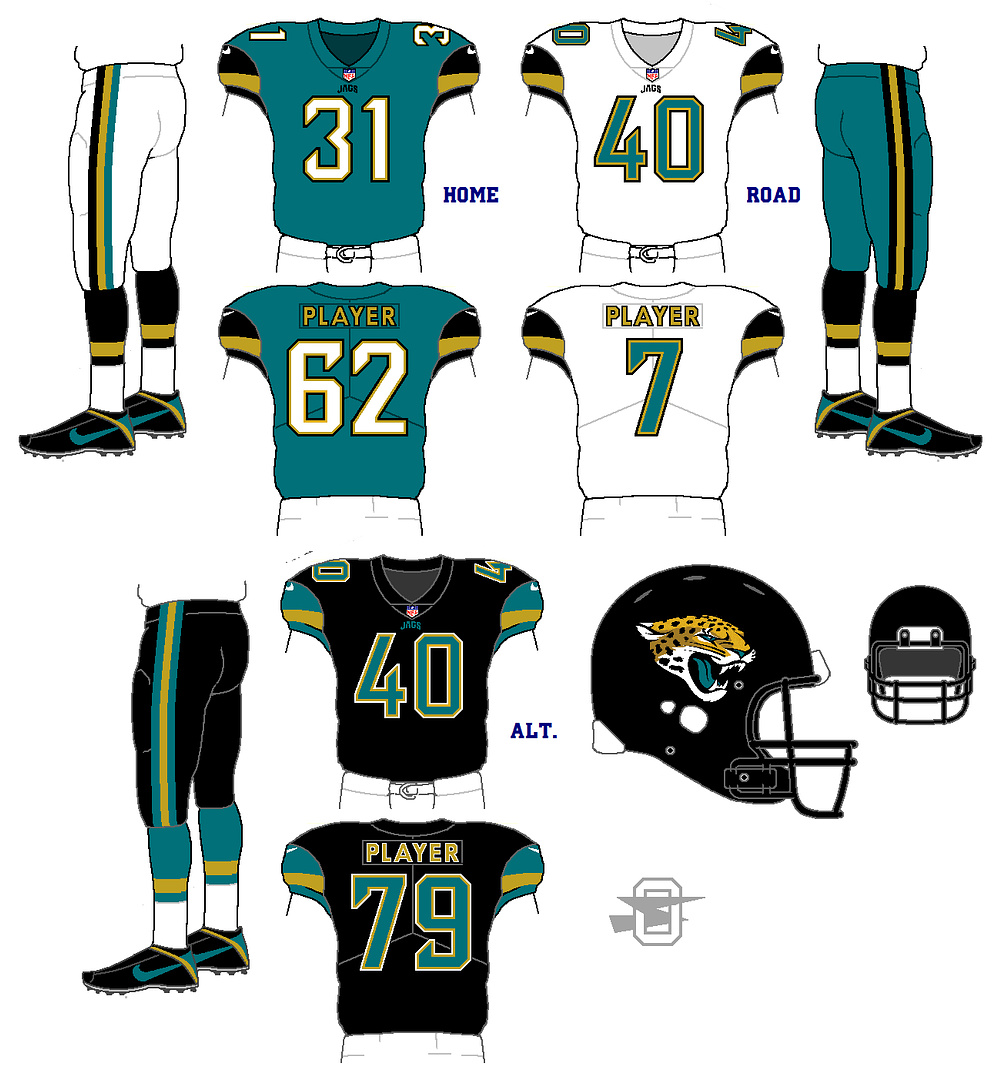
Pretty good blend of old and new. The only thing to really get irritated at is the teal numbers on the black jersey.
-
Accidental double post, so...how about black collars for Baltimore?
-
4 hours ago, Cujo said:

If only we had already worn the black jersey this season...then this would be really wrong if he's gone after the season.
-
On 9/18/2017 at 8:45 PM, insert name said:

He looks Very Sad.
-
23 hours ago, Dnice said:

Man, I miss teams putting TV numbers on the sleeves.
-
1
-
-
The picture that made me fall in love with these Reds uniforms:
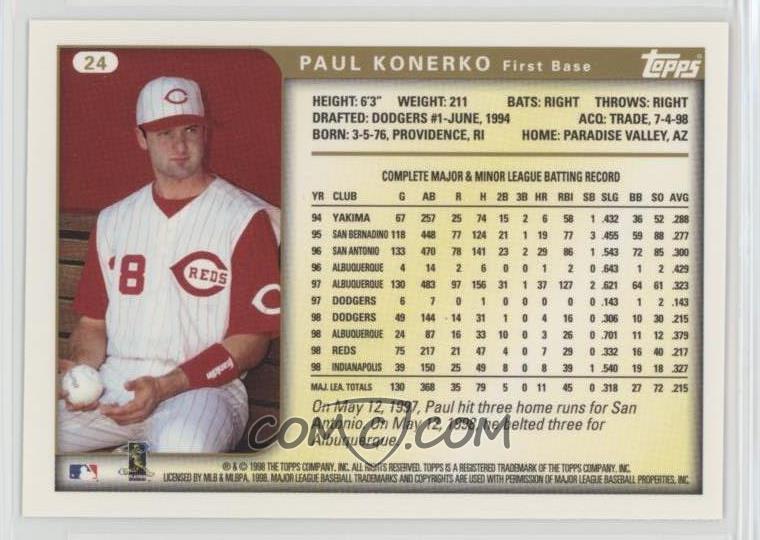
Also, the Reds actually didn't wear these in 1999.
-
Luis Gonzalez twofer:


-
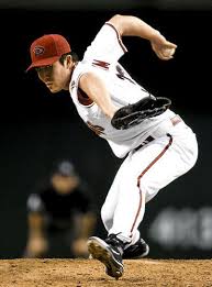
Byung-Hyun Kim, who spent all of two games with us in 2007:
I'm sure that this has been done before, but Randy Johnson:

-
2
-
-
2 hours ago, FinsUp1214 said:

Honestly? I know very little about hockey or hockey sweaters, or the Leafs' uniform history...but these look pretty good. Does wanting them to bring back the cutout leaf count as an unpopular opinion? (Probably)
-
1 hour ago, MCM0313 said:
Tell me about it. @Danny the Sheebwas born the year I graduated high school.
Danny, I am envious of the fact that you didn't have to deal with the monstrous sports fashions that plagued my mid-teens through my early twenties. Drab colors (it's given me a lasting dislike of navy blue) with lots of BFBS, overly complicated designs that made no sense...my least favorites of those looks would be those of the Bills in football and (sorry) the Royals in baseball. I only regret that you didn't get to see bright metallic colors, to which Nike is apparently allergic.
Are you referring to the Royals' BFBS era? I prefer to pretend that never happened. I love saying that if the 2015 World Series had happened ten years before, we would have a calamity on our hands.
Nobody else my age seems to care about sports logos. Knowledge is wasted on my generation.
-
2
-
-
50 minutes ago, dsaline97 said:
‘03?! Holy hell. I’m not even old and I feel old.
I can respect buying those three dollar hats from an antique store, that’s a deal that’s pretty tough to pass up. I own a Rockies Memorial Day cap from a couple years ago with the camo crown-purple bill; I despise camo but thought this one looked surprisingly sharp. Even among terrible trends, there’s always a few that look (kind of) decent.
I just bought one of those camo BoSox hats a couple of months ago. I think it's the tan color of the camouflage with the red that got me. It looks sharp, and I don't even like the Red Sox.
-
I can remember very little of anything-sports included-before 2012 or thereabouts. By that point BFBS was nearly dead. Even the Mets were done. I'm glad I have only pictures to rely on for most BFBS-era monstrosities. I will remember Mets-in-Black for many things, not the least of which was beating my DeeBax in the NLDS back in '99. Not too fond of it, for many a reason.
Does liking the Mets' non-pinstriped white alts (black-free, regular cap, not that orange-brimmed stupidity) count as an unpopular opinion?
Also, I'm fine with the Cards if they're not playing AZ or KC.
-
On 8/19/2017 at 10:27 PM, Cardsblues02 said:
I actually own a Mets and Royals BFBS cap. Even though I am a Cards fan, I had to get them. Payed three bucks at the local antique store. Dont know what it is, but they both look right to me. Probably because I grew up with them wearing black, but IMO it looks nice. A's on the other hand have no business in black...
I say that I can stand most unpopular opinions...but I look at this thread and it gives me a headache. (Not trying to dump on you.)
I'm glad I didn't have to live through part of the Royals-in-Black era. Born in '03, Royals and D-backs fan for life. Unless they move...
-
I confess...I love the Indians' block "C". Also, the red hat (just with the cream jersey. Why did they get rid of it?). My dad loves the Flames' fire-snorting horsehead logo. Not sure if that qualifies...
Note: I am okay with Chief Wahoo. I just like the block "C" better.


Unpopular Opinions
in Sports Logo General Discussion
Posted
Nah, as far as I know, that honor belongs to @RealSkillsAbraham.
Anytime