


WideRight
-
Posts
1,901 -
Joined
-
Last visited
-
Days Won
18
Posts posted by WideRight
-
-
Hi All,
I realize that I have not posted much lately. Life has been busy and just keeping the Alt History USFL going has been a lot. But, I wanted to catch you up, so here are the new looks for 4 USFL teams in 2014. No relocation or new teams for 2014, but that may well change by 2015 with the Las Vegas Thunder being league owned and desperate for a new owner. But for 2014, here are the new looks:
ATLANTA

LOS ANGELES
OAKLAND
ST. LOUIS (With the helmet vote winner)
And as a bonus, the 2014 Summer Bowl Logo
-
 7
7
-
 1
1
-
-
18 hours ago, Dozap17 said:
I see on the main site there's going to be a new St. Louis Skyhawks helmet, will there be a vote on that?
Yes there is and the vote is now open. XFL/UFL fans will recognize some of the options.
Here are the 4 choices. Hit the website to vote: https://apsbertsche.wixsite.com/mysite
Just realized that 3 of the 4 images say OPTION 3. Oops. On the vote there actually 4 different numbers. I will fix this tonight when I get home.
-
2
-
-
I never feel more like an old man than when I see a uniform I absolutely detest for being "kewl" and
"xtreme" and see a bunch of comments about how it is " ". Pretty much if any one says a new look is fire, I know I am going to hate it.
Guess I will just go back to watching old USFL games on YouTube and yelling at those punk kids to get off my lawn, because watching most NFL games is going to just be painful. At least Bills-Jets games will look good this year, as long as they don't break out those horrible black alternates.
-
4
-
-
My takes so far:
NY JETS
LOVE: The callback to the Jets of my youth with the green & white sets.
LIKE: The addition of green pants.
NOT SO MUCH: The entire black set, unneeded, ugly, and just gratuitous. A throwback Namath era would have been a better option.
DETROIT LIONS
LOVE: Use of consistent striping from helmet to sleeve to pants (silver only)
LIKE: Traditional block font is fine with me. No more all grey or all white looks.
NOT SO MUCH: Stripeless pants and another gratuitous BFBS alternate.
DENVER BRONCOS
LOVE: The jerseys, overall really strong. Pant stripes. The throwback alts.
LIKE: The use of 3 jerseys to have both orange and black alts.
NOT SO MUCH: a bit too much with the triangles. The helmet stripe is godawful. No striping on socks.
Overall a pretty decent year for Nike so far, no truly horrible looks, just a few items that need to be adjusted (Detroit pants all need stripes, Denver helmet stripe, Jets need a throwback).
-
2
-
-
10 hours ago, MJWalker45 said:
I think any updates would probably be closer to the 2020 version, but I would think this is just the next evolution of the derrick.
This.
-
2
-
-
Looks a bit like the Kansas City Recorders. Would the new fight song be "Hot Cross Buns"?
No, seriously, the spear is very thin and I am not sure what the stripes on it represent. I would also say that the tip looks less like a spearhead (see FSU) than a directional arrow from wingdings. Sorry, but it does not read as a spear.
-
1
-
-
Well, my Switchbacks made the cut, but not so sure about that new logo. I will wait and see.
-
Next up the 2nd of 3 Texas teams, Dallas...er...Arlington.
TWEAKS:
1. OK, clearly I am split on the city name here. In my opinion Arlington only exists as a suburb of Dallas, and since the logo they want to use is clearly a D+R monogram, I would go with Dallas as the city name.
2. Not a fan of the plain white DR monogram on the blue helmet, so I switched it to black and red.
3. Went back to the 2020 striping.
4. I also really dislike the actual number font, but wanted to keep the thin red line in the middle of the numbers, so I just went with a blockier font.
5. Decided to go halfway between the 2020 shoulder yoke look and the weird "overall straps" they have now.
6. They have that great "renegade" logo, so they need to put it on the uniforms, so it is now on the sleeve.
7. As always, no unitard, so blue pants only with white jersey, black pants with either.
-
5
-
-
Gonna throw one more former XFL team out here today.
The Tweaks:
1. The big one is fixing the helmet. I am not a fan at all of the 3-color design, way too gimmicky.
2. For the Jerseys, I wanted to get rid of the weird yoke with the cutouts in the front. Just went with more of a Titans style yoke, again using the oil slick effect as on the pants and the numbers.
3. No unitard, white over white, white over blue, blue over white, that is it.
4. Added the 2nd logo to each sleeve.
5. Increased the size of the H logo on the helmet.
-
3
-
1
-
 2
2
-
-
3 hours ago, MJWalker45 said:
It worked as a gimmick for Texas Tech. But with three Texas teams, it looks pretty silly. I'm also not a fan of asymmetric helmet designs like the numbers on one side and the logo on the other.
I have to agree. Among the worst current trends in football design are:
- white socks with no stripes
- colored socks with no stripes or white lower section
- pants with no stripes or logos
- helmets with the logo on one side and number on the other
- the unitard
- and the eternal scourges of bad number fonts, overuse of the yoke or side panel on jerseys, and adding either black, grey, or camo designs for no reason.
Now, you punk kids, get off my lawn.
-
2
-
Next up is the first of the XFL Teams, and the one with the fewest tweaks needed.
The Tweaks:
1. Decided to get rid of the primary logo alltogether. The secondary logo (pentagon) and the sleeve logo (DC as flag) are both better than the primary (C+star inside D), so why not lean into those two?
2. Pentagon logo on helmet and collar. Sleeve logo stays the same.
3. Put stripes on the pants, a no-brainer.
4. Also added stripes to socks, instead of all red or all white (hate that look)
5. No unitards. White pants with red jersey and vice versa. I will allow white over white if the temperature is over 85, but never red over red.
-
4
-
2
-
-
One more from the "does not need much" group. Birmingham
So what did I change?
1. Returned to the 22-23 pant striping with the tapered stripe to match the helmet.
2. Decided to add a bit of flare to the numbers, Viking style, sort of.
3. Team monogram on the collar, name on the chest.
That is about it. pretty minor changes.
-
4
-
-
OK, working from the idea that I am tweaking the designs, not overhauling them, here is my first revision, Memphis. Notes to follow.
The changes are:
1. Made the yoke thinner, so that the UFL and UA logos do not require the weird cutouts from the yoke color.
2. Added tapered stripes to the shoulders to match the helmet and pants.
3. Tapered the blue stripe on the pants as well, not just the yellow.
4. Added a blue pant set, to be worn with the white jersey because I hate the unitard look (no blue over blue over blue).
That is about it.
-
2
-
1
-
-
So I caught parts of all 4 games this week and, as expected, there were several uniform elements that just made me cringe. But I thought that overall, with just a few tweaks, some minor, some a bit larger, the UFL could be a good looking league. So, I thought I would throw those tweaks out for you to comment on. I am starting with the helmets and will then hopefully get to the uniforms. Here are the 8 helmets with the tweaks I would make.
TWEAKS:
ARLINGTON: Make the DR logo black with red and return to the striping from 2020.
HOUSTON: My biggest eye roll is for the Houston helmets. Just go solid navy with the logo on both sides. Just to do something flag-related I put in a tapered stripe with the Lone Star.
SAN ANTONIO: Really no changes here except I opted to go with a darker facemask. I picture black being part of the color scheme along with charcoal and yellow.
ST. LOUIS: I like the arch-stripe, but I prefered the original 2020 blue helmet and the more curved wing pattern, so a blend of 2020 and 2023.
DC: Just swap out the D logo for the pentagon & lightning logo and I think this works. Love the marble effect for DC.
MICHIGAN: The only tweak needed is to return to the original colors with a lighter champagne gold and a darker, more purplish burgundy.
BIRMINGHAM: I like the larger logo and thinner stripe this year, so no changes here.
MEMPHIS: Another helmet that pretty much works.
Next up are uniforms, again, trying to improve them with as minor an adjustment as I can make, but I can say that some of the striping/yokes, particularly for former XFL teams are not going to make the cut.
-
9
-
-
9 hours ago, neo_prankster said:
How come the Cannons are leaving????
Has the USFL failed in Boston TWICE??????
Yup, Boston lost the Breakers back in the late 80's, got the Atlanta Fire to move in the early 2000's and then lost that team to Dallas in 2013. The problem is that Robert Kraft will not let the USFL use Gilette Stadium, so they cannot find a decent stadium to play in, lose a lot of revenue and have trouble being profitable compared with other franchises.
-
Just realized I had not posted these design options for Dallas's franchise yet.
It has been revealed that the 2009 League Champion Boston Cannons are the club that has been sold to Mark Cuban and his Dallas investment group. They will relocate and play the 2013 season as the Dallas Roughnecks. There is currently a poll on the USFL Alt History Website (The USFL Lives) to pick the color combo and uniforms for the team.
Here are the three options, with notes in each image outlining where the inspiration comes from for each.
-
4
-
-
Weird Idea: What if the horns on the sleeves of the uniform that has been leaked are not the same on the back as the front. What if they actually extend across the entire back to form one huge set of longhorn horns, with the player name in white within the center of the two horns (blue)? Hmmm.. that may be worth a concept.
-
2
-
 1
1
-
-
22 hours ago, Green27 said:
So many teams yet so many are the Bulldogs or Tigers/Large Cats....
And yet, and this is amazing, no pro sports teams called Bulldogs. Wildcats too (not counting 2020 XFL). Some of the most common college/HS names are out there: Eagles, Falcons, Colts, Tigers, Rams, but not Bulldogs, Mustangs, Wildcats.
-
1
-
-
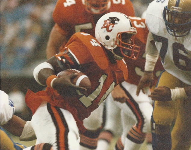
On 12/22/2023 at 5:09 PM, VancouverFan69 said:
I hope the Lions go with a true pro look. No more monochrome black unis; bring back helmet striping with matching striping on the pants; much prefer orange as the primary dark colour.


Gotta disagree. Too much black in CFL already. I am still a fan of this ""vintage" look from the 80's
-
7
-
-
16 minutes ago, ZapRowsdower8 said:
That’s a red swoosh inside the navy “horn” on the sleeve, right?
These aren’t a disaster, but they are definitely worse than what they had.
I was wondering that as well. Is it just the Nike swoosh or is there a red nougaty center inside the blue horn?
-
Back with the next team. So far I had only offered one AFC North team, the Browns, so here is their Ohio state bestie, ok, their rival, Cincinatti.
This is largely based on a design I did back in 2020. I added the all white look (notice no orange at all), because the Bengals got it about half right IRL.
-
6
-
1
-
-
A few thoughts:
MEM: I like the addition of grey to their palette. Works well with the blue & gold.
ARL: I might try to keep some version of the yoke, since you pretty much have all 8 teams using standard sleeve stripes, which made sense in 1983 but is not really aligned with the current cut of jerseys without sleeves. The 2020 version of the Renegade jersey worked pretty well with a yoke and shoulder stripe combo.
HOU: Here I would look at using different sleeve colors, again like 2020. Either that or some form of striping that makes use of the "oil slick" effect from the 2023 uniforms.
STL: One of very few improvements from 2020 to 2023 was turning the sword stripe on the Battlehawk helmet into a stripe that resembled the Gateway Arch. I think even with a blue helmet that would make sense.
DC: I like the return to the lightning motif on the sleeves and pants. But why a single stripe on the helmet. Perhaps no stripe is needed?
SAN: I like the pant and shoulder stripes. Not sold on the white helmet.
Overall an improvement over the XFL style we see IRL.
-
1
-
-
And the Bills, with a new alt idea.
BUFFALO BILLS
NOTES
1. Most of the current look stays, with just a few tweaks and a wild new alt.
2. Removed the last vestiges of navy from the horrible 2000's.
3. Decided to update the wordmark a bit with a script "Buffalo", which will appear on the jerseys.
4. Kept the white facemask and the slightly widening helmet stripe.
5. Did the same effect to the pant stripe, slightly widening at the hip.
6. Created a new secondary logo from the script "B" and the front of the Bills logo.
7. White on white is possible, blue over blue should not be done.
8. Decided that we are assuming all teams have a standard throwback look, so no need to go the red helmet or standing buffalo look. Instead decided to lean into the snowy weather and go with a white over white over white look with only thin red and blue piping. It would certainly be different. Might drive the announcers crazy to try to read numbers.
OK, on to a new division.
-
2
-
1
-
-
Decided to finish up the AFC East. Starting with the Fins. I doubt I will change much for the Bills as I love their current look.
MIAMI DOLPHINS
NOTES;
1. Went back to the logo from the late 90's, which I think was their finest, far better than the airline logo they use now.
2. Also opted to keep the navy blue added at that time.
3. Jersey is heavily based on pre-2000's look, with logos on the sleeves and the cuff being the only striping.
4. Opted for a motif of a thick main stripe with two thinner stripes, one of which is always Navy.
5. Miami can go white over white in the hotter months, but should never go aqua over aqua.
6. Wanted to do something other than invert the colors for the alt uniform. Not sold on the ombre effect as the right thing.
-
6
-
1
-


Oldschoolvikings' NFL concepts - New Washington Somebodies(?) concept
in Concepts
Posted
The Washington Whizzers!!!