


MrOrange
-
Posts
141 -
Joined
-
Last visited
Posts posted by MrOrange
-
-
Ireland hat a retail jersey sponsor since the the end of the 90s with "Eircom" and then "3" I think.
I get it for the Football Associations/Federations financially, but as a fan, this just is terrible.
Canada soccer might soon not have a choice to be picky, their finances are reportedly extremely bad. Dire situation.
-
Oh Canada...

If Nike was a country I could understand the Nike "hockey logo" history callback and collar swosh...
but the country is Canada - and even going if they want to do a "hockey" connection, the Canada hockey jerseys themselves don't look as weird.
the away is slightly better, but nothing special.
Sidenote: Thankfully I recently found and bought (albeit non authentic) male version of their 2021 women's jerseys.

-
Mon dieu - I'm loving the French "color pine stripes" away uniform
 - (IMO ugly) FFF logo aside.
-
31 minutes ago, sky1324 said:
In cases like this, I wish teams would place a wordmark there. The kit is empty without something in that stripe.
Yeap, either that or actually make a design/pattern that is visible enough with/without sponsor.
-
 1
1
-
-
40 minutes ago, MJWalker45 said:
Is there some rule I'm missing out on? I can understand the Galaxy jersey missing a sponsor in Europe because it's a MLM, but what's with the others?
Certain companies or industries are prohibited from advertising - however rules vary from country to country AND even competition to competition.
in my country for example: betting sponsorship is only allowed IF the betting company sets up an local office, registers for a national gambling licence, accepts financial checks, pays licence fees and taxes - which are mostly used to combat gambling addiction and so on.
the Galaxy merch always had the herb-a-life sponsorship in sports retailer stores though.
had the Galaxy played a game here, the would have had to at least cover their logos with tape.
-
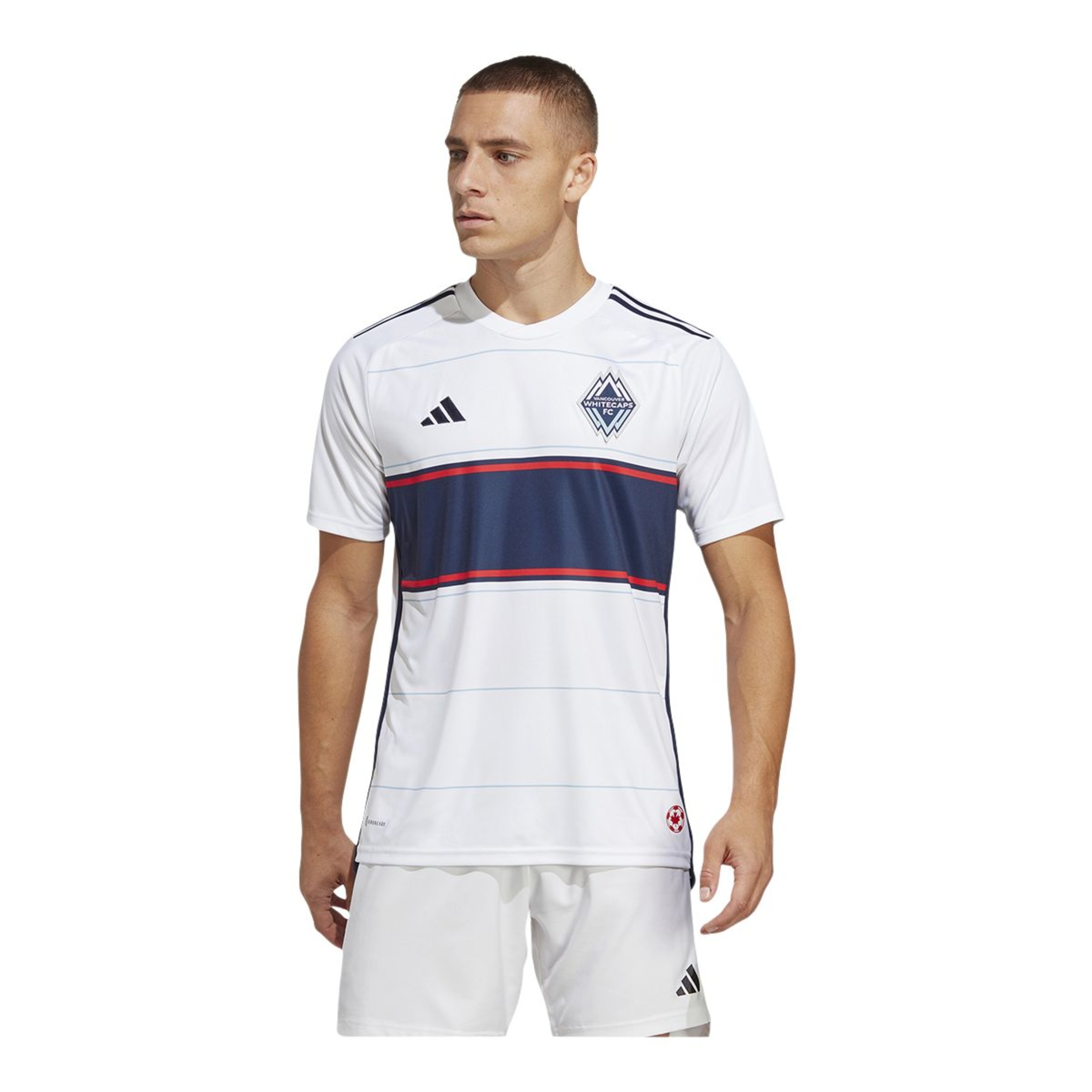
Vancouver Whitecaps 2023-2024 "Bloodline" primary jersey without sponsor - from Sportcheck.ca
-
found an LAFC one too
and a LA Galaxy one
-
3
-
 1
1
-
-
20 hours ago, VampyrRabbit said:
New Oakland Roots jerseys announced.
I use the word supposed, because if your retinas aren't bleeding, it ain't a tribute.

-
This is hilarious, especially with more and more photos showing up of "shoulder logos" like the League or Apple TV patch coming off the 2024 jerseys doing the rounds...
faulty application or bad adhesive...
-
1
-
-
18 hours ago, VampyrRabbit said:
It's not bad, just that the Whitecaps are a team who have had the chestband on most of their jerseys and it seems a miss that their 50th anniversary shirt doesn't have one, and that the team aren't using a version of the 79-84 logo, though that never appeared on the jerseys back then.
It's also using gold as an accent colour for a dark anniversary jersey, and that feels so overplayed at this point.a mockup of a chestband version from the r/WhitecapsFC
Personally I'd have preferred if they used the current logo and maybe their older one(s) on the neck or tag or all "watermarked" over the whole jersey.
the special color combo seems fitting for an classic anniversary - even if it's not their usual color palette.
-
2
-
-
from the league website, here is an overview on all the "names" of kits/jerseys.
- Atlanta United: 2024 The Resurgens Kit
- Austin FC: 2024 The Armadillo Kit
- Charlotte FC: 2024 The Carolina Kit: Explore
- Chicago Fire FC: 2024 Return to Red Kit
- FC Cincinnati: 2024 The Canvas Kit
- Colorado Rapids: 2024 One Flag Kit
- Columbus Crew: 2024 The Home Kit
- FC Dallas: 2024 Afterburner Kit
- D.C. United: 2024 The Icon Kit
- Houston Dynamo FC: 2024 Still Holdin' Jersey
- Sporting Kansas City: 2024 Diamonds Our Forever Kit
- LA Galaxy: 2024 Angeleno Kit
- LAFC: 2024 Primary Kit
- Inter Miami CF: 2024 2getherness Kit
- Minnesota United FC: 2024 Starry Night Kit
- CF Montréal: 2024 La Main Kit
- Nashville SC: 2024 The 615 Kit
- New England Revolution: 2024 Boston Tea Party Kit
- New York Red Bulls: 2024 Legacy Kit
- New York City FC: 2024 24/7 Kit
- Orlando City SC: 2024 Legacy Kit
- Philadelphia Union: 2024 The XV Kit
- Portland Timbers: 2024 Nature Unites Kit
- Real Salt Lake: 2024 Peak Utah Kit
- San Jose Earthquakes: 2024 The 50 Kit
- Seattle Sounders FC: 2024 The Anniversary Kit
- St. Louis CITY SC: 2024 The Confluence Kit
- Toronto FC: 2024 GTA Kit
- Vancouver Whitecaps FC: 2024 The 50 Jersey
-
1
-
Love the Minnesota kit, Caps and Galaxy aren't bad either.
Don't know if it's just me, but I feel like in 2024 (or actually a year or two ago during the design cycle process) more MLS teams actually tried to be creative and mostly succeeded - regardless of the often lame PR speak.
Solid year for designs IMO
-
1
-
-
F1 should mandate (whether it's minimal weight or something else) that the traditional team colors are applied to all visible parts of the car - so that spectators, fans, media, sponsors - both track side and on the broadcast - can easily identify the cars.
Unfortunately It seems like 2024 is even more gonna be carbon black car 1, 2, 3 and so forth with a few exceptions.
I also agree that special liveries/designs should be limited in usage, so they remain something special and not a marketing gimmick every race as it has been the last years.
Same goes for the drivers helmets, overalls, team gear btw.
-
overall lots of fun designs, throwbacks and nods.
Looking forward to higher res photos of the authentic ones and how they look on the field/TV coverage.
my favorites
- DC United (modernism-pattern, Ben Olsen - the artist would approve) - would have been ace if they'd made one band/line white across the chest.
-
NY
RedBullsMetroStars - RSL (including mountain theme, not primarily the "Barcelona" stripes)
Also good ones
- LA Galaxy's "reverse" sash
- New England Revolution
- Portland Timbers
- San Jose Earthquakes throwback
- Sporting Kansas City (argyle pattern is back)
- Vancouver Whitecaps (50 year celeberation)
-
1
-
the NYRB look Metro-Starsey...

Hopefully they'll have black shorts and socks to go with it.

-
1
-
-
I do not envy the Canucks or thier fans, so many different identities and color options. So many to choose from, so many opinions.
the 2020-2021 reverse retro is easily my all time favorite Canucks logo/color/uniform combo.
I'm Team gradient, no matter how despised it seems to be nowdays.
Wouldn't mind the Orca, but in Flying Skate 80s colors too.
Thankfully there was some First Nations themed design and merch available a year ago that did that in a similiar colorway.
Shame those special edition jerseys are 750 CAD or more.
-
 1
1
-
 1
1
-
-
5 hours ago, MJWalker45 said:
adult size look for Miami.
Galaxy using the same template for their home
-
1
-
 1
1
-
 1
1
-
-
I think it's a good refresh overall from the decluttered primary to the well done wordmarks and secondary logos.
the alternate crests/logos explored and briefly shown in the video were mostly more to my liking however.
too bad they didn't tone down the rave green even more or switch to a diffrent green all together tough.
the newly added heritage color is a nice touch.
-
Hope the fanbase likes it once it's revealed.
We've seen to many refreshs/rebrand go bad in recent MLS times (Crew, Chicago, Montreal 2x)
As an outsider, if they alter the blue/rave green and go with other blue/green colors that's an upgrade.
If they declutter the shield within the shield and the wordmark bridge logo, that's an upgrade.
dropping the FC/SC and just going with Seattle Sounders would be a nice change too.
-
1
-
-
-
from the Main Page
QuoteThe announcement on MLSSoccer.com also mentions that TFC is one of four clubs “selected by Major League Soccer and adidas to don a third jersey for 2023” and the first to unveil theirs. Atlanta United has already started teasing their third kit, which is expected to be released sometime in August.
-
Is it just me or do these name/color videos sometimes give a bit a staged vibe?
-
7 hours ago, SSmith48 said:
Would have loved them to go the old NASL route and pick up the Sockers names, but that's already taken by a local MASL team. Leaning into a Mexican-inspired club name/imagery would be a nice touch, although a "Club San Diego" is a bit generic. Maybe an Atletico/Club Atletico name? Or lean into the SoCal roots and go with San Diego Sol?
Whatever name they go with, there's enough cultural heritage in SD to get a brand that's visually impactful and connects locally, as long as they don't over-corporatize it. I'm a proponent for a bright and bold color scheme with some Mexican visual elements included, given the city's proximity to the border and heavy Latino presence.
there was an LA Sol (previous women's pro soccer league team) btw, but San Diego Sol could be a fitting name regardless IMO.
Couldn't agree more with the bolded part above
-
7 hours ago, FiddySicks said:
Like, I get it, and it worked in the previous Warren Smith project. But that was organic and the branding was built around the state and all of its features. The “Loyal” brand is built around how much San Diego got :censored:ed by the Chargers. Like, I get it, but it’s kinda cringe to base the name of another team in a different sport after a perceived slight.
Speaking of Warren Smith, he is NOT taking the news that Loyal won’t be included in the San Diego bid well. I feel for the guy. He saw an opening and JUST missed final gate. It’s a bad break to have it happen once, but has to be a total kick in the nuts to have it happen to you twice.
the "Loyal" name/reasoning is indeed dumb for the reasons stated above, among others.
If they can't achieve a miracle to survive in USL once SanDiegoMLS is here, they will likely either
- cease to exist as a pro (outdoor) soccer team
- or
- betray the "loyal to the soil" -mantra and have to move elsewhere (example Austin Bold FC)
I know USL has some deteering terms in their contracts, so it disincentives the USL>MLS path especially business wise (brand, exit fee) .
I really wish San Diego Loyal and SanDiegoMLS could have or will find a compromise to work togther - whether that is the Loyal becoming part of their soccer community/academy partnership, their reserve team, the community outreach and to get Landon Donovan involved with the MLS part.
Think about it: the man whom the MLS MVP award is named after and one of the "faces of the league", who helped (along with many others) to bring pro (outdoor) soccer back to San Diego currently isn't even mentioned, let alone involved - even if it's just as a "ambassador" or whatever.
the San Diego Loyal colors are also ace in my view and what they have been building community wise for the last 5ish years - not just at the games - but also how they handled certain events (walking off for racism and more) are very admirable.
-
2


MLS Kits 2024
in Sports Logo News
Posted