


MrOrange
-
Posts
141 -
Joined
-
Last visited
Posts posted by MrOrange
-
-
speculation in some places online and on the ground is:
colors to include black, red, gold/yellow inspired by:
- San Diego flag
- SD (State University) Aztecs
- Egyptian flag (primary owner)
- Kumeyaay tribal flag (secondary, local owner)

-
Thrilled
- San Diego is getting an MLS team
not so thrilled
- with the majority owner/investor (for reasons I don't want to discuss on here)
- they couldn't come to an agreement of collaboration, partnership, takover or whatever with San Diego Loyal (USL)
Name/Colors/Branding-wise
Kinda hoping the final name isn't Football Club San Diego and it's just a part of due dilligence or it will be at least "Futbol" Club to give it more of a local twist and to differentiate a bit within MLS.
-
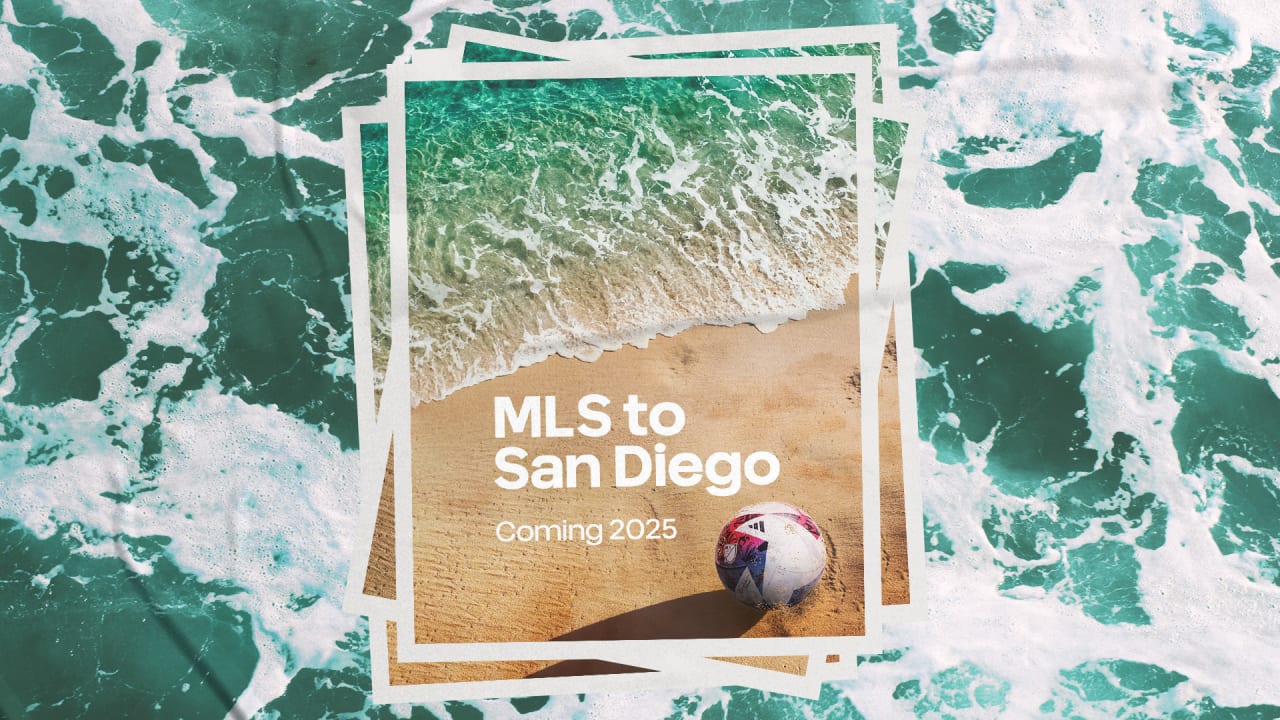
San Diego is
heavily rumored to bethe next MLS expansion clubHere is what is known
so far, regarding name/colors/branding and moreOfficial MLS Expansion Annoucement / Statement
- Stadium: Snapdragon Stadium (SDSU San Diego State University + NWSL San Diego Wave FC)
- USL's San Diego Loyal is not involved - club statement
- start playing 2025
Name/Colors/Branding (updated May 19th, 2023) (according to SanDiegoMLS CEO Tom Penn)
Name: San Diego FC or FC San Diego "should we put the Football first or San Diego" "we are gonna listen to everybody on that"
Logo/Colors "Crest and Colors to be unveiled in sometime Summer/Early Fall 2023"
thanks @BrySmalls
Some (re)sources:
https://www.90min.com/posts/mls-to-announce-new-franchise-in-coming-weeks
https://www.reddit.com/r/MLS/comments/13fe1sf/fc_san_diego_interesting_research/
https://www.mlssoccer.com/news/major-league-soccer-awards-expansion-team-to-san-diego-x9222
https://www.mlssoccer.com/news/mls-san-diego-aims-to-build-something-special-before-2025-launch
https://www.mlssoccer.com/news/right-to-dream-finds-a-natural-spot-with-mls-expansion-to-san-diego
https://theathletic.com/4531733/2023/05/18/mls-san-diego-expansion-explained/
-
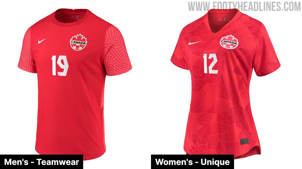
Loving the Canada home (black/red geometric pattern), available both for ladies and gents.

the USWNT home is meh, but better than the USMNT one.
the away which both USWNT and USMNT will wear looks like the picked 90s highlighter colors, because their traditional colors weren't in their crayon/color set anymore and they had to make due. Reminds be of a Holland/Netherlands jersey too.
-
On 3/2/2023 at 1:37 AM, Cujo said:
More newsworthy: Nokia is actually still in business.
Nokia (the company) never went away or under by the way.
They focused on networking and IoT-tech and are a big player there today after Microsoft bought their mobile phone business in 2014.
Present day "Nokia" mobile phones are licensed by HMD (Ex-Nokia people who basically bought the patents/rights back) and manufactered by someone else.
Sadly they have almost nothing in common with the wonderful Lumia's of Nokia's past who had awesome designs and lots of hardware inovation.
Still have my beloved
 Nokia Lumia with Windows 8.1 - such a beautifuyl device and OS.
-
 1
1
-
-
I'm generally not a fan of monochrome looks either, maybe it's the addition of the red lines to the "classic" cheest hoop and/or the combo with this years shorts/sock design, but I actually like the 2023 "all white" look better for once.
My favorite Whitecaps look however is still the 2016 away/secondary one with primary navy socks and shorts + and navy/dark > sky blue > white shoulders/arms gradient jersey.
-
4
-
-
2 hours ago, VampyrRabbit said:
Whitecaps had an unbroken hoop and it looked great, shame about the crappy MLS numbers that don't have outlines.
the legibility of those jersey names/numbers from the stands and on screen was really bad, especially as they also were sun/light reflective in some circumstances. Wasn't alone with that view in my family and friend circle.
and IMO it also looks bad with the numbers being larger than the hoop/stripes.
A potential solution for the latter would be to slightly increase the size of the hoop, so the whole number(s) fits in it, no overlapping.
-
3 hours ago, upperV03 said:
The Dynamo are going with black shorts for their new primary kit:
I don't mind the Houston double orange (if that's a thing again), but the black looks kinda washed out / greyish to my (old) eyes.
side note: I love all these little peaks, Media Day "leaks, rumors and gossip" is always kinda my start to the season, even though jerseys, most interviews and all only will be released in about a month or so.
-
2
-
-
WOW

Amazing work and series

Can't believe I missed out on the (pre)order
-
 I'd pay extra to not have sponsors
  on my team's gear...
- no free walking adboards for whatever terrible or dumb companies
- no ruined designs because of a letterbox etc.
-
 1
1
-
 1
1
-
Haven't followed the whole situation closely, but saw some NHL teams now having jersey sponsors.
Will these sponsors be on all team merchandise including jerseys?
or just on the players jerseys but not the fans ones now - at least for now?
-
On 9/11/2022 at 6:11 PM, BBTV said:
When I say "late", I mean that many (if not most) financial / regulated companies blocked Chrome from employee desktops (with the exception of software developers and support people) because of it's frequent updates and difficulties in integrating it with various security policies. I don't know the specifics, but those issues have now been resolved and most (if not all) companies have opened up Chrome to their employees (with tight controls) and it's the dominant browser. Had Edge come out years before it did, it could have picked up where IE left off. Instead, even though for all intents and purposes they're the same browser, given the choice, most people are going to choose Chrome because it's just what they're already used to using.
just to add: Microsoft has had two Edge browsers.
the original, now called Microsoft Edge Legacy launched in 2015 and is based on their own HTML5 engine.
It was their successor to the Internet Explorer.
While not bad per se and an improvement over Internet Explorer, it started out kinda half finished and critically never gained enough developer support (extensions, website optimization etc.), thus never got the market share required to become competitive.
Since 2020 there is a "new" Microsoft Edge - which is based on Chromium and is essentially Google Chrome minus Google plus Microsoft services.
I know a lot of companies who had "cleared" Google Chrome for daily use, that have since switched to the new Edge and blocked Google Chrome again.
-
3
-
-
On 8/25/2022 at 1:09 AM, XenonDesigns said:
On 9/1/2022 at 12:51 AM, XenonDesigns said:
On 9/12/2022 at 1:46 AM, XenonDesigns said:
Interesting designs and work.
My favorite logos are NY (the letters being part of the shape, topped of by the iconic skyscraper) and Vegas (the later thanks to retro futurism / googie-style)
Love the Aztecs colorway too.
-
I don't understand why US Soccer can not go the route of CanWNT home or the World Cup France away one with some bespoke "designs/watermarks" at least!
for the USMNT home a lot depends on the colors of the shorts/socks and numbers
white/blue/white with red/blue numbers?
the USMNT away is atrocious - the graphic "blob/dyed/deep ocean cartography" design itself is ugly in all variations I've seen so far and to make it's worse, it's just a generic one.
Even an all blue (as in World Cup France home) off the shelf one would still look better than this piece of garbage.
-
1
-
-
I think a brand refresh is more likely than a full on rebrand for the LA Galaxy.
Here's what I'd do:
- keep the name and blue/gold and probably also white.
- add the fan beloved teal back into the official color palette - not necessarily on the logo itself.
logo-wise
- empathize the "LA"
- get rid or de-empathize the Quasar
- get rid of the "arc" where "Galaxy" is written on it
- use smaller stars depicting a starry night sky above the "LA" or alternatively use smaller stars to create the letters "LA" itself
-
I get that manufacturing/warehouse/shipping-costs aren't cheap nor easy, but I always find it weird the famous leagues invest so much into their brands/identities and then don't go and do it on their own to keep all the profits from merchandise sales and have full control vs a percentage and/or an upfront fee by the supplier.
-
Really like the overall updated logo
from the outer shape, to the font / text which - for both Dallas and the FC with the lines to the side
awesome that you kept the longhorn and "Burns" flame
Don't think the soccer ball is required and it kinda gives the cow a long/weird neck/chest too -
IMO looks better with the OG star or maybe even empty and the cow could be overall a bit lower and a thus a bit smaller (to fit the overall shape still).
Looking forward to more of your MLS redesigns too.
-
22 hours ago, Chromatic said:
The majority of Canucks fans are very happy with the current look and want more than anything for the team to finally settle on an identity and stop screwing around with the uniforms.
The issue is that the team has had so many looks that there are vocal minority camps of people advocating for the one they want in particular, creating a lot more artificial noise around the subject than there really is. And the look they want in particular is almost always the one the team wore when they got into following the Canucks or feel some sort of nostalgia for, not because they like it for the design merits.
You also have a lot of non-Canuck fans hyping up the skate because we’re in an era that’s fetishizing 90s nostalgia and it’s “fire bro, lit AF”, so I don’t really care what they have to say on the subject. When the team wore the navy and maroon Orca people did the same thing with the blue and green stick. When they went back to blue and green, people did the same thing with the millionaires. It’s just trendy.
I'm a Canucks supporter and I prefer their 80s colors - which I grew up with - especially like their 85-89 dark jersey design but I prefer the Orca logo over all others by far.
Thus this years First Nation themed merch was almost made for me
")
Too bad there wasn't an official jersey though*
*other than the player issued warm up ones, that if somehow available, would be still way above my means.
-
love this ManUtd away one, from the black shield around the badge to the colors = shades of their 97-99 away - which is one I owned as a kid.
Still ridiculous "design/marketing" phrases however.
-
1
-
-
Re: the 2020 Canadaian Championship Final player in 2022
As "it's so MLS" doesn't apply here, let's just say "it's so CONCACAF" instead
")
Canada Soccer Association / Players
What's the TL/DR for the Canada Soccer Association vs Players issue?
is it just the players wanting more $ or is there legitimate questions on where the money goes with that Canada Soccer Business company?
-
some awesome designs, I especially love the Sailish art style logos and primaries.
-
1
-
-
I love the orange Houston Dash.
the only thing I don't like is the sponsor interfers with the design.
Would be also an awesome USMNT/USWNT jersey design in red/white/blue
-
1
-
-
Wow, gorgeous primary from Minnesota Aurora, love how they literally integrated the aurora (borealis) in the design.
awesome and fitting name too.
-
1
-
-
RE: Timbers investigation = what a only slap on the wrist fine for REPEATED inexcusable and disgusting behavior by the clubs ownership/leaders.

-
2
-


.jpg)

San Diego MLS expansion
in Sports Logo News
Posted
about as official as it can get https://www.mlssoccer.com/news/mls-commissioner-don-garber-set-to-make-major-announcement-from-san-diego
still after Sacramento Repuplic's unfortunate stumble due to the owner bailing out after the expansion team was already annouced such a league statement is no longer as reasuring as it once was to me...