


Indigo
-
Posts
1,734 -
Joined
-
Last visited
-
Days Won
6
Posts posted by Indigo
-
-
15 hours ago, AgentColon2 said:
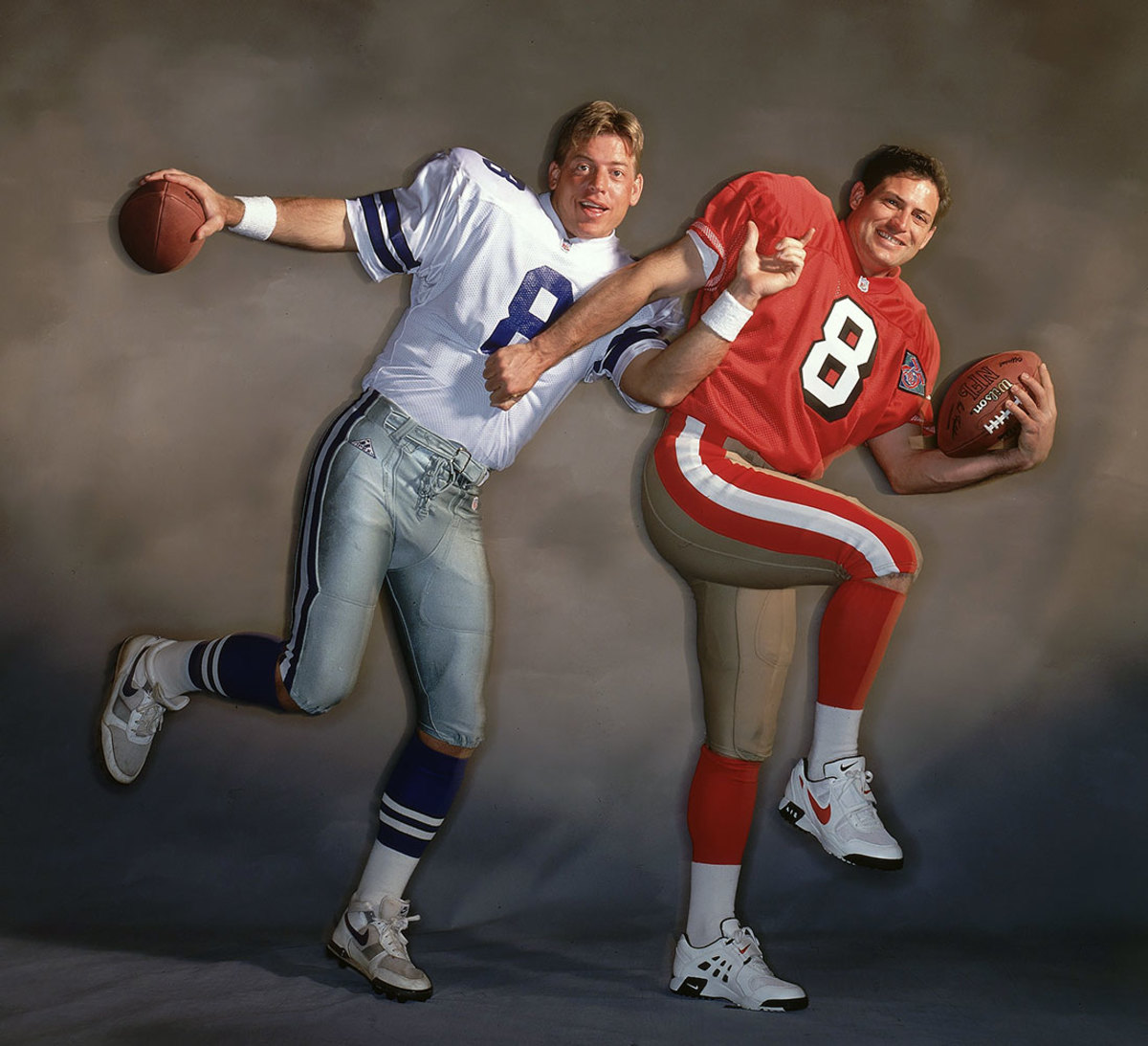
Slightly off topic. Mix and match 75th anniversary jersey with current pants of that season for a Sports Illustrated photo shoot.

Both teams look better this way.
-
 4
4
-
 1
1
-
 1
1
-
-
Has anyone checked on @Sec19Row53? I want to send my condolences.
-
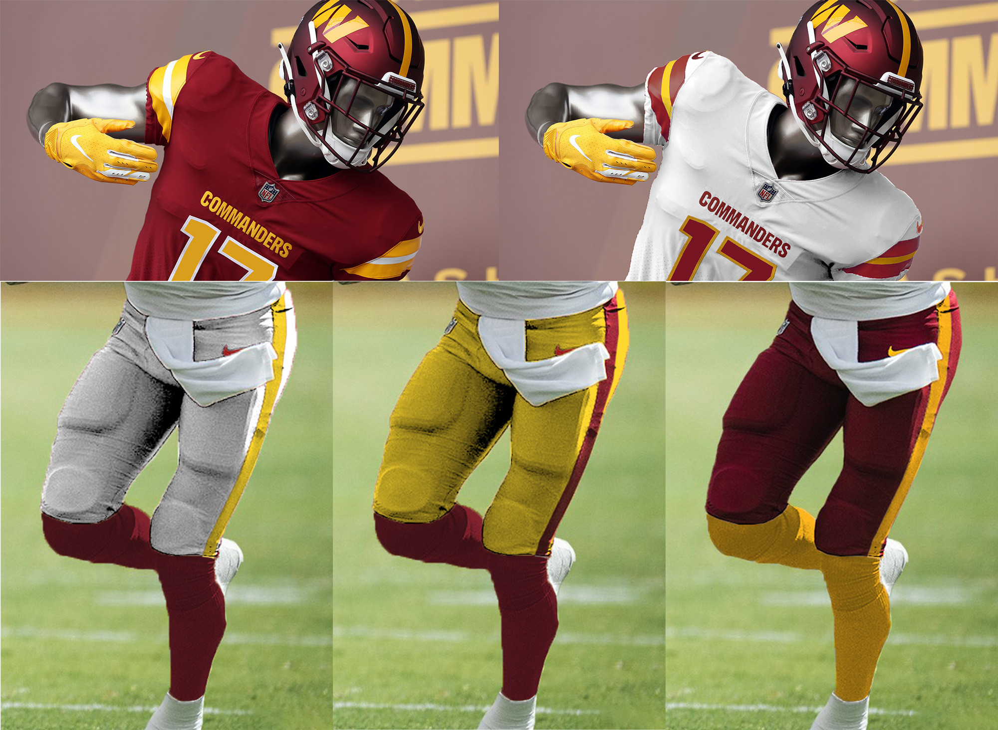
3 minutes ago, PaleVermilion81 said:
My shameless plug. And I'm not saying the helmet and burgundy jersey are perfect, but they are definitely solid pieces you can build off of. Take the burgundy jersey, remove the lines above/below the word mark, make the numbers solid gold. And then base everything else off of that. 3 pants options (with a single stripe to match the helmet) but NEVER MONO, gold and burgundy socks that always contrast the pants.
The stripe on the red pants should either be solid burgundy or be outlined in burgundy. Yellow-on-white never looks good.
-
3
-
-
Seattle vs. San Francisco
Los Angeles vs. Jacksonville
Miami vs. Buffalo
New York vs. Minnesota
Baltimore vs. Cincinnati
Dallas vs. Tampa Bay
-
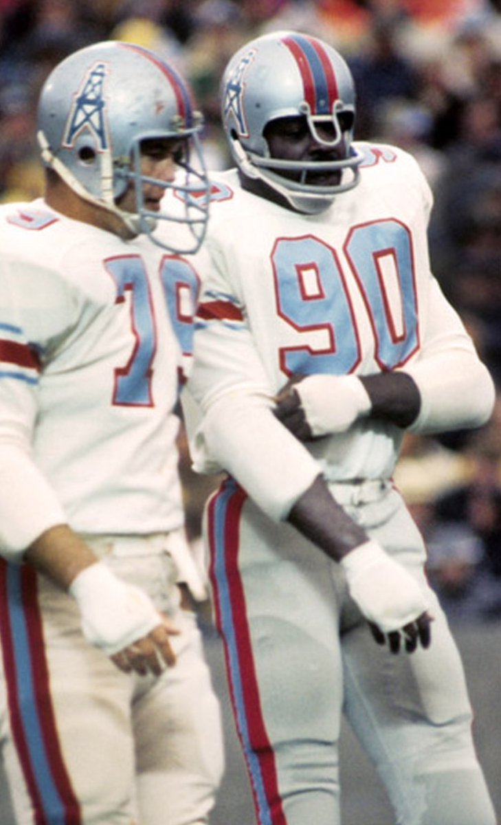
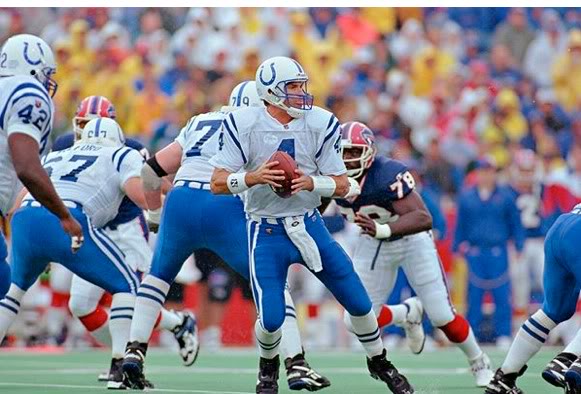
They've worn silver helmets before:
-
2
-
 2
2
-
-
I waited til the last week of the season to do this lol.
Kansas City vs. Las Vegas
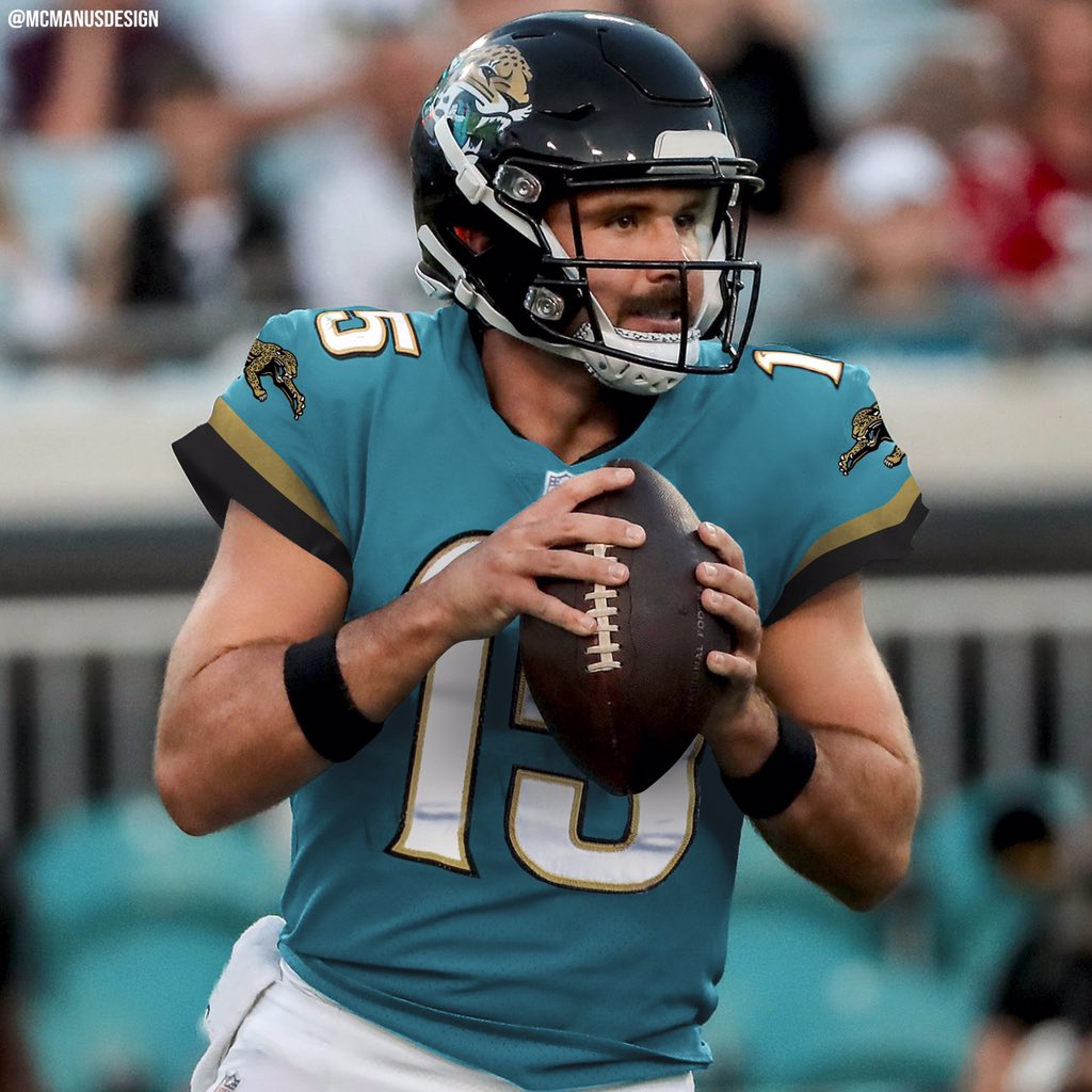
Tennessee vs. Jacksonville
Cleveland vs. Pittsburgh
Minnesota vs. Chicago
NY Jets vs. Miami
Tampa Bay vs. Atlanta
Carolina vs. New Orleans
Houston vs. Indianapolis
Arizona vs. San Francisco
Dallas vs. Washington
LA Rams vs. Seattle
NY Giants vs. Philadelphia
LA Chargers vs. Denver
Detroit vs. Green Bay
Baltimore vs. Cincinnati
New England vs. Buffalo
-
3 minutes ago, dont care said:
Is there such thing as the music titans?
I think he means figuratively, Nashville the epicenter of country music, which I guess makes them titans of the industry (I don’t listen to country, so I couldn’t tell you).
But the name was definitely chose due to the “Athens of The South” nickname.
-
3
-
-
Every idea that involves replaying the game is rather murky. My suggestion is to just call the game a tie and continue onwards. I doubt the Bills and Bengals players want to play at all anytime soon, and a rematch would only trigger memories of said incident. A tie seems like the only fair way to not replay the game.
-
2
-
-
1 hour ago, DG_ThenNowForever said:
I think you're miscasting this a little bit. This is a source I found for Bart Scott's comments: https://www.msn.com/en-us/sports/nfl/bart-scott-accused-tee-higgins-of-lowering-his-helmet-on-damar-hamlin-hit-on-first-take/ar-AA15VPyz
And more specifically,
The article I linked characterizes those comments as "incredibly messed up," but I don't see it that way. To me, Tee did lower his head and pop Hamlin with his helmet....but so does nearly every offensive player in a situation like that.
No one goes on a football field looking to stop people's hearts. But sometimes it's important to reflect on what dangerous plays continue to be legal in the game and whether they actually should be. Offensive players continue to have a different rulebook than defensive players.
I already pointed out that the Bengals TE knocked a Bills defensive player out on the first drive; I can't find the video, but under the guise of blocking, he drove the player backwards and into the ground. There's a block, and then there's a dangerous block.
Football is a dangerous game, and it's worth looking again at how balanced the rulebook is to support safe play. I would say that right now, it's not balanced.
Put another way, if Hamlin had come into Higgins the way Higgins came into Hamlin, it would have been a penalty, and probably rightly so.
I disagree. Higgins led with his shoulder directly in Hamlin’s left breastplate. Higgins head was almost turned away, as the right side of his helmet hit Hamlin’s chest, not the crown.
Not only was Scott’s assessment wrong, I highly doubt he was not intending to blame Higgins, given his past statements and overall state of mind.
Football is dangerous (as we’re all aware of right now) and continuous hits to the head over time will affect brain function. Given that Bart Scott played a decade at linebacker, this assumption is likely accurate.
-
Unfortunately we have people like Bart Scott ( former Ravens linebacker who still has a grudge against the Bengals) who are not only lying about what happened, but attempting to blame blame on a man who’s going through extreme guilt trauma right now.
And just for the record, Scott has said some outrageous things before, including asking his former team to place a bounty on Joe Burrow (a la the Saints and Brett Farve). -
But if you to feel the need to tweet something about this (because he doesn’t have to) why not send get-well wishes and prayers to Hamlin before worrying about the schedule?
Skip Bayless is a terrible person, and I’m ashamed that he claims the Cowboys.
-
3
-
-
And then we have this POS:
-
-
Yikes. This is absolutely terrible. It’s been a very long time without any updates, which is scary.
My mother always says that the human body was not made for football.
Side note: do they call this game at 7-3, or will the two teams finish playing at a later point? If it is the latter, do they restart from 0-0 or 7-3? -
4 hours ago, OHK said:
What was going on with Frankie Luvu's shoulder stripes in that game?
Uni Watch did an article on this:
https://uni-watch.com/2022/12/22/the-strange-saga-of-frankie-luvus-jersey-stripes/
-
2
-
-
-
2
-
 1
1
-
-
The catches in this Niners-Raiders game have been crazy. First Adams, then Aiyuk with spectacular clutch receptions.
-
Everyone should go back to Hail Marys after seeing this:
-
3
-
2
-
-
26 minutes ago, flyersfan said:
Texans have maybe the most under-appreciated brand in all of american sports.
Logo is simple, applicable in many places, yet is a spot-on representation of the nickname they chose.
The font for the wordmarks and uniforms is not gimmicky, fairly simple, yet customized and representative.
Jerseys are modern. they are simple but have a unique element in the single shoulder stripe. Fits a modern template.
Colors are good, hard to get RWB wrong. But they aren't the premier RWB team in the NFL, there's another patriotic flag team that owns that type of feel (and they happen to have had a massive run in the spotlight)
The division they play in is a downside to the brand. Jags are Teal & black and never clash well enough (except for this weekend they will), colts are so white-heavy but still are blue, and the Titans are obsessive over Navy.Theres room for a red team, which will clash really well in 6 games immediately, and sets the brand clearly away from the Patriots. The only team in the league with a red helmet is KC.
Which is why all the Texans have to do is use the red helmet and red jersey permanently. (And bring back the red pants for the road uniform).
-
1
-
-
Dallas does have the 1960 throwback pants with the navy/white/navy stripe that they could wear. Unlikely that they wear it, but it does exist.
-
7
-
-
The fact that this is possible, and it’s been done before, and they still refuse to do this is insane.
-
14
-
 1
1
-
1
-
-
Not the most knowledgeable when it comes to NFL history, but has there ever been a bigger fluke than Nick Foles?
And I’m not talking about a guy with one great year and then he disappears. I’m asking about a guy who has had major success with one team, then got multiple(!) chances elsewhere to replicate that and fails miserably. -
There’s a good idea in there somewhere, it’s just that they tried to do too much and it ended up looking terrible.
-First of it’s kind teal flake helmet
-Weird, toothpaste-like piping in an odd spot on the Jersey that got mangled by Reebok templates
-Wonky number font, with a few notches too many
-
2
-
-
51 minutes ago, jerrylawless3 said:
I didn't say to use the elements from the throwback jersey. I think if you add a single pants stripe and maybe another gold element it would elevate the whole set while keeping it minimal and using the color-blocking to provide contrast and let the colors stand out against each other.
If I had to choose one set as-is, I think the current uniform is better than the throwback on Nike's uniform cut.
Let's agree to disagree. i think the old is superior, even with the new Nike uniform cut.
-
20
-
1
-


2022 NFL Season week by week uniform match-up combos: From HOF Game to Super Bowl LVII
in Sports Logo News
Posted
Every team except the Jaguars.