


rorinator
-
Posts
80 -
Joined
-
Last visited
Posts posted by rorinator
-
-
Saw this graphic online. Look what logo they're using for the Jets:

-
 1
1
-
-
Looks like the Eagles jerseys still have their old wordmark despite a new one being introduced a season ago (not that I'm really complaining)
-
 1
1
-
-
UCLA looks amazing since partnering with Jordan, don't care if it isn't the historical shade of gold. Their colors look really rich and vibrant
-
4
-
-
The obscured helmet looks like it has the D logo. Shame that they're only using their throwback look on an alternate white helmet paired with what I'm assuming is their all-orange color rush. Hoping they can be like the Panthers and designate it for their all-white aways but I doubt it.
-
1
-
-
Nope. Vegas just has no away jersey sponsor and Florida has no home jersey sponsor. Thus allowing for the proper patch placement when they play in Sunrise.
-
1
-
 1
1
-
-
Called it...
-
6
-
-
An 80s Rams throwback, consistent pant stripes, or even a well-done yellow alt would be the best outcome. However it could also just be a nothing-burger to announce some kind of collaboration with Bryan Cranston since he's a Rams fan.
-
 1
1
-
-
5 minutes ago, Carolingian Steamroller said:
People are either going to love it or hate it or they'll think it's ok.
Big if true
-
10
-
4
-
-
Allegedly the Commanders are getting new owners. Odds that the Harris group changes the team's name?
-
3
-
 1
1
-
-
-
If any NFL team were to use that font I'd imagine it'd be the Ravens. Looks way too gothic for a team called the Texans to pull off. I'm sure the Love Ya Blue is going to go over really well with most fans though and if they do change that's the direction they'd go in, at least as an alternate/city jersey. Not a good secondary mark imo, at least the classic bull head is still there on the side.
-
8
-
-
Looks like the Coyotes will be releasing a new alternate jersey soon. Love these pants, should coincide with the rumors of a crescent moon for the captain's patch.
-
8
-
-
Love the bear head logo but I don't know it fits in with the jersey, especially on the arms. Maybe if it swapped places with the shoulder numbers? CBJ's good but how would it look with the light blue replaced with navy on the body for a more understated military uniform-esque look?
-
This series was great! The uniforms are all vibrant, tasteful, and distinct even with two teams with the letter 'A' and a boat on their helmet. If anything I might flip that vessel on the Argos's helmet so it's sailing forward, but that's super minor.
Anyways, congrats so much on being hired by Fanatics, you'll be making some great stuff if the talent you've demonstrated on the boards is to carry over - which I'm sure it will!
-
1. Morocco #2
2. Canada #2
3. Morocco #1
4. Costa Rica #2
-
1
-
-
MassMutual is awful but this is probably doubly awful, at least aesthetically. Looks like a comically large hole punch got to the jerseys.
-
1
-
1
-
 2
2
-
 2
2
-
-
1983 Chargers, 2010 Cowboys (wore throwbacks for Thanksgiving but white rest of season), and the putrid 1976 Bucs.
-
6
-
-
It was for the name of the Agua Caliente Band of Cahuilla Indians who owned the team. They operate a few casinos out in the Palm Springs area. The local AHL team's stadium was even going to be built on their land before that fell through (the Firebirds not the Reign).
-
1
-
-
Every set was a really believeable and thoughtful 'what if?' that matched each era perfectly! These jerseys ads will be brutal though... hurts to see even on a concept.
-
4
-
-
I don't know if this could be argued? Their back to back championships didn't come with wordmarks on the aways, but it's probably too similar to be considered 'wrong':
The Blazers only title came without the sash:
I don't associate the saloon Suns uniforms with playing for titles, but maybe that's just me:
Maybe these last two are modern bias though
-
Both teams, to be honest. No nickname or city name on either jersey - just very generic descriptors (I know the history of Oakland being called 'The Town' but still...)
-
11
-
-
Uniforms as always look great, but the new TCU logo is a little too curvy/simple IMO. I think this is most true with the right arm, the line should bow out instead of in, it looks atrophied in comparison to the left. Keep it up though!
-
2
-
-
Maybe in humor it's superior, but I'd rather have a generic mascot name than something I can't say without cracking a smile. To me at least, WFT has never sounded dignified or classy. It sticks out like a sore thumb when compared to the 123 other Big 4 names. Although none of these proposed logos are that great, they're about on par with their current dull bland.
-
10
-
-
They showed Bucco Bruce at the end of the reveal trailer so I'm going to be cautiously optimistic, then again if we got multiple helmets this year wouldn't the Colts have opted for blue? I don't know, but I'm hopeful for a creamsicle return...
Also, although they might have been in Baltimore during the era these are nice throwbacks!


/cdn.vox-cdn.com/uploads/chorus_image/image/65953708/1195274371.jpg.0.jpg)
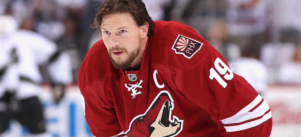
![r/Coyotes - [Craig Morgan on Twitter] Check out these pants! New uniform announcement coming soon.](https://preview.redd.it/aeqqtkpjqaba1.jpg?width=640&crop=smart&auto=webp&v=enabled&s=0f4a674274c70366650fad11b447108249b77c81)


:format(jpeg)/cdn.vox-cdn.com/uploads/chorus_image/image/18203085/88037215.0.jpg)
2024 NFL Changes
in Sports Logo News
Posted
Better than I was expecting considering the "4 Unique Designs" claim. Pants look like they have some sort of stripe since you can see some white at the very bottom, unless it's similar to the Jags dash of color on the back of their unis.