


Krudler
-
Posts
84 -
Joined
-
Last visited
Posts posted by Krudler
-
-
2 hours ago, DCarp1231 said:

Monochrome sets must die
-
 8
8
-
 1
1
-
 1
1
-
-
On 5/1/2024 at 2:48 PM, Ben5 said:
It's because Randy Edsall didn't like red.
In his first run at the university, he eliminated red from all their uniforms and gear. And all the sports were pretty much on their own islands (men's and women basketball each had their own logos, baseball had the hook C), so it didn't matter. Right before he left, they started the push to standardize their logos. That's when they got the current husky logo they have now. Randy left before he had to use it.
By the time he returned, it looks like they loosened the reigns a bit, because he went back to the block C logo he used that they previously retired. Again, he got rid of red from the uniforms (but they still had red on some gear). Then he got sacked. LOL
Thanks for the history lesson! It's kind of funny Edsall was so anti-red, but it didn't stop him from going to Maryland.
-
2
-
-
The long sleeve jerseys from that era are so fire.
-
1
-
-
-
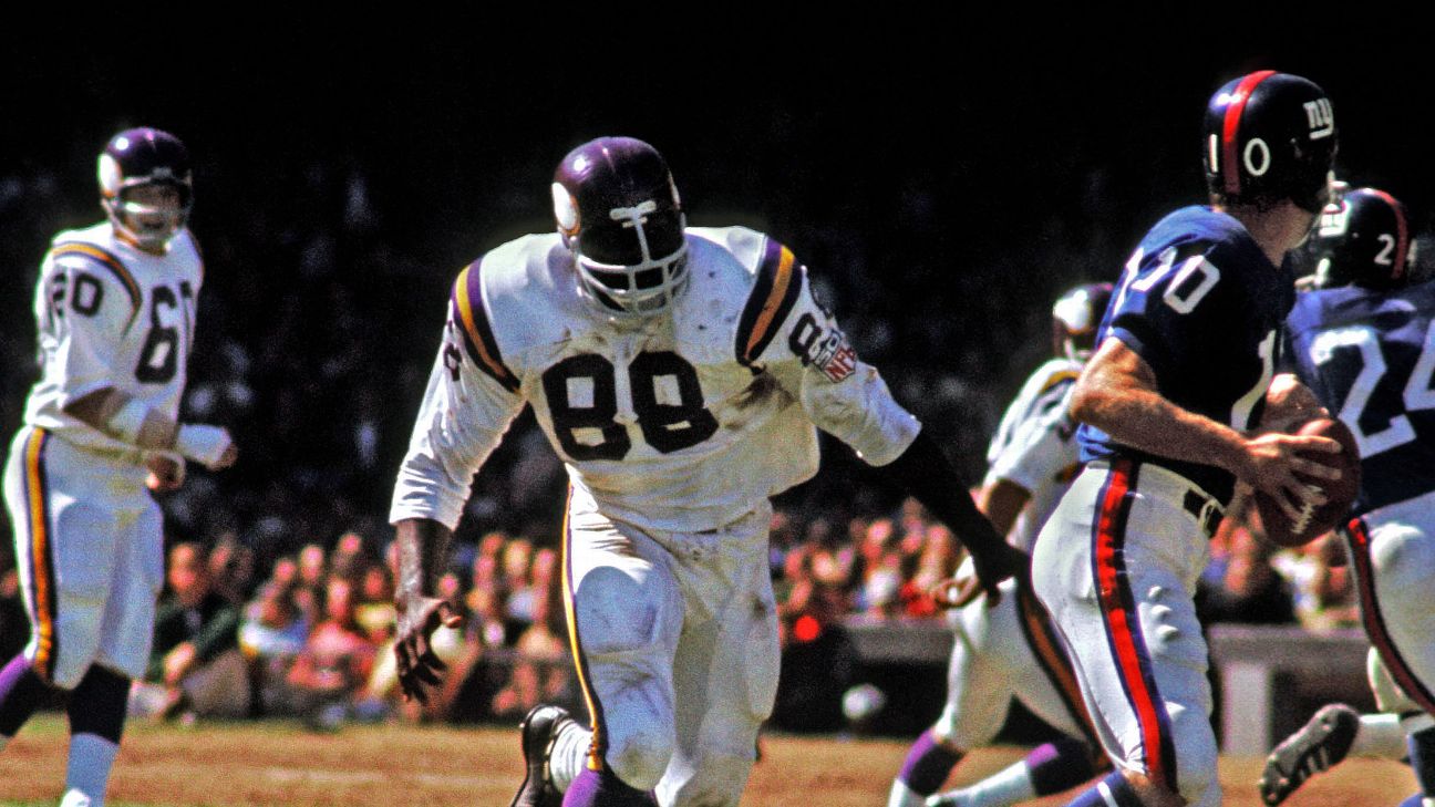
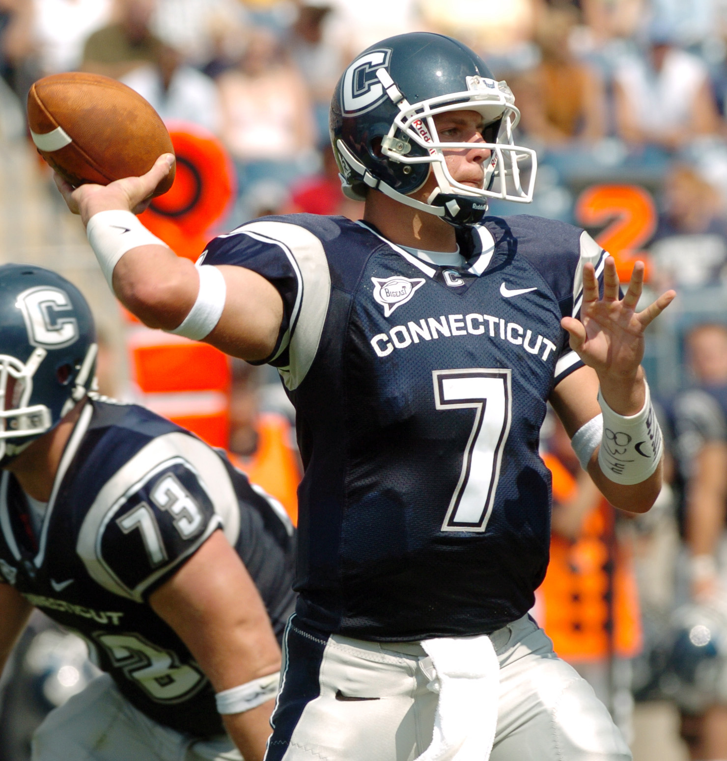
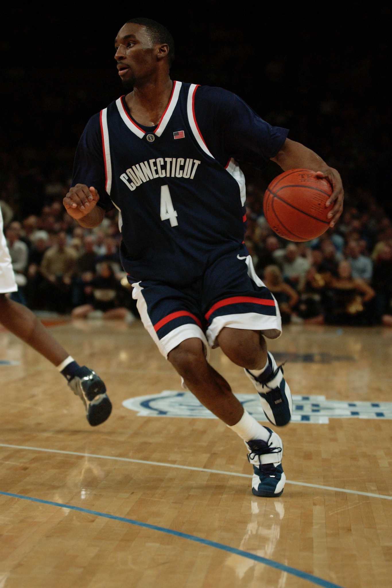
For the longest time UConn's football team seemed to be strictly blue, silver and white as opposed to the blue, white and red of the other sports. Always bothered me.
Example:
vs.
-
On 8/6/2023 at 10:49 PM, DCarp1231 said:
I believe I’ve pointed it out before, but on the previous WFT jersey, there was one particular cut that used the bottom stripe all the way around the sleeve, but stopped the top stripe at the seam
Man, I miss this uniform set.
-
1
-
-
32 minutes ago, Cujo said:
Possible Broncos unis based on "all the rumors"
They gotta bring back the light blue.
-
3
-
 1
1
-
-
The Avs kind of feel like Burgundy Pants and Burgundy Helmets would fix a lot
-
Always very depressing when these franchises co-opt identities they couldn’t run fast enough from.
-
1
-
-
On 8/30/2023 at 12:04 PM, bbush24 said:
Excuse me?
The Browns best look imo
-
2
-
1
-
-
Did the Lakers intentionally ruin their purple uniforms so people would be ok with them wearing their other nonsense?
-
1
-
-
21 hours ago, kimball said:
Per Locker Vision ...
(Just waiting for the rest of the schedule including the Lakers-Nuggets series.)
Eastern Conference Finals
G1 - MIA (Red) @ BOS (White)
G2 - MIA (Red) @ BOS (White)
G3 - BOS (Black) @ MIA (White)G4 - BOS (Green) @ MIA (White)
G5
G6
G7
Western Conference Finals
G1
G2
G3G4
G5
G6
G7
I'd rather exclusive white at home green on the road, but I'll take the black set over the dark green monstrosities.
-
The wordmark on the red is so unnecessary.
-
3
-
 2
2
-
-
49 minutes ago, adsarebad said:
the look of a defeated man........what is he thinking right here?
-
He's looking forward to rocking these on 100 degree Sunday afternoons in July.
-
 13
13
-
-
3 hours ago, sonny said:
Utterly repulsive. Trash.
-
2
-
2
-
-
11 hours ago, CreamSoda said:
One of the biggest misses of late has been the Devils new sweaters.
it just looks so bad without the hem stripes and the super huge arm stripes.
what a downgrade from their classic uniform.
It's a travesty what've they've done to those sweaters. Such seemingly small changes causing such a major downgrade.
-
4
-
-
These are so close imo. Lose the wordmark on the home jersey, swap the pants for home and away, replace the gray trim with navy and yellow and fire the black alts into the sun then we'd be cookin. Thank God they didn't change the logo or helmet.
-
1
-
-
The Cardinals jerseys should be red.
-
4
-
1
-
-
23 hours ago, Cujo said:
I fail to see what's so amazing/mind-blowing about these uniforms.
They're nice. Average. But nothing more.
These would be so much better if they used the vintage “Astros” word mark with a star instead of numbers on the front.
-
3
-
-
I think Old Marlins colors with the teal reigned in a bit would look good with the current font.
-
2
-
-
I really hate how they changed the numbering rules.
-
12
-
2
-
 1
1
-
-
On 12/20/2021 at 11:21 PM, mcj882000 said:
NHL All-Star Hockey on the Sega Saturn: for some reason, every team in this game wears navy blue pants. Now, obviously the level of "inaccurate" varies from team-to-team. Teams like the Hartford Whalers, who already wear navy blue...
...it's not so bad. They basically look normal!
For teams like San Jose...
...and Calgary...
...it's kinda bad, but it's still close enough to the black pants they wore IRL that unless you look closely, you might not even notice.
For teams like the Detroit Red Wings, though...
...It just looks awful. Dunno what happened where this was basically the devs' only option, but I can't really imagine any other reason it'd be like this.Wayne Gretzky's 3D Hockey for the N64 gave every player a black helmet, regardless of team color or home/away.
-
I love the USSF logo and think it is a vast improvement from the prior crest.
-
That's a great look for the Niners.


/cdn.vox-cdn.com/uploads/chorus_asset/file/23125191/1360396557.jpg)


/cdn.vox-cdn.com/uploads/chorus_image/image/69760791/usa_today_16608696.0.jpg)


2024-25 NHL Changes
in Sports Logo News
Posted
Black Diamonds would be pure class.