


VampyrRabbit
-
Posts
1,001 -
Joined
-
Last visited
Posts posted by VampyrRabbit
-
-
Hi, I like to redesign soccer logos as a way to unwind. Here are a few I've done since I decided to make a start. I always wanted to try my hand at redesigning them, but never got round to it or just span the wheels so to speak....until a few weeks ago.

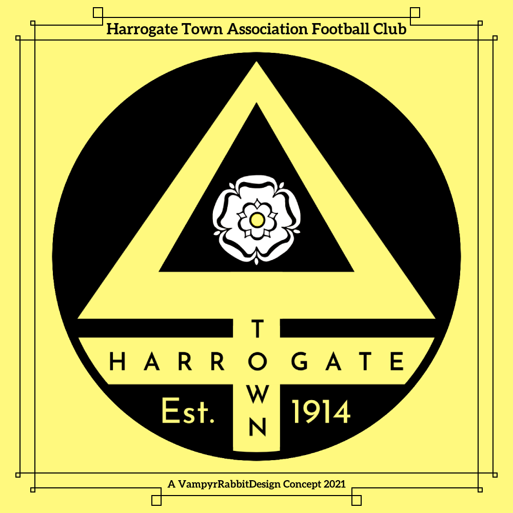
First up, Harrogate Town. They traded their old crest (which was almost identical to the coat of arms of Harrogate) for a new one when they turned professional in 2017, and like many new emblems, it was done in the "English Style" in one similar to the new Manchester City logo (Roundel, date of formation on midline of surround, many outlines). I decided on something that moved away from "English Style"
As far as I'm aware, there aren't any other clubs in England that have an alchemical symbol as part of their crest, and Harrogate are nicknamed the Sulphurites. So I've used an alchemical symbol for Sulphur as the centrepiece for the crest, to reflect the nickname of the team and the springs that the town of Harrogate is known for. I also used a more "Brimstone" shade of yellow, and a font that feels "Yorkshire". The white rose is also larger on this crest, and the date of the teams foundation is on the crest, rather than their admittance into the West Riding (of Yorkshire) league.
Redesign for the Corsican club Bastia, their Current logo has black outlines on everything and the emblem of Corsica isn't the focal point. The only black outline is the one around the shield with the Moors Head. The star is a nod to the teams earlier name of Sporting Étoile Club Bastia, which is the name they had when they reached the final of UEFA Cup in 1978 and won the Coupe de France in 1981.
The shape of the shield was taken from a carving in the Citadel of Bastia. And last for the time being, Oxford United. This is sort of an update to the crest that the team wore between 2001 and 2015, but with the yellow the dominant colour and the horns breaking through the roundel.
The Desmond Morris designed Ox head is timeless, so I left that well alone, and used the shades the team wore in 1985-87, when they made their way to the top tier of English Football for the first time and won the League Cup.
-
 3
3
-
-
On 2021-06-24 at 12:52 AM, Sidney said:
Here is one of my rebrand I've done a long time ago about my hometown football (soccer) team Les Girondins de Bordeaux. You'll see the normal logo and the alternative? I've used elements of their past logos. It's a different feeling but I'm really happy with the result. C&C are appreciated. And the symbol on the top "The biohazard" symbol is the city icon of Bordeaux, it's "Le chiffre de Bordeaux" the shield of the port composed by 3 moons.
C&C are ppreciated
This is a lot nicer than the current logo (and especially the awful 2020 logo).
Do you think it is possible to do a logo for G de B that incorporates a representation of the Chaban-Dalmas Bridge?-
1
-


.png)


Reimagined Soccer (and other) Emblems (Chile)
in Concepts
Posted
More crests for three more teams.
Logo for Chicago Fire, I'm not a fan of the "fire crown" logo or the new one just launched. This uses the Florian Cross from the original logo, which is part of the original logo design that should really have been kept.
At the centre of the logo is the Flag of Chicago, possibly the most Iconic city flag in whole of the US, partially surrounded by a red C. On the left branch of the Florian Cross is the municipal device of Chicago, as found on the Chicago Theatre sign, and the right branch is adorned with a heart, to represent the one of the nickames of Chicago being The Heart of America, and it's position of the city being at the heart of the US Rail network.
Crest for Toulouse FC, the current logo had everyone thinking the team was about to be brought out by City Group, so I decided to give them something more distinctive and pretty leftfield, and used the Occitan Cross instead of the full coat of arms for the sake of simplicity.
The outline of the crest is taken from a decoration from the Capitole de Toulouse, and the white and violet stripes are a nod to the distinctive architecture of Toulouse, known as Le Ville Rose (the pink city), as is the colour of the lettering and date of foundation.
Crest for Fulham, this has the Cross and the Crossed Swords from the coat of arms of Fulham, and the waves at the bottom represent the river Thames. At the top of the crest is a representation of the gable from the Haynes stand of Craven Cottage.

I've seen loads of redesigns for Fulham, and most of them have been really good and included the cross and the crossed swords. I wanted something a bit different, hence the cross being just an outline. I put just the "Fulham" to try and keep it resonably non cluttered.