


VampyrRabbit
-
Posts
1,001 -
Joined
-
Last visited
Posts posted by VampyrRabbit
-
-
On 2022-01-19 at 5:58 AM, vtgco said:
I think your Pacific logo looks best without the hexagonal outline, and I'm not just saying that because I'm hoping to avoid competition with my hexagon + waves Sounders concept ; P
In all seriousness, the tree + trident combo is really good, and I'd just suggest thinning up the center vertical prong, and maybe giving the trunk a white or teal outline rather than counter-coloring it in white.
The font is a bit of a downgrade again, but the clean-up for Kyoto is much-needed. The lantern shape is unique, but it's not quite reading properly to me. I wouldn't normally suggest it, but maybe in this case some tonal shading (or possibly horizontal hatching lines representing creases) near one of the edges would help by giving it some depth...? Also the slight vertical asymmetry is bothering me slightly, even if it's realistic.
I'll rework both the PFC and Kyoto emblems, and rework the shape of the lantern for Kyoto.
In the meantime, here is an idea for the newest MLS Club. Well, sort of.

This is my take on a badge for the newest MLS team. I'm not a fan of the name Saint Louis CITY SC, so decided to use the name of the recently defunct Saint Louis FC, but the pink, navy and white colour scheme is pretty boss, so I kept it. I originally wanted to just use pink and navy, but with the arch and the colour pink, you can guess what the designs with those colours looked like, so the white returned.
This has the Gateway Arch and the "Flame de Lys" from the crest of another defunct club from the city, AC St Louis, with a cresent moon from the seal of Missouri. Beneath is a mound with the short form of the city name on it, and under that is the blue with four peaks to represent the Missouri and Mississippi.
-
 2
2
-
-
On 2022-01-20 at 3:32 AM, 4_tattoos said:
In case they end up losing the lawsuit and have to change their name, I wonder if they'd be allowed to call themselves Global Miami instead? Global is literally a synonym for international, and the word global is the same in both English and Spanish. Or would swapping in the word Global still be some sort of infringement?
I guess that would be fine. And in the case of being barred from being called Inter, they could always have the MLS dust off the old Fusion name.
And on the subject of OG MLS Names, the Energy Drink boys are again going to be wearing Metrostars colours on the road.
-
And my first non - footy redesign is that for the much missed Quebec Nordiques. The letters Q and N, with a hockey stick forming part of the N and the tail of the Q. For the colours, the classic blue, white and red.
-
2
-
-
On 2021-12-10 at 4:46 PM, insert name said:
I'd like to see NYCFC try an orange kit.
-
2
-
-
10 hours ago, BryanSmalls said:
Took them long enough to embrace Pink as their primary kit color. Not sure why they didn't do so from the start.
Also, I must have missed this, but did Inter Miami settle their lawsuit with Inter Milan or is that still ongoing?Still ongoing, as far as I'm aware.
-
-
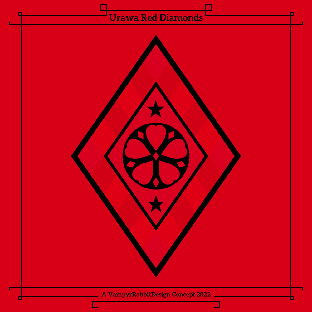
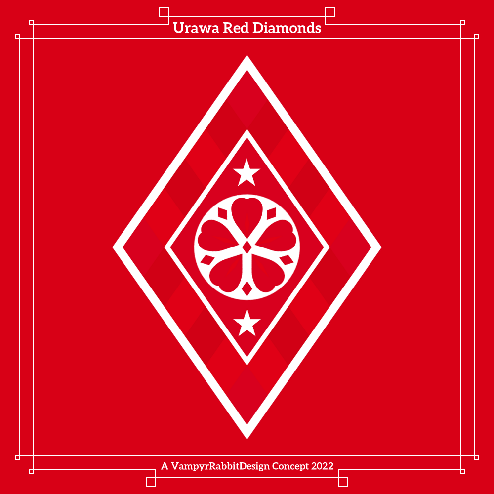
More for the team from Saitama.
Main and secondary emblems for Reds, the flower now has petals comprised partly of diamonds, and in that motif, there are now 11 diamonds. I tried to incorporate a subtle echo of the Mitsubishi logo using different shades of red.
Red and Gold versions of the emblems.
-
1
-
-
Just now, Friedrich Stuart Macbeth said:
Wouldn't it hurt to add in the team's name? Right now, it could be any team if you replace the flower with something else, because it looks a bit generic.
Maybe you can make the logo shaped like a Mitsubishi logo while modifying its shape to be appropriate for football.
You're right, I do think it needs the team name or at least the initials somewhere, Probably either a scroll or the initials of the club along with an S for Saitama. And I think I can incorporate the Mitsubishi logo into the flower by adding an extra petal.
-
On 2022-01-10 at 6:38 PM, GriffinM6 said:
That's a pretty sweet sticker. Maybe the use of green will also entice them to use some Olympic themed colors in the kit as well...
Green with Gold logos and gold, violet, blue, hot pink and red trim on the sleeves would be a really nice colour combo for Atlanta.
-
Back after healing from a hand injury, here are some more reimaginings.....
Based in the Greater Victoria area and playing in the Canadian Premier League, Pacific FC have a really nice colour scheme, but their current crest isn't anywhere near as nice. There is supposed to be an outline of Vancouver Island and a Douglas Fir in that logo, but it's not clear, and the Trident and the initials of the club are tiny.
The redesign here has the trident and tree as the centrepiece of the logo, and waves representing the seas around Victoria. Two versions, one with a shield with the tree bursting out, and another one without a shield outline.One of the best followed teams in Japan, Urawa Red Diamonds were formed as the works team of Mitsubishi and used to be called Mitsubishi Urawa FC. Initials were not the only thing the team took from Manchester United - they also took the same colours (the team have worn red shirts, white shorts and black socks since the J - League started) and Red Devils nickname.
Their current crest has a lot going on, the redesign simplifies the crest and has a lot of red diamonds. The flower is now at the centre of the crest and has even more red diamonds, and the two stars represent the two AFC Champions League titles the team has won, a record for a Japanese club.
-
How aboutnaming the mascot Expo Joe?
For the colourway, A is the best.-
3
-
-
2 hours ago, vtgco said:
I really like that last version (inlined spokes with hexagon hub) for Arsenal; my first thought was that the stacked cannonballs can also serve a small nod to the ermines of the team's longtime crest.
I think that Stade Brestois update looks absolutely perfect, and that Monterrey shielded update is an upgrade too; thanks for humoring me!
The integration of the crowns on that Morelia logo is really nice.
The elk idea for Salt Lake is really unique! It would make a great mascot for the team, instead of the overplayed lion. It's well integrated into the flower, too. I'm curious, since it's unique but kinda confusing; what is the shield shape supposed to be?
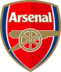
Thanks! That version of the Gunners crest is my fave too. Orignally, the Hexagon was going to be used as a shield, but it looked better standalone with a stack of cannonballs, instead of inside a hegaxonal shield with the blackletter Arsenal font as I originally had in mind. The cannon and ball logo was worn when Arsenal won the title with almost the last kick of the season, so that pretty much decided that I was going to go that route.
With RSL, The shield shape was supposed to be shaped like Mount Olympus at the top, but didn't work that well with the main flower emblem, so it's just a shield now. As Utah has two pro teams that have no symbolism of Utah in their logos, I wanted to change that for Real. Might do that for the Jazz too.
Originally I was going to rename the team, but I decided to keep the Real as the highest point in Utah is Kings Peak. And yeah, I would take the Elk over the Lion any day as a mascot for RSL.2 hours ago, vtgco said:Understandable... If you're willing to do that distinction with color instead of size, though, you could do "GALAXY" on top "EST. 1996" on the bottom...
I think that could work, in the meantime, here is a slight redo that gives the quasar a bit of space and one in the colours of 2000....
And an emblem refresh for the newly promoted J - League team alongside Jublio.......
Remake for Kyoto Sanga, the current logo looks dated and could do with a simplification. This redesign cuts the number of colours down to deep violet, red and a light gold. The logo is shaped like a traditional chōchin lantern.
-
Happy new year!
A remaster of an old design, and some new stuff -
Refresh for SB29, this now has two cutlasses and just the team initials.
Redesign for Mexican team also known as Monarcas Morelia. This has the initials AM, and there are three crowns, for the three kings on the coat of arms of Morelia. Their current crest has a lot going on, so I designed something simpler and more in line with their "Monarcas" crest. The star represents their lone championship win, and also was something to fill the space.
And a redesign for Arsenal. The current lemon coloured change kit is the first in a long time where the Gunners have just the cannon on their shirts, and it is a nice change and a big improvement from the current, now rather dated crest, and it would be nice if Arsenal go back to playing with just a Cannon and the stack of cannonballs, as they did from 1978 to 1990.
This is my take on the cannon and ball design, I tried to make the cannon look imposing, and decided that 12 spokes with 6 pairs were good numbers, 12 for the players on the field plus the fans, and 6 for the shirt number of Tony Adams.
And two versions that have hexagonal axle caps, a nod to the "Art Deco" crest introduced by Herbert Chapman, who also introduced the classic Gunners kit of red shirts with white sleeves.
-
4
-
-
-
6 hours ago, aawagner011 said:
I hated it because the contrast was horrible. It was so pale you could barely even tell it was pink. I couldn’t see the adidas logo or stripes. The kit wasn’t classic for its plainness, it was just straight boring. It looked like teamwear and they just slapped a crest on it.
I can make out the stripes and the pink trim on the cuffs, but not the Adidas logo, which really should have been in black. The shirt (the authentic one with the Grandad Collar) looked decent enough off the pitch, but on it, it didn't work thanks to not being able to see the adidas logo and those shorts.
-
3 minutes ago, Sidney said:
Indeed I wanted a slightly modern style, not too different from the past version. So to you is that good or no, the fact that it looks like a 1990's French football team?
I think it looks really cool, so it's good.
-
2
-
-
I didn't mind the clear pink on the home shirt, thought it worked well with the white, but they definately should have used white or black shorts, pink just didn't work.
-
The Quebecois Fleur de Lys inside of the diamond looks great.
Getting serious 90's vibes from the other logo, it looks like it was cut from the same cloth as many 1990s French football team logos from that period, with the painted style.
-
3
-
-
Another redesign for Crew, this time with a bigger hard hat and arch.
Redesign and rebrand for Real Salt Lake, I decided to use more of the imagery of Utah, so the Sego Lily, as found on the new (and rather nice) Flag of Salt Lake City is the centrepiece of the logo, and the three petals are separated by a representation of the head of a Rocky Mountain Elk, the State mammal.
Two versions, one with a deep red and a lighter shade closer to the shade the team uses.
-
3
-
-
There is a fine line between classy and chintzy, and the gold on the Nats logo falls into the latter for me.
The gold used in the All Star logo works with all the other colours and doesn't overwhelm them, the shade the team uses now is a different kettle of fish.
-
1
-
-
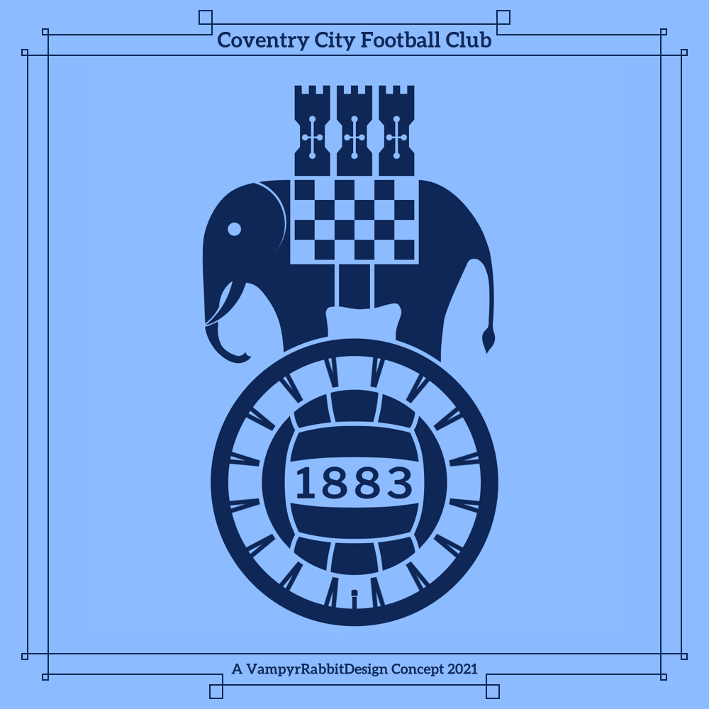
Slight tweak to the Cov crest, a thicker wheel rim (it is carrying an Elephant after all) as well as a tyre valve added.
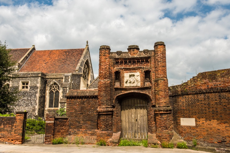
Redesign for Ipswich, this keeps the Punch draft horse, and gets rid of the red and the amount of lines. The crenellation at the top of the current crest is supposed to resemble the Wolsey Gate, a local landmark which to be fair, has seen better days. I put a more faithful representation of the gate at the top of the redesign.
The two Octagons represent two other important locations in the town, Christchurch Museum (one octagon from the shape of the clock above the main entrance) and the Waterfront (the shape of the sundial).
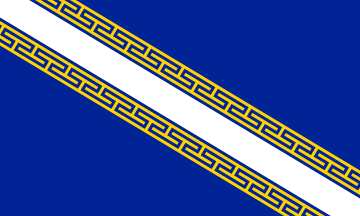
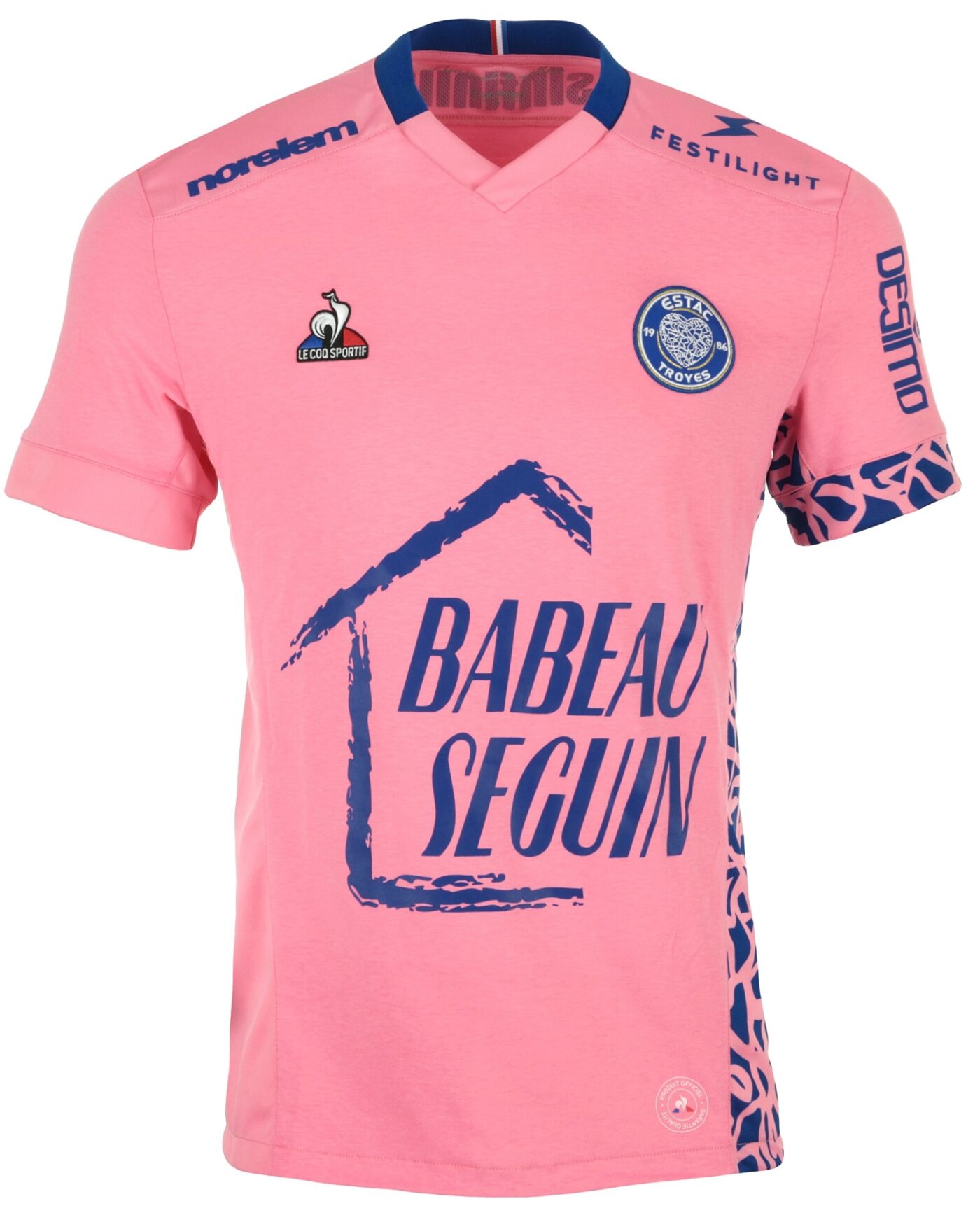
From Champagne country, Troyes recently became a member of the City Group, and like most City Group teams, they will probably get a cookie cutter roundel crest in the near future if the logo from their 2021 change is anything to go by, I decided to give them something more unique.
The crest shape is inspired by Le Cœur de Troyes, a sculpture in the middle of the city, and has the flag of the province of Champagne across it. The X stands for the number of the Department of Aube (10). For the script, I've gone for ES Troyes AC. The club have been pushing the name ESTAC, but nobody is calling them that.
-
1
-
-
9 hours ago, vtgco said:
Really appreciate the thicker outlines for Coventry City, and the font is much better, but the wheel issue stands. Looks really good without the shield; not to say that it doesn't work with one.
When I redid the numbering, I just got rid of the name instead of updating it and decided to discard the shield too. Coventry are one of those teams that can get away with a pretty stripped down crests and I'm pretty sure it would work on a mostly Sky Blue shirt.
I agree on the wheel. Problem is that if you make the football small enough that the wheel becomes clear as a wheel, it means that there is a lot more light blue on the bottom half of the crest than the top, and makes it look unbalanced. I think I might have found a solution to that problem, going to sleep on it and see if it still works tomorrow.
9 hours ago, vtgco said:Good placement of the mountains on the Monterrey update, though I think I liked the shield... Does it work still or no?
I think so.
9 hours ago, vtgco said:Your hard hat is nicely rendered for Columbus, and I like the Arch City idea, but there is too much empty space everywhere! I'd definitely have the arch text be "CREW SC" to fill the gaps on it. After that, I'd probably either put the arch below the circle like a banner and fill the circle with the helmet... OR maybe fill some of the remaining space with stripes and/or checkerboards (not sure this would work, personally)
I'll have a go at something like the top right, perhaps the middle one.
10 hours ago, vtgco said:The Galaxy one is a nice era-combine, but I think it really wants to be a roundel logo; maybe the Greek pattern could work in there too. The Griffith Observatory makes for good inspiration; I've been thinking about an Angel City FC kit based on it too : )
The Griffith Observatory is awesome, I'm suprised that Galaxy haven't used it for inspiration for one of their shirts yet. Not sure I can keep the GALAXY lettering with a roundel logo though, which is one of the things I really wanted to keep.
-
1
-
-
-
Staying in the US.....
This redesign for LA puts the quasar (originally from the Seal of LA County) as the main focal point, and surrounding it is a swirl detail inspired by the teams first emblem.
Thats not the only inspiration from the original logo - the wordmark has the middle two letters highlighted, and above and below the other 4 letters is a Greek Key pattern, taken from the Griffith Observatory.
Another nod to the stellar name of the team. I decided to have the quasar simple as on the LA County Seal 1957- 2004 for the sake of simplicity.
-
1
-


.jpg/640px-Griffith_Observatory_2006_(architecture_closeup).jpg)
Reimagined Soccer (and other) Emblems (Chile)
in Concepts
Posted
Thanks for the feedback, I'll work on those changes for PFC and Kyoto.
"Roundel" version of the Reds crest, this has just the one shade of red.
And a redesign for the team from the Capital. The main problem I have with the current D.C. Emblem is the flag on a black background, so it gets a shield. The outline of the Jefferson Pier is at the top of the logo, and the two non flag stars are for the CONCACAF Champions League win and the Copa Interamericana win in 2018.