


VampyrRabbit
-
Posts
1,001 -
Joined
-
Last visited
Posts posted by VampyrRabbit
-
-
4 hours ago, MDTrey4 said:
Finally getting around to posting the next team in the series. I've always liked the idea that some European teams are named after the neighborhoods that they're in like Chelsea or Fulham in London. So for my DC team, I didn't want to just have Washington or DC in the name.
Chelsea are actually based in the London Borough of Fulham, though they are named after the area called Chelsea.
I like the club crest, but why is there a 39 on it? And while the socks look nice, they would look a lot nicer if there were 3 stars on them and the nike logo wasn't over the stripes. A third kit wouldn't go amiss either, considering the team plays in two of the most common colours in football.
-
 1
1
-
-
Excellent work, and I fully approve of the choice of incorporating more blue and purple into the jerseys and using the full logo.
-
The max number of outlines for a name for most name fonts before they become messy looking is 1 and for numbers its two. a good number of your designs simply have too many outlines and it seriously drags down the designs. Another thing is the sleeve logos, which are generally way, way too big.
The Angels home and Away are good, but the alternates are horrible, with the two toned red caps, the seriously dated 90s logos, the socks which don't go with the uniforms, and the lack of Halos.
-
On 2022-07-16 at 11:17 PM, coco1997 said:
Nice work on both the Cubs and Sox! For the Sox, I’d make the wing of the flying sock logo either red or gold to give it a nice pop of color. I might also add front numbers to every jersey (except the weekend alt, of course, though I might move the pant numbers to the other leg to keep the design from looking lopsided) since they help balance the designs and this is something the Sox do anyway. I think in general the rounded number style you used for the Sox would work better for the Cubs because it’s pretty close to the style the North Siders use anyway. For the Sox I’d go with a Tuscan style number font which would go well with the various scripts and logos you used.
For the Southside alt, I’d use the pullover style template you used for your Reds home and road sets. The ‘83 style horizontal stripe across the front of the jersey doesn’t quite work on a button down jersey.
Speaking of the Reds, they look perfect!
Thanks, I'll get around to the number alterations and the numbers for both teams from the Second City shortly.
Some alterations I have made
Arizona - road alt added, numbers revised, alternate with new jersey emblemBoston - home throwback with red socks
Baltimore - numbers revised, home alternate added.
Will get round to Angels, Cubs and Sox.
And onto Cleveland! I thought the Guardians was a great choice for a new name, but wasn't entirely sold on the wordmarks and while the Knuckleball G is a pretty cool logo and I wanted to use it, it kinda clashed with the C/G logo I came up with, so I left it off. I decided to go classic with the home and road, and adventurous with the alternates.
The home and the away both are inspired by the 1948 uniforms, with a stylized G/C inspired by the Guardians of Traffic statues on the Hope Memorial Bridge. On the inside of the baselayer is "BALLGAME!", after the final call of sportscaster Tom Hamilton after the final out of a guardians win. On the sleeves is a baseball wearing winged headgear inspired by the Guardians of Traffic.
The home and road alternates have contrasting sleeves, and the Cleveland sign at Edgewater Park is used for the script, as it was too good for just one team from the city to use. The road uses a red fronted cap, a first for the team.
Cream version -
SpoilerAnd the heritage home, there is a uniform inspired by that worn by the Cleveland Buckeyes of the Negro League. For all the sets, the font used for the name and numbers is FTY Strategycide NCV.
So thats the Guardians. Up next we go to the Mile High City!
C+C would be cool.Edit on 25th - cream version of heritage added.
-
3
-
-
Cypriot side APOEL release their new kits, including a home in their traditional blue and gold with a "subtle pattern".
And PSG have released their new change kit.
-
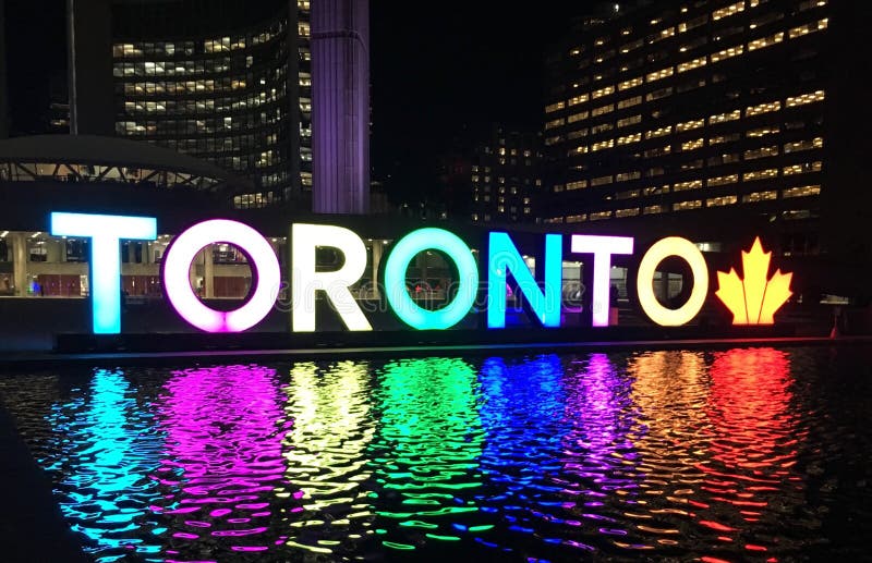
17 minutes ago, johne9109 said:
Toronto Maple Leafs
I took a couple of sources of inspiration for the Leafs. The main one is the TORONTO sign in Nathan Phillips Square. The colors in the letters are given a gradient to represent the different cultures in Toronto to represent the diversity of the city. T-French, O-Irish, R-Chinese, O-Mexican, N-Lebanese, T-Metis (Native), O-Japan. These were chosen as they are the most prominent cultures in Toronto.
You got the gradient the wrong way around for Mexico, and you used the same gradient used for the T for both China and Japan instead of going with the actual national flags. And they look like they were picked randomly.
-
17 minutes ago, MJD7 said:
Miami Marlins City Connect
Since the Cubs got the Marlins’ original red design, I couldn’t help but go with a basic South Beach neon lights theme here.
Now that's a Miami City Connect Jersey.
-
3
-
-
The Arsenal change is pretty nice and the Cannon badge looks a lot better than the full crest, which now looks seriously dated considering several of the trends it launched (half shaded badges and outline styles) have come and gone, but it's never not going to feel strange not having a yellow and blue kit in their rotation.
-
They aren't bad and the colour combo is really nice, but these uniforms are just bland. It feels like something is missing.
-
Love what youve done with Cincy - the striping is even better and more 90s than before.
-
On 2022-07-13 at 7:47 PM, JerseyJimmy said:
road pinstripes my beloved
speaking of road unis, as much as I like the Southside set, it feels like it'd probably have to be road-only
Youre right, it would clash with any team that traditionally wore road gray, and clash with almost every other team that didn't, so it would probably wouldn't be worn at home often.
Moving on to Cincy, here are the Reds!For the home, I've gone for a pullover with two buttons, I'm not usually a fan of pullovers for Baseball, but the classic look of the Big Red Machine meant that the Reds were always going to get a pullover for the home. I also got rid of black as an accent colour as I prefer the look of the team with just red, and brought in the blackletter C on a home plate as a stirrup logo. Mr Red is on the sleeve, and on the inside in the Reds custom script is the motto of Cincinnati, Juncta Juvant (Strength in Unity). The road gray is button up.
The alternate home is sleeveless, like many Reds outfits of the past, but this one uses the blackletter C on the front, and on the baselayer sleeve, you can find Mr Red, but just his head. Like pullovers, I'm not usually a fan of sleeveless baseball shirts, but it made sense for Cincy. The road alt uses the Reds script, an outlined headspoon and two striping trim.
So thats Cincinnati, next up we go to the north of Ohio and to the shore of Lake Erie.
C+C would be cool.-
5
-
-
-
I dig the pointy part in the centre, that part is 90s AF and it suits the Aeros, though it would also look good without it. Also the alt looks lovely as well.
-
Holy moly, that Valladolid shirt is chintzy as all heck with that fully gold crest, and I don't think having a white shirt with a violet chevron was the wisest move considering the team has a home of violet and white stripes.
-
Could you do a version of the Ducks rink with the Mighty Ducks logo at center and the D footprint logo repeated on the centerline? Also, considering they do play at The Pond, something similar to what you've done with the frozen pond for the winter classic would suit Anaheim well.
For Jersey, having the state outline repeat on the centerline (similar to Arizona) could work.
And I'll be that dude and ask the question that 99.9% of Hockey design threads get asked - Could you do designs for the Whalers and the Nordiques too?
-
1
-
-
-
1
-
-
2 hours ago, ralphz said:
Well there's egocentric maniac and there's copyright infringement...
Five pointed stars. Both of them look quite different. No way do the Cowboys win that case.
-
The home and away look great with the Coyote and I like the new Alt with the pawprint logo. Good job on all the sets there.
-
On 2022-07-12 at 2:49 AM, MJD7 said:
I really like that yoke for the Knights, and the use of the Caballeros logos is a nice touch, too.
In general, my opinion has soured on “tinted” road uniforms, saying that as someone who’s tried it myself. I think I’d prefer a regular gray for most of these uniforms so far, personally.
Other than that, these designs show a lot of creativity & willingness to try new things, so I’m looking forward to seeing where the rest of the series goes!
Cheers, originally I was going to just use the usual pinstripes that Charlotte have used plently of times in the past, but decided to give something that I haven't seen on a Baseball Jersey a go. I gave the road a violet tint because I decided to go all in on the yoke, and the shade of gold used didn't go well with gray, so violent tint it was. There will be plenty of teams that I'll use road gray for.
Some teams I won't mess with too much (you can probably guess which ones these are), but there will be experimentation and new looks for quite a few.
On 2022-07-12 at 2:57 PM, coco1997 said:Awesome work on the Knights! May I ask what number font you chose? I may want to use that for a concept I'm currently working on. Thanks!
Thanks, the number font is https://www.freefonts.io/cooldnes-font/
Onto the next team, and onto Armour Square!
The Chicago White Sox have had many, many looks over the years, but white with black pinstripes feels like the look for the Southsiders, and like all the White Sox concepts here, the Pale Hose have Pale Hose. The stirrups get foward facing wings on the outstep, inspired by the 49-59 logo, and the winged sock is on the sleeve too. On the inside of the baselayer is the script "Southside". The font for the name and number is Stockport, and for the road script, we go all the way back to 1916.
The home alternate is a mostly colour-flipped version of the home, the cuffs and collar stay the same, as do the stirrups and the socks for obvious reasons.
The weekend alternate takes inspiration from the 1906 uniform with its navy and cap insignia, and has the Sox emblem from 1936-38 on the chest. The pants are navy, a nod to the infamous 1977 uniform, and like the other uniforms in this set the number is on the pants, as with the 1983 Sox uniform.
And like the team from Lakeview, Sox get a light blue alternate, but as opposed to the bright shade, the colour here is much more muted to compliment the black, white and gray main colours of the Southsiders. The Southside script goes across the chestband, and like the throwback alt home, the sleeve flying sock is on a home plate instead of a baseball diamond. On the inside of the baselayer, the 1983 Chicago White Sox script can be found. I originally had it as a button up jersey, but I've seen the light in terms of pullovers for Baseball teams, so its now a pullover.
Earlier Versions
SpoilerOriginal Uniforms with Big Shoulders Font.
So thats the White Sox. Next up is Cincy.
C+C would be cool.-
7
-
-
-
Crystal Palace first and second, the crew from Croydon go all in on sharpie stripes.
-
1
-
-
The wolf head stands on its own, except for maybe the 1877, no text is needed. Just make the wolf head bigger to fill the space where the Wolves script is and this crest would be great.
-
The home would be hugely improved as suggested below with sedona red gloves and pants, and replacing white with cream would work wonders on the road. Also using a recoloured Peyote Coyote would really lift the uniform, that logo is a far superior one to the howling Coyote and would fit the sleeve patterns better. I do like that you put a hangar effect on the home, road and alt, that's something that was missed from the Habs and Devils sets.
The Alt though is fantastic with the logo. Peyote Coyote > Propofol Pooch, any day of the week.-
1
-
-
Two of the kits are gold and black, and the other is mostly black, that's a big problem right there in terms of contrast, the third should really be white dominant and having all three pairs of socks be black doesn't help in that regard. One pair of black socks, one pair of gold socks and another pair of white socks would be a great help. The stripes going over the checkerboard on the home and third socks isn't plesant and it would be a massive improvement if the checker pattern was moved to the turnover or had a gold border.
The crest isn't bad, but that halved effect makes it look like a product of around 2009-2012 and the Est 1949 could stand to be bigger and with equal space between the crest outline and the pillars of the Roberto Clemente bridge.
-
1
-


Unifying the MLB (30/30) NFL (32/32), NHL (32/32 Complete), NBA (30/30 Wizards Added)
in Concepts
Posted
Sure, I would gladly tell the front office that the Tigers looked much better with navy names with no outline and navy wordmark and number with one outline on the road pre '94.
I do like a good deal of your designs, I said I liked the Angels home and away, and I would also add apart from the oversized sleeve logo, the throwbacks are good too. It's just that the alternates really are bad. The IRL home alternate for the Angels has red wordmarks, numbers and name all with multiple outlines, and it's far from the most legible or easy on the eye, and that is by far the worst aspect of those jerseys. Either blue or white with just one outline would be a massive improvement.
The Disney era script you've used does look more pleasant than the one on the IRL jersey due to the thicker navy outline and large white wing, but it does mean that there are no Halos anywhere on either alt set, and considering just what the teams nickname is, thats unfortunate. And I don't understand why you used two shades of red (an orangeish shade for most of it) for the cap and another shade for the two front panels when you only used one shade for the home and away, and one shade of navy for the heritage, and the shade of red used for those two panels isn't used anywhere else on the uniform.
When put next to the Home and Road and the heritage uniforms (which are really nice), the Alternates look really subpar. You've also used Kauffman Stadium for the background instead of Angel Stadium.
The reason I commented was that I liked the H+R and the Heritage sets, but the Alts just brought it down. I'm also a sports fan and think that sports are "the most important of the unimportant things", and as a result, I have a soft spot for the Halos and feel the pain of their fans who have had to put up with Arte Morenos S***e and have to watch two generational talents get wasted and everything else that has happened with that team. And I know what it's like to have a team owner that knows the price of everything, but the value of nothing.
It would be nice if you used Angel Stadium for the background at least.