


VampyrRabbit
-
Posts
1,001 -
Joined
-
Last visited
Posts posted by VampyrRabbit
-
-
On 2022-10-21 at 4:52 PM, MJD7 said:
Do you mean like this? This was my original version of their set:
Pretty much, except with pinstripes for the home, and the same thickness trim on the collar and cuffs on all the shirts like with the addendum set.
-
 1
1
-
-
14 minutes ago, IceCap said:
Arizona- This has reached the point where the original has been tweaked so often it's lost all value. The original was 90s cheese. The first RR was a clever switch up. This just doesn't work and highlights the problem of the katchina Coyotes look- what is their colour scheme anyway?
Peyote.
15 minutes ago, IceCap said:Colorado- A Rockies homage?!?!
Why not? I like it more than a Nordiques redux in Burgundy and Steel Blue, and the flag colours work well on the classic mountains jersey design of the Avs.
20 minutes ago, IceCap said:Calgary- Very sharp, I love it. Like with the originals though, the look is held back by the pedestal stripes.
The pedestal stripes on both the original and the RR feel like they are kind of the point of the whole jersey and wouldn't work as well without. It was a time when CCM went outside the box with hem trim and they went pretty outside that box with the Flames.
-
2 hours ago, the admiral said:
The last time the Panthers decided to add powder blue to their palette, everyone found it tired and annoying. Now, it's a stroke of genius. I don't begrudge people liking it, I see why some might like it, but the unanimity of the response is odd. I don't think any of these sweaters earned unanimous praise.
The only conclusion I can draw is that people in media really want you to like the Florida Panthers right now, as they did with the Hurricanes a few years ago.
It looks to be a different shade of blue this time, this time around the shade looks to be brighter, whether that is due to the shade actually being brighter or just that it's next to red and golden yellow as opposed to blue with white piping.
The differences in shade (real or percieved) and the logos, plus that it's a big twist on a well liked original shirt rather what seems like a shirt designed to please jetBlue looks to be the difference.-
 1
1
-
-
10 minutes ago, rainmaker17 said:
Speaking of mothballs, glad the Stars "mooterus" isn't seeing the light of day.
The logo was horrible and should be consigned to the history books, no arguement there.

Having said that, while the logo and colours were a long way from pleasant, the striping would probably look decent in the regular stars colours. It's probably the only part of the jersey which could be redeemed. -
Could you do a version of the Twins set with the "Win" wordmark please? It's my fave wordmark, due to the underlined win.
-
21 hours ago, Ridleylash said:
I'd disagree, because that at least had effort put into its design, and generally managed to capture the intent it was aiming for as a melding of their history. This...is just the Fisherman but stripped of literally everything that made fans want it back in the first place except for the logo.
And the main logo has been been changed significantly (Same font size for all letters, removal of most of the teal) and the lighthouse shoulder logo is AWOL.
-
On 2022-10-17 at 4:09 PM, spartacat_12 said:
Red jerseys with black pants is already Chicago & New Jersey's home look, and was the primary look for Ottawa & Calgary for a long time. Carolina already has a hard enough time standing out from all the red & black teams, they don't need to look even more like them.
The home and away shirts for Chicago and NJ, and the current alternate for Carolina have quite distinct hem and sleeve trim, and New Jersey has the yoke. The Hurricanes also have silver as part of their palate.
If Carolina brought back their original uniforms for the home and away and swapped red shorts for black with some red, white and silver trim, The Canes would still be distinct with the storm flag pattern, the black shorts aren't going to change that.
-
 2
2
-
-
8 hours ago, officeglenn said:
Newcastle 130th anniversary kit:
The Newcastle crest is one of those that doesn't look all that nice monotone, but otherwise it's not bad. Having said that, Newcastle United were founded in 1881, not 1992, which is the date the team moved to St James' Park and has been acknowledged by the club itself.
It should be "130 years at St James' Park" -
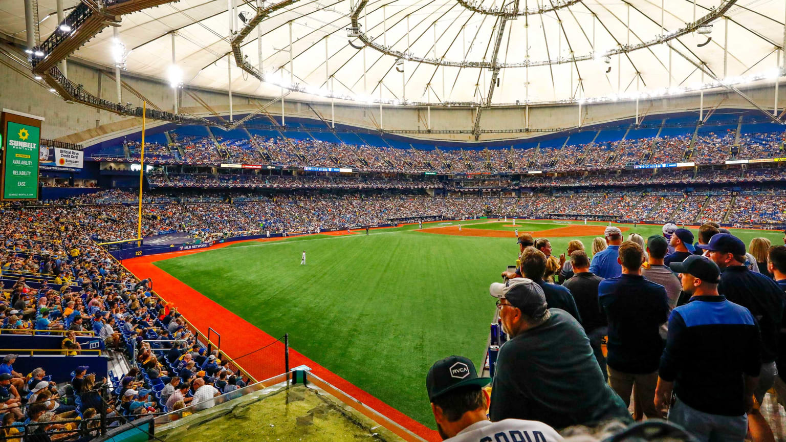
4 hours ago, coco1997 said:
- I wasn't originally planning to tackle Tampa Bay, but I couldn't shake the idea of trying the Rays in orange and forest green. It hit me that the only way to make quite possibly the drabbest stadium in MLB work was to give it the brightest, gaudiest color scheme imaginable.- Although this one clearly breaks my "no corporate names" rule, "The Trop" nickname sounds a lot better than "Tropicana" and lends itself better to a jersey design.
- The "O" in "Trop" has an orange slice inside of it
- The thick sky blue stripe with rays on the socks is inspired by the Touch Tank at the stadium
C&C appreciated as always!
I like this. The colours work pretty well together, and everything clicks.
Glad it's a Pullover too. I would also make the Cubs shirt a Pullover as well, having the cubs logo over the placket looks a bit awkward, the uniform looks great otherwise. And if you are doing Arizona, Miami and Pittsburgh, then I would consider suns out guns out for those teams. Especially The Pirates.-
1
-
-
32 minutes ago, chcarlson23 said:
I guess what everyone else, and myself is saying is that if you change the color of the breezers, than the color blocking is completely different, therefore it doesn’t look like just the original Hurricanes.
There are small things like the black cuffs on the red breezers that are missing, but if the original hurricanes were red from head to sock, changing that color in the middle would be missing the point of the throwback.
In any sport, if a team wanted to do a throwback, but randomly changed the color of the pants, then it wouldn’t really be a throwback to that look, even if the shirt is the same color.
In Soccer, there are quite a few teams that have done throwback looks, but changed the colour of the shorts or socks, Barcelona for their Centenary shirt wore navy shorts and socks instead of white shorts and black socks, and Manchester United wearing black shorts and socks with the green and yellow halved shirts in 1993-1994 instead of either white or navy shorts. I would still regard both of those as throwbacks. Same with the Norwich City 2015-2016 kit which had green shorts and yellow socks instead of black shorts and socks.
For me, the colour blocking doesn't look or feel that different with red or black pants, but I feel like black ones would work better with the red Canes jersey than the red ones. Though for the original set, the red worked wonderfully with the white jersey of the same time period and probably better than black pants.
-
 1
1
-
-
19 minutes ago, chcarlson23 said:
Well the black breezers are something they never had until the original black Reebok alternate. So it wouldn’t really be a throwback if they did something they never did.
The collar isn’t something a casual fan would notice. In fact, their original jerseys only had single colored names, until 2000, but these throwbacks are supposed to the inaugural look. Again, something a casual fan wouldn’t notice.
But black breezers?? Casual fans would notice, and know that they didn’t wear them with that set. You can argue for whether or not black breezers look better than red ones, but the true throwback has to be with red breezers and not black. So no they would not look like the original hurricanes if they wore black breezers with the original red sweaters.
It would be like saying if the Yankees decided to have red pinstripes instead of navy. Would they look like the Yankees? No. Would it look good? That’s a different question…
It's not, because I never said anything about changing the actual shirt, just the pants colour. A better comparison would be The Yankees changing the cap colour to white or wearing navy pants. In both cases, the actual shirt is left alone.
FTR, I would leave the Yankees Uniform well alone, It is The Most Recognisable Uniform in Sports.
Anyway, we are talking about the Canes here, and if they have (almost) the same jersey, with the same colour helmet and gloves, just with black pants instead of red pants with black hem trim, then they would still look like the original Hurricanes.If it's a throwback, then they should definately have had those black hem trims though. But in a few years when they make that jersey the new home, which will happen sooner or later, it's happened with many other teams going back to an original Jersey, then going to black shorts would probably be an improvement.
-
8 hours ago, Sport said:
Yeah, but it still looks 97% like the original Hurricanes where black pants wouldn't. Surely you understand the difference between closely resembling the original uniform intended for an anniversary night and wearing something entirely different from what the team wore in 1997?
It would still have the same shirt details apart from the collar, the same shirt colours, the same logos, so it wouldn't be something entirely different.
With black pants, it would still look like the original Hurricanes. Not as high as 97 percent, but still a pretty high number. If the Canes do make it their home jersey again, then black pants would look better than red ones.
5 hours ago, habsfan1 said:Because it wouldn't be visible enough, if it's hidden in a spot too close to the big crest. It defeats the purpose.
Sponsors would not want the Captain's C or anything else getting in the way of their ad and the space around it.
Or for the logo to be covered in blood after a fight.
-
1
-
1
-
-
7 minutes ago, Ridleylash said:
I mean, it's a throwback alternate. Messing with it and making a uniform that never existed is kinda running against the point of making a throwback alternate in the first place, which is to bring back their original look exactly like it was when they started.
That wasn't possible considering the template, so right off the bat it's a uniform thats different from the original. And that had black hem pants trim and this doesn't, so it's not like the Canes haven't changed a part of the uniform other than what would be different due to the Adidas template.
-
 1
1
-
-
17 hours ago, Sport said:
Carolina could really have done more with the pants and stockings. If they had to use a solid colour for the pants then black would have been a better choice, and matching the stockings to the sleeves would also be an improvement.
-
1
-
-
2 hours ago, South of South Street said:
The seating size is a factor of the site. I really cant fit a huge third deck in a downtown site. Its also do to the the Rays not drawing a big crowd. Also with a lower seating bowl I can shade more seating areas.The reason the Rays don't draw big crowds is due mostly to the Trop, which is not only an awful venue, it's also incredibly hard to get to from Tampa due to being on a Pennisula. With a 32,000 seat stadium in Downtown Tampa, the team would be playing to near capacity.
The Stadium is good, but considering the humidity of Tampa and the storms, it could do with a roof. The stadium also really needs a proper batters eye, I don't think an offset giant Coke Bottle and a tree is going to cut it. I like the brickwork, but it would almost certainly need to be padded to protect outfielders.
Things that might improve the stadium- A retractable roof
- A proper Batters Eye
- The Brickwork incorporated into more areas of the stadium, particularly the concourse.
- The Team Gradient around the Stadium.
- A nicer scoreboard, one inspired by the architecture and signage in Ybor City.
All of those improvements would really bring the stadium up to MLB standards.-
2
-
1
-
-
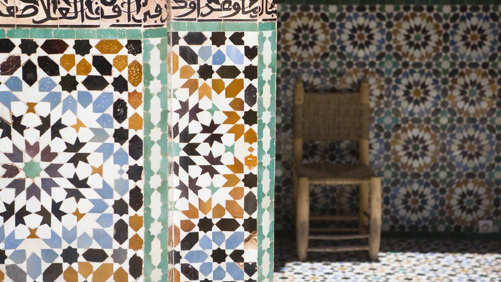
On 2022-09-30 at 2:45 PM, MJWalker45 said:
https://www.bbc.com/news/world-africa-63084459
Algeria and Morocco are arguing over this shirt. Adidas said it's based on a palace in Algeria and Morocco is calling BS on it.
Algeria jerseys
Moroccan tilework
Mechour Palace (Algeria)
It's a Zellij Pattern, which has it's origins in what is now Northeastern Algeria, Tunisia and Northwestern Libya, but it became most popular in Morocco and is most commonly found there, as it fell out of favour everywhere else.
-
1
-
-
On 2022-10-07 at 4:01 PM, Nordiks_19 said:
This being Arizona, the most important question to ask is "Has this dude ever dropped Mescaline?"
-
11 hours ago, insert name said:
I know this one is mixed but I personally like it. I like the shades of blue they're using in the gradient. It might look better if it started at the cuffs of the sleeve.
the colours are great, but the yoke doesn't work that well with the template and the cuffs look out of place. Hopefully the shirt isn't the only place we see the gradient, nike have shown they can get a decent looking gradient on socks with the Houston Astros City Connect.
-
55 minutes ago, DTConcepts said:
The wordmark-less Screagle jerseys would like a word.
The white jerseys were a perfect, perfect look. If the blue jerseys had a black cuff and no wordmark, the overall look would've been perfect.
Not gonna lie, those Uniforms are pretty sweet.
-
5
-
-
9 hours ago, chcarlson23 said:
IMO, the Caps have never had a perfect, perfect look. The Reverse Retro was pretty darn close, but otherwise each era has had its own flaws in the sweaters and branding. The current look, at least for me, seems to be the most “Capitals” of the bunch.
For me, the closest they've got to perfecting their look were these two uniforms -
Both have the W with the representation of the Capital Monument and both have really good colour balance.-
8
-
2
-
1
-
-
13 minutes ago, SSmith48 said:
Name is weird, but that logo and color scheme is fantastic! Never knew that a fleur-de-lis could so smoothly transition into an F. Brilliant design there.
Its not a new idea, Fiorentina tried it in the 1980s, but it doesn't look that elegant.
-
1
-
-
50 minutes ago, pepis21 said:
I'm in opposite since I like Czechia most from those new away kits
By the way name in English isn't actually a Puma fault but Czechia itself because when you looking at their other sports they use English name on it as well:
Considering that change kit shouldn't have existed and they should have just used the 2020 shirts, it's still a puma fault.
-
Going back to the classic colours was the right choice, but Wild Wing should have been left alone. The striping on the retro looks awesome, much better than that found on the home and road which look pretty standard and together with the recoloured main logo, really blands out the two jerseys.
The retro also has a far better colour balance than the home and road, those two really needed full contrasting collars.-
1
-
-
6 hours ago, pepis21 said:
Disagree, their Euro 2020 kits were amazing and much better than adidas especially with original aways (some of new ones like Czechia was nice too). Now their homes are great (especially Paraguay) too but aways are too much outside the box although Morocco, Egypt and Paraguay are quite ok.
With adidas I'm not a big fan that sides wraps shoulders arena and those flames are like taken from some dart/bowling shirt. Anyway is a massive upgrade over their 2020 shirts.
The away kits Puma made for their teams at Euro 2020 were generally really good, but due to the tournament being held the following year due to Covid, Puma introduced new away jerseys all with the same template so these weren't used at that tournament.
Instead, what we got were bland shirts that looked like training gear and without the bespoke patterns. In their place, the name of the country on the chest and a teensy-weeny crest for Switzerland, Czechia and Austria.
And out of all of them, the worst was Czechia, by virtue of the name on the chest being in English (the only one to do so).


/cdn.vox-cdn.com/uploads/chorus_image/image/68716909/cut.0.png&f=1&nofb=1)


2022-2023 NHL Jersey Changes
in Sports Logo News
Posted
I can totally understand the Avs using Rockies colours for obvious reasons. The Devils, not so much.