


VampyrRabbit
-
Posts
1,001 -
Joined
-
Last visited
Posts posted by VampyrRabbit
-
-
6 hours ago, oldschoolvikings said:
It's been a while...

I do like the D foot on the shoulders, and the font for the name and numbers is pretty nice. The rest of the uniform isn't exactly easy on the eye. The purple is nice on its own (most shades of the colour are), but pairing it with a washed out shade of green and with silver and black, it looks nasty, and I would choose either Eggplant/Jade or Black/Orange/Gold over the colour combo you've used.
The striping is okay, but it feels too conventional for the Ducks, when you think of the Ducks, most people would think of either the original jerseys or the 2006 rebrand, the only Jersey Anaheim that has had that had stripes as conventional as this concept was the 2003 alternate.Even though that ugly shade of green is on it, the return of Wild Wing to the front is welcome.
A nicer colour to work with the purple instead of that green and less conventional striping and this could be pretty good.-
 1
1
-
-
Hampton Roads Rhinos. It was an absolute travesty that this masterpiece never saw the ice.
-
2
-
-
Sonics look really good. Only thing that I would change is the Seattle in the main logo, it looks odd how it follows the curve of the Supersonics lettering until it gets to the second T and starts to dive, making it straight or following the Supersonics lettering.
-
1
-
-
3 hours ago, B-mer said:
I suppose a hanger effect. I dunno. I like the logo but also doesn’t say “coyotes” to me. I do like the AZ logo
Like the Kachina logo, the lizard logo has a representation of the Four Peaks and is also inspired by Southwestern art. It fits perfectly with the Cresent Moon and the Coyote.
For the home jersey, I would add a contrasting collar (making sure to avoid the "toilet seat" effect). For both of them, swap out the black trim for a shade of copper that works with the sand and brick red. Maybe also flip the colours on the Kachina pattern for the home. -
On 2023-01-17 at 10:54 PM, vtgco said:
Albuquerque looks good! Definitely an upgrade on the low-effort Rapids-knockoff crest the Sol currently have and the NM United crest. The old ball/Zia sun combo is excellent, as is the triangle-patterned border... but I think the overall logo has a touch of Inter Miami/Sounders syndrome where the stack of two major crest shapes is kinda odd. I would prefer to ditch the outer shape in favor of a diamond-shaped logo overall (a la HSV), maybe with the text running diagonally along the four sides.
The jerseys are excellent, and NM United should totally adopt them as-is, but in the context of MLS maybe a bit more red or teal could differentiate them from the Crew.
Excellent work!
Thanks!
I totally get the strange effect of two different crest shapes, but I decided that it went with Sol being one of three "Weird West" teams in the league and decided on the full crest for the shirt.
And I did alt home and away versions, one set with more red and another with more teal/turquoise.
SpoilerRed
SpoilerTeal/Turquoise
I like both versions, but prefer the red accented set.
And now onto the next team, the "oldest" in the league.......
FC Dallas Tornado
Considering that the team were NASL Champions in 1971 and were founded by Lamar Hunt (though they were never moved the needle like the Rowdies or Cosmos attendance wise), it was surprising that Dallas didn't follow the lead of San Jose and go with a NASL name for their 2004 rebrand, a year after Lamar Hunt brought the Franchise. FC Dallas had a similar colour scheme to the Tornado, with Shawnee Silver replacing the sky blue of the NASL team, but I wish the team had used sky blue too, so I decided that using similar colours to the team that existed from 1967 to 1981 (and predated the NASL) was the way to go.
The current FC Dallas logo is an excellent design and has held up very well for the better part of two decades now, so the Tornado logo is mostly the same as the current FC Dallas logo, with the exception of more red, shield shape and script. The Tornado script is Noto Serif, similar to the NASL 1978-81 Tornado wordmark, the Dallas and 67 - 95 (the year the USA team started play and the year the current team was founded) in Staubach font.
The colours are white, sky blue, and red from the original Dallas Tornado, and a similar shade of Navy from the current FC Dallas colour scheme.
The home and road were inspired by the 73-75 Tornado jerseys, with a hooped design that continues on the back. The hoops are woven on the main body, and subliminated on the side panels on the jersey and shorts. On the inside of the collar is the 78-81 Tornado wordmark, and above that is the pattern taken from the Dallas Centennial Hall.
On the back of the shirt is a twister in the shape of a T in the four club colours, an LH patch is on the sleeve, and on the socks, a D inspired by the 67-81 logo with a Twister in the negative space. The name and numbers are in the Staubach font.The third is inspired by the 1971 and 72 road uniforms, and has the pattern from the Centennial Hall on the front, 3 in red and 1 on the blue chestband. The decision to incorporate that pattern was inspired by this FC Dallas concept by Vtgco.
It's a shame that the Tornado name wasn't revived, nor was their colour scheme. I do like the current one that FC Dallas uses, but the red, white and sky blue of the NASL Tornado and the navy of FC Dallas, and keeping the hoops, would have been a great colour scheme.
-
2
-
-
3 hours ago, WBeltz said:
I wouldn’t mind seeing a yellow kit from Colorado as a clash. They tend to do a good job with using the state flag as a uniform inspiration. More so than the other teams in Colorado
I mostly agree, except when it comes to the colours on the badge. For some reason, they went with just red and blue on it and it didn't look pleasant.
All nice shirts (the 2017 is my fave), but the colours on the crest really let them down. If they had gone with blue and white as the colours it would have looked a lot nicer.
-
3
-
-
On 2023-01-07 at 1:31 PM, vtgco said:
I quite like the shade of gold used for the Salt Lake away kit, and the blue home socks are really nice; you make a good case that the hooped socks suit RSL better than they did for Colorado!
Really great idea to include the lightning bolts in the crest for Philly! If anything, I'd make them a bit more obvious! You could taper the outlines to a point at the shield's bottom even more, or you could replace that blue arc with a Chargers-style arc-shaped bolt! That away jersey is quite nice, and though the white shorts at home are kinda odd I think they work okay. I think navy/navy + gold socks is still my first choice though...
Good work!
Thanks! I got the idea for using white shorts for Philly from Boca Juniors and Fenerbahçe, the former played in white shorts in many of their early seasons and Fener have traditionally worn white shorts with their Canary Yellow and Navy shirts.
Most teams suit hooped socks and I think that both RSL and Colorado suit them, I'll be using them for at least one set for the Rapids for sure. Apart from the three stripes on the turnover, the following team will be the only one in the West Division that doesn't have a set of hooped socks now that St Louis is in the East. In this Universe, the Austin Aztex stayed in Austin and rebranded, and MLS, after Tampa got a kick in the grass, decided not to give Orlando an MLS team. They have to make do with an MLSII team till they make the playoff and beat the lowest placed East Division team. (I will have the MLSII teams finalised next week).
On 2023-01-07 at 1:31 PM, vtgco said:Ah well if it's Phoenix, that'd make the first one something other than Arizona as I'd assumed... Trying to think what else could come that early alphabetically! Albuquerque?
Albuquerque Sol FC
I like the black and yellow main colours for New Mexico United, but find everything else underwhelming about the team, and find the name Albuquerque Sol far more evocative, so thats the one thats used, and in this universe, its the one the team entered MLS with. The Black and Yellow stay and are the two main colours, but are joined by Red (from the flag of New Mexico and Albuquerque) and Turquoise (the state mineral of NM) on the crest. The centerpiece of the crest is the Zia sun symbol with an old style football at the center.
The triangle pattern is taken from the Seal of Albuquerque, and the font used is HFF Beer Van, a font with a little western flair was a must for ABQ.
Just like the current NMU home, the first choice is black shirt, shorts and socks, but has a few extra colours added. In four rows on the shirt, two on the first choice socks and one on the second is a pattern with the five colours (Violet, Pink, Turquoise, Orange and Green) from the logo for the Albuquerque International Balloon Fiesta. The pattern was inspired by Southwestern art. The jock tag is the date of the foundation of Albuquerque taken from the city flag. On the inside of the collar is "The 505" and the pattern found on the crest, and on the back, the Zia sun symbol as found on the Seal of Bernalillo County.
The change is a white version of the home, with all of the same features.
The third has the triangle pattern across the chest
Currently NMU have a great colour combination in Black and Yellow, but adding a touch of the southwest/weird west could do wonders for their identity.-
4
-
 1
1
-
-
14 minutes ago, MJWalker45 said:
Dazzle camo? Well I guess it makes sense since Yeti is a glamping company, why not pretend to be military?
A faux military look seems like it would fit DC United more than Austin, or something that would be a choice for a new franchise in San Diego or Hampton Roads. It is nice to see ATX get creative with the stripes after an utterly conventional first home jersey though.
-
Sorry for the delay everyone.
On 2022-12-31 at 10:07 PM, woody86 said:Great job on the RSL quest. Given they play in Sandy (suburb), they likely wouldn’t make a ton of nods to the city itself. That said, love the creativity!
Thanks! The new flag for SLC is excellent, the moment I saw it I thought that RSL should really do a flag based kit, and hopefully that will happen sometime. And I get that they play in a suburb of SLC, but the Fire play in a suburb of Chicago and the Union play in a suburb of Philly, and both have released jerseys with a lot of referances to their titular cities, so I could someday see Real put more nods to SLC in their jerseys.
Speaking of Philly.......Philadelphia Union
The Union have a really strong crest, but I've always wanted to see them use a version of their simplified crest on their jersey. The central band has been widened and rendered in a brighter shade of gold than the dirty looking one the team originally used, with Union (Slightly modified Labor Union font) in the same shade. The dark blue used is a slightly lighter shade than the team has used, and the dark blue and gold are paired with a shade of powder blue, which is kept separate from the gold.
The vertical central stripe returns on the home, with a tonal jagged lightning bolt graphic and a woven edge. The first choice shorts are white, a first for Union. A stylized cloverleaf is the Jocktag, inspired by the team anthem. On the inside of the shirt is the motto of Philadelphia in Labor Union font and a green and blue splatter graphic, and on the back is the Liberty Bell.
The font used for the name and number is Union Agrochem.
The change is white, with light blue stripes (with one shade being the signal blue the club currently uses), blue shorts and a choice of either light blue or white socks. The stripes on the shirt and socks have a lightning bolt pattern, and the Jock Tag is "We Are One" (used on shirts previously) and on the inside of the shirt is "jungite aut perite", the club motto.
The third jersey is gold with dark blue trim, and has the same shorts and socks as the home, though the gold socks with navy turnovers are the first choice. The jersey has front and back horizontal tonal stripes in the same style as the graphic on the home.
While the Union have a strong look, when I think of Philly Union, the central band comes to mind and there is a lot of mileage that Union can stil get out of it, and I hope one day they return to that look.-
4
-
1
-
-
7 hours ago, BlazerBlaze said:
We tried that in 19/20. Didn't go over well with the fanbase. ButtStripes was a phrase I heard to much around tailgates those seasons.
I meant full stripes on the front and the back, the gold numbers should contrast well with both black and red.
-
2 hours ago, aawagner011 said:
Additional photos of the Atlanta 23/24 shirt.
Was able to buy this from an online shop in France. Probably my second favorite shirt behind the original five stripes. Interestingly, I thought it simply had two black stripes (from the original leaks), but it looks like depending on sizing, the black stripes would continue towards the sides. I think this was the case with the original, too. I’m curious if there will be other differences between the authentic level shirt. Obviously it will have the star and differences in materials, but sometimes MLS authentics have major differences from the replicas like trim, cuffs, etc.
There is a good chance the authentic version will have black underarm panels.
I like the shirt and it's good that ATL are back in full stripes. Would have liked to see the stripes on the back too. -
1 hour ago, MJWalker45 said:
Badge should never be below the manufacturer logo. I would expect this to be almost entirely black, or some type of green according to FH, since this year's away shirt is white.
The colour scheme that FH reported is one they call Green Night, but it's more like black or a very dark gray, and is more blue than green (R- 41 G- 51 B- 54). It's not a particularly attractive colour to my eyes at least.
-
1
-
-
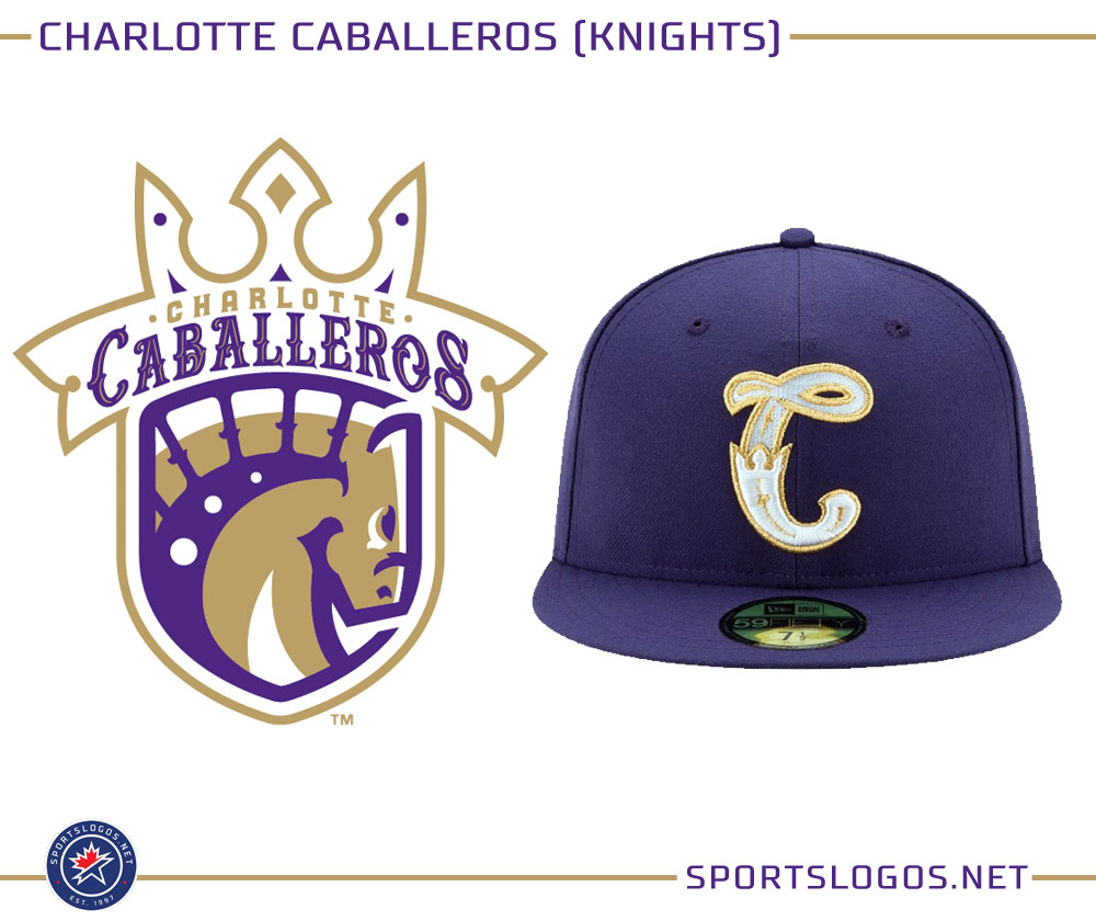
Curious to see the Knights in the teal and purple of the Hornets and with the Caballeros Cap logo, as those colours pop and that logo is probably the best the Knights have had.
-
2
-
-
Nice. Only change I would make is a white button for the Dodgers hat.
-
1
-
-
Back to the thread after a pretty hectic week.
On 2022-12-19 at 1:23 AM, neo_prankster said:Nice work on both!
Thanks!
On 2022-12-19 at 6:06 AM, mrcubfan415 said:Interested to see how you plan on distinguishing them from the Chicago Fire.
The rebrand of the Chicago Fire was quite simply a travesty, and I, never in a million years, was going to keep Fire as a navy blue team. The colours and logos would have made STL and Fire distinct anyway, but they will be even more distinct when I rectify the mistake of the teams rebrand.
On 2022-12-25 at 7:24 AM, vtgco said:A good step up in your font choices for St Louis compared to your old version, and smart to go outline-less at home. I like the pinkish-cream away color quite a bit. Also, the home and away are fine, but those stripy socks are making me wish for a diagonal stripes jersey as the third!
Still kinda feeling the empty space of that Crew logo from before... How would just the hard hat as the crest be? Also I like the yellow and white jerseys quite a bit; I'd personally prefer those as home and away, since the black kit is sorta plain. I like the number font choice and the arched name on back a lot!
Maybe getting ahead of myself with those colorways... Excited to see my Sounders in those gorgeous shades of blue & green, and curious what's going on with Austin in orange & purple and Nashville in peach. Also, just one NY team, eh? Kinda funny that New Orleans appears to get a team before Sacramento or NY team 2 : P
I'll work something out for a diagonal stripes jersey for an alternative third. And you're right with the Crew - the yellow should be the home.
As for the upcoming teams, there isn't a NOLA team, and while I wish I could put a team in the Big Easy, couldn't bring myself to boot out any of the current East Division teams, and the colours shown are the finest combo that peyote can buy.
The colour for Nashville was picked from a Fender colour chart and I decided on violet for Austin over green due to one of the nicknames of the city. There is only one NY team in this universe, as MLS got their hands on a certain name and the owners of Manchester City decided against buying a Franchise.
As for Sacramento, the Republic should be in there, guess I have a tough decision to make.
And now onto the next team......Real Salt Lake
I decided to keep the Real name, as the highest point in Utah is Kings Peak, so the team name could be retconned and the team named after the mountain. The crest here consists of the Sego Lily, the state flower of Utah, with the state mammal of the Rocky Mountain Elk in between the petals and RSL in Amagro font. The main colours stay Claret Red and Cobalt Blue, with light gold as the third colour.
The home has cobalt blue sleeves and shorts, and the main body of the shirt has a subtle pattern consisting of peaks and the sego lily found on the new Salt Lake City flag. The jocktag is the crown found on the current crest, and on the inside of the shirt is the slogan BELIEVE. For this kit, and the road and third, the font used for the name and number is Scantype Black.
The change also has the Sego Lily pattern, this time just on the front, the main colour is light gold, with navy blue as the second colour and a darker gold from the Salt Lake City flag.
The third is inspired by the flag of Salt Lake City. The new flag for the city is really nice and a huge improvement over the previous flag, so a flag based kit was always going to be an option, and like the home, the kit has a pair of hooped socks.
Real Salt Lake have a great colour combination, but could do with a refresh of their brand that draws more on Utah iconography, and hopefully the concept here does just that.
-
6
-
2
-
-
In a vacuum, the colours pink and violet work really well together and if you get the right shades, the colours pop. And the leaked colours certainly do that.
But with the knowledge that its the colours of the main sponsor, it just feels like a really cynical move.48 minutes ago, CDCLT said:I don't mind the colors on their own, but the Ally connection, if real, is embarrassing and once again makes CLTFC feel corporate and impersonal. The black and mint set was obvious for year one so this is adidas' first real test for making something great for the Crowns. I can't think of what else the colors could be a reference to so I'll wait until the reveal.
Purple is the colour of royalty, and the state flower of NC is the Flowering Dogwood which can have pink flowers. But I somehow doubt that is where they got the inspiration for the colours from.
-
1
-
1
-
-
7 hours ago, spartacat_12 said:
Real Salt Lake is inexcusable though.
The highest point in Utah is called Kings Peak and the second highest is South Kings Peak, so if the team want to justify that name, I suppose they could always retcon it so the team was named after those Mountains.
8 hours ago, seasaltvanilla said:MLS please keep the armpit side panels far away. Just because it's a different panel on the shirt doesn't mean you have to highlight it in a different color.
So far, of the released and leaked kits we have seen photos of, St Louis is the only one with contrasting armpit panels. Hopefully it stays that way.
42 minutes ago, WestCoastBias said:Has LAFC already run out of ideas for kits???
To be fair, the colours for the new change kit are original and they did strip down their badge for it, so they did come up with some new ideas. Whether they were good ones is up for debate.
-
1
-
-
Both ATL and Miami look really good. If I'm nitpicking, not sure why the crest for Miami is monotone when white is a very Miami colour, but it still looks nice and the horizontal print on the shirt works really well.
United returning to proper stripes is very welcome and the shades of red and gold really work well together and with the shade of black. It also helps hugely in that just like the Miami shirt, the shoulder armpit panels on the back are non contrasting.
The LA shirt, maybe it might grow on me, but first impressions, holy s*** that is a monstrosity. -
10 hours ago, Jer15 said:
With MLS eventually going to 30, maybe 32 teams there's almost not way to avoid an actual clash at some point.
While I have previously said I dislike the idea of going white heavy It would make sense to me if MLS just said all teams wear their primary and all clash should be white. I'd really like MLS to lean on a primary look and a clash as opposed to home/away/3rd.
I might just be old school. Excuse me while I yell at some kids to get off my lawn.
"Light" and "Dark", sure, but having all the clash kits be white would get boring real fast. It got boring when Adidas gave almost every team a white jersey a while back, and a league with 32 teams all having white kits.....(shudders).
-
4
-
-
3 hours ago, Digby said:
FH says Seattle is going to have a red away kit, which seems odd. Can’t really imagine that looking very Sounders, unless they’re going to yank the Kraken’s color scheme and beat them to a red base jersey. Also please enjoy this gem of a sentence from FH.
I associate red much more with the Timbers, what with most of their road kits in the early days of their MLS existance having been red, and Portland is the Rose City. Red as the main colour for a Seattle team, even for their road jersey, just seems really out of place.
-
4
-
-
St Louis F.C
From the oldest to the newest, we have the team from St Louis. I decided on the name St Louis F.C instead of Saint Louis CITY SC because it sounded nicer and had a better flow. I also decided to keep the shade of "red" the team uses and also the blue, because they absolutely pop together.
FTR , I do like the SLC crest and the new home they revealed, but I wanted something that had a "Flame de Lys" on it and had a lot more navy on it because the two colours work great together.
The crest has the "Flame de Lys" from the crest of the defunct AC St Louis. Around it are the Gateway arch and a mound with the letters STL on it in ARB-187 Moderne, with wave peaks representing the Mississippi and the Missouri Rivers. Under it is F.C in ARB-187 Moderne. To go with the blue and "City Red", the accent colour of cream was chosen due to just wanting something different from either white or a shade of yellow/gold.
The home has thin stripes on the front with a pattern inspired by the Gateway arch, in particular the three rows of panels. For the stockings, we have navy with the CITY Red turnovers and spiral socks for clashes of hose. The shirt has a mandarin collar with hidden buttons.
The change is in cream, with a navy vertical stripe flanked by the same subliminated pattern found on the home flanking it. To my knowledge, no MLS team has had a cream jersey, so STL can be the first team to do so. The shirt also has hidden buttons, but with a band collar.
And the third has a chest band with the archway pattern on it and a crew collar. All of the kits here have the "Flame de Lys" on the back of the jersey and on the socks, a 1764 jocktag (the date of the foundation of St Louis) and on the inside, the lyric "The Lights are Shining" from Meet me in Saint Louis.
(For the record, not every team will have kits that have the same jock tag, sock logos and phrase on the inside of the shirt)-
4
-
-
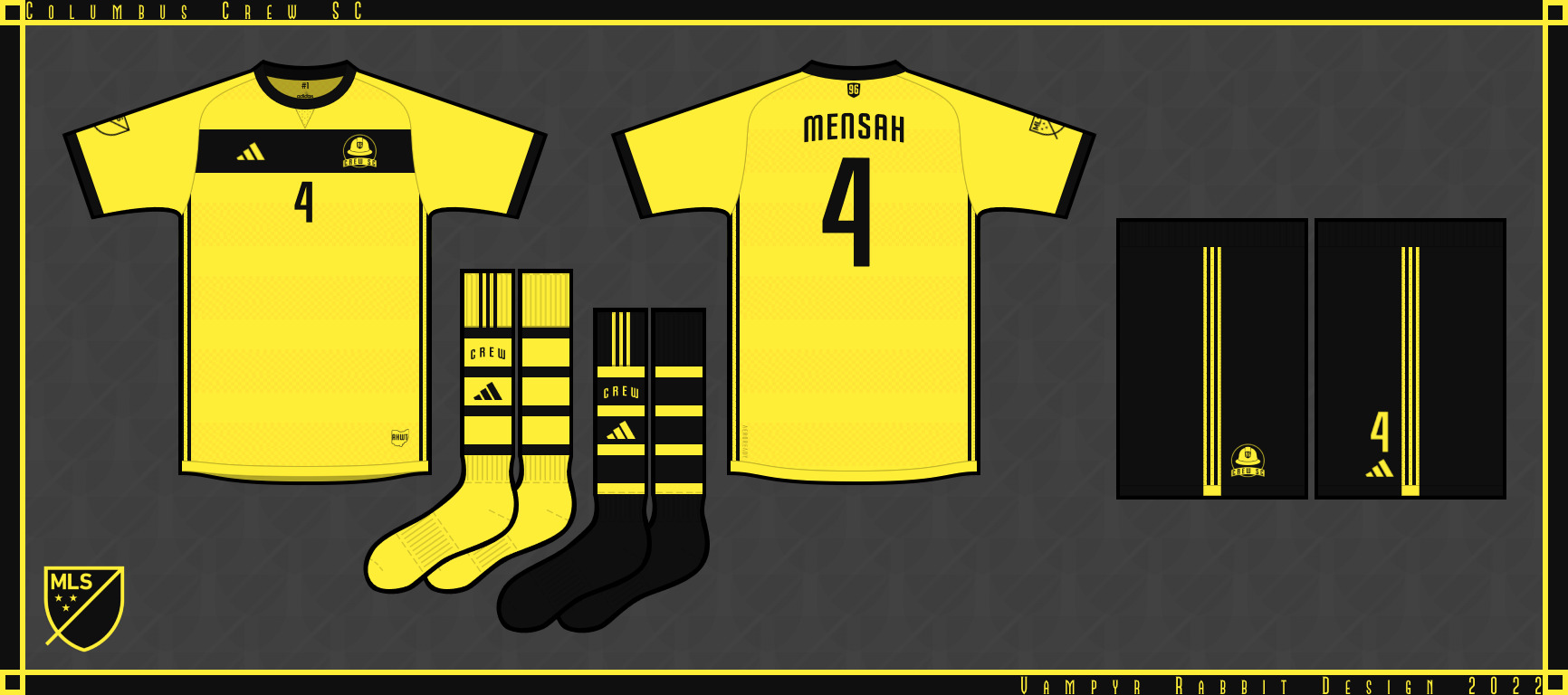
Columbus Crew SC
Guess the first place to start is with the first MLS club. The Crew stay The Crew and keep the black and yellow, the crest has a hard hat, an arch with the team name and a shield with 96 on it (both in Slim Jim), with the shield in the shape of the first Crew emblem.
The home is yellow, with stripes consisting of a checker pattern with arches subliminated into the shirt. The Crew owned the checker pattern and it was one of the best parts of their 2014 rebrand, so decided on keeping it and added a subtle arch to it within the stripes. Columbus is the City of Arches, and that is a theme with the home and change kit.
The change is black, with an arched checker pattern subliminated into the shirt.
For the third, Americas Hardest Working Team get a white change which has two pairs of shorts and also has a check pattern, this time in a front vertical pattern flanked in black.
All the kits here have a AHWT jock tag, the 96 shield on the back and inside the shirt, #1
-
4
-
-
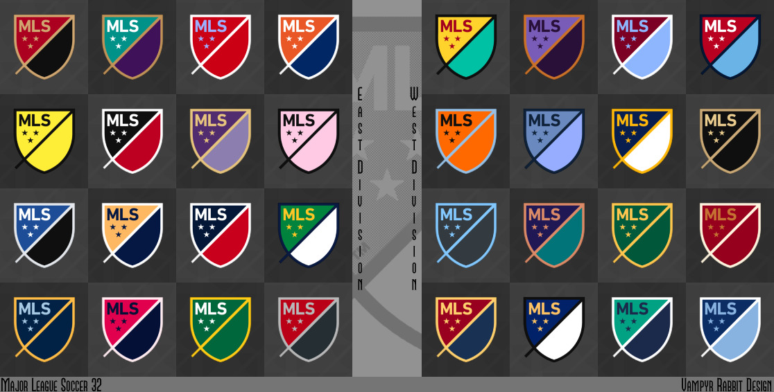
Welcome to a new series, an alt world take on the MLS with 32 teams, and the question "what if MLS hadn't stuck a fork in the two teams in Florida? Oh, and there was 3 more teams as of present and a MLSII (which will be covered in another thread) allowing for possible promotion and relagation? And that not every new team had a European style name? And what if the MLS wasn't the only one of the five major professional sports leagues in the US and Canada that didn't have teams rocking teal?". Well, questions. Questions that I, a dude from the other side of the pond, will try to give an answer to.
As you can see, we have 2 divisions of 16 teams, split east and west, and each team has an MLS logo in their colours. Some are pretty much the same as they are IRL because of brand equity, or I think they look fine as they are, or both. Some use colours that were proposed but never saw the light of day, some are major twists on existing colour schemes, and some are totally new. I'm sure you can guess the teams from the order, and some from the colours, which are those used on the home outfits.
Teams get 3 uniforms, one home and two aways, generally two of the three kits will match colour and design, but there will be exceptions. All teams get two pairs of socks for each uniform, in case of a clash and also if they want to change up their stance game.
I hate sponsor logos on shirts, so in this version of MLS, there are no sponsor logos on the front, just the player number and in one special case, the team name.
So sit back and enjoy the ride, C&C would be cool. I'll be posting teams in no particular order. So here we go.........EAST DIVISION
Atlanta United
Charlotte Fortune
Chicago Fire
FC Cincinnati
Louisville Whiteoaks
Inter Miami
Impact de Montréal
New England Revolution
New York Cosmos
Tampa Bay Rowdies
Toronto Towers
WEST DIVISION
Austin Crown
Colorado Rapids
Houston Apollos
Kansas City Wizards
Los Angeles Galaxy
Los Angeles FC
Minnesota Stars
Phoenix Rising
Portland Timbers
San Jose Earthquakes
Seattle Sounders
Vancouver Whitecaps
-
1
-
-
13 hours ago, upperV03 said:
Possible leak of the new Galaxy secondary shirt:
Certainly looks legit, as it’s on the correct template and has the new Adidas logo. Quality looks legit for a replica, too. If it is indeed legit, it’s a pretty solid effort. Really clever incorporating the LA flag into the collar like that, and I like them keeping the teal around instead of reverting back to navy for the secondary kit. I do think this could’ve used some black accents somewhere like the ‘96 kit.I think it works well enough with the red and the gold, I understand why black could have been on there, but it still looks nice with the three colours.
Of the OG MLS teams, only Galaxy used teal as a main colour, with San Jose using it as one of about 4-5 accent colours, which considering it was the 1990s is pretty surprising it was only two. If Charlotte and the Sounders had been in the MLS back then, then it would have been a good bet they would have used teal as well.Nobody else is using teal, it doesn't look like there is going to be anyone else using it in MLS, so I'm all for Galaxy running with the colour for their change kits.


/cdn.vox-cdn.com/uploads/chorus_image/image/8742287/image.0.jpeg&f=1&nofb=1&ipt=64bbbf4bd32f066745ead800eff460c681444d0dd1a60ecc71a7f76e68e87b3b&ipo=images)


.jpg)


2022-2023 NHL Jersey Changes
in Sports Logo News
Posted
Haven't the Canucks been doing just that since Adidas took over the NHL Contract? Their two reverse retros have been blue and green and they had an alternative blue and green jersey with the stick in rink logo on the front. Using blue and green (albeit with a much darker blue) for both RRs sure seems like embracing that identity.