-
Posts
1,001 -
Joined
-
Last visited
Posts posted by VampyrRabbit
-
-
This looks really good. The compass rose S looks great on the cap.
I would like to see the wordmarks and logos without the bevelling and a road gray, Seattle should have dumped the cream alt this season instead, as the road gray was really nice and there is only one MLB team that should have a cream uniform trimmed in blue and gold.-
 2
2
-
-
The white pantsed version looks great. The T-Bars and the headspoon are exactly what nike should have went with.
-
 1
1
-
-
2 hours ago, dont care said:
If that’s all it takes I guess Georgia is part of the PNW
The Pine Barrens make New Jersey a part of the PNW too.
-
On 2023-04-21 at 4:43 AM, Digby said:
supposedly a leak of Arsenal’s third kit for next season. Hate the goofy little monogramming on the color but otherwise this is a thrill. They’ve brought back the banana kit plenty of different ways but I’ve been dying to see the dark green/navy blue raglan look again, it’s such a great design.The 1982-83 was green with standard cut navy sleeves, with white piping, it lasted for one season before yellow and gold was brought back and it had normal sleeves.

Arsenal first wore raglan sleeves in 1988 when adidas introduced their second set of uniforms for The Gunners.
-
 2
2
-
-
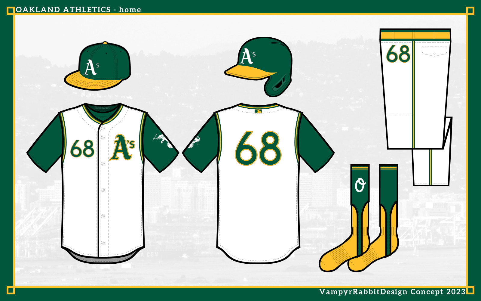
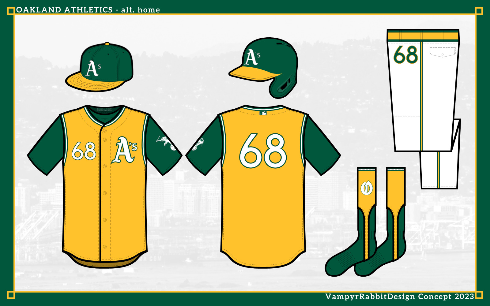
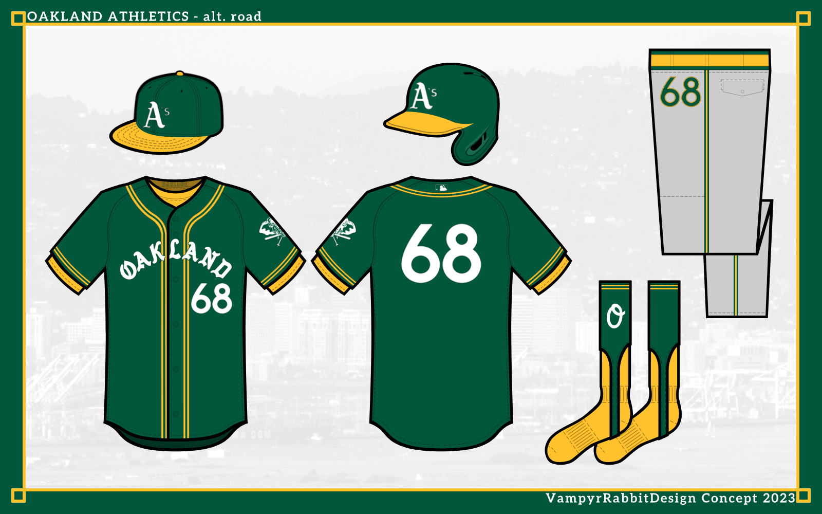
So it looks like the Athletics are finally saying goodbye to Oakland and leaving for the bright lights of Vegas. So first of two sets of uniforms, one in the (unlikely) event that the A's stay Rooted in Oakland.
Oakland Athletics.
The Green and Gold stay, with the green a shade between Kelly and Forest green, and the gold a slightly lighter shade than currently used. White shoes would be worn with all uniforms.

For the home, the A's go sleeveless, harking back from their first few seasons in Oakland. The 1988 logo is on the sleeve, with an O for Oakland instead of the A's. The sanitary socks are gold as with the 1987-1999 uniforms, and the stirrups have the O from the current Oakland road script.

For the road, collar and cuff trim is added, and Stomper is on the sleeves, this time his head with a diamond behind.

The home alt has a gold sleeveless shirt over a green baselayer, and green sanitary socks with gold stirrups. On the stirrups, the O from the 1968 script is present.

And for the road alternate, this was inspired by the teams current second alternate. The gray pants from the road are used, and the script from 1968 graces the front, this time in white with a green outline. The head of Stomper is on the sleeves.
So thats the Oakland A's. Next up, The Vegas A's.-
 2
2
-
-
On 2023-04-28 at 2:06 AM, coco1997 said:
Curious if you have any suggestions for how to handle the Rockies?
Updated scripts, perhaps take inspiration from the Rockies City Connects, different shade of purple.
-
 1
1
-
-
The first Disney era rebrand of the Angels is so 90s theres no taking it out of that decade, pretty much anything with those logos is going to look like it stepped out of a time machine. I don't think there is any bringing it into the modern day. I understand not using the original alternate logo, though that does mean the uniform set is Halo free.
I like the set for what it is though.-
 1
1
-
-
The original home uniforms of the Diamondbacks used a cream base, as it stands you've got 3 white based uniforms for them, which feels a little redundant.
Purple, teal and copper is the best colour combination Peyote can buy, but I like the rest of the rest of the set with the far more muted colours and using the old stacked Diamondbacks logo was the right call.-
 2
2
-
-
49 minutes ago, aawagner011 said:
What’s the significance of the “My Oh My?”
Part of the call made by the Mariners Play by Play announcer when the team clinched their first ever playoff series win in 1995.
-
25 minutes ago, tigerslionspistonshabs said:
Can anyone enlighten on me why we're talking about expansion? I mean 20 years ago we were talking about contraction.
Manfred said that expansion wasn't on the cards until the situations with Oakland and Tampa Bay were resolved. Now with the A's heading to Vegas, that's one part done.
-
14 hours ago, Ridleylash said:
The Mariners and Pilots both originally wore the same colors, so presumably that's the inspiration for the color choice and overall look; tying into Seattle's MLB history by mixing those two brands together.
The problem with that is that the Pilots and the pre Nintendo owned Mariners were two sacks of s***.
The Pilots had one season in Seattle, and that season was absolutely wretched, the team played in a ballpark that was Sick in every sense of the word, and as a result of an economic downturn in Seattle, the team had no money. When the Mariners wore Blue and Gold, they had one winning season, plenty of awful teams, and they played in a dank pit of a stadium.
Considering that Seattles MLB teams almost always stank the joint out while wearing blue and gold full time in venues that were absolute toilets, I have no idea why Seattle are going that route instead of trying something new inspired by the city of Seattle.
-
 1
1
-
-
On 2023-04-18 at 5:47 PM, coco1997 said:
Up today are the Rangers!
Notes:
- I really like what Texas did so no major changes, the biggest being swapping the "TX" and numbers on the front of the jersey. Placing the logo on the right breast seems like a case of being different just for the sake of it, but the end result looks awkward.- The new set is allegedly "pitch blue" but looks black to me, so I just went black.
- I added some red to the top of the socks to create some much-needed visual separation from the pants.
- Lastly, red trim is applied to the cap logo.
And here are a few variations I worked up:
First up, for those who aren't big on dark pants with light colored jerseys, here's an inverted version:
And since the Rangers have sadly retired their red alternates this season, a red version:
Note: I had to add outlines to the logos and numbers for this one, since the black did not pop enough against the red.
I dig these, and you've improved them from the actual versions by swapping the number and logo around on the shirts. I was wondering how these might look with sleeveless jerseys (with the cuff trim moved to the arm opening) and a red brimmed hat for the red jerseyed uniform.
Also wondering how they would look with a headspoon.
-
 1
1
-
-
11 minutes ago, Cujo said:
A shared market with the Giants while drawing 2,000 fans per game.
Public transportation ranks 497th on reasons to keep a team in town.
The Giants don't play in a dilapidated dual use Football/Baseball stadium with a tarp capped monstrosity that San Francisco is still in the hole for blocking a scenic view, nor are the owners of the Giants about to oversee a second consecutive 100 loss season.
-
39 minutes ago, Cujo said:
I'm waiting for you to name one single thing where the A's staying in Oakland has an advantage to the team relocating to [insert any city in the northern hemisphere here].
The city has had enough of the owners s***, and the fans have been driven off by the sandbagging. But if the A's ownership had actually been willing to spend their own money on a new stadium and hadn't treated the city like crap, then staying in Oakland would have been a far better option than relocation.
The market size and one of the best public transportation systems in the US, along with a Ballpark that isn't a haven for possums and doesn't overflow with pisswater would have been good reasons to stay in Oakland.-
 1
1
-
-
3 minutes ago, Cujo said:
How is any of this worse than staying Oakland?
It's not, but staying in Oakland is almost certainly out of the question now, at least with the current ownership.
-
9 minutes ago, Cujo said:
Getting a new state of the art stadium and thriving sports city where fans will actually show up is an awful choice?
It is when they are moving to a smaller market that already has 2 established Big 4 league teams, and is the home of UFC which is more or less equivalent to a big 4 team. And considering they will probably be moving to Vegas on the back of a second, perhaps even third, 100 loss season after sandbagging the f*** out of Oakland, there is no guarentee that fans in Sin City are even going to show up for a team that is as cheaply run as the A's.
-
5 hours ago, Cujo said:
As much as we despise BFBS, when the A's move to Vegas, I totally expect them to embrace black to fit their city's pro sports identity. The Raiders and Knights obv utilize black. They'll go heavy black. Convert yellow to 'Vegas gold'. And use 'Blackjack table felt green' as trim. Something pretty close to this:
That would be an absolutely awful choice for a new look, but then again, moving to Vegas is an awful choice, so it tracks.
-
 1
1
-
-
The addition of light copper makes the home jersey even better, and while I would have used the copper in place of the cream for the rest of the uniforms (the copper I feel is light enough and the magneta and teal contrast enough to avoid the muted colours problem), it still looks good.
While I like the magneta, I would have stuck with Purple and while there would still be comparisons with The Rockies, the cream base and the Arizona AF colours of Copper and Teal (along with the sleeveless jersey being the definative version) would distinguish it enough from the Rockies. And for my money, the Arizona Diamondbacks got far closer to a timeless look with their 2001 home sleeveless Jersey uniform with the A logo than Colorado ever did with any variant of their home look.
I would like to see an update for The Rockies, considering out of all of the four teams, they were the only ones to stick with their look apart from a subtle change with their purple shade, and it's probably the look that has aged the worst.-
 1
1
-
-
On 2023-04-21 at 2:47 AM, leopard88 said:
So the Mariners are throwing back to a team that played in the most aptly named stadium of all time and were a dumpster fire on and off the field, and also to the days when they played in a tomb and the prospect of a winning season was a pipe dream.
I would prefer something inspired by Seattle rather than a throwback to rotten teams that played in Stadiums not fit for purpose. -
I think it's a mistake to drop copper, as not only is it the state metal of Arizona, when it oxidizes it produces teal/turquoise and black compounds. A D-Backs Uniform never feels right without the copper, I would like to see a brighter copper used instead of the cream for the logos, trim and numbers. The cream as the base colour for home and home alt pants looks great with the new magneta colour.
I would also use the db snakehead logo on the sleeves of at least one of the jerseys, that logo is beautiful and with it's abstract, angular design, feels like it should have been in the original logo set instead of the snake with the baseball. -
Tampa Bay is great, the sleeve stripes and the gradient are both fantastic.
As for the Marlins, I much prefer the teal and black, the current logos look really good in that colour scheme.-
 1
1
-
-
5 hours ago, Chromatic said:
All of these sets are gorgeous and if I were a Wild fan I'd be happy with any of them.
I actually like Minnesota in green and red, I think its a great colour scheme that fits the team perfectly. The "christmas" complaints are complete nonsense. At the same time, they look great in green and gold too, which is an amazing colour scheme and I wish somebody in the league would use it. Its like the Kings. Silver and black is a great colour scheme, but I also think its a shame that out of 32 teams in the NHL, not a single one wears an iota of purple.
The Coyotes have purple on the logos for their home and road. 1 out of 32 is still too few though.
-
Is the last team Tampa Bay?
-
On 3/14/2023 at 7:35 PM, MJWalker45 said:
Given the choice between a solid back/broken stripes/hoops and unbroken stripes/hoops, give me unbroken every single time, so I would choose the more visable option for numbers every time. The new number looks far better on striped backs than the old ones.
-
 1
1
-


/cdn.vox-cdn.com/uploads/chorus_asset/file/16498233/1157626861.jpg.jpg)

MLB Concepts - 2024 Update
in Concepts
Posted
The home, road and home alt for the Pale Hose look great apart from the numbers, which look really ugly, the block font used for the 80's throwback would work better.
White Sox script uniform is nice apart from the aformentioned number and a cap with the mismatched bill and button, the 1919 throwback is great except for the Reds number style on the back.